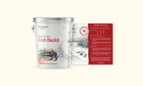
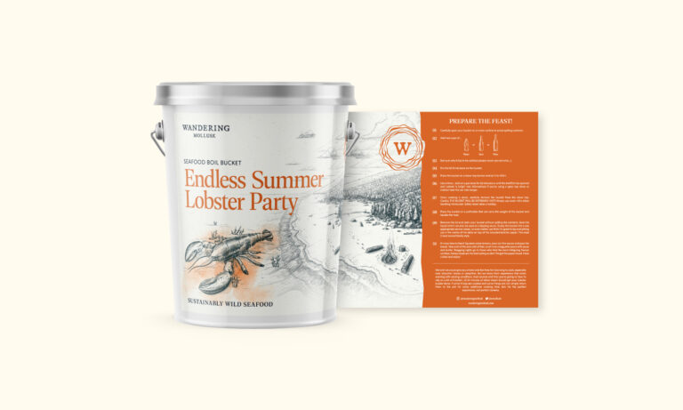
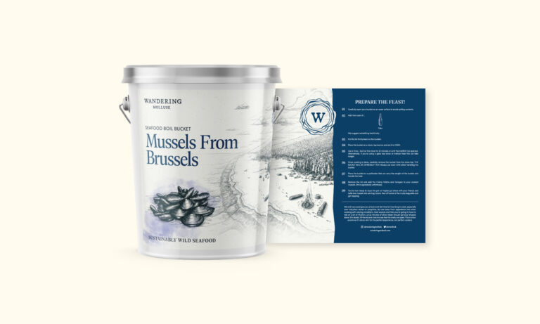
We’ve been working closely with Wandering Mollusk for some time now, so when he approached us about a full rebrand and overhaul of all print and digital materials, we headed straight to the drawing board. When factoring in the rebrand we considered their historical growth and our knowledge of where they are headed to design a rugged, timeless logotype with an emblem that nods to where it all started – Oysters.
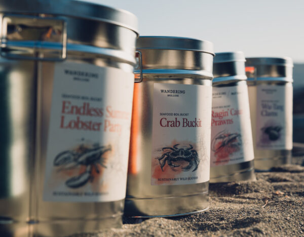
The updated label designs for their seafood buckets are based on an established system that we put in place a couple of years ago. From there, we developed new, custom brand illustrations per label design to ensure the aesthetic was consistent across the board. Each bucket consists of its own unique colour and includes step-by-step instructions to get the most out of your unique experience.


