A complete series of food for our four-legged friends that are prepared by avid dog lovers and targets people who love their dogs as if they were their children. They strive to give them quality biscuits and dental sticks, full of nutrients, good things and great taste that don’t cost an arm and a leg. The brand is about care, health, joy, and believes in creating a world where people stop exploiting and abusing animals and where all species live in harmony.
Their selling line is “For the Love of Pets” and they mean it. It’s designed by using a free-form font, making it personal. The promise is not given by a faceless company but by the people of this company who are dog owners themselves.
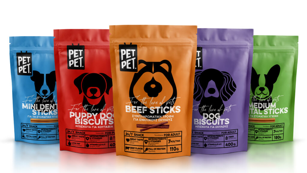
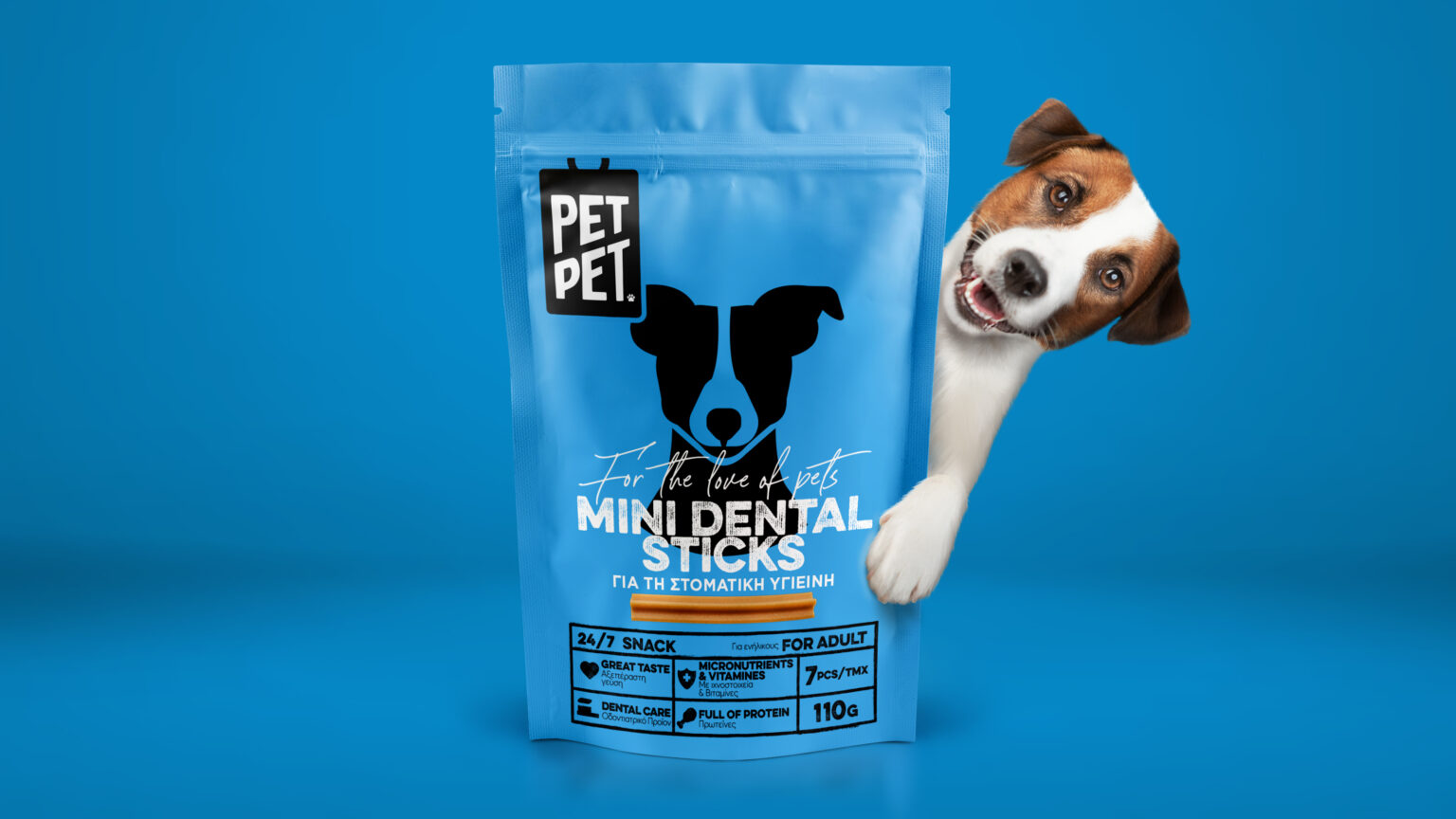
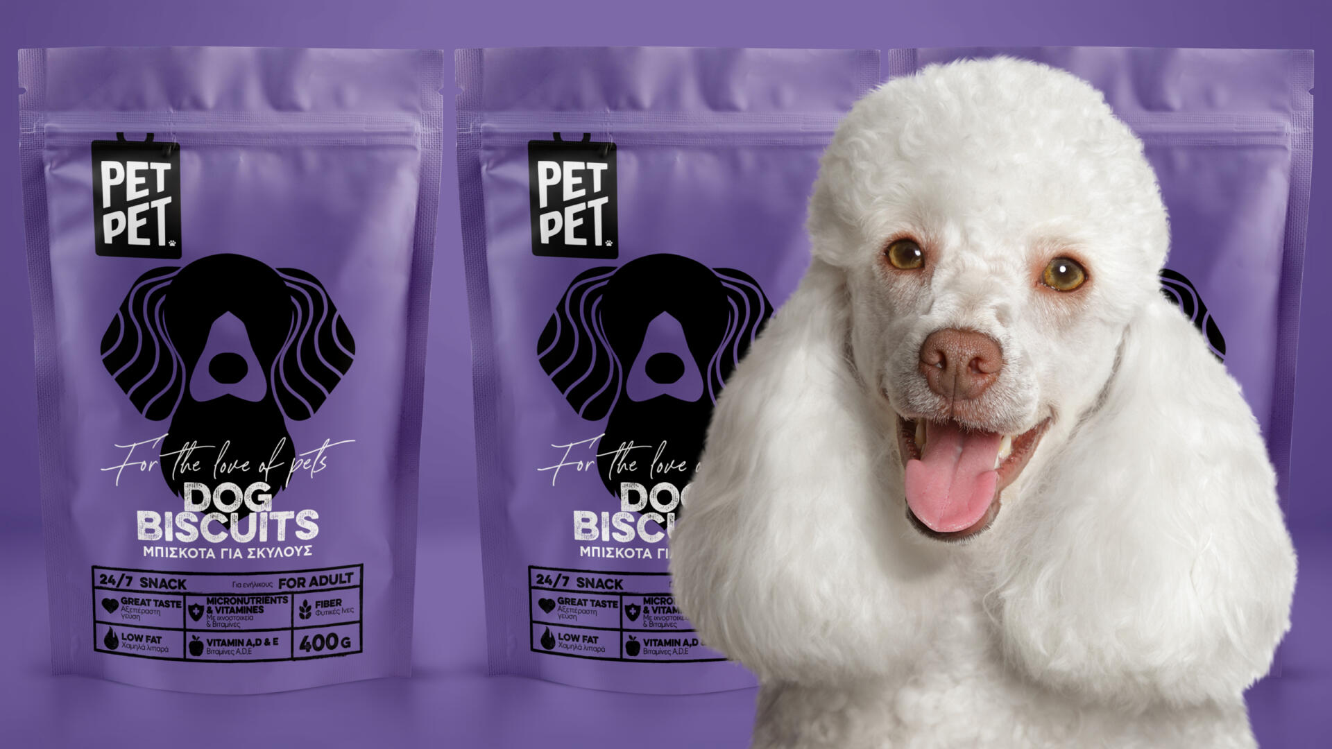
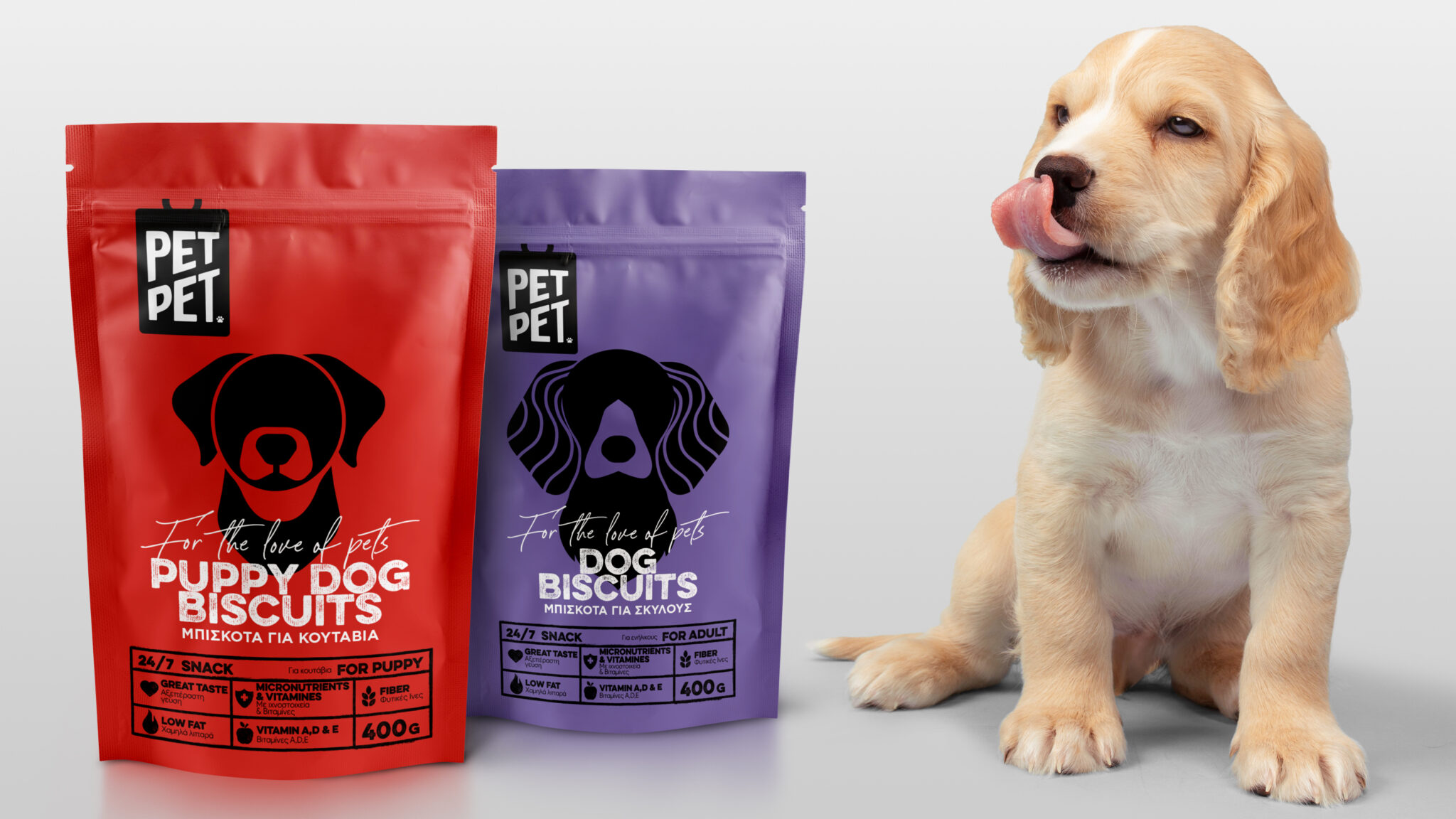
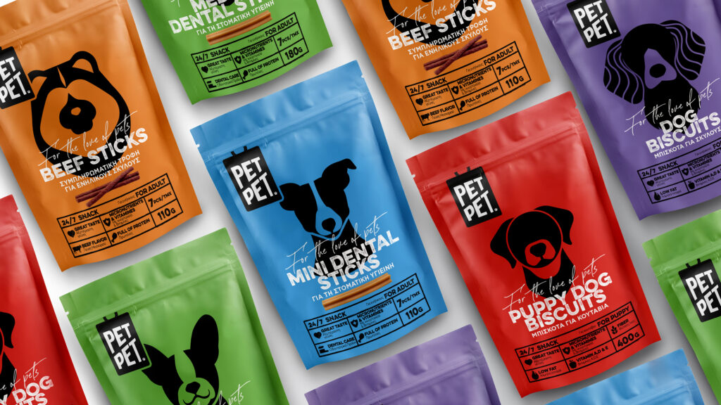
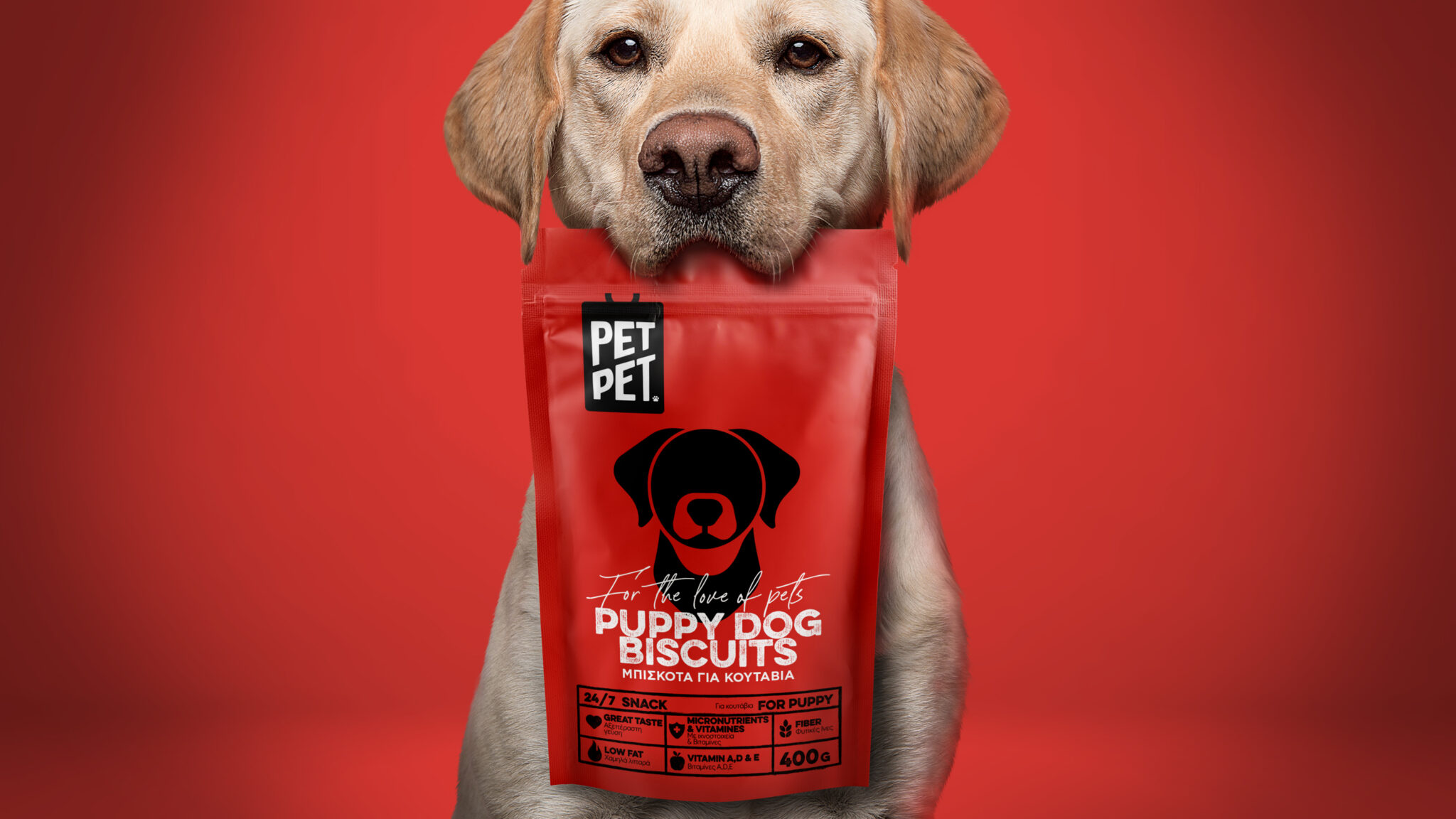
Love for the pets is portrayed in the logo too which is the illustration of a dog tag. The tag conveys an animal that belongs, that is loved and cared for. It works as a stamp on the package, giving it a name and personality. One small yet significant detail in the logo is the paw, which replaces the ™ symbol.
The paw signifies that the products are pet-approved and endorsed by the most credible judges—the pets themselves.
The packaging is designed with vibrant, eye-catching colours that convey a strong message, combined with simple graphics reminiscent of infographics. The linear illustrations of dogs add another unique element to the packaging.
The nutrition facts table is prominently displayed on the front of the packaging, rather than the usual placement at the back for that transparency and honesty touch.
The harmonious combination of colors and illustrations and the overall linear approach create an open, postmodern, and dynamic brand that doesn’t lecture and inspires positive emotions and a sense of freedom.