About
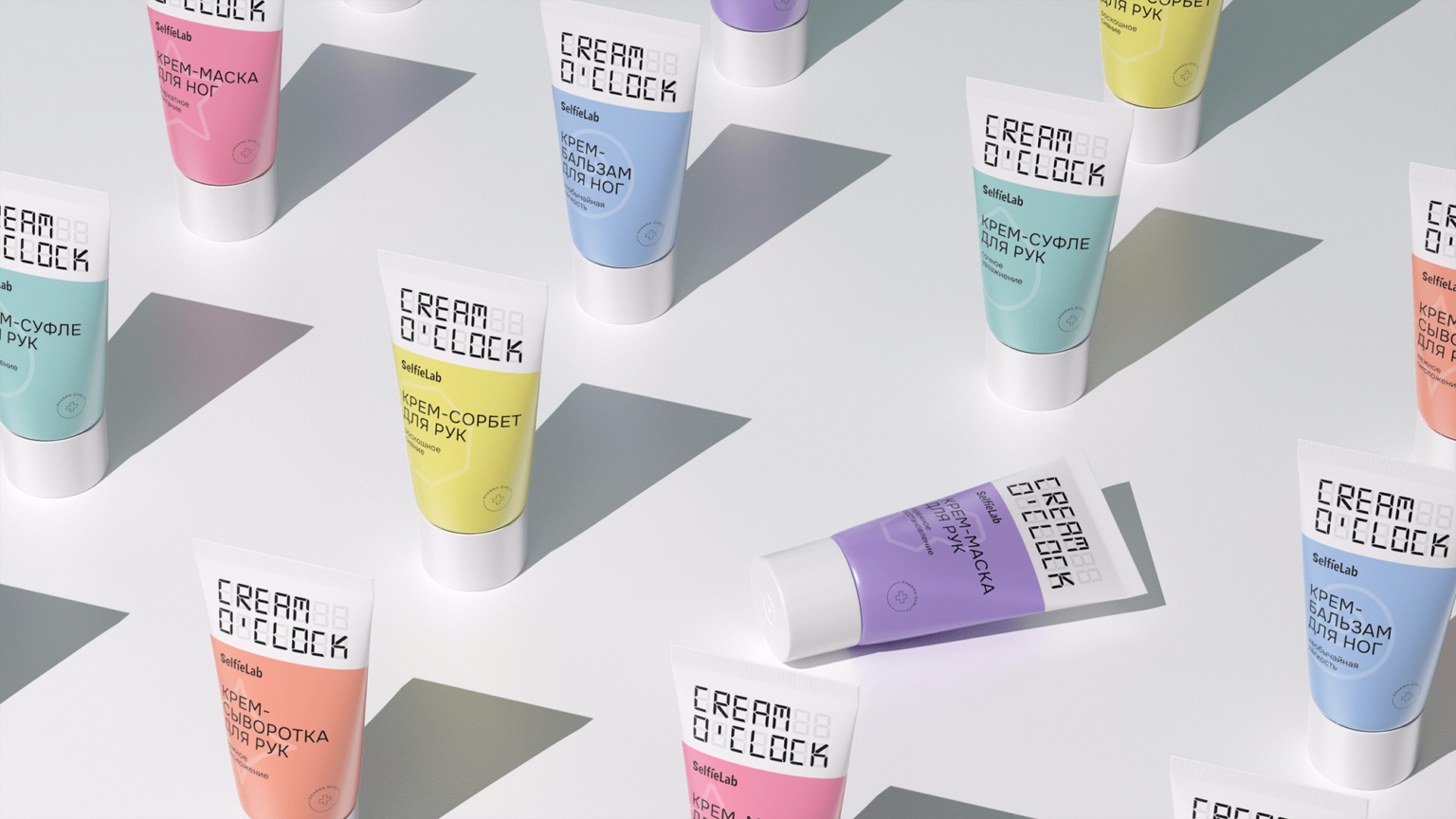
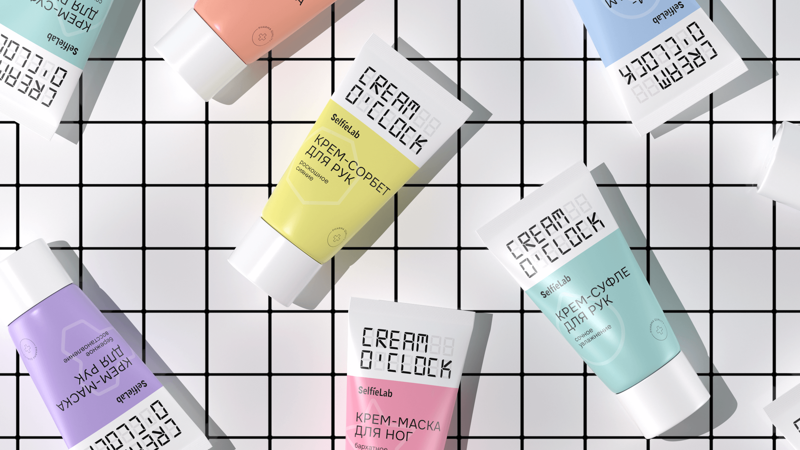
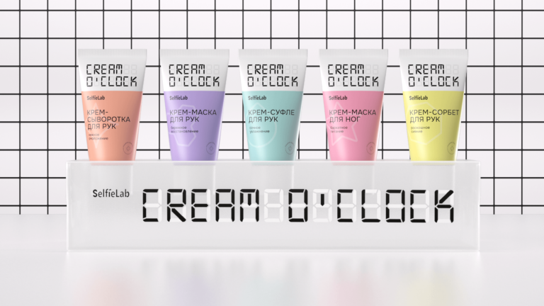
Cream O’clock is a new line of functional hand and foot creams that help to maintain skin quality. They contain active natural fruit and berry extracts and floral essential oils. The convenient “pocket size” packaging allows to carry them with you and apply offhand to take care of your skin.
Goal
To develop the packaging design and naming for launching a line of modern skin care creams.
Background
The idea swivels around time. The frantic pace of life often does not leave ordinary people any opportunity to take care of themselves. We are literally torn between work, family and hobbies. Sometimes it seems that we don’t even have an opportunity to just relax and unwind. What’s the good about talking about body care then? But one must learn to take breaks and devote some time to oneself.
Concept
To emphasize the importance of a beauty break, we came up with the product name Cream O’clock. It alludes to the metaphor of an electronic clock. Everyone has encountered them in their life, and on the subconscious level, the image is clear to everyone. Based on this idea, we chose a simple visual language for the product. The upper part contains a white heading with the brand name alluding to the metaphor of an electronic clock.
The lower part is separated with a color area for convenient differentiation between creams within the product line. The whole concept serves as a simple reminder for customers: if you see a cream next to you — it’s time to use it.