LA FLOR DE RUTE, DESIGNING AN IMAGE OF HIGH CONFECTIONERY
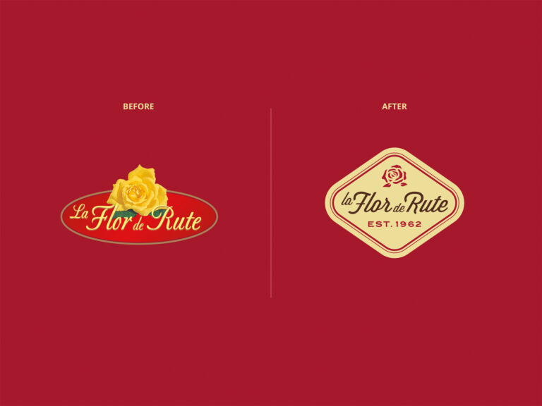
LA FLOR DE RUTE enters a new brand universe with this restyling of its image. New branding with a higher brand positioning. A brand for traditional confectionery brand, which offers high-quality products. Quality, looking at the communication style of premium pastry shops. We have created and developed a brand image that allows the company to communicate a concept that has always been intrinsic to its values. “The usual guarantee of a high-quality product”, and in turn detaches from the seasonality of the traditional Christmas sweet segment.
EVOLVING THE BRAND TOWARD THE NEW CONSUMER
The new typography we have adopted is an evolution from the current source, an elegant and luxurious script. In the new logo, we have provided the preposition “the” so that its composition is more balanced.
The icon of the rose, a characteristic of the brand, has been redrawn, thus preserving the inherent and peculiar vision of the current logo, vectorizing, and improving readability along with its reproduction.
The branding colors evoke the premium world pastry and sweet artisan.
We add ST. 1962 contributing to the value of the guarantee and heritage of company tradition.