SAMPÉ gin is a strong alcoholic drink distilled in Croatia from the finest Croatian grapes. Sampé wine distillate; with its refined combination of herbal aromas that include pine, lemon, and Adriatic salt; draws its inspiration and has a strong connection to the sea.
Many countries on the shores of the great sea know the legend of how St. Peter once caught the John Dory fish and left fingerprints on its body; that’s why this sea delicacy is still called by his name: Šanpjer, Sant-Pierre, Sampé. Inspired by an ancient tale, we gave the name Sampé to a premium gin that pays tribute to the Mediterranean — a mythical place where the divine touch permeates nature and its precious gifts.
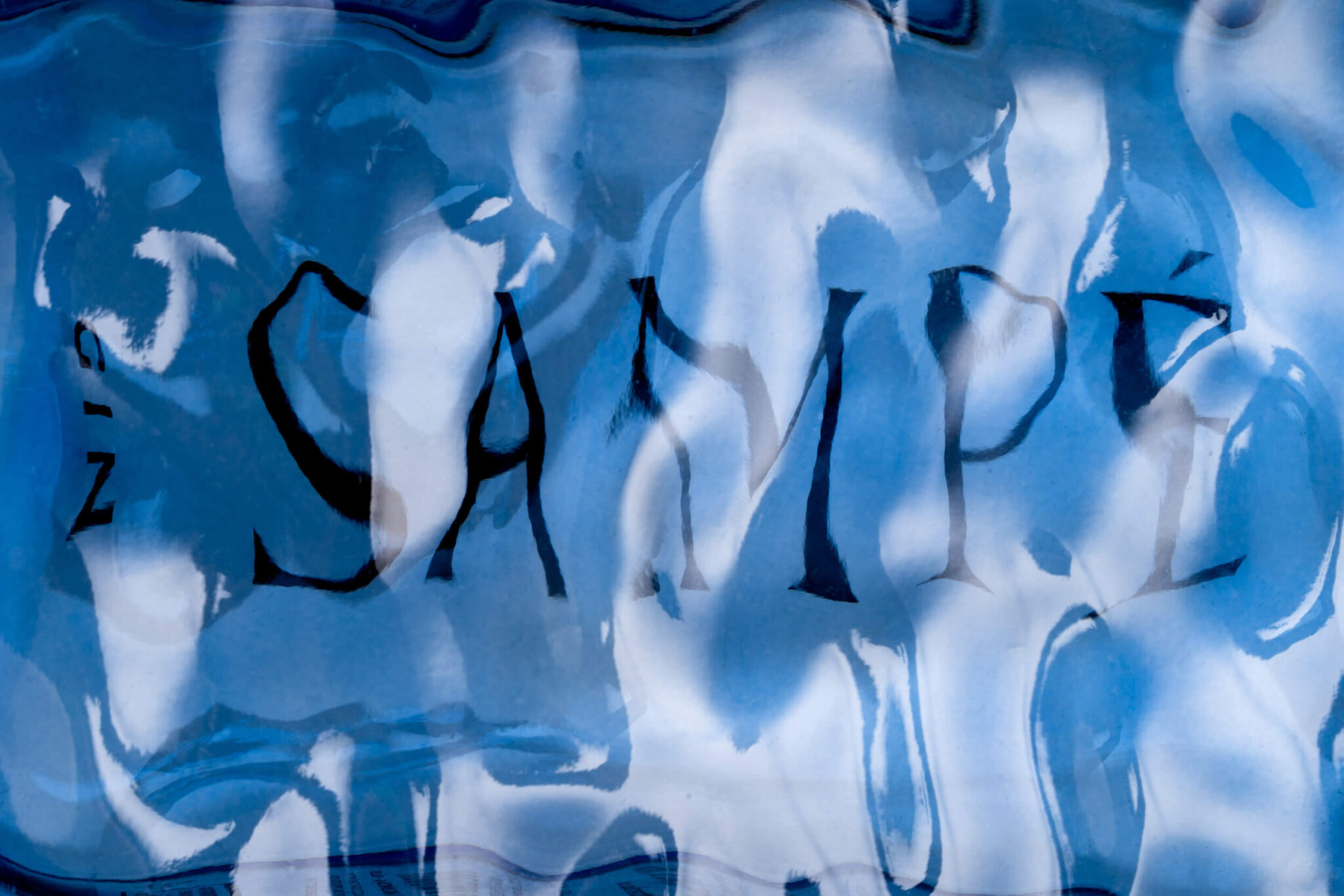
The originally designed bottle has the shape of the sea surface on the front. The brand name is mirror printed on the back of the bottle, so on the front, it is visible through sea waves and the gin liquid which gives the impression that the brand name Sampé is in the water. This position deforms the typography and creates exciting shapes and structures that change by turning the bottle in hand or changing the viewing angle. The typography Rector, created by Hrvoje Živčić, was selected for the ideal combination of monumental and graceful.
The light blue-colored glass and wooden stopper in the conical shape of a sailor’s cap contribute to the overall Mediterranean feel.
Curator’s Insight
The bottle’s front mimics the surface of the sea, but there’s a surprise. The brand name, SAMPÉ, appears as if it’s underwater, peeking through the waves and gin. It’s like a game of hide-and-seek, a visual treat that changes as you tilt and turn the bottle. The label isn’t just a label; it’s like a living artwork that dances with your every move.