Branding and Packaging for Marianitos
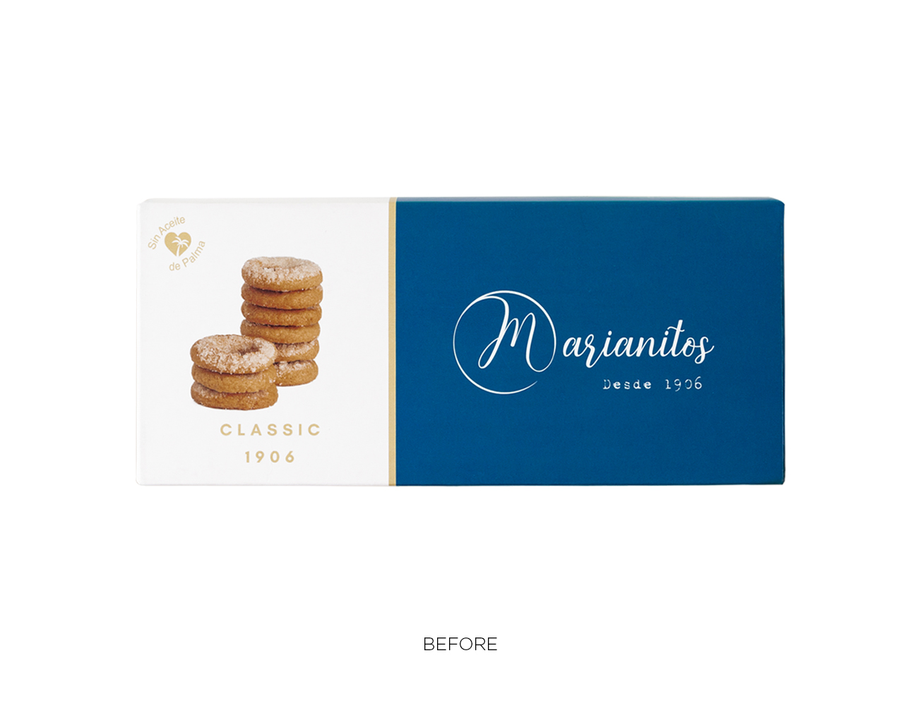
Brand and packaging redesign for “Marianitos” rolls, a revitalization of the flagship product of the business from Alicante towards internationalization and the creation of new flavors and coatings. Marianitos is a tribute to craftsmanship, tradition, love, and passion, as well as the family’s dedication since 1906 and the El Toldet bakery in Santa Pola. It’s also the result of blending innovation and cutting-edge with a traditional foundation and artisanal expertise.
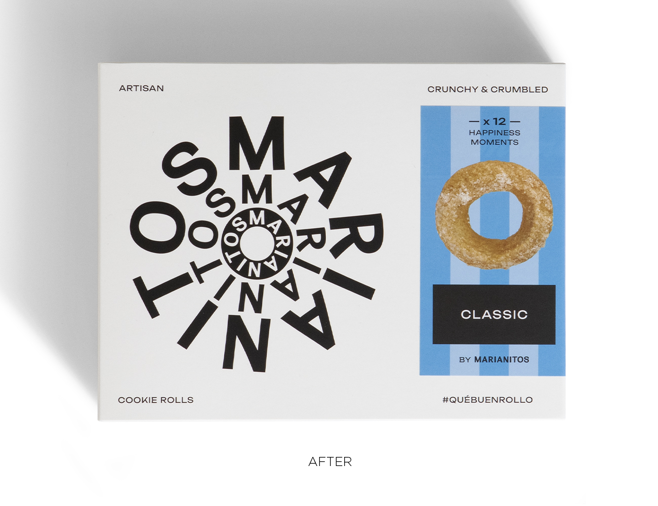
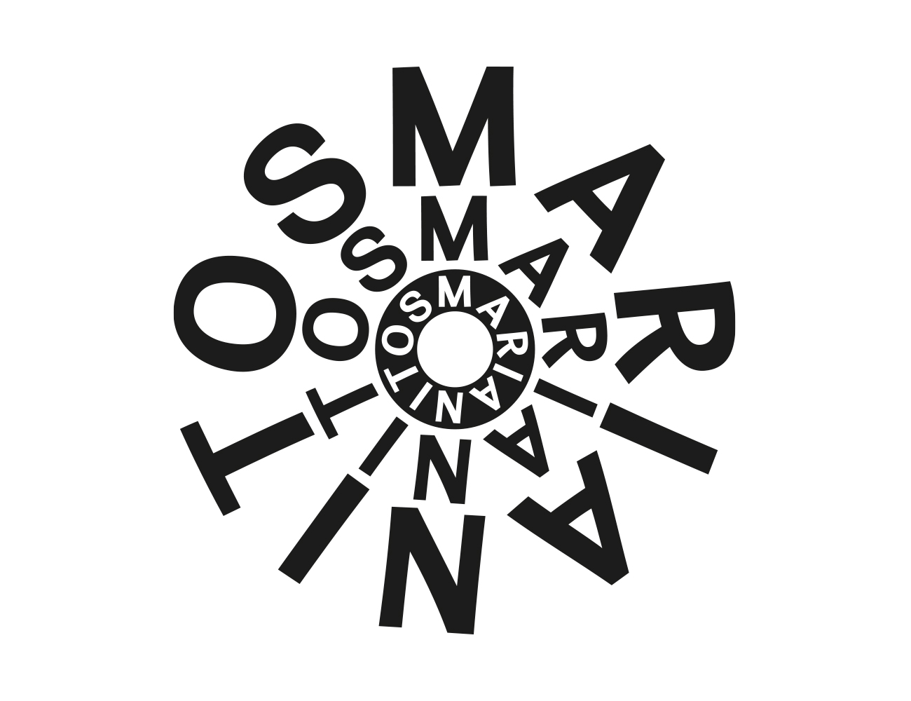
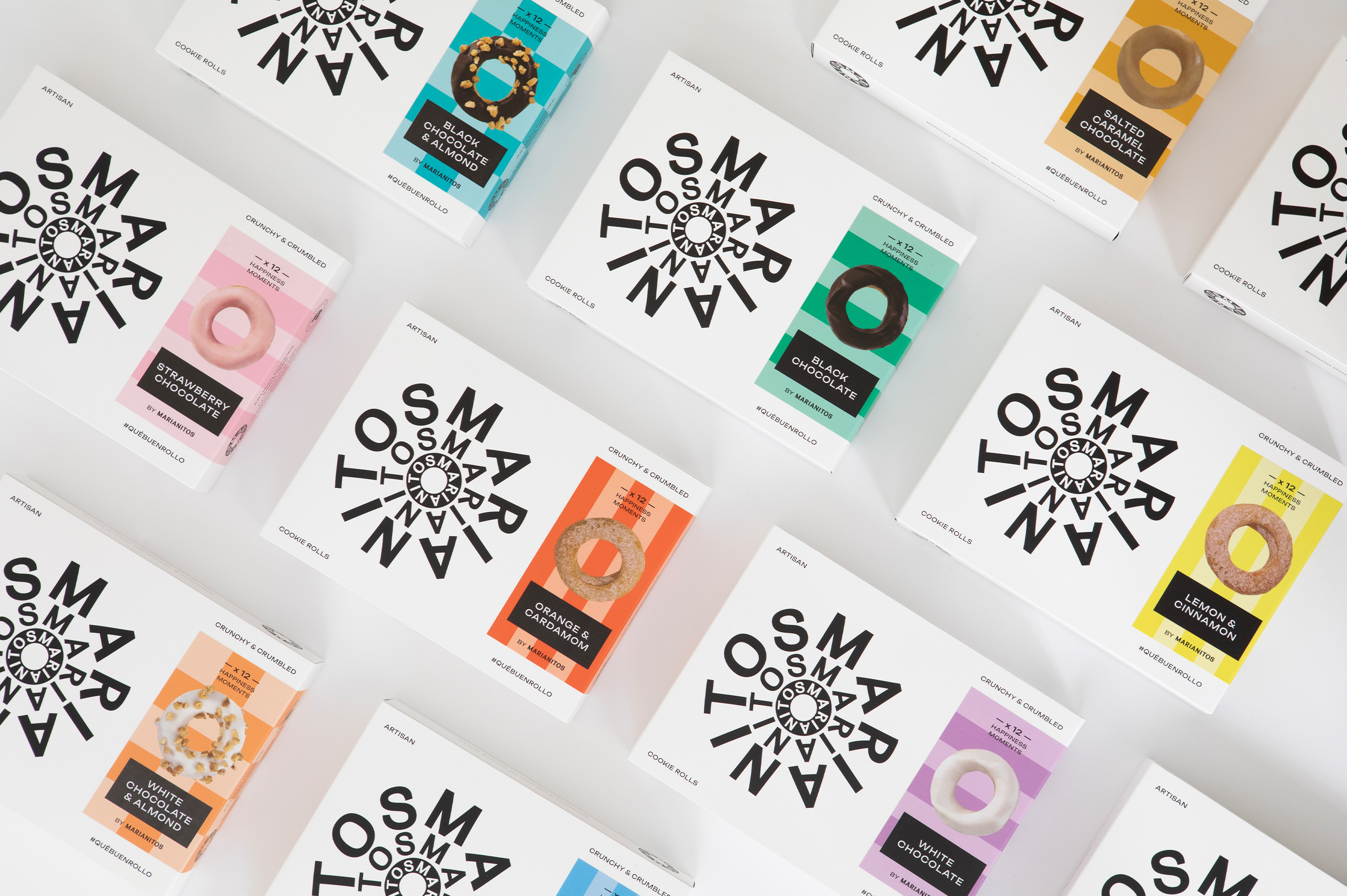
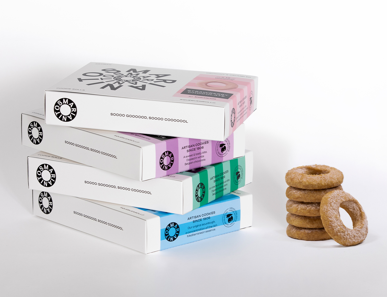
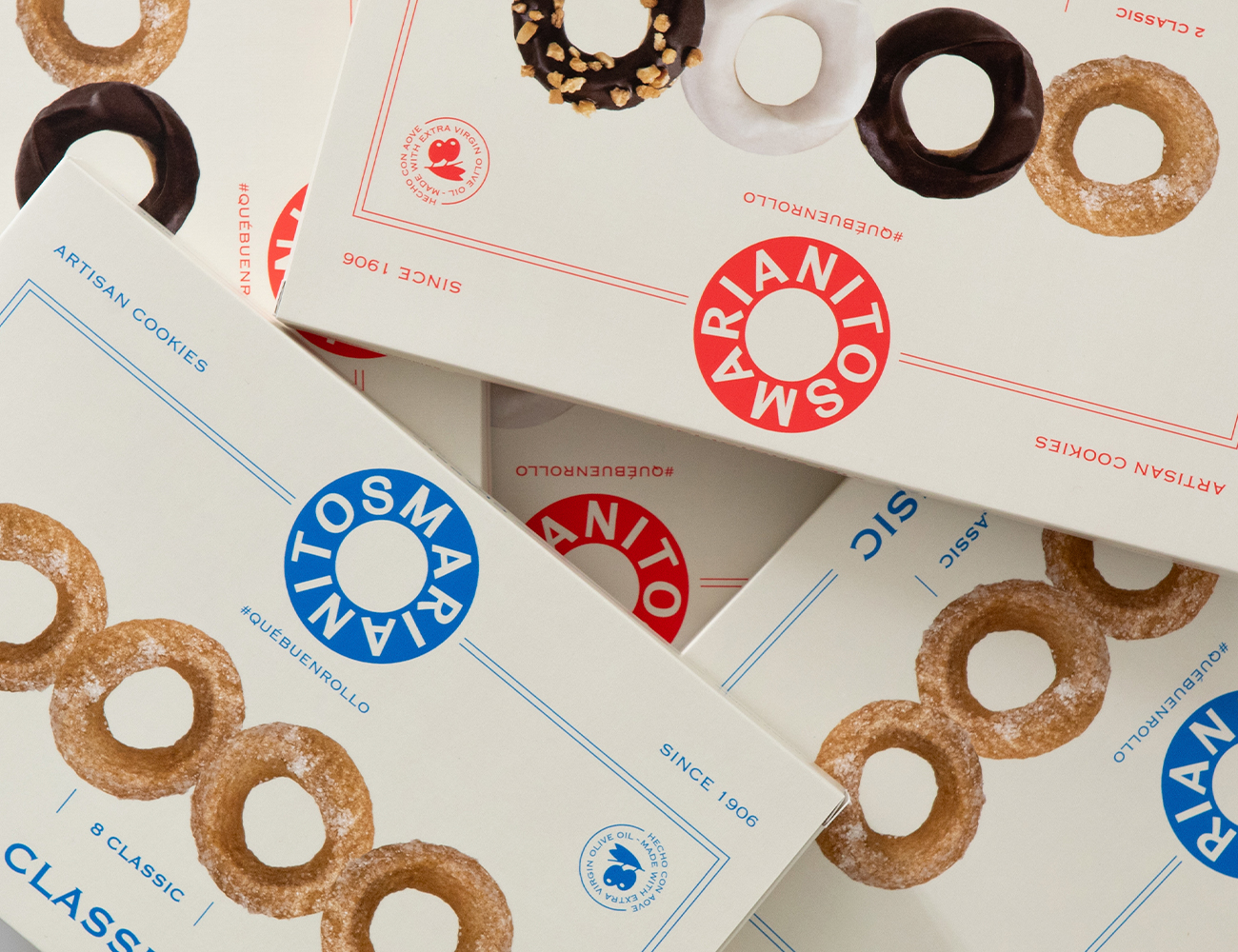
The brand is a formal nod to the classic donut, simple yet striking; modern and timeless. The sans-serif typography combines modern elements with irregular and gestural strokes, giving it an artisanal feel. Its circular and concentric arrangement creates a distinctive seal that aligns with the personality of the new Marianitos.
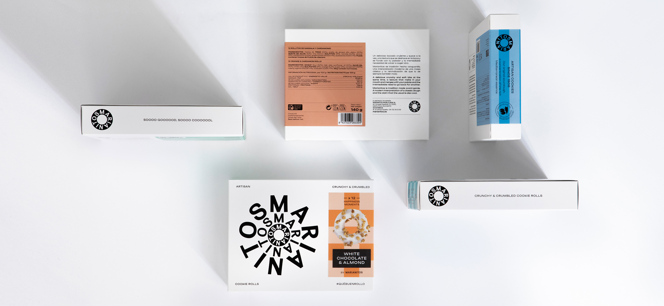
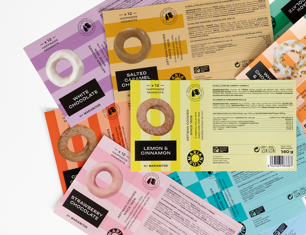
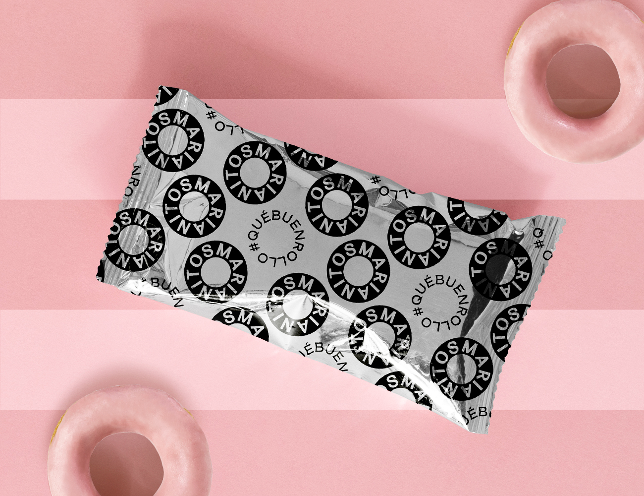
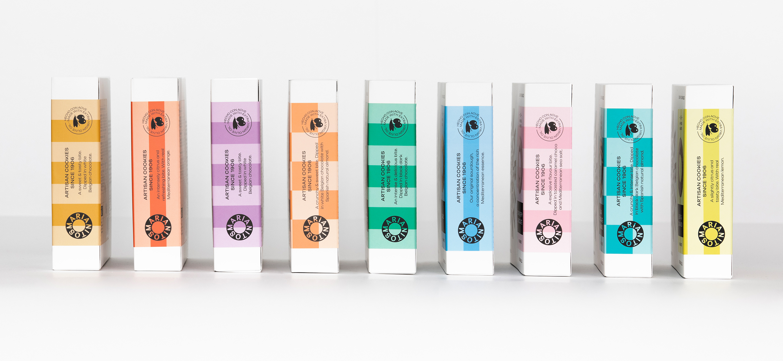
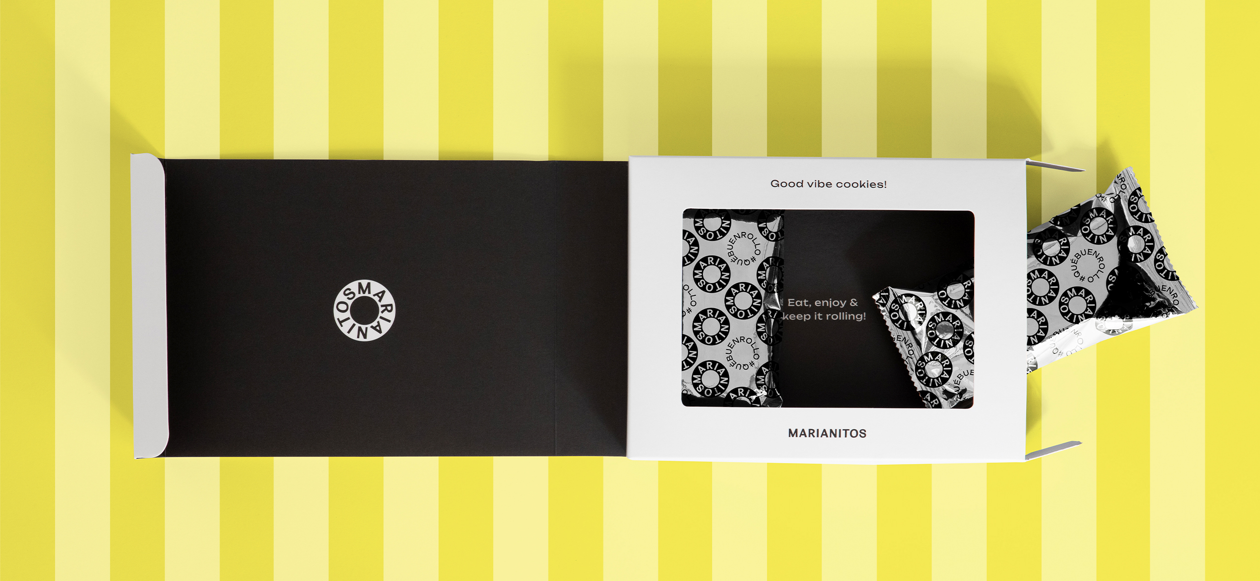
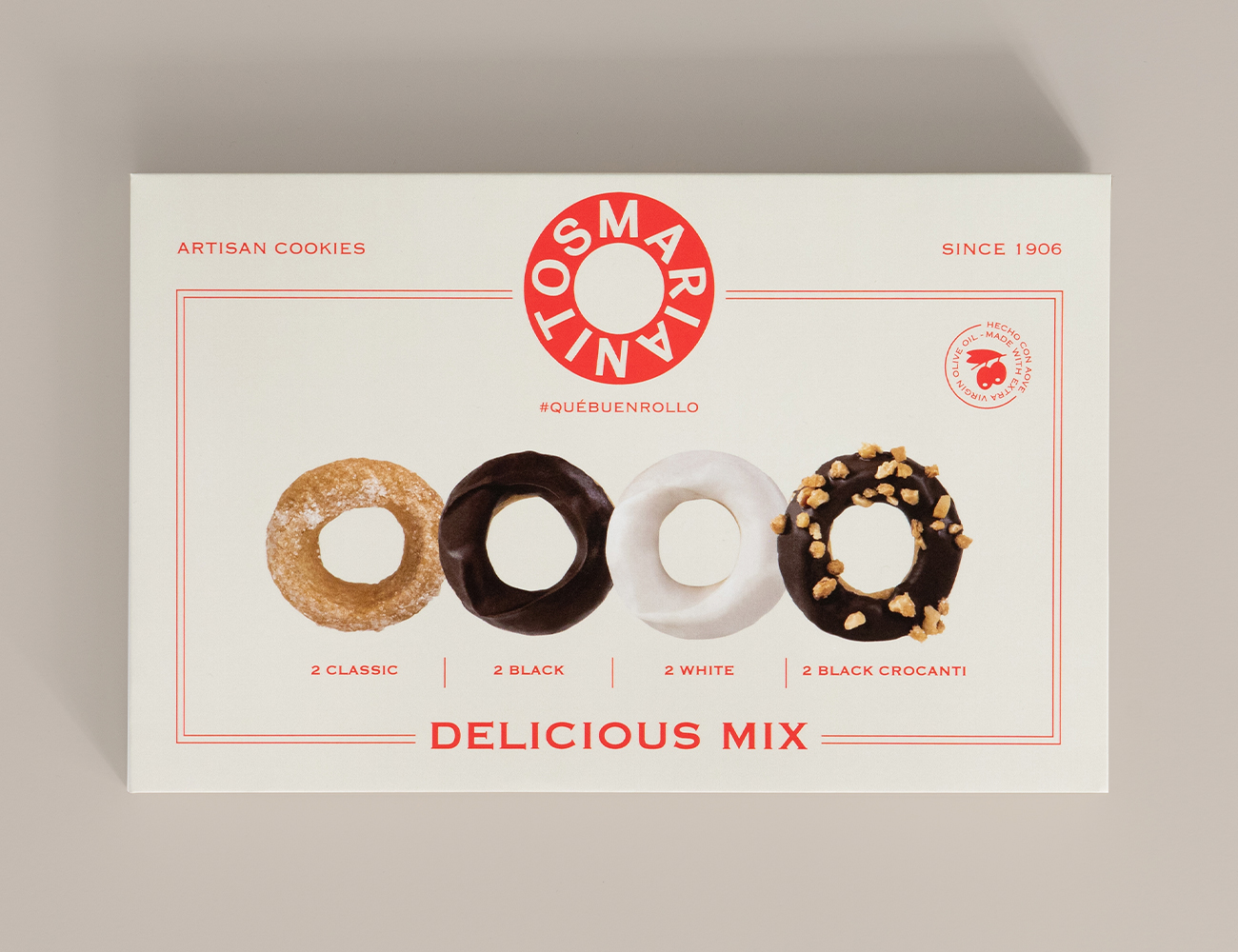
The packaging reflects all of these values. It features a single white box with black ink printing and a book-style opening, modern, elegant, and with a gourmet touch. The main graphic element is a typographic rosette that surrounds the brand. The touch of color comes from adhesive labels that differentiate each flavor through chromatic patterns and photographic images of the product. Playful and humorous text adds to the brand’s optimism and approachability. The result is fresh and recognizable packaging that stands out.
Furthermore, a seasonal gift edition of the Vintage Collection has been designed with a retro look reminiscent of old confectionery shops.
Curator’s Insight
The circular arrangement isn’t just about authenticity; it’s a clever design choice that grabs your attention and complements the shape of those delightful rolls perfectly. It’s like a visual harmony that not only adds to the brand’s appeal but also highlights the core product – the delicious Marianitos rolls.