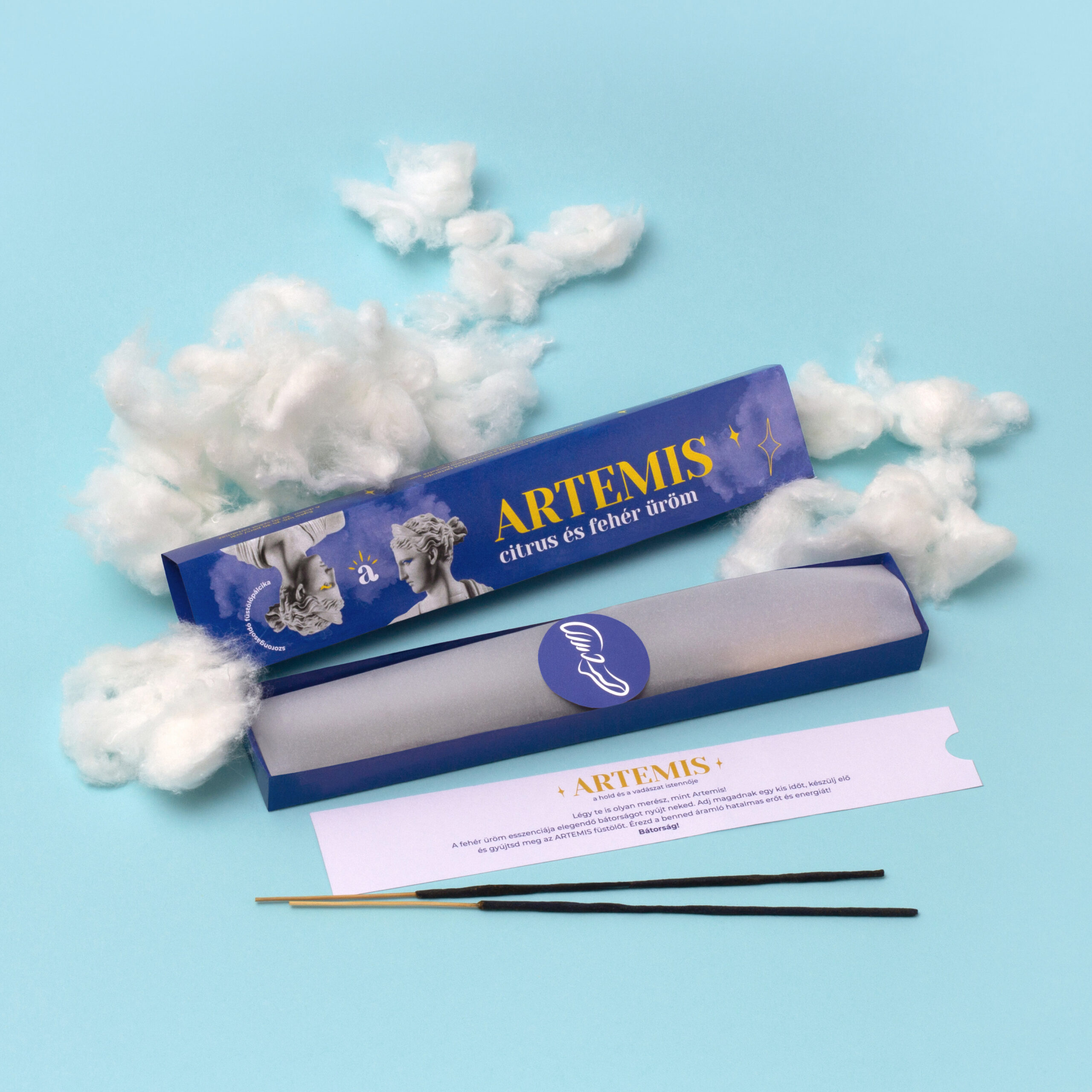
The main concept of the packaging is embodied by my two favorite Greek goddesses, so two different boxes were created for it, with graphics whose main elements are constant, but in both cases, I chose the goddess and color that matched the given fragrance.
With the packaging graphics, a new element is added to the image: I felt that since each brand is made unique and rounded by the product itself, in the case of the arété, I used photo cutouts on the front of the packaging, so the design gets a look with Greek sculptures that take the style in a graceful but at the same time truly exceptional direction. This was what I decided when the brand was born.
The two packages can be interpreted individually, as they are uniform. Both mutations are made on the same principle to refer back to the smell and ingredients in mood and to fit well into the image. On the two packages, different pictograms encourage courage, self-love, and similar virtues. I also developed this concept so that the pictograms correspond to the theme of the given taste.
In addition to the incense, an information card was also made inside the box, which contains inspiring, motivating messages and a description of the fragrance.