Haruna PREJOY: Branding & Packaging Design
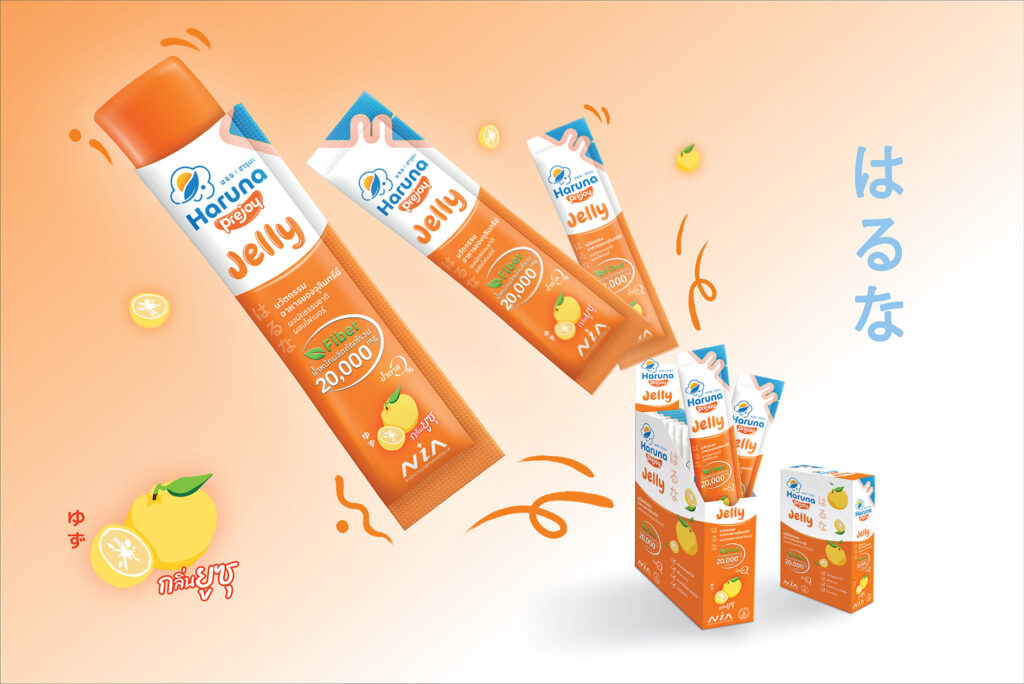
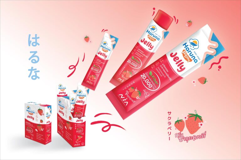
Challenge: Haruna PREJOY, a dietary supplement, focuses on digestive balance, easy bowel movements, and a robust intestinal tract through its three-step approach (Pre-Pro-Post). Targeting a broad customer base seeking both taste and convenience, it offers increased fiber and diverse flavors for a delightful, yet easy, consumption experience. It maintains the quality of the Haruna brand but with improved taste, faster results, and clear flavor differentiations.
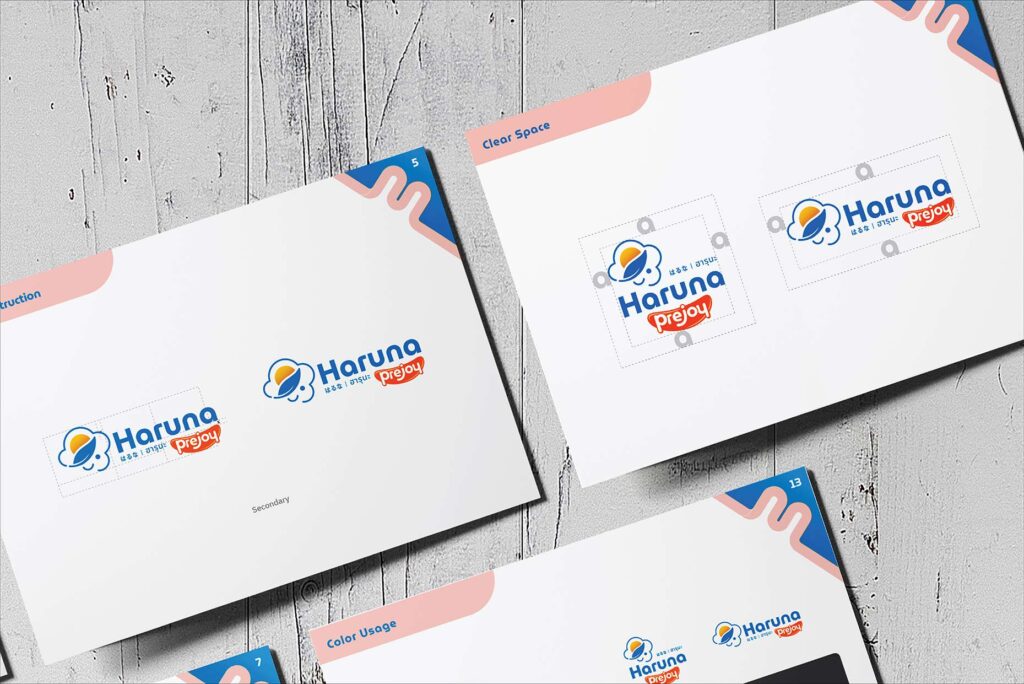
Idea: Revamp graphics for a gel-like product with playful, dimensional elements. Vibrant colors and Japanese-inspired fruit illustrations create an eye-catching, appetizing look. Introducing “Haruna PREJOY” continues the Japanese aesthetic.


