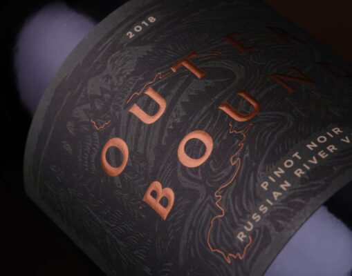
Label design comes in all shapes and forms, and in the case of Outerbound, it started with a carving knife and a linocut block of wood. On an expedition to the nooks and crannies of Sonoma wine country, our team toured the scenic mountains and iconic landmarks behind each region of Outerbound Wine. We then translated this adventure into a series of hand-etched wood carvings, the first step in developing the package for the lineup. Each label was then beautifully debossed with one of these woodcut carvings and accented by a path of copper foil, capturing the unique characteristics of each region’s terroir.


