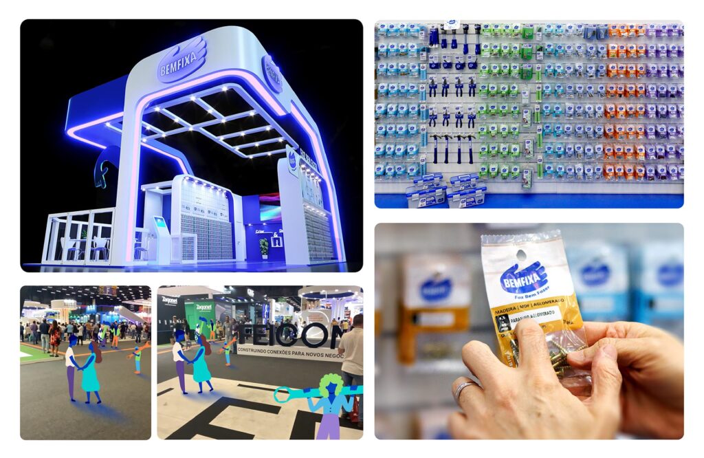
Bemfixa is a reference in the do-it-yourself segment. For years, it has built a solid history in B2B, and our challenge was to strengthen the relationship with the end consumer. Through research, we seek to understand the purchasing journey to offer a unique experience, engage the consumer, and enable them to carry out projects with their own hands. Going through brand and portfolio architecture, we defined three pillars: build and install, organize and facilitate, and create and decorate, and thus simplified this journey. From the simplest to the most inspirational products, the brand redesign brought a moving hand, and the positioning “FAZ BEM FAZER” (It’s good to DIY) was an affirmation and encouragement, showing that there is a reward in the act of doing things with your own hands.
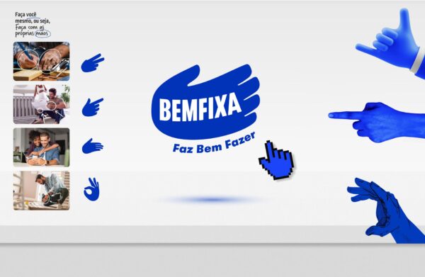
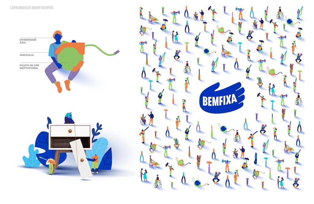
A complete branding project, with deep immersion in the market and trends, interviews with employees, suppliers, and customers, qualitative research with consumers, and lots of field visits. This entire listening stage led us to reorganize the product portfolio and create a new brand architecture based on the best DIY experience. We also created the blue hand, which came to life not just in the logo but as an element of brand communication, an icon of making things with your own hands.
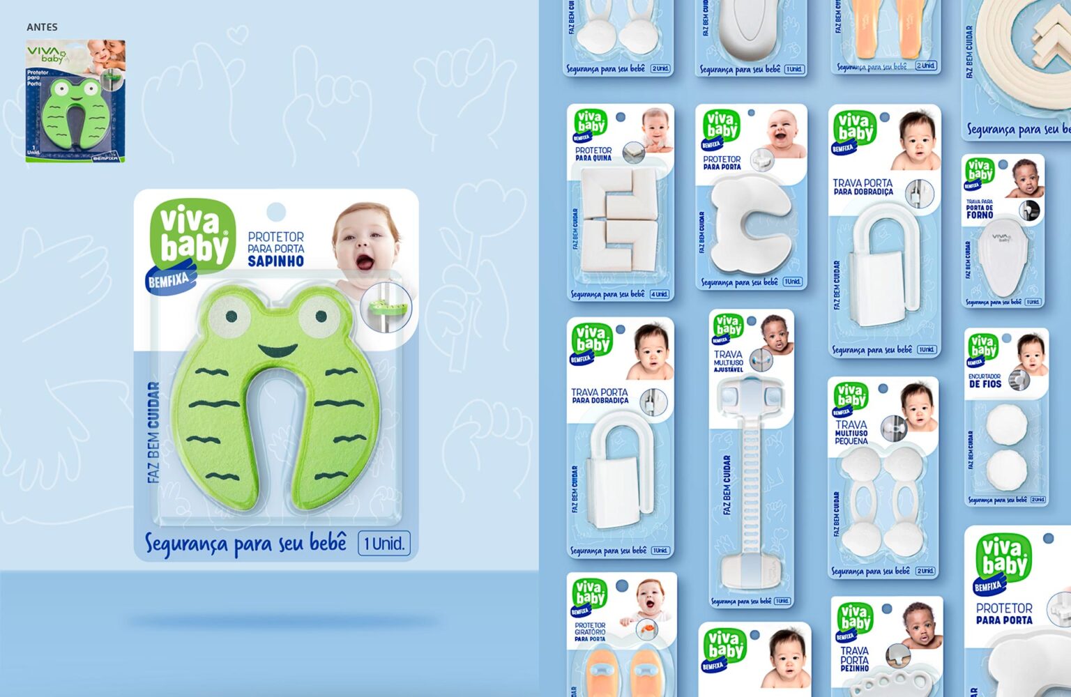
The monolithic brand architecture predominated, giving greater unity and strength to the line. The exception is the endorsement for the Viva Baby brand, which, being a very different segment, maintained its children’s identity.
With the purpose of “stimulating the habit and pleasure of doing it yourself,” the new positioning “FAZ BEM FAZER” (It’s good to DIY), an affirmation and encouragement, shows that there is a reward in the act of doing it with your own hands.
The new Bemfixa brand reinforces important concepts such as being a specialist and experienced, but with an eye on the future, seeking and sharing what is new and modern in its segment. A contemporary brand adapted to the demands and challenges of its time. It’s fun and friendly, embraces creativity, and encourages consumers to explore unique solutions. Bemfixa’s hand is dynamic and was born to have movement. These movements reinforce the recognition we seek as “the blue hand mark”.
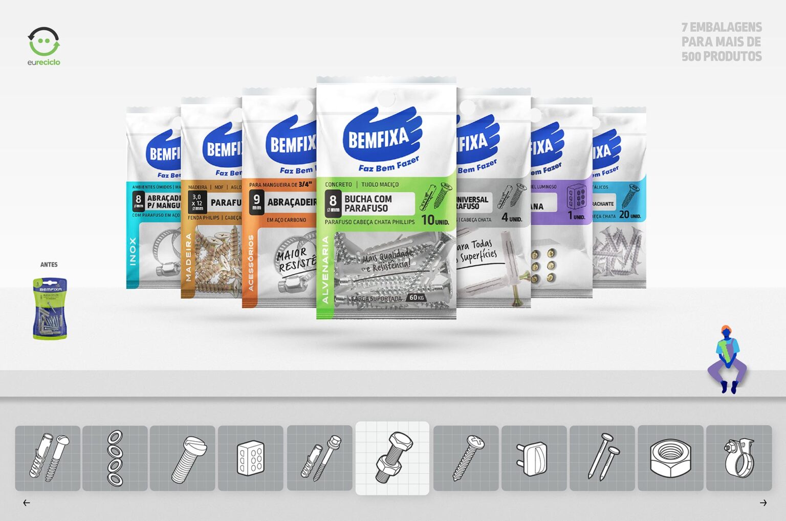
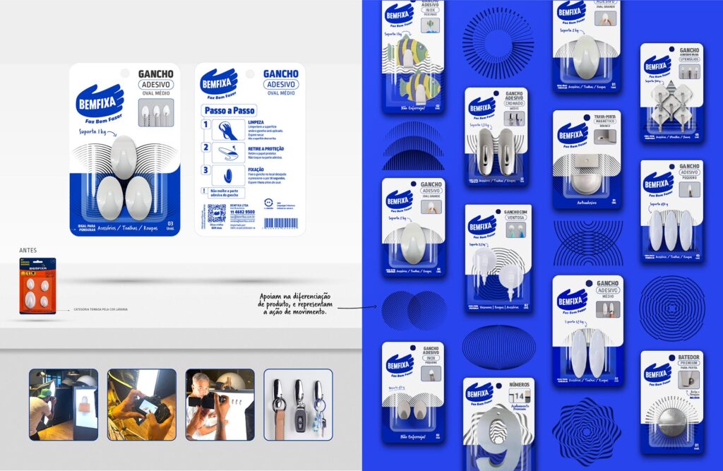
The Bemfixa brand strategy project reinforced important concepts such as being a specialist and experienced, but with an eye on the future, seeking and sharing what is new and modern in its segment. A brand adapted to the demands and challenges of its time. Its new verbal and visual identity is fun and friendly, embraces creativity, and encourages consumers to explore unique solutions. A line of hardware that gained personality, an iconic brand, didactic and impactful packaging, and rich communication full of graphic elements, including the creation of its own characters that interact in a playful way with the products, the bemfixeiros (DIYers)

