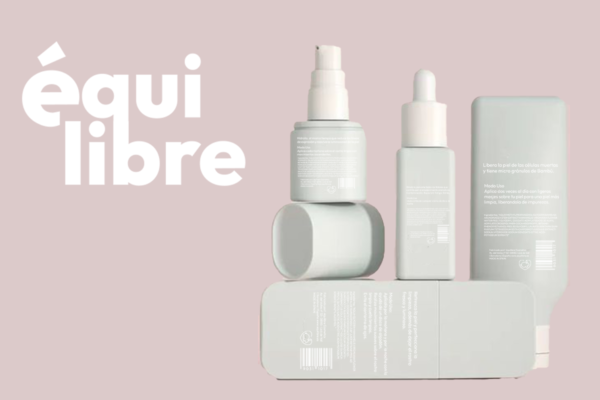
Equilibre is a skin care line specially designed for young people between 18 and 30 years old looking to find the perfect balance for their skin. It offers a range of products that are easy to use and understand, with natural and high-quality ingredients that help combat the most common problems at this stage of life, such as acne, blackheads, excess oil and dehydration.
The design of Equilibre’s packaging seeks to reflect the brand’s philosophy: finding the perfect balance between simplicity and sophistication. It is characterized by being minimalist and elegant, with clean lines and neutral colors that convey a feeling of calm and harmony.
To achieve this balance, a color palette based on white and green was used to provide a touch of freshness and vitality. The typography is modern and legible, and is used in a minimalist way so as not to overload the design.
The Equilibre packaging design is distinguished by the following elements:
Ecological and sustainable materials: Recyclable and biodegradable materials are used to minimize environmental impact. Functionality: The packaging is easy to use and store, and is designed to protect the product during transport and storage. Aesthetics: The design is attractive and modern, and adapts to any type of dressing table.
In summary, Equilibre’s packaging design seeks to convey the essence of the brand: a skincare line that offers natural, effective and easy-to-use products for young people looking to find the perfect balance for their skin.

