In this Curator’s Insight, let’s dissect this limited-edition brew series designed by Memory Studio.
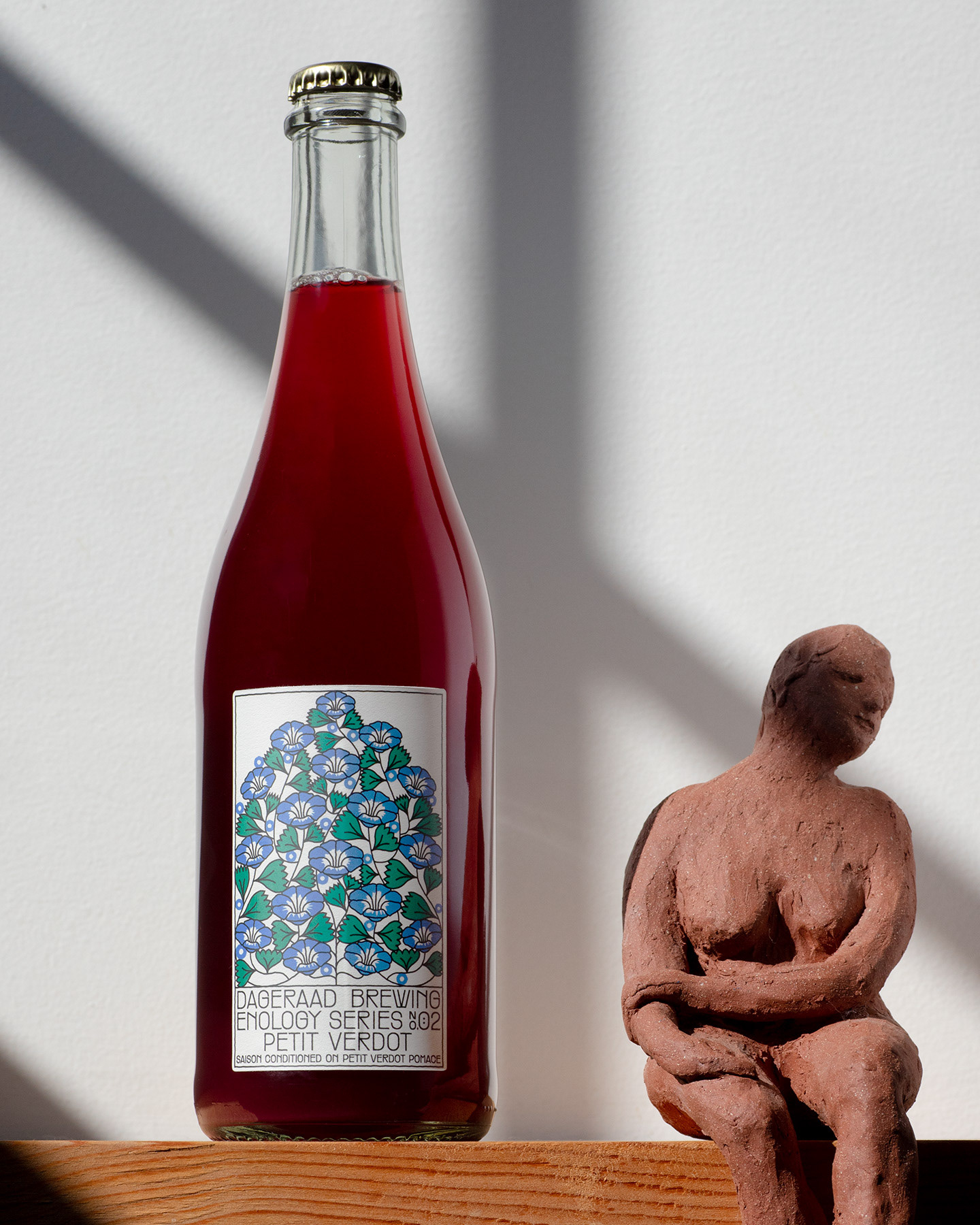
Forget hops and barley illustrations! These labels feature botanicals, each with a historical reference tying back to Dageraad’s brand story. It’s a clever way to connect with their core audience while introducing a special edition feel.
The illustrations have a beautifully minimalistic style, perfectly paired with clean typography. It’s modern and sleek, yet the historical references and muted tones give it a touch of sophistication, making it feel both premium and approachable.
Imagine a warm fireplace and a delicious craft beer – that’s the vibe these labels exude! The design is inviting and makes you want to curl up with a bottle. It’s a fantastic way to showcase the craftsmanship behind the beer – you can almost feel the dedication poured into each batch.