New Identity for the Korean Street Food Restaurant Chain KIMCHI TO GO
Our team has developed a visual system for the Korean street food brand KIMCHI TO GO to make the increasingly popular Korean culture more accessible and understandable to Russian consumers.
KIMCHI TO GO is a street food restaurant chain that creates vibrant experiences of authentic Korean food and encourages more people to seek out those experiences. The brand offers a chance to get acquainted with “true” Korean cuisine, which is not found in travel guides, but is widely represented on Korean streets.
Context
The Korean phenomenon has ceased to be a novelty for the Russian HORECA industry. In recent years, the popularity of content related to Korean culture has been growing. Passionate consumers are interested in listening to the same music, watching the same movies and TV series, eating the same food as their favorite characters/artists – it is interesting to feel part of the Korean world.
Problem
Street food is an extremely competitive market with a large number of local analogs with a basic offer. Korean street food is monotonous, every player sells the same menu and the same feeling: “this is a traditional Korean dish.” The Korean street food market is superficial, and the street food itself is overcrowded with offers.
Role of Strategy
Strategists needed to find a differentiating idea that would be close to the Korean theme, but would bring something new to it: reintroduce the consumer to Korea.
Metaphor
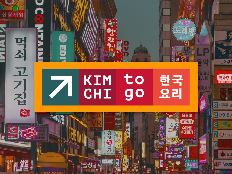
As a brand metaphor, our team suggested an excursion through the colorful and noisy streets of Seoul, deep within which lie true legends of Korean street food that not everyone knows. KIMCHI TO GO – brings the consumer and Korean cuisine as close as possible, shows it as it is without the typical tourist flair.
Enough words, we start our journey into the world of authentic Korean street food. Don’t fall behind!
Irina Kuznetsova, Art Director of Heads:
“We faced a non-trivial task – to translate the language of Korean street food into a visual language. The most difficult thing was to find the line between the authenticity of the product and the understandable, mass “fast food” presentation. Food branding is primarily about safety and bright positive emotions. In the case of KIMCHI TO GO, it was also necessary to preserve the unique aspects of Korean culture, without falling into either youth trendy trends (not becoming “not for everyone”), or national traditions.”
Brand Image of KIMCHI TO GO
Open and cheerful: KIMCHI TO GO is communicative, fun and ironic. A charismatic guide, a conductor into the culture of Korean street food.
Truly appetizing: Bright, rich flavors, authentic recipes.
In the right direction: KIMCHI TO GO is a convenient and understandable navigation through the world of Korean street cuisine. The world is so diverse, but these signs are instantly recognizable by absolutely everyone.
KIMCHI TO GO is well-supported by the variability of wording, which ultimately reflects the brand’s principles and supports communication with the audience. As soon as we saw the particle “TO” in the name, we realized that there was a lot of room for creativity over slogans and wording. “TO” opens the door to numerous meanings, allowing the brand to explore different facets of its identity. It can mean action, direction, purpose, or even a sense of adventure.
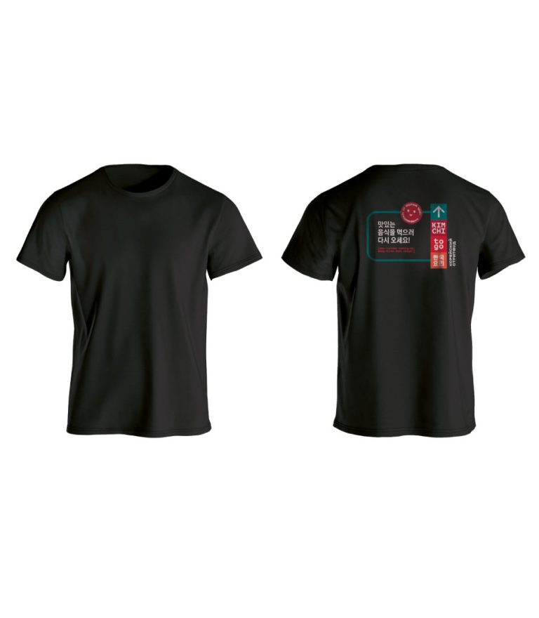
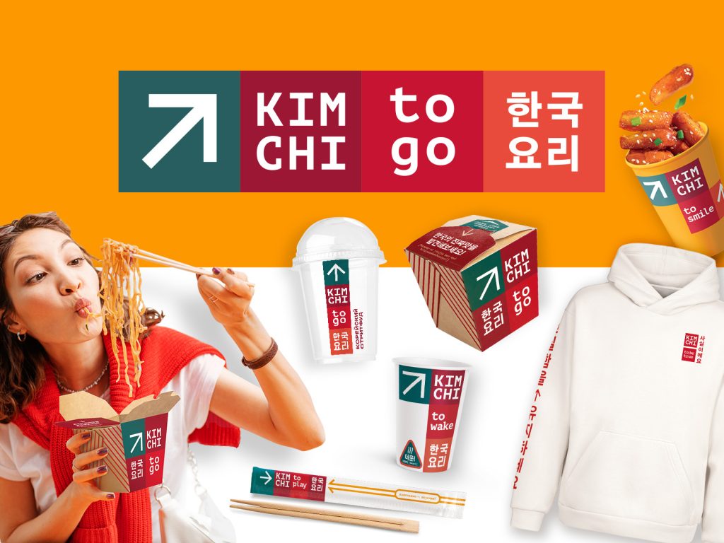
“TO” in “KIMCHI TO GO” is more than just a preposition; it is a powerful branding tool that paves the way for creativity, adaptability and emotional connection with the target audience. It creates a platform for a consistent and universal message, allowing the brand to effectively convey its core values, engage customers at a deeper level and create engaging and memorable brand experiences. This helped us to scale the concept to merch for the most hardcore fans and staff. Now, together with KIMCHI TO GO, we are ready TO JOY, TO WAKE, TO SMILE!
Merch and Branding Elements
The brandbook compiles and thoroughly details all the nuances of the new style and positioning, resulting in a true textbook on using brand attributes and a strong foundation for the brand’s further development.
Sergey Thai,CEO of KIMCHI TO GO: “Irina and the Heads team have done a tremendous job, bringing all the pieces of our brand together into a unified design system. The visual language is dynamic, vibrant, with a unique metaphor, and perfectly captures the spirit of KIMCHI TO GO.”


