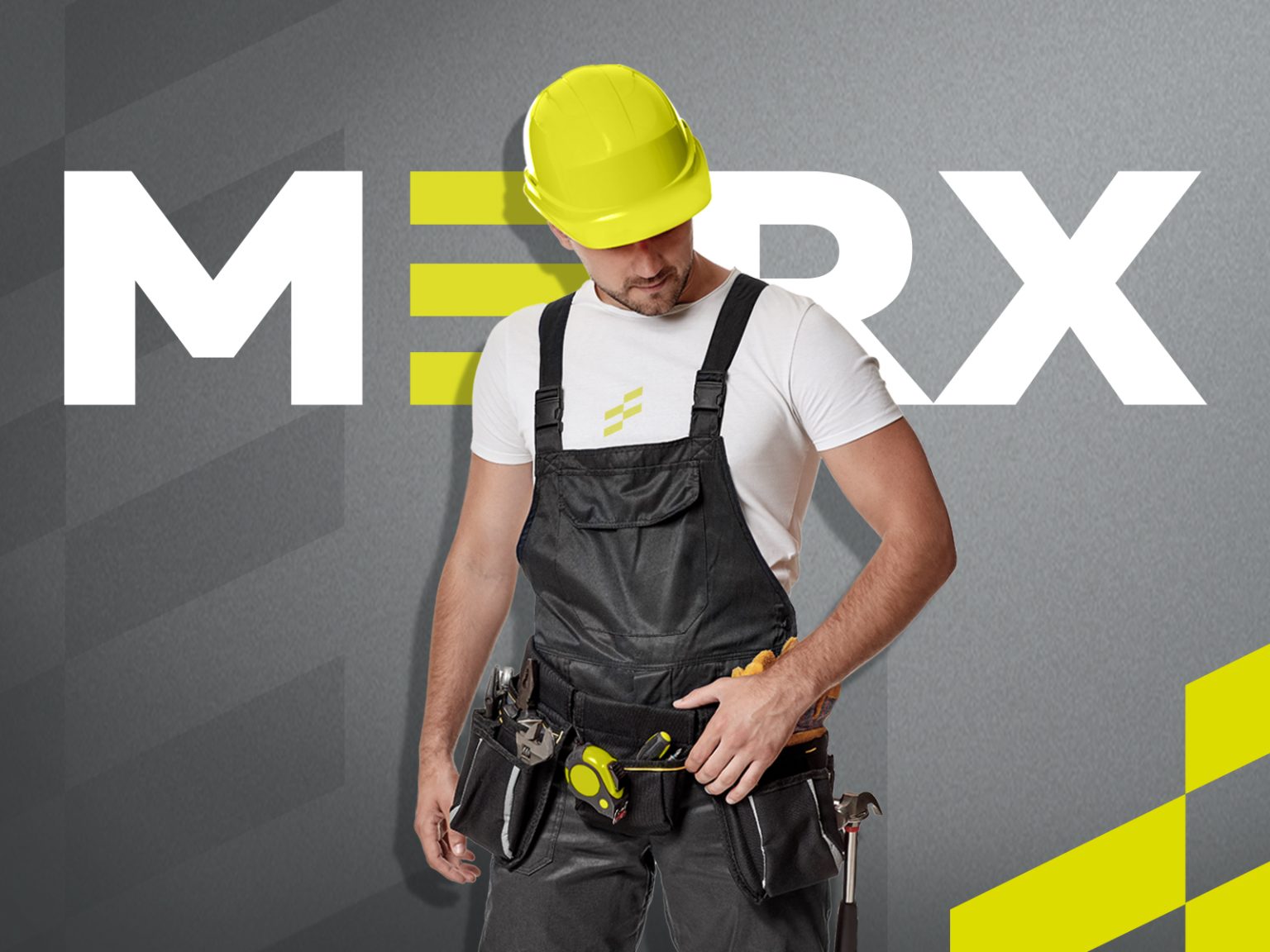
Development of a new brand of MERX. power tools
Ozon, our regular client, approached us with the task of developing a new brand of power tools. We had an ambitious goal – to create a modern, recognisable and visually appealing brand that would effectively communicate its individuality through all points of contact with the consumer: from the design of the packaging and the appearance of the tools themselves to the design of product cards on the marketplace.
The first step was to create a memorable and concise naming convention – MERX. This short, sounding name is easy to pronounce and perceive, evoking associations with technology, reliability and high quality products.The next stage was the development of visual brand identity. Special attention was paid to creating a harmonious visual image that would not only reflect the key advantages and values of the brand for the target audience, but also ensure seamless integration of all elements of corporate identity. In the process, several original design concepts were created.
As a result, a concept was chosen based on the use of a bright green accent colour and the integration of a stylised letter ‘E’ into the logo. The bright green colour is associated with safety, dynamism and innovation, while the ‘E’, visually resembling a pedestrian crossing, serves as a metaphor for comfort, safety and usability of the tools. The dynamic nature of the brand is highlighted by the diagonal pattern on the packaging, contrasting colour scheme and unique typography, which speaks to the modernity and technology of MERX.
We also went beyond standard packaging and promotional materials, utilising the manufacturer’s technological capabilities, and developed the branding of the tools themselves to reinforce the brand presence. The strategic use of colour accents and patterns in the design ensures continuity of brand perception, transforming MERX instruments from faceless devices into recognisable and valuable brand attributes.
Finally, special attention was paid to product cards as a key element of communication with consumers in the online environment. Product cards became an organic part of the brand’s visual concept, harmonising with the design of the packaging and the tools themselves. Adapting the design to the online platform and the peculiarities of digital perception maximised the effectiveness and attractiveness of the product cards for potential customers. As a result, the created MERX corporate identity effectively communicates the brand’s key values and favourably differentiates it from its competitors.
OZON brand team: “We are grateful to you for the quality and efficiency of your work. In the course of your work you showed yourself as an expert in your field, promptly responding to our requests and wishes. Your professionalism has helped us to achieve our commercial goals and gain a prominent position in the market.”


