Design development for Poetti Leggenda capsules
Our regular partner, the coffee roasting company MilFoods, approached us with the task of designing the packaging for Leggenda capsules in the Nespresso Original coffee machine system. It was important not just to link the capsule design with the design of Poetti Leggenda in natural coffee, but to convey in the graphics the feeling of exquisite pleasure of coffee consumption. It was necessary to create a concise and aesthetically pleasing design that would stand out on the shelf, maintaining premiumisation and providing a clear differentiation of the range.
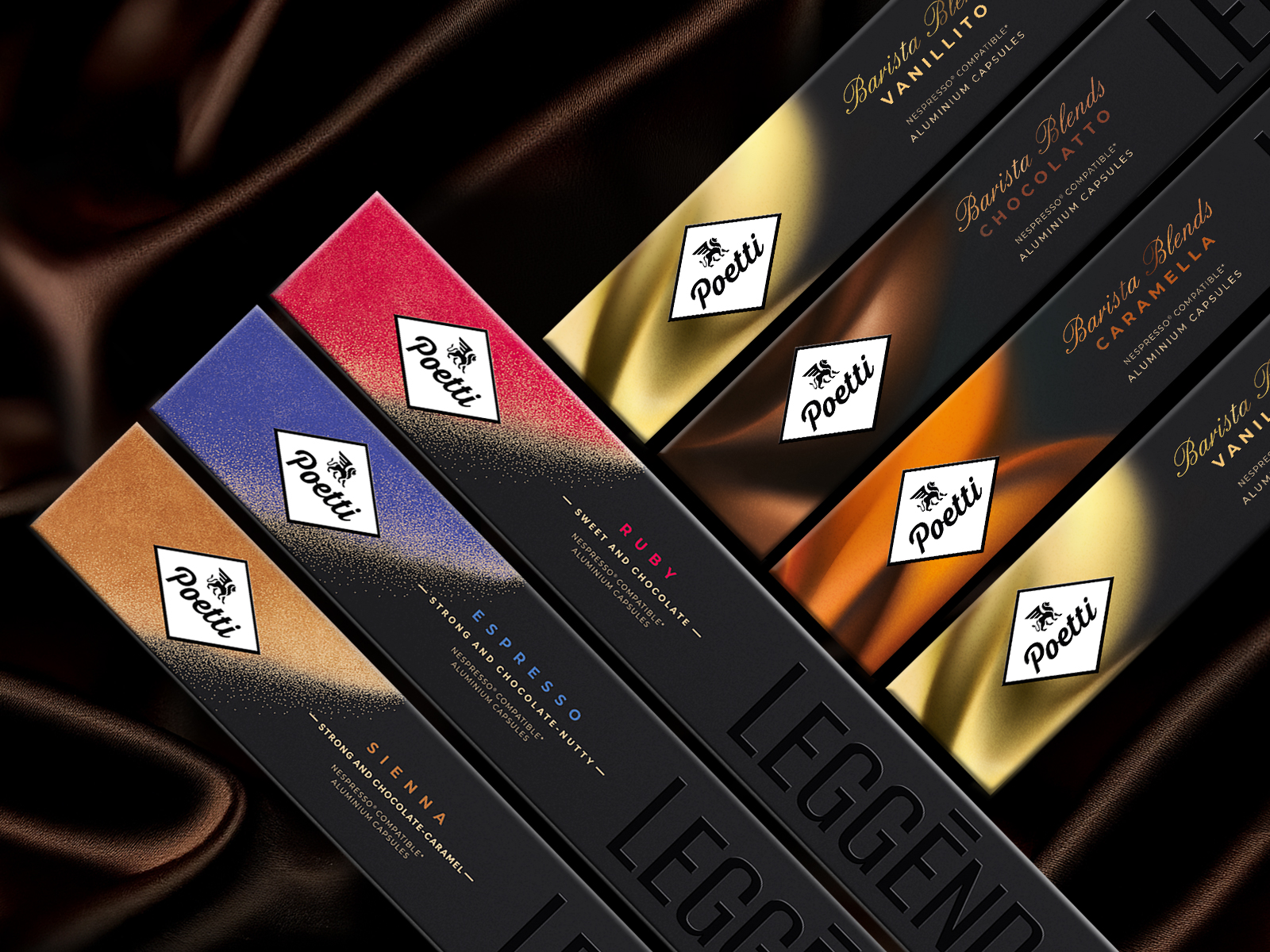
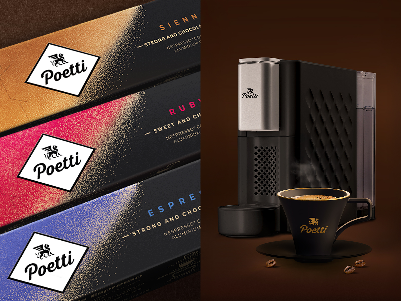
Our designers created many concepts, but two of them were particularly appealing to the client. The first was a stardust shimmering in the blackness of the night, expressing the brightness of Poetti coffee flavours. The second one is an elegantly understated version in terms of colour accents, but with large-scale typography that expresses the superiority of a brand that is confident in its quality. With the help of the latter it was possible to highlight the name ‘Leggenda’ on a large scale, but not shoutingly, but calmly and interestingly, in the colour of the packaging, emphasising the inscription with lacquering and embossing. Such an effect arouses interest in the consumer, and a tactilely pleasant thing is well remembered, which in our case we wanted to achieve. We combined the two concepts to create an elegant finale with a colourful accent that supports the differentiation of the packaging. All the colours are differentiated from each other, and the star pollen combined with the metallised cardboard conveys lightness.
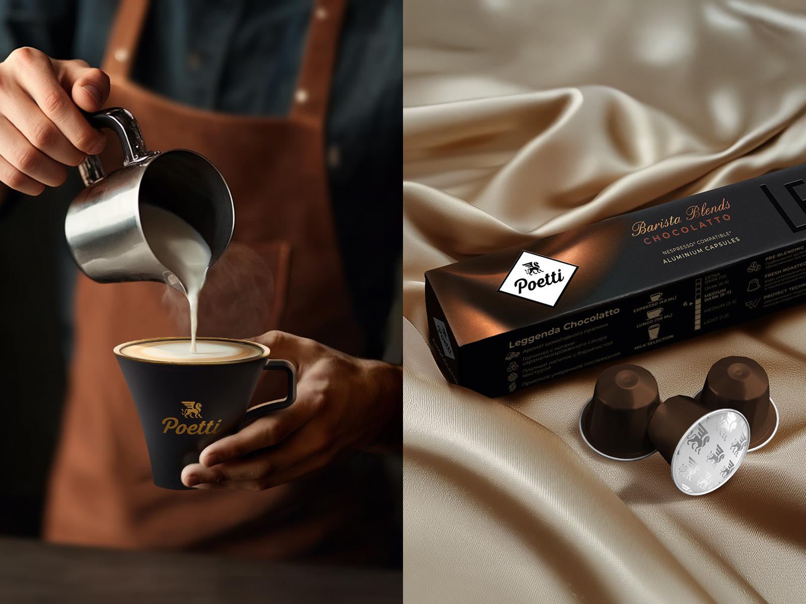
After the launch of the Leggenda capsules, the new challenge was to develop a new collection within the Leggenda sub-brand called Barista Blends with a unified architecture. We created a pattern that was differentiated from the other ranges and could be differentiated from each other through colour, different line curves and highlights. It was important to emphasise the positioning of the new range – ‘tastier with milk’, because it helps to reveal the flavour notes of coffee in a new way. We chose complex and deep colours of the pattern to visualise the milkiness, creating an atmosphere of harmony between coffee and milk and emphasising the flavours available in this range: Caramella, Chocolatto, Vanillito.