Cheesl’s: A Brand Refresh for the Crispiest Cheese Snack
Heads Branding Agency has developed a new packaging design for Cheesl’s chips for Lyubatovo company, featuring 100% real cheese. The restyling has given the brand a unique style, character and mood, setting it apart from competitors and making it stand out on the shelves.
Problem:
To create the Cheesl’s chips brand, it was necessary to clarify and emphasize the product’s USP (Unique Selling Proposition) using visual tools.
Context:
Cheesl’s are the crispiest cheese chips imaginable. The brand exists in a highly competitive market where unique sensations build brand loyalty. And Cheesl’s has this uniqueness!
Strategy Role:
In the project, we needed to highlight the USP and DNA of the brand, but present them in a new way. The brand should be recognizable by hard-core users and attract a new audience from adjacent segments: potato, corn and extruded chips, as well as crackers.
We began by immersing ourselves in the most cheese-focused brand with a product audit and discovered that Cheesl’s strengths are:
- Unique Format: Instead of the typical potato or corn base used in the market, Cheesl’s uses a wheat-potato base.
- Relevant Recipe: In a long-lasting wave of concern for health, the brand offers the healthiest cooking method – baking instead of harmful frying, as well as 100% natural cheese in the ingredients.
- Dynamic Mood: The brand’s signature color contrast encourages the experience of bright emotions and pleasure.
- Real Cheese: Of course, the real cheese in the ingredients, which no other chips on the Russian market have.
From this, we formulated Cheesl’s growth point, which in a highly competitive market forces the brand to seek its unique differentiation.
Cheesl’s USP in Emotions: The brand creates moments of joy and enjoyment with vibrant flavors.
We focused on naturalness and “cheesiness” to harmoniously combine visual and product communication. We also strengthened the USP with bright and concise words to showcase the best examples of precise communication related to cheese.
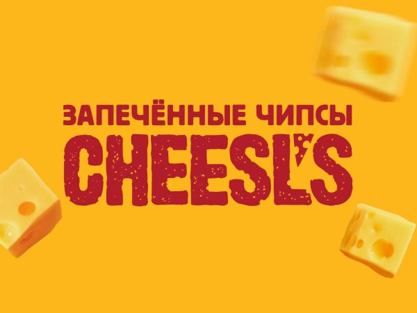
We “rhymed” this 100% cheese wording with the name and font of the updated logo. Thus, the updated Cheesl’s was born:
Irina, art-director Heads: “By using the cheese texture in the logo, we emphasize the brand’s USP, and the neologism Cheesl’s = Cheese Pls tells the consumer right away what the product is about. The entire cheese logo block is fastened with an apostrophe in the form of cheese, “cementing” the brand’s image as the most cheese-focused on the market.”
We solved the problem of the brand’s ideological differentiation from competitors, but now we faced the task of updating a bright but at the same time very recognizable brand identity.
For this, we developed a system of visual identification.
As a result, we got a strong market player with its own unique style, character and mood. Cheesl’s identity directly fulfills the brand’s strategic tasks and is a continuation of its positioning, tied to unique taste sensations.
The brand organically fits into the salty snack shelf and attracts the attention of young consumers with its brightness, always ready for new adventures and unforgettable experiences that Cheesl’s offers.
To ensure that not only consumers but also the team enjoy the brand, we prepared a detailed brand book with all the constants for further use.
Cheesl’s brand-team: “Launching a new brand on the market, especially in such a competitive segment as chips, is always a challenging task. But thanks to the brand’s visual identity that we developed, we were able to add our cheese DNA to the heart of Cheesl’s. The brand will be bright, fun and memorable, which is very important for our target audience and is a key difference in the chips category.”

