Brand development of natural fruit snacks ‘Frutango’
The company ‘NADO’ is a leading manufacturer of natural supplements. Being a big specialist in the B2B market, the company planned to enter a new B2C territory with a functional product – fruit snacks. The client approached us at our agency to create a new brand, including research, positioning, name and packaging design for various SKUs.
“The task before us was inspiring – we had to make not just a new product, but a trend that would be followed. Consumers often associate healthy products with something unpalatable, unattractive, and perceived as a compromise in nutrition and a deal with conscience. During the project we actively shared with the client’s team not only the insights we found, but also discussed possible product solutions: new flavours, forms, brand development in other categories.” – Olga Kryuchkova, Heads Development Manager and project supervisor.
Market and target audience analysis
Post-pandemic changes in consumer behaviour have led to a growing interest in healthy products. Therefore, we have identified high competition in the healthy-snacks market. In this regard, for a successful launch it was necessary to offer not just a new product, but a unique consumer experience. Trend analysis revealed a demand for functional products focused on the specific needs of target groups.
We conducted in-depth interviews with the audience and determined that the core group is the representatives of healthy lifestyles: they are focused on the idea of making their lives healthier, but they may not exercise; their motivation, values and lifestyle coincide with what the product can provide. Other snack lovers are secondary.
Developing a brand platform
The analysis resulted in a clear brand strategy:
Product positioning: ‘Fruit in a new form’ – emphasises the natural composition and innovative approach to a traditional product.
Brand positioning: “Love and other goodness” – conveys an emotional connection to the product, associating it with caring for oneself and loved ones.
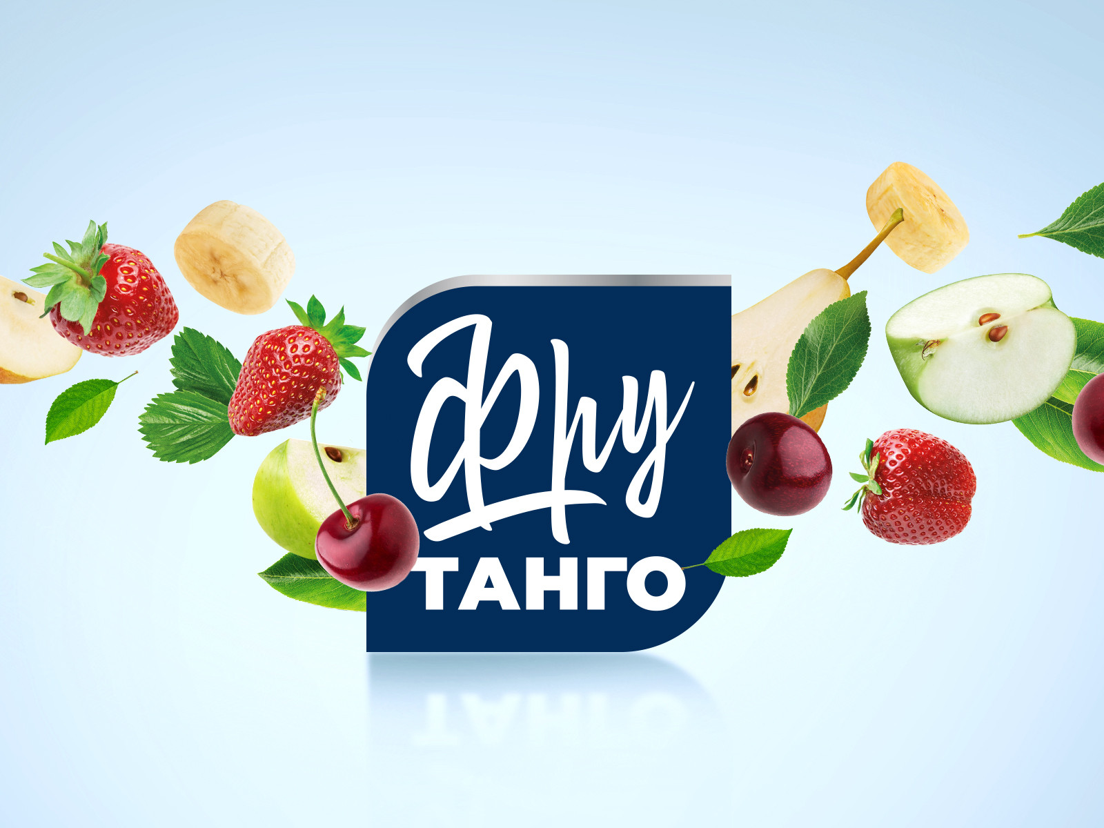
Naming
The name ‘Frutango’ was chosen for the brand, combining two keywords:
- Fruit: Emphasises the natural composition and freshness of the product.
- Tango: Adds dynamism and emotional colouring, hinting at energy and activity, but not directly associating it with sport.
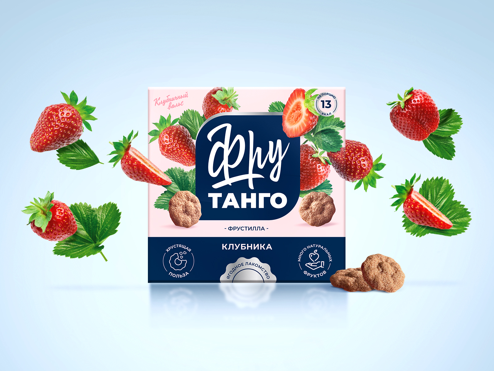
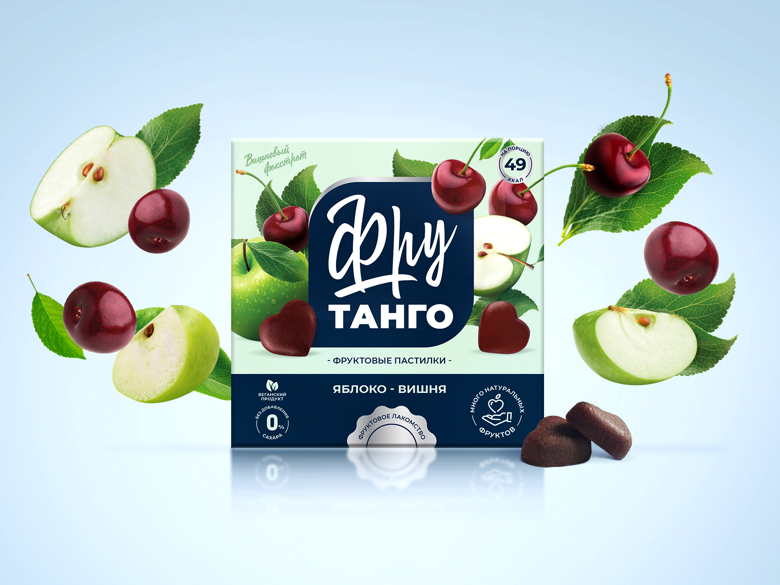
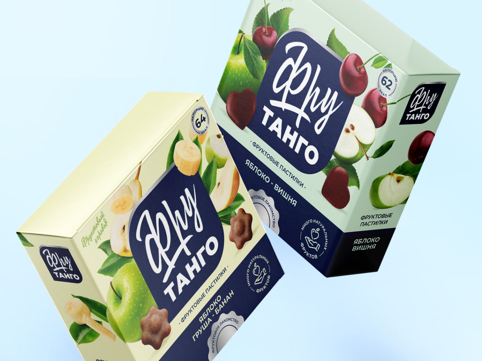
Packaging design
Dynamic and light fruit images reflect the audience’s demand for an active life and emphasise the ‘lightness’ of the product: the calorie content is minimal and the sugar is only of natural origin. The naming is also used here: fruits and berries are not just lying on the table, but are in a state of dynamic interaction, as if participating in a dance.
We also chose a unique colour scheme that distinguishes Frutango from its competitors. Instead of the standard bright, ‘shouting’ colours typical of many products in the healthy-snacks category, we chose a calmer and more natural palette based on pastel tones close to the natural shades of fruits and berries. This creates a feeling of naturalness and peacefulness, reflecting the brand values of “Love and other wholesomeness”. Each flavour has its own colour accents while maintaining an overall harmonious palette.
The packaging clearly highlights the key advantages of the product: the naturalness of the composition, the absence of harmful additives, the use of high quality ingredients. This is achieved through the use of special stamps that meet modern standards and are perceived by consumers as a guarantee of quality and trust.
As a result, the developed brand ‘Frutango’ represents a holistic and attractive offer on the healthy food market, taking into account modern trends and the needs of the target audience. The unique combination of naming, positioning and packaging design creates a strong and memorable image that can distinguish the product among competitors and ensure a successful market launch.
Frutango Brand Team: “We are grateful to Heads Agency for their professionalism and responsiveness. Working with the agency’s designers and strategists, we were able to create a unique, competitive brand with memorable naming and juicy design.”