Elevating Bergen: A Bold Redesign for Distrito’s Signature Beer
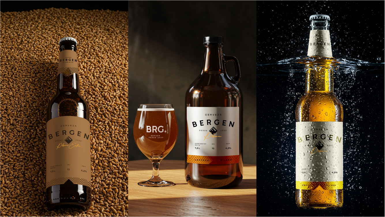
Distrito Brewery, located in Paraguay, challenged us to elevate the identity of their beer brand, Bergen, which means “Mountain”. The goal was to create a new visual identity that reflected the strength and grandeur of the mountains, without relying on typical clichés. The project involved creating an iconic and easily adaptable symbol that captured the essence of the mountain in an innovative and distinct way. Additionally, we were responsible for redesigning the labels for the main beer, Pilsen and Pilsen Extra, aiming for a modern, efficient, and aesthetically appealing solution that matched the brand’s bottle shapes. We also designed labels for more artisanal versions of the beer, catering to diverse audiences while maintaining visual coherence and excellence in execution. The challenge was to create something new and impactful that reflected Bergen‘s quality and identity, staying true to its authenticity and connection to its roots.
We are driven by the power of nature and the thirst for new experiences.
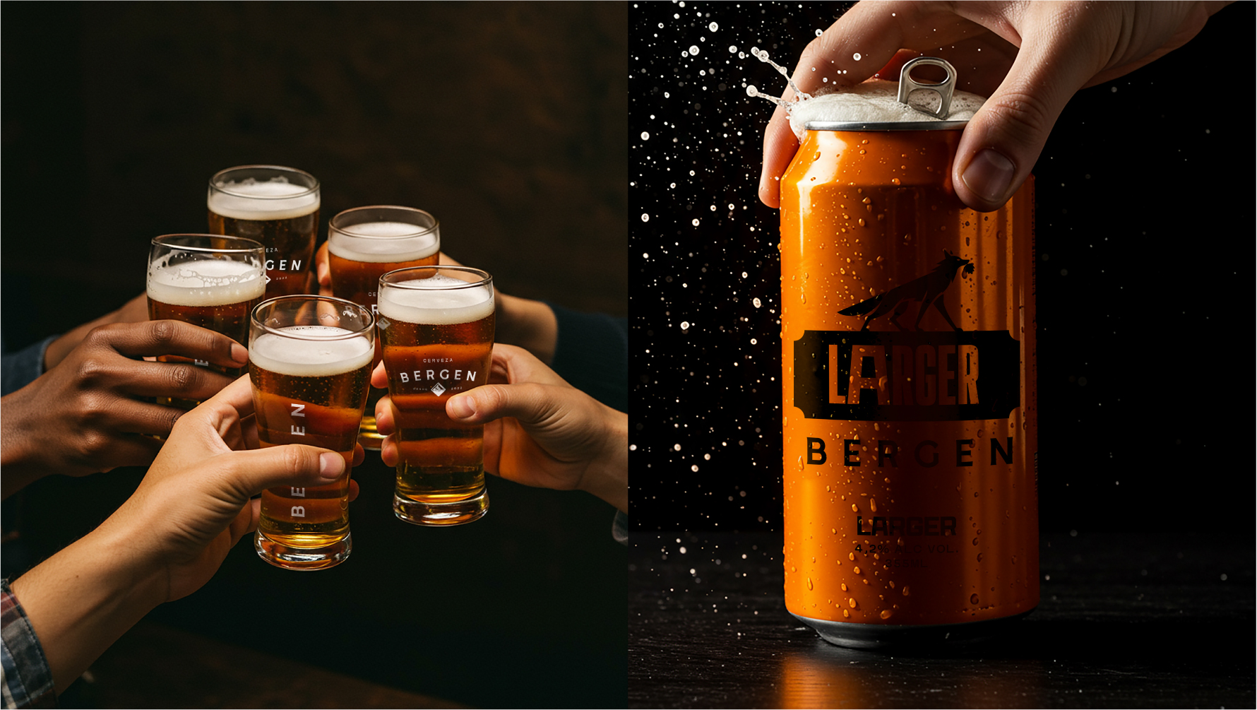
Bergen is born from the grandeur of the mountains, the free spirit of those who explore the unknown, and the audacity of those who refuse to settle for the ordinary. Our beer carries in each sip the authenticity of adventurers, the intensity of unforgettable moments, and a tradition that reinvents itself without losing its essence. A toast to freedom, where rustic meets modern, and flavors challenge limits. Because Bergen is not just beer. It’s a journey. It’s for those who live without fear of going further.
Each label is an invitation to discover new paths, savor the unexpected, and feel the greatness in every detail. We respect the ingredients, value the process, and honor the art of brewing with passion and precision. From the first sip to the last toast, we strive to offer a unique experience that awakens the senses and creates memories. Bergen is for those who seek more than just a drink; it’s for those who want to feel, explore, and connect. Our essence is to transform ordinary moments into extraordinary ones.
Whether on the trail, atop a mountain, or toasting with friends, Bergen is always present, carrying the intensity of a true achievement. Because life is made of challenges, and each sip of our beer carries that energy. We know the taste of victory comes from courage and the tireless pursuit of something authentic.
Our identity is strong, and our purpose is clear: to offer a beer as grand as the journey of those who choose it. Bergen does not follow patterns. Create new paths. Challenge. Leave a mark.
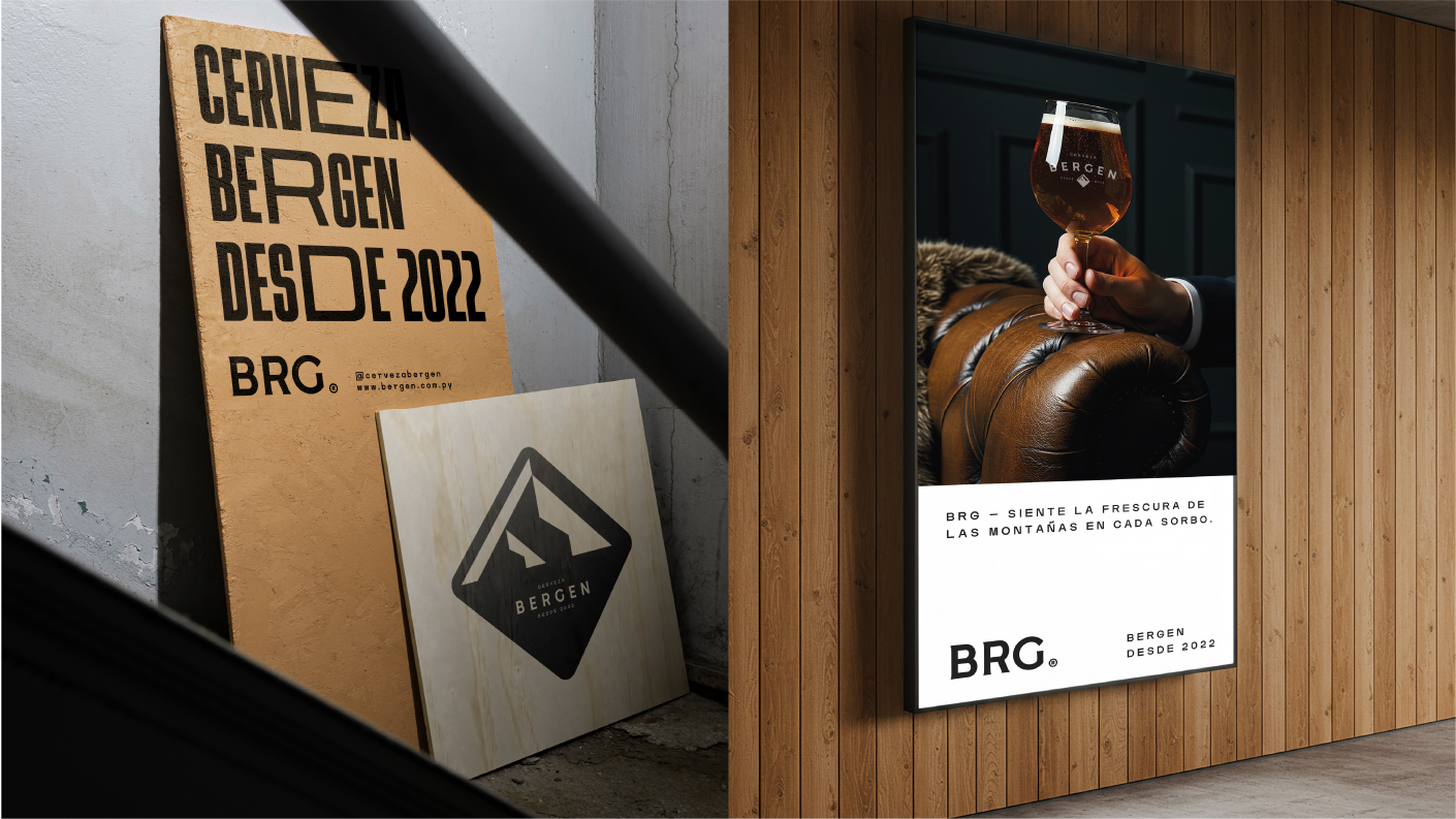
Bergen City. The summit has flavor.
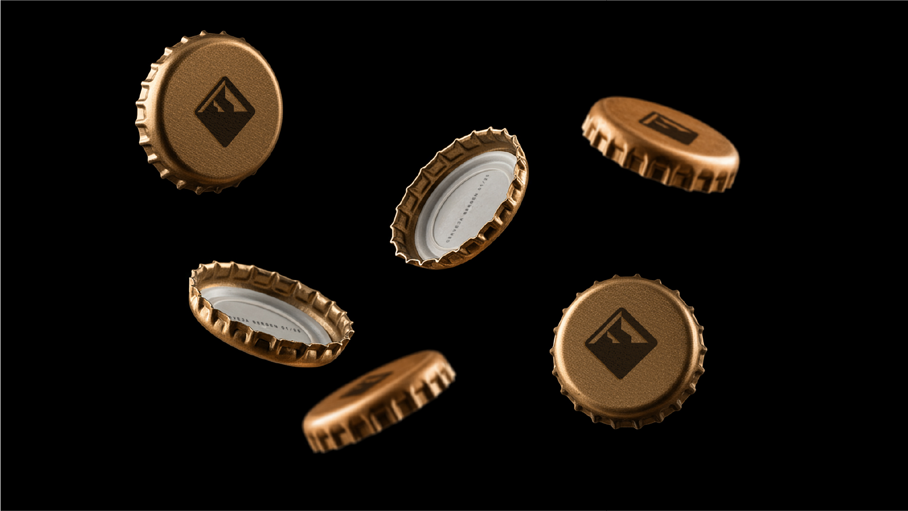
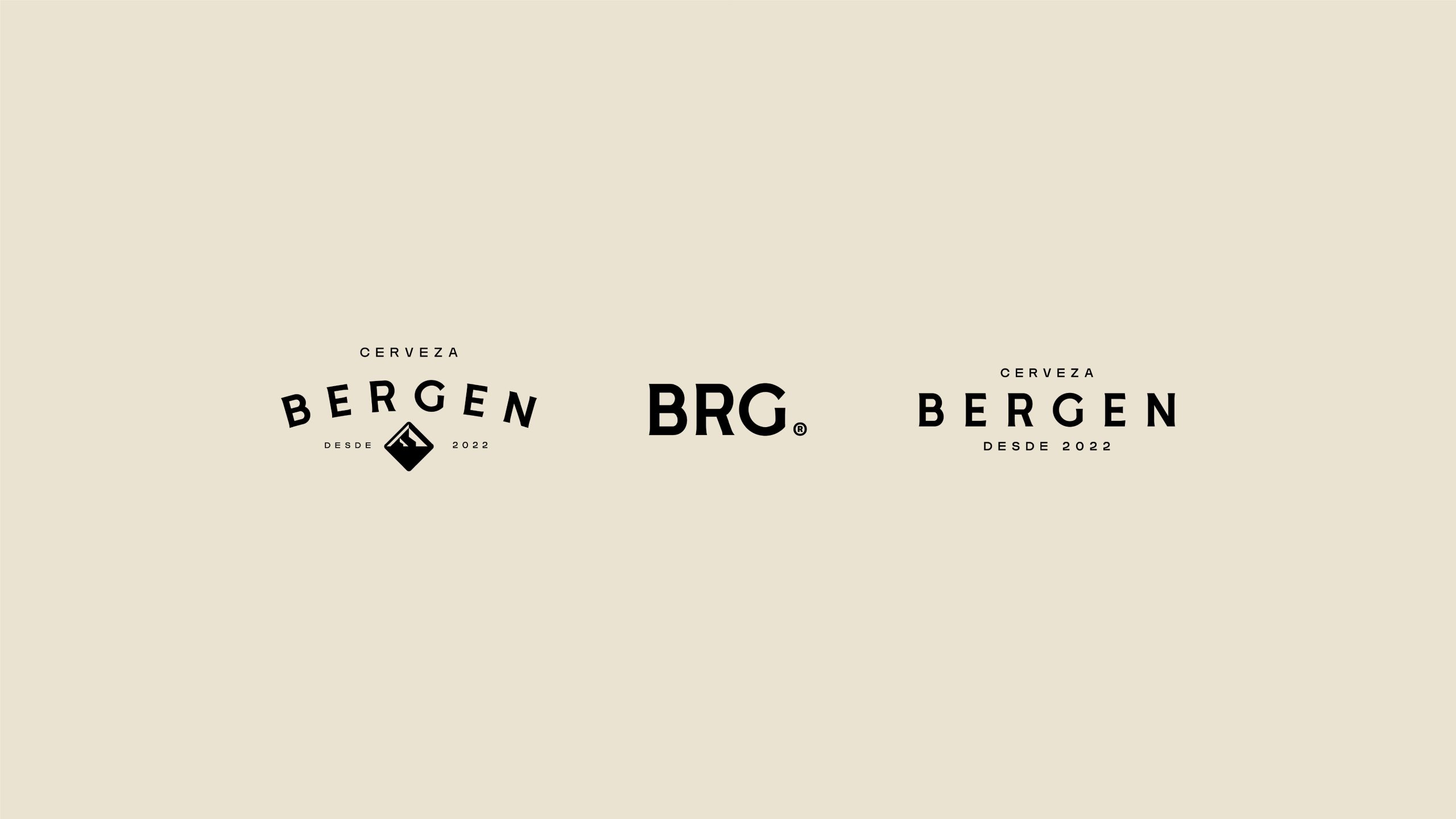
Central Symbol: The stylized mountain is the main element of the identity, with a striking and structured design that conveys grandeur and authenticity. Its composition reinforces the connection with nature and Bergen’s adventurous, free-spirited essence, highlighting its youthful and daring character.
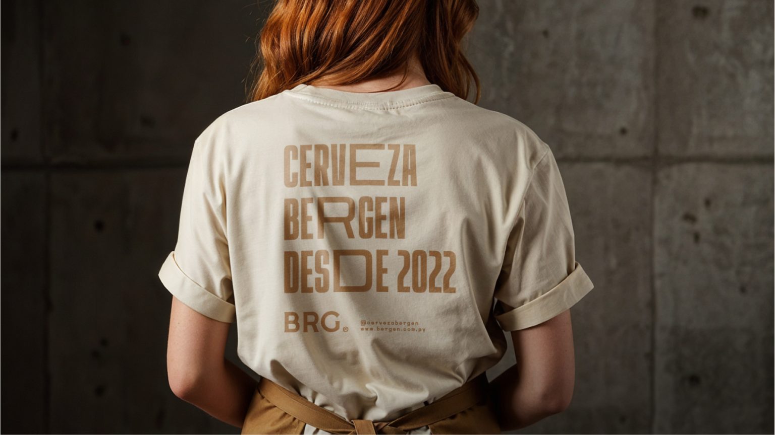
Typography: The typography was created from a sans-serif font with subtle details on the edges, giving it a rustic yet modern look. The balance between strong lines and curves reflects the duality of tradition and innovation, ensuring personality and impact.
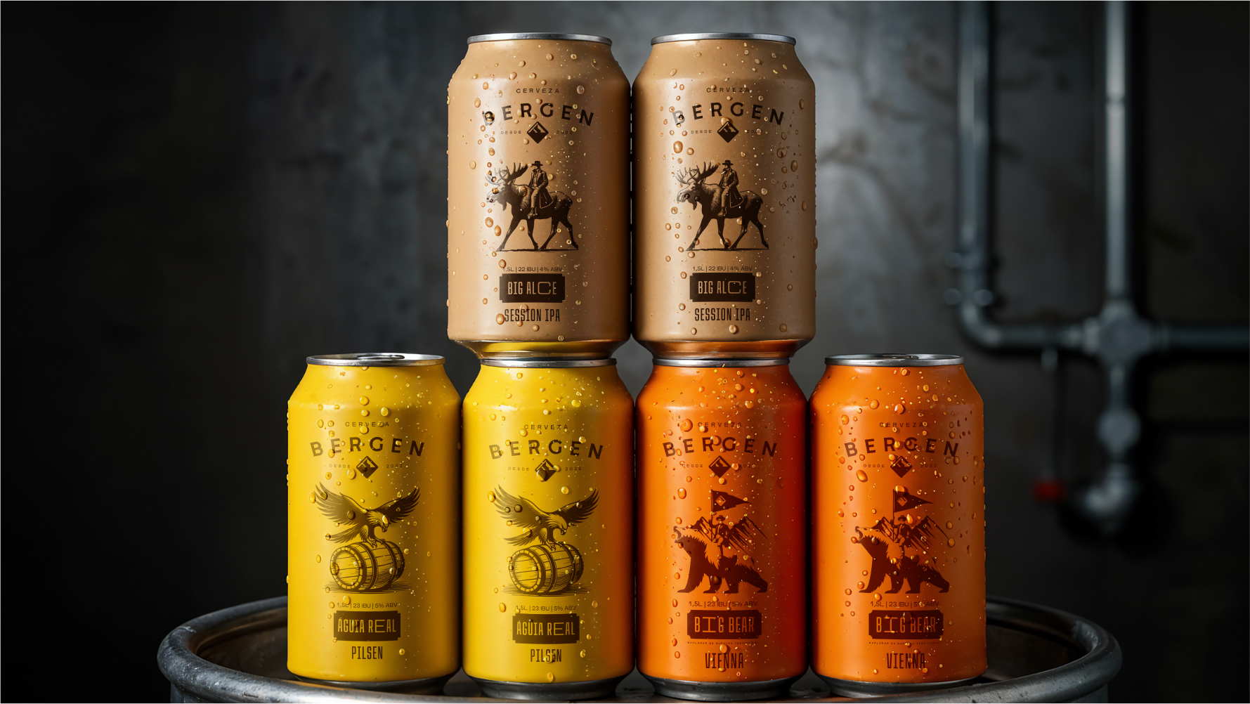
Graphic Variations: The mountain symbol allows for variations that explore its versatility, whether in different proportions or in combination with the brand name. This visual flexibility ensures a consistent and impactful identity across various applications, from labels to digital platforms.
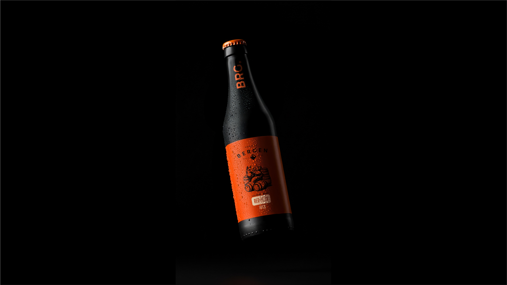
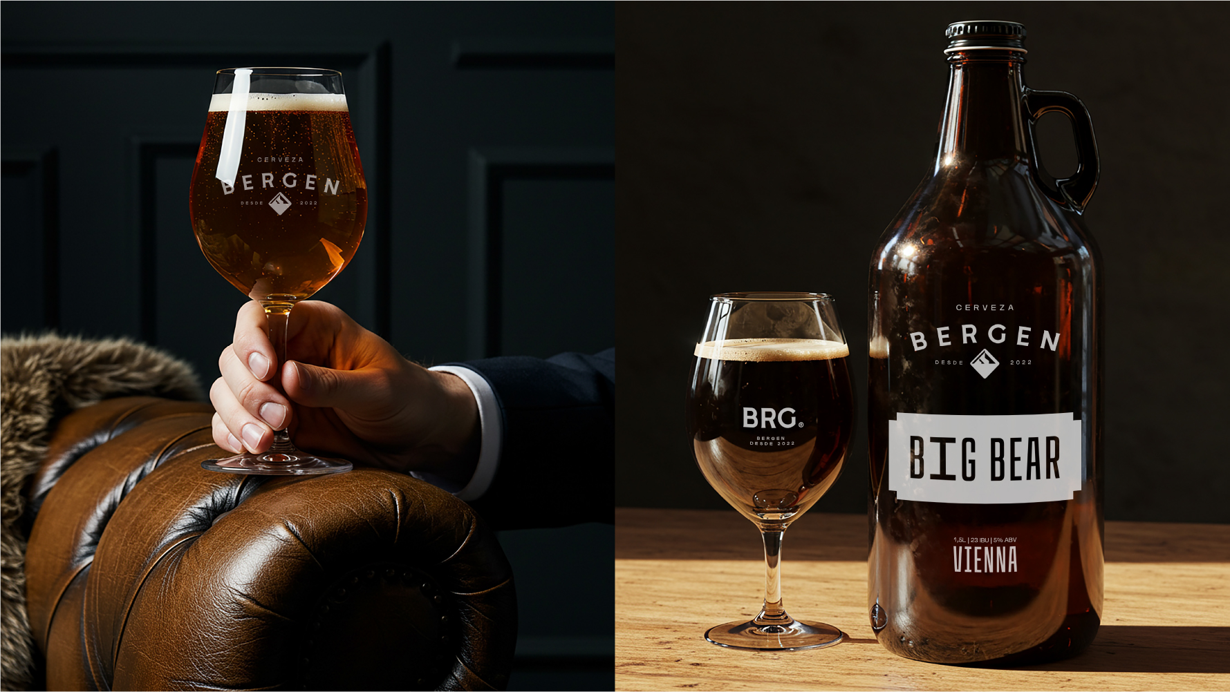
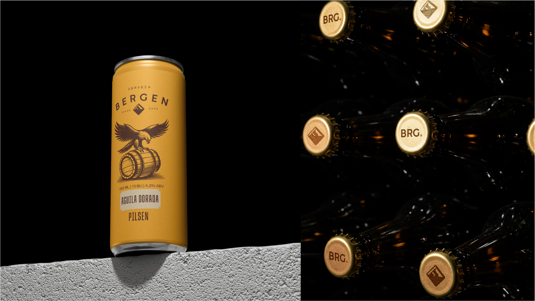
Supporting Elements: The color palette and textures inspired by natural materials enhance the sense of originality and resilience, creating an engaging and dynamic visual universe. The combination of neutral tones and vibrant colors for the artisanal beers allows for versatile and differentiated positioning.
Complete project – BERGEN
Discover other works | Black Pepper