ABOUT:
Palmer’s House is a fancy yet cozy café that mixes luxury and comfort without even trying. It’s inspired by the natural vibe of palmtrees, aiming to be a classy but friendly spot where you can get away from the usual grind, treat yourself, and just soak in a place that feels polished yet easygoing.
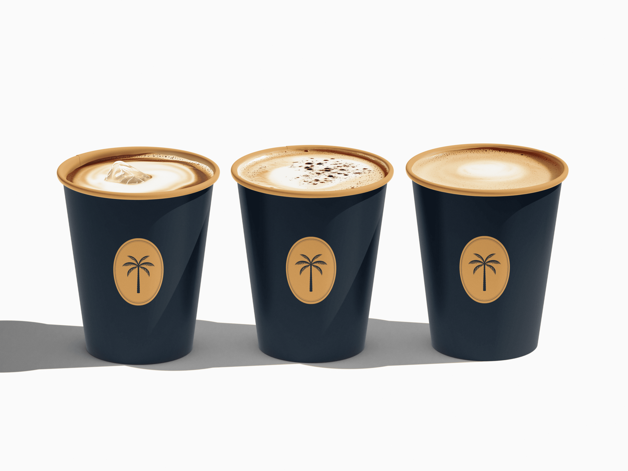
SOLUTION:
To make this idea real, I created a brand that feels high-end but still approachable. The colors are deep and natural, pulled from nature and a touch of luxury, while the fonts mix old-school charm with a fresh twist. Little palm hints pop up in the design, tying it to nature without going overboard. From the logo to the packaging, I thought about every detail to keep it all smooth and classy.
RESULT:
The finished brand feels smooth and on-purpose—fancy but friendly. Palmer’s House isn’t just a café; it’s a vibe. Everything, from the look to the feel inside the place, tells a story of chill elegance. The outcome? A brand that shines, pulls people in, and sticks with them.


