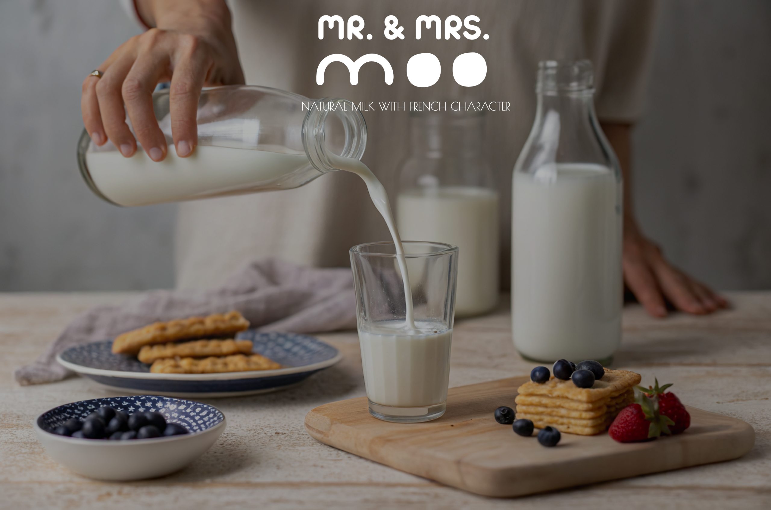
DAIRY BRAND IDENTITY AND PACKAGING DESIGN
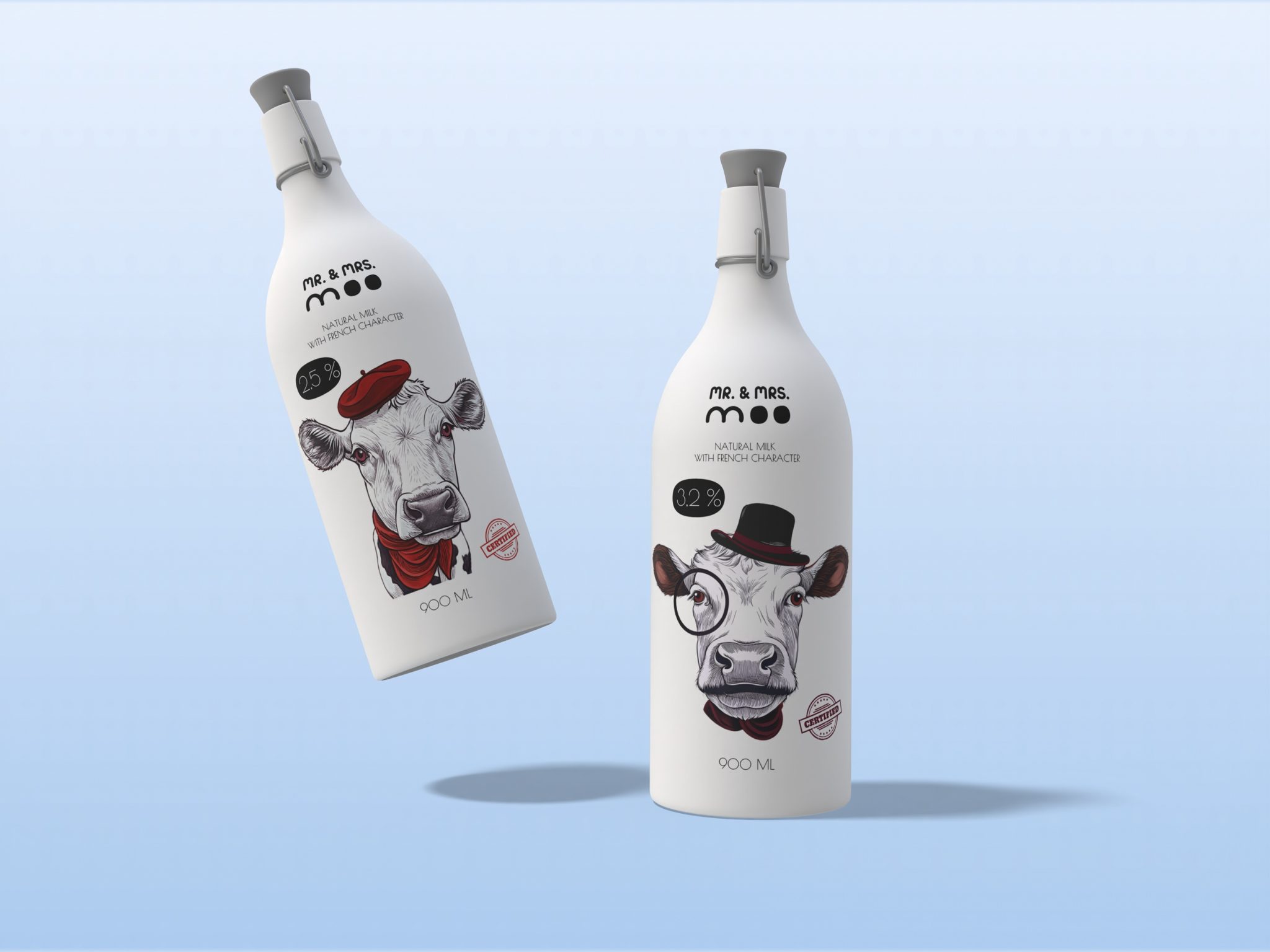
Mr. & Mrs. Moo – Natural Milk with a French Character.
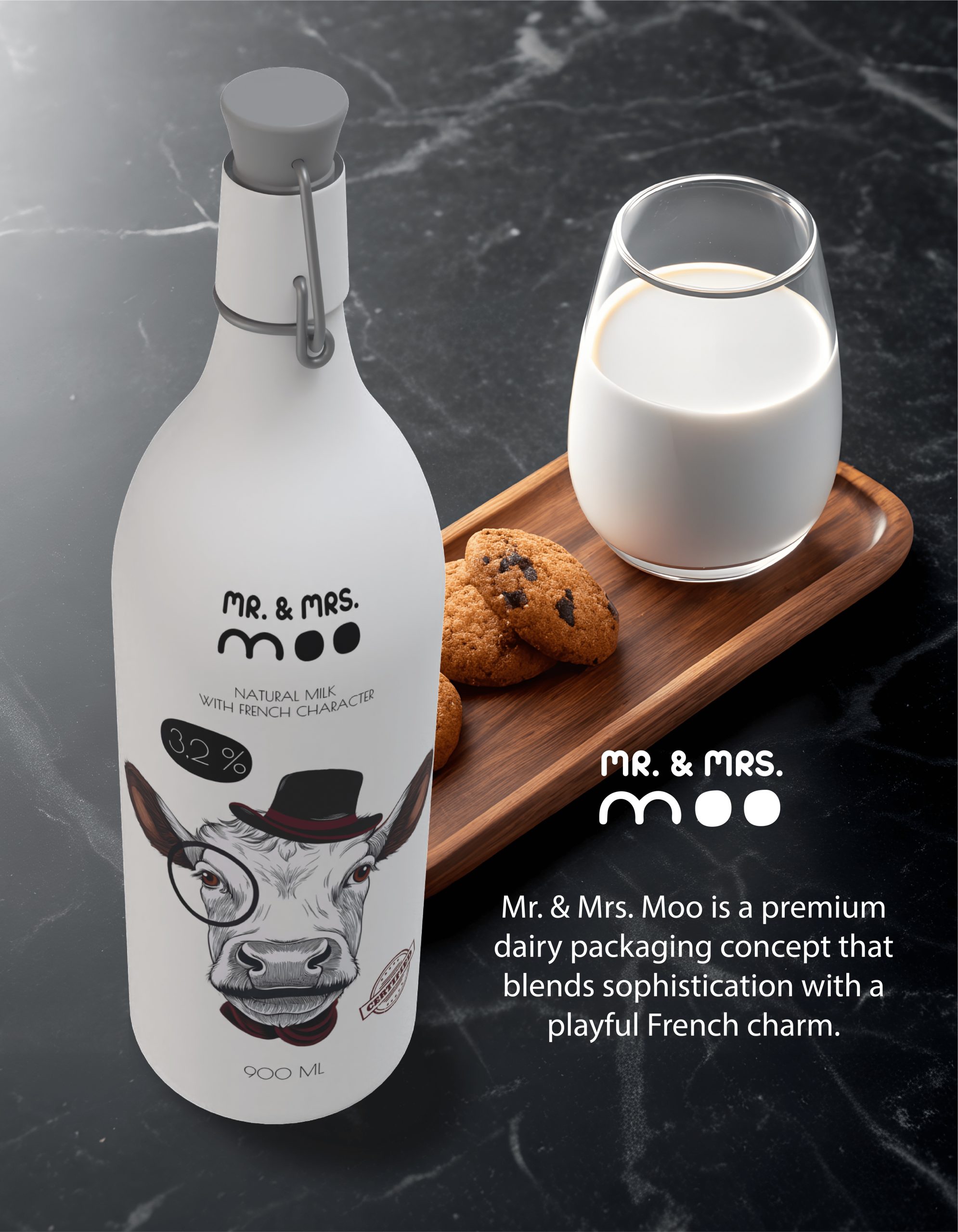
Mr. & Mrs. Moo is a premium dairy packaging concept that blends sophistication with a playful French charm.
Designed for an audience that appreciates both quality and aesthetics, this concept features minimalist design, hand-drawn illustrations, and a refined monochrome color scheme with bold accents.
Design Approach:
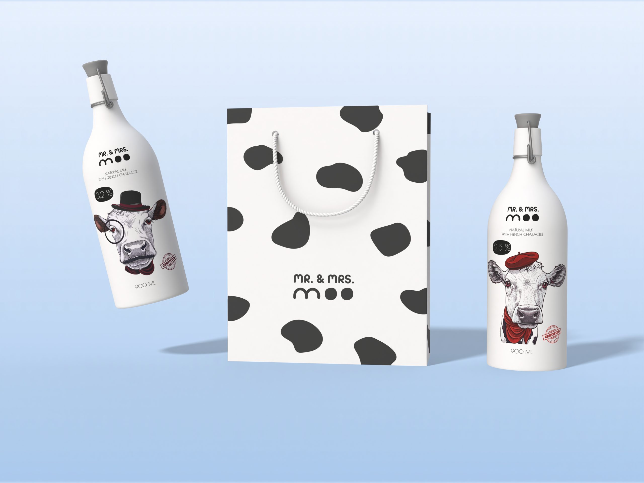
- Elegant bottle shape & elegant clasp – Inspired by vintage milk bottles, enhancing the premium feel.
- Monochrome with selective color accents
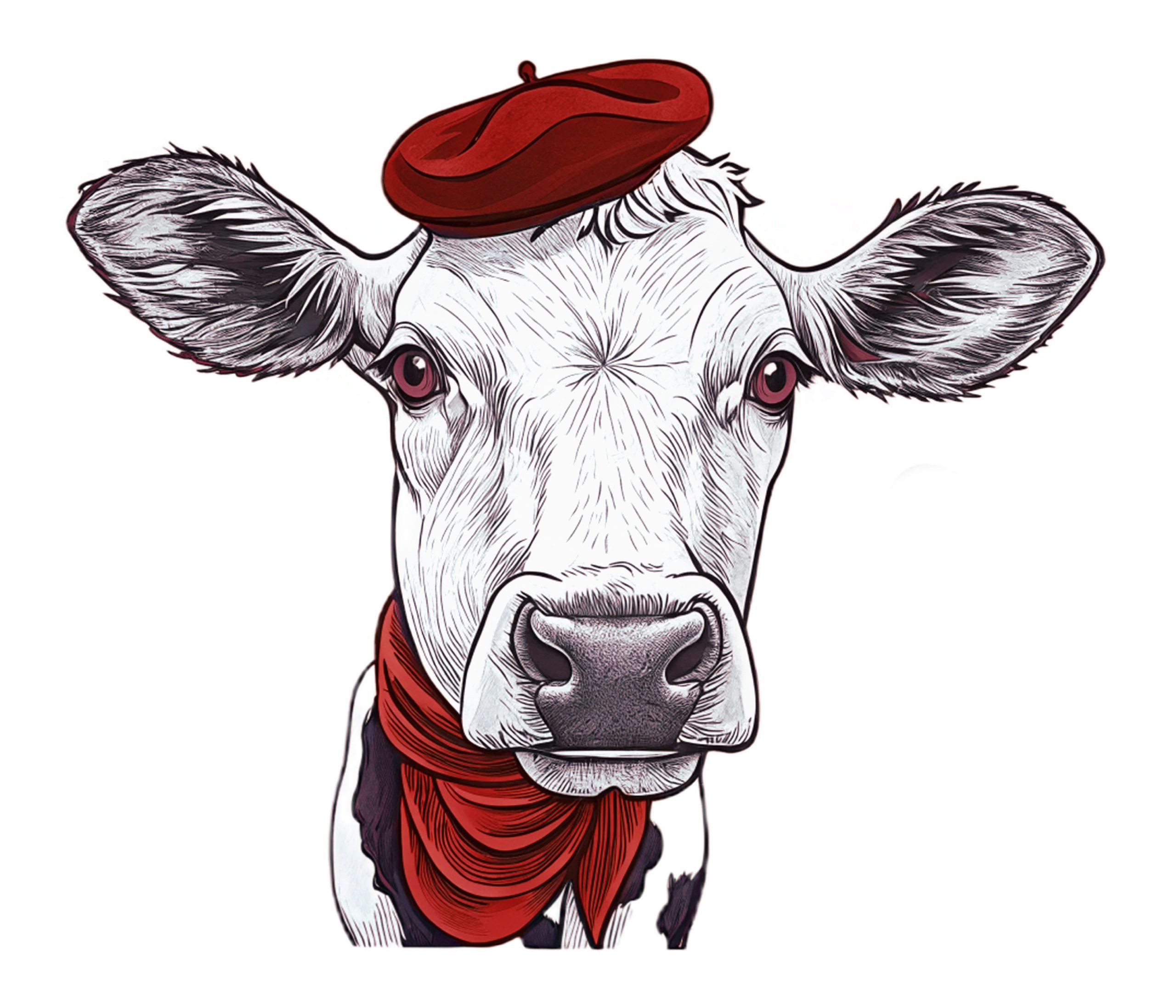
- Ink-style illustrations – Expressive, character-driven cow portraits that bring personality and storytelling to the brand.
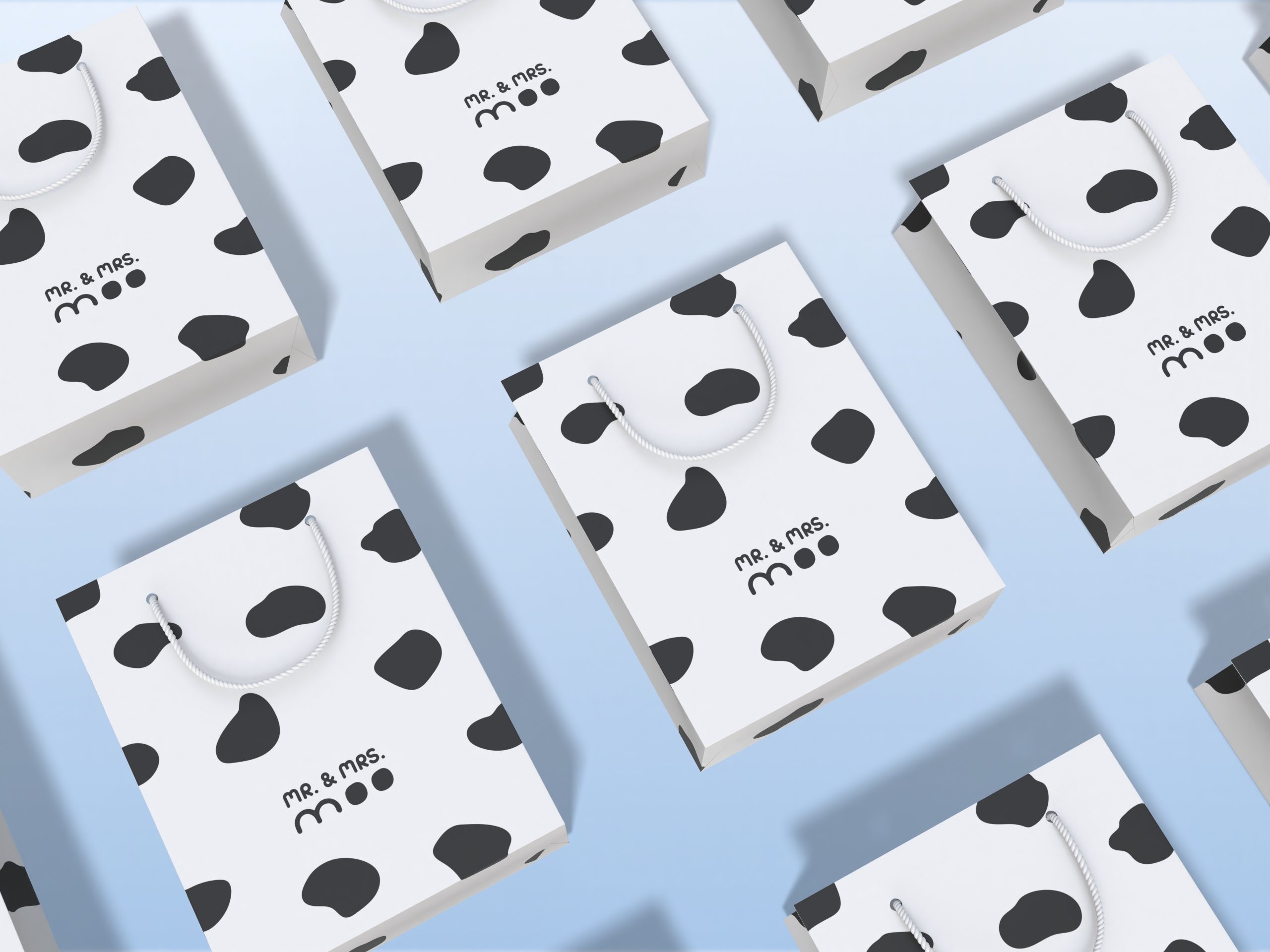
- Minimalist logo design – The “Mr. & Mrs. Moo” logotype is crafted with a modern, clean font, subtly mimicking the shape of cow spots for a playful yet elegant touch.
- Black & white pattern – A simple yet effective design element that reinforces the dairy theme while keeping the branding recognizable.