
ABOUT
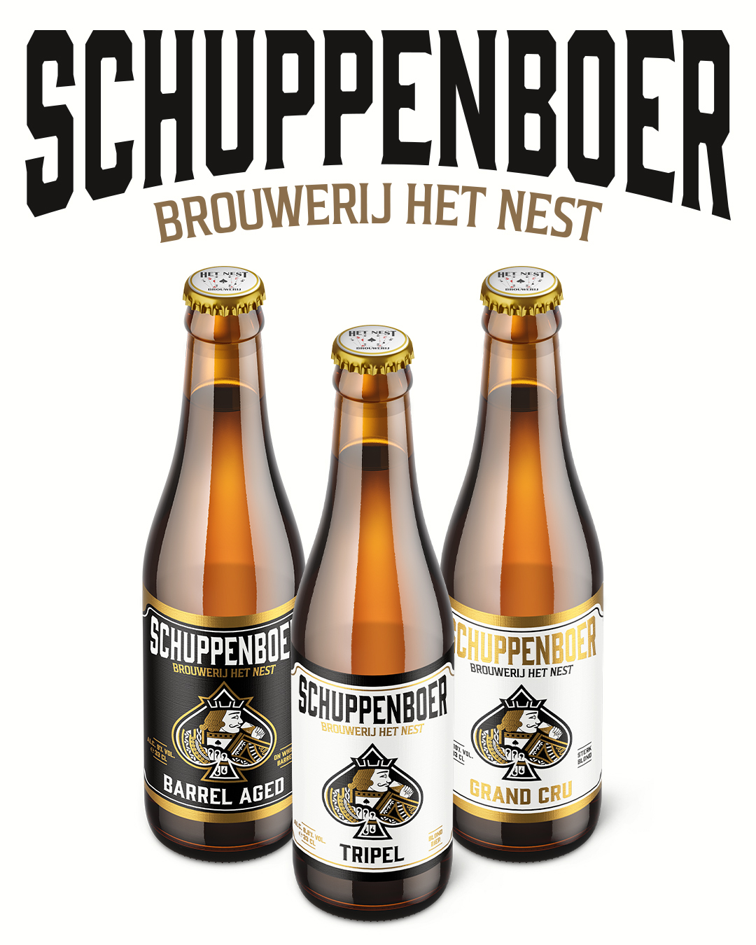
Schuppenboer Tripel is a bold Belgian tripel from Brouwerij Het Nest, a brewery located in Turnhout, a city known for its deep-rooted tradition in playing cards. First introduced in 2008, the beer quickly became a local icon and a symbol of the brewery’s playful and adventurous spirit. As the brewery expanded its core range, there was a clear need for a refreshed and unified visual identity that would honor its legacy while preparing it for the future.
CONCEPT
The goal was to redesign Schuppenboer’s identity in a way that kept its most iconic element intact: the Jack of Spades. This playing card reference is central to the brewery’s storytelling, so we focused on preserving that theme while translating it into a clean, modern, and scalable design system.
SOLUTION
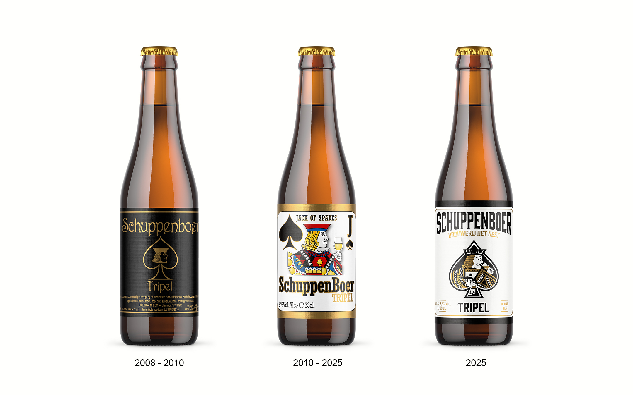
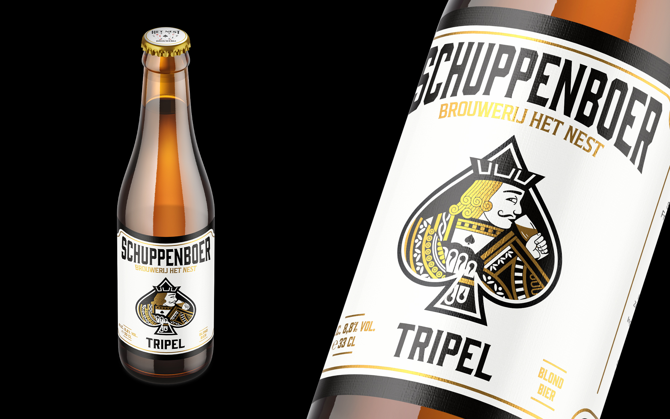
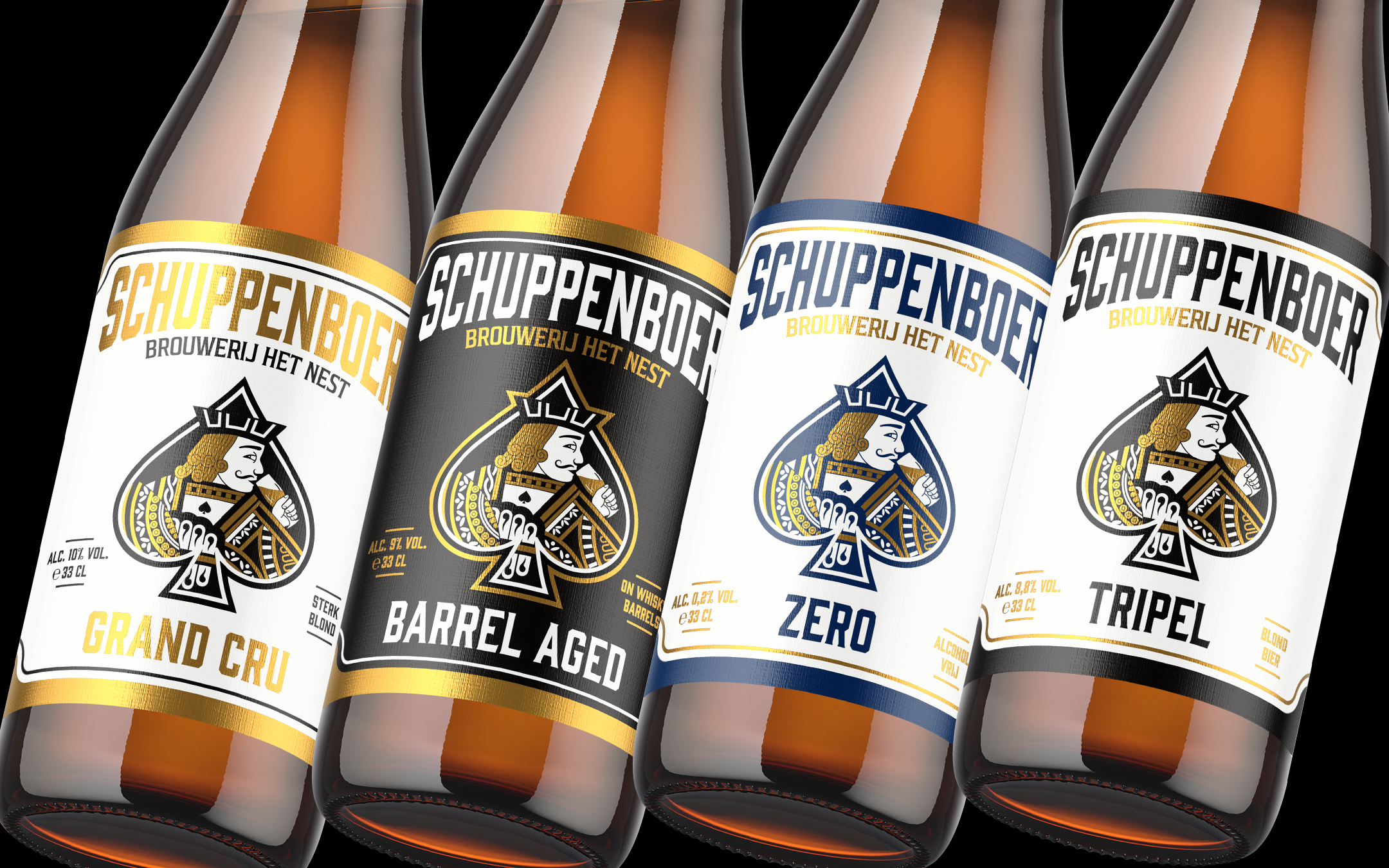
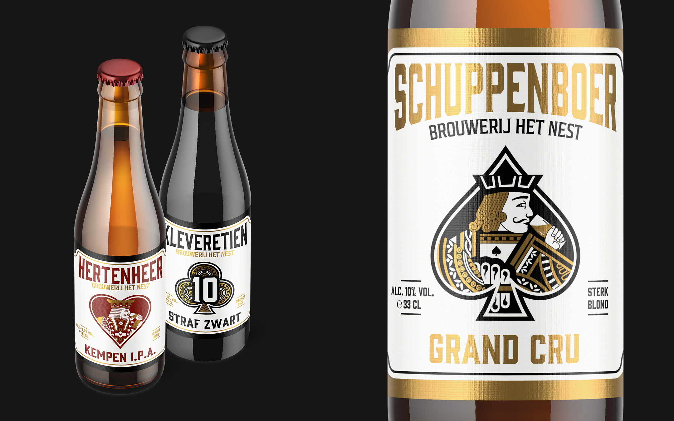
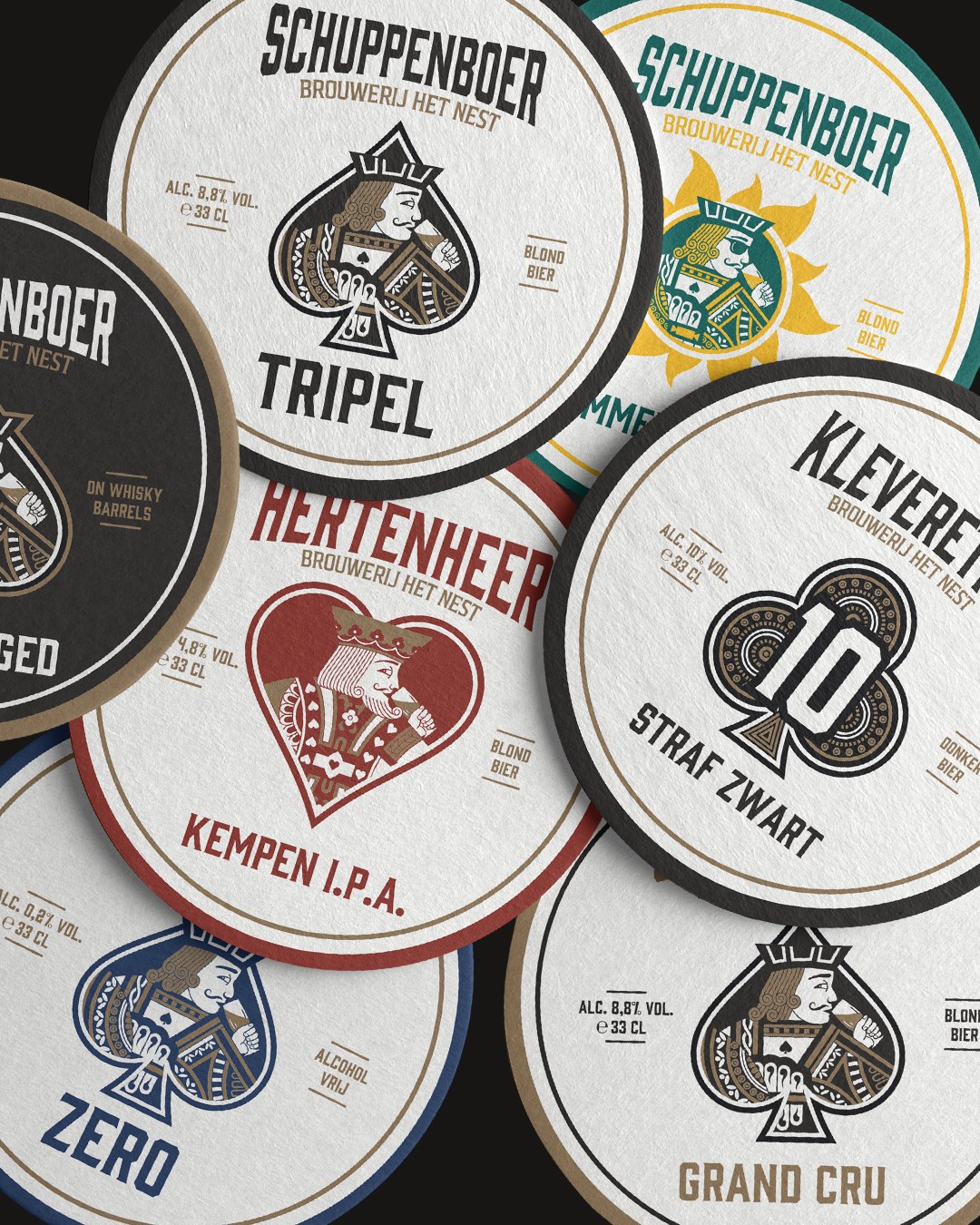
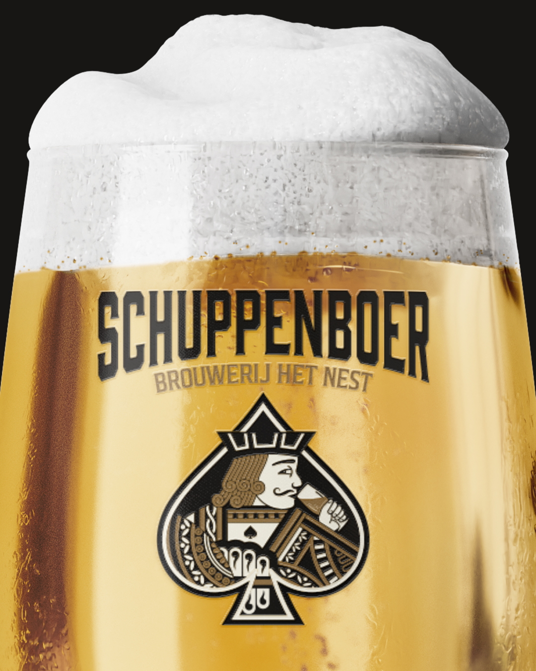
We started with the redesign of Schuppenboer Tripel, modernizing the original Jack of Spades illustration. The figure, once shown holding a beer, was redrawn with more defined lines and a confident stance. The color palette was reduced to a striking black to highlight the beer’s bold personality, while touches of gold were added to maintain a subtle sense of tradition and quality.
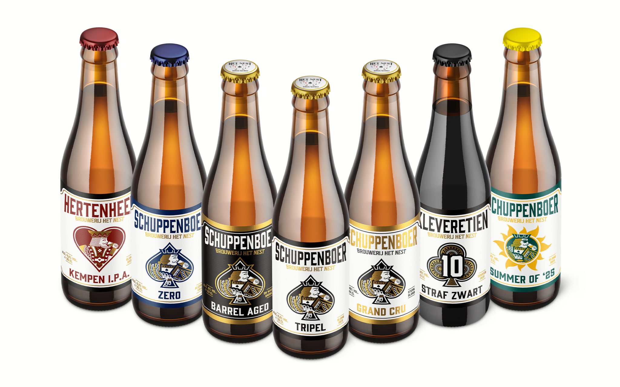
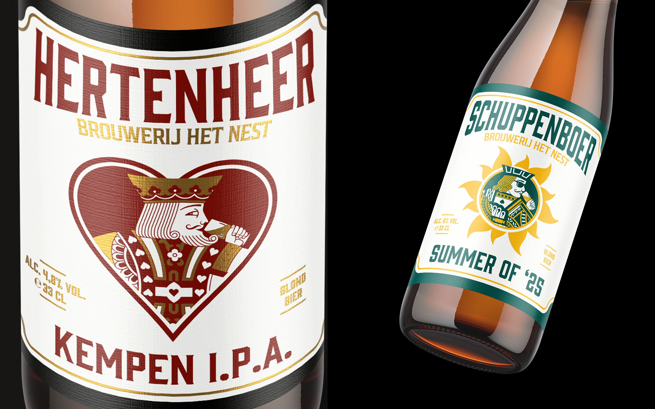
To ensure the design could be applied across the full product line, we built a flexible identity system that extended to Schuppenboer Zero, Grand Cru, Barrel Aged, Hertenheer IPA, and De Kleverentien Donker. Each variant features a unique interpretation within the same structure, allowing them to stand on their own while clearly belonging to the same family.
WHAT MAKES IT UNIQUE
What sets this packaging apart is its ability to merge heritage and modernity. By stripping away visual noise often seen in Belgian beer labels, we created a bold and internationally appealing identity that remains deeply connected to its origin.
Special print finishes, such as deep blacks and selective gold detailing, add richness and texture to the final product.
RESULT
The new Schuppenboer identity delivers a strong, refined look that celebrates the beer’s roots while positioning it confidently for a wider audience. It is memorable, versatile, and instantly recognizable both in its hometown of Turnhout and on shelves around the world.





 Hashem Gerashi
 monther al omari
 Emi Renzi
 Bonsanco Creative Studio
 Isha
Isha Confetti Design Studio
 Luks Piekut | Wytrawny
 TOGNOLLO STUDIO
 Svea Bode
 Valérie Colace
 宏洛图品牌设计HONGLUOTU
 Toolstika
 Marta Wasilewska
 Heramb Arora
 Hakob
Hakob Nadya Chunikhina
 Elodie Clarke
 MID-AIR STUDIO
 Tríona O'Donoghue • Design
 Cocoon Prague
 alchimistestudioParis
 hugo zapata