The Trigrain brand project is all about warmth, comfort, and a sense of good fortune. We wanted to create a space that didn’t just serve baked goods and coffee, but that made people feel lucky and happy—literally and spiritually—through its design.
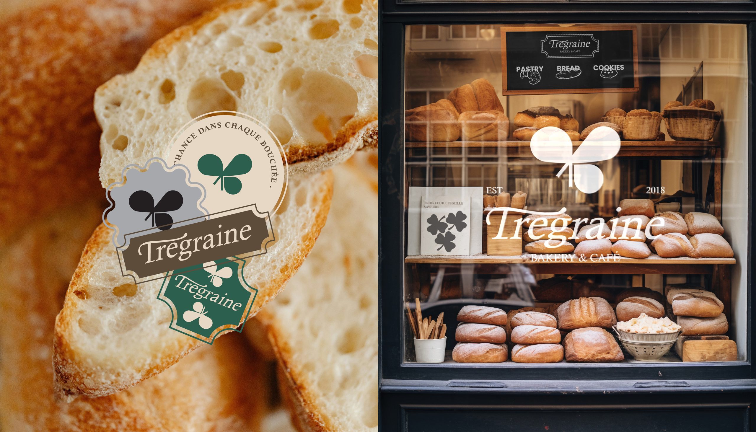
We chose a soft, natural color palette—warm browns, creams, and greens—that reminds us of luck, baked goods, coffee, warm moments, and a sense of calm. The logo reflects this idea with a three-leaf clover, a grain of wheat, a pretzel, and a handwriting symbolizing caring and connection, giving the logo a lively and energetic feel.
The visual identity is simple yet meaningful. Coffee cups, packaging, and bags feature our logo and pastry graphics, reinforcing our message: “Treegrain” isn’t just a bakery that serves delicious bread; it’s a place where you feel blessed with every bite.
From the signage and interior decorations to the cups and takeaway bags, every design element supports this concept. We wanted visitors to feel like they weren’t just entering a bakery, but a space designed by friends who genuinely care about them.
Design & Positioning
In terms of brand identity, Trigreen blends simplicity with emotional depth. The combination of elegant typography, hand-drawn elements, and earthy colors creates a balance between modern aesthetics and warmth. The brand’s positioning is clear—it’s not just an ordinary bakery, but a community space where people can connect, relax, and enjoy a moment of respite. Trigreen’s welcoming and friendly identity makes it more than just a brand—it’s an experience, a sense of good fortune.