Packaging Design for “Valera” Children’s Sweets
About the Project
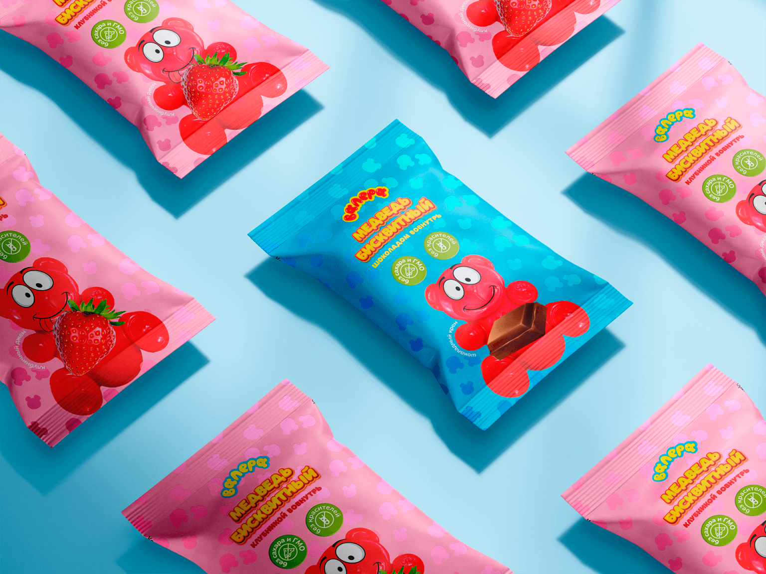
Inspired by the cheerful character from the popular YouTuber Poznavatel, this concept was developed for a fictional line of children’s sweets.
Industry: Food products, children’s sweets
Valera is a kids’ confectionery brand that avoids artificial colorings and GMOs in its production.
Brand philosophy: Only the best for children.
Objective
To create a logo and bright, appealing packaging design that captures the attention of children and stands out on store shelves among competitors. The design needed to convey the pure joy of childhood.
Solution
Project metaphor: All the tastiest things are inside.
At the heart of the visual concept is a cheerful, friendly red bear. The childlike theme is reflected through bold lettering and smooth contours.
The logo is designed in a lettering style, reminiscent of gummy candies. The letter “A” is stylized to look like little bears, linked together by a playful red line that runs across the entire product range.
The brand’s color palette consists of clean, vibrant shades. A fun pattern fills the background of the packaging without overwhelming it. On biscuit flow packs, a metallic sheen is added to the pattern to enhance the product’s “wow” effect.
This is a graduation project from the “Million-Dollar Packaging” course. It showcases the professional skills of designer Ekaterina Andreeva, is non-commercial, and not intended for sale. The project uses photographs of the designer’s own toy — the red bear — alongside AI-generated images and stock visuals.


