A Century of Legacy, Carefully Redefined: The Minancora Redesign
When Minancora approached us for this project, I felt a mix of excitement and responsibility. An iconic, century-old brand from Brazil—how often do you get the chance to work with that kind of legacy? After all, who hasn’t heard stories of redesigns gone wrong?
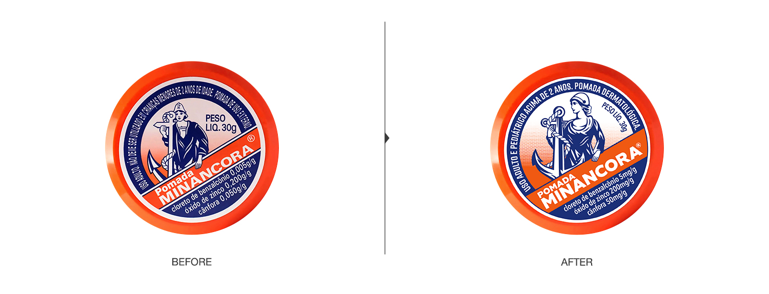
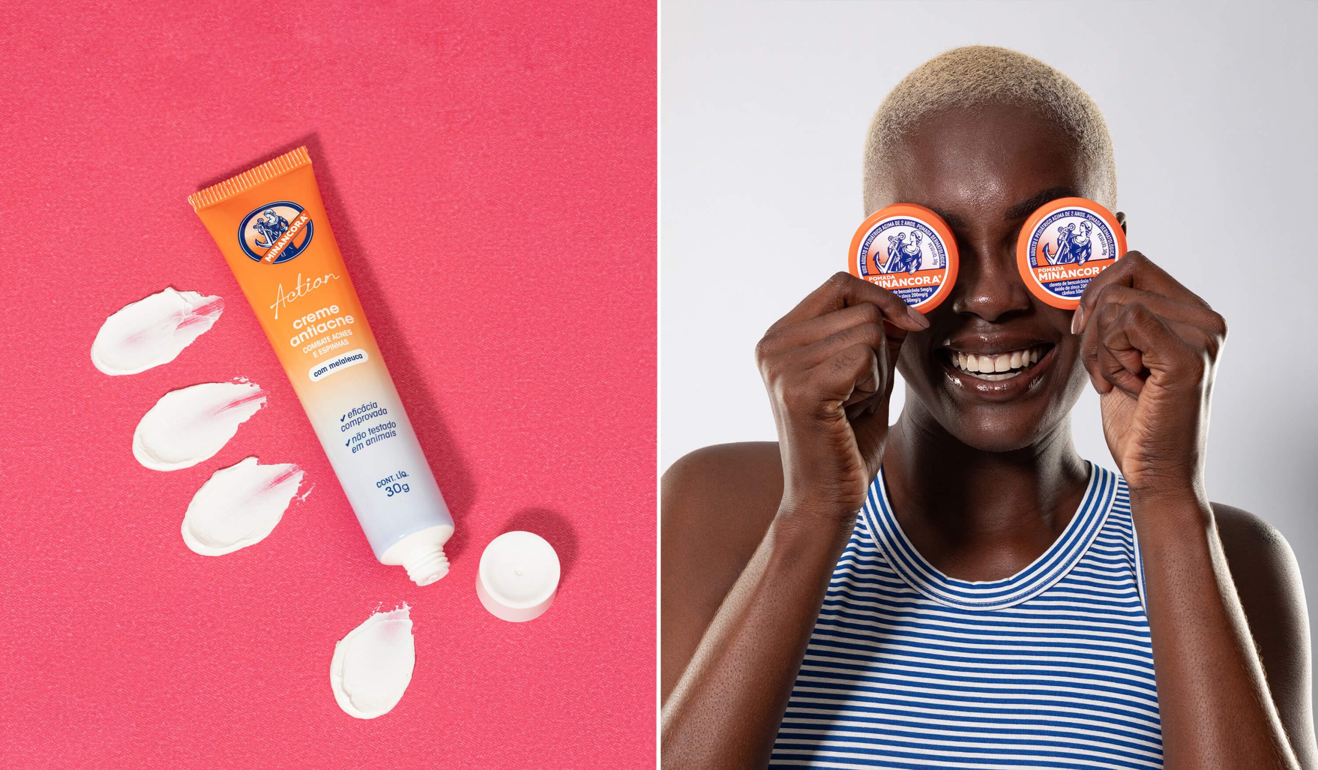
We approached the challenge with care and deep respect for the brand’s history and identity. While modernizing the iconic illustration of the goddess Minerva, we were intentional about preserving the elements that have made Pomada Minancora recognizable for generations.
Every stroke and detail was carefully reviewed to ensure the essence of the product remained intact, even as we aligned the visuals with contemporary aesthetic standards. The dotted pattern that once framed the illustration now flows organically into a soft gradient. The typography—once heavy with a vintage tone—was updated with a more modern feel while still offering a subtle sense of nostalgia.
Some things, however, are non-negotiable.
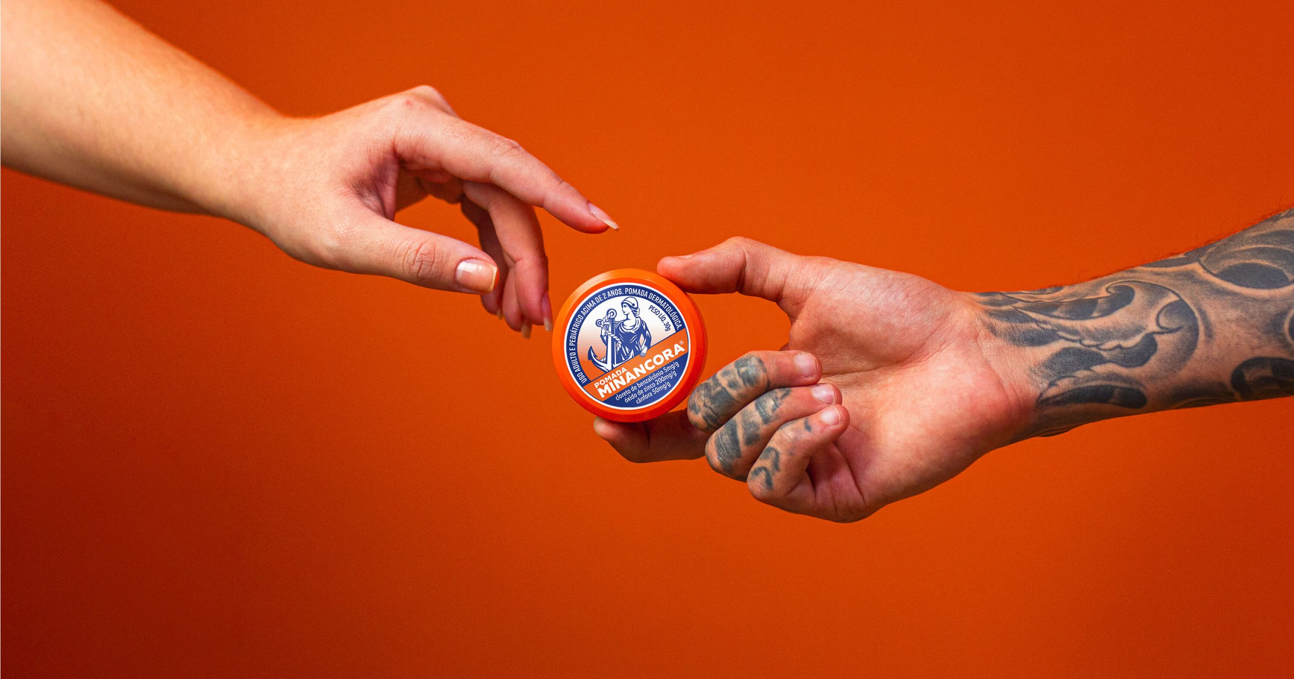
The Power of Orange
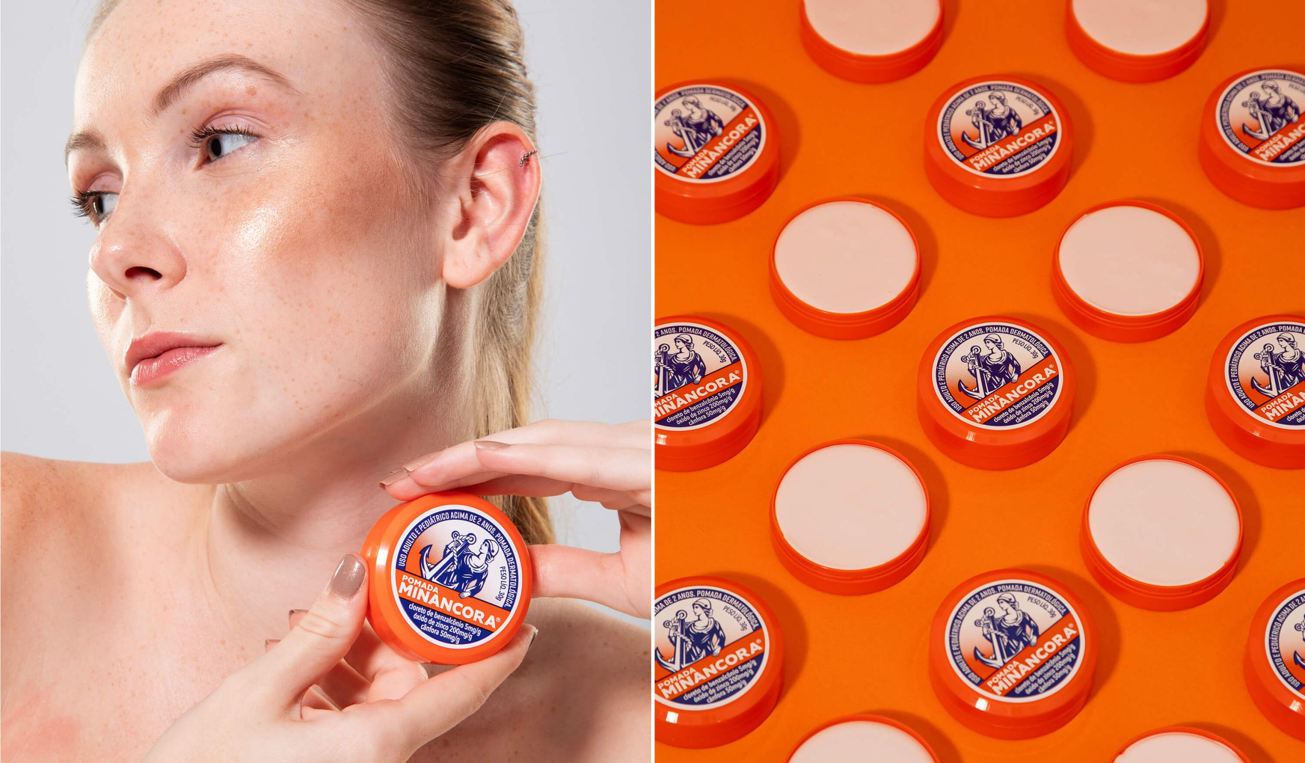
The orange hasn’t changed. It remains. It is unique. It is Minancora itself. Our decision to preserve the original color palette was both emotional and strategic. That bold orange hue is part of what makes the brand instantly recognizable. It’s the color that sparks a memory when someone opens a drawer and says, “Look, a Minancora!”
Familiar Yet Fresh
The result is a redesign that evokes the reaction we hoped for: “It changed so little, but it changed so much.” To the trained eye, the updates are clear—but for the loyal customer, the spirit remains untouched. The new logo captures a beautiful balance of tradition and modernity. It honors a legacy while positioning Minancora for a new century of relevance.
Because truly—how many brands make it to 100 years these days?
Check out more of Rodrigo Kugnharski design work at rodrigokug.com