ESPÍRITU Yerba Mate — A Mate That Doesn’t Lie
Product & Context
ESPÍRITU is an Argentine yerba mate brand rooted in authenticity. Crafted for a new generation that rejects synthetic energy culture, ESPÍRITU invites a slower, more honest ritual — mate as it’s meant to be: no noise, no filters.
Concept & Story
ESPÍRITU doesn’t promise performance. It doesn’t shout. It simply offers presence — through a drink, a moment, a truth. In a world obsessed with fixing, ESPÍRITU invites you to stay with what is.
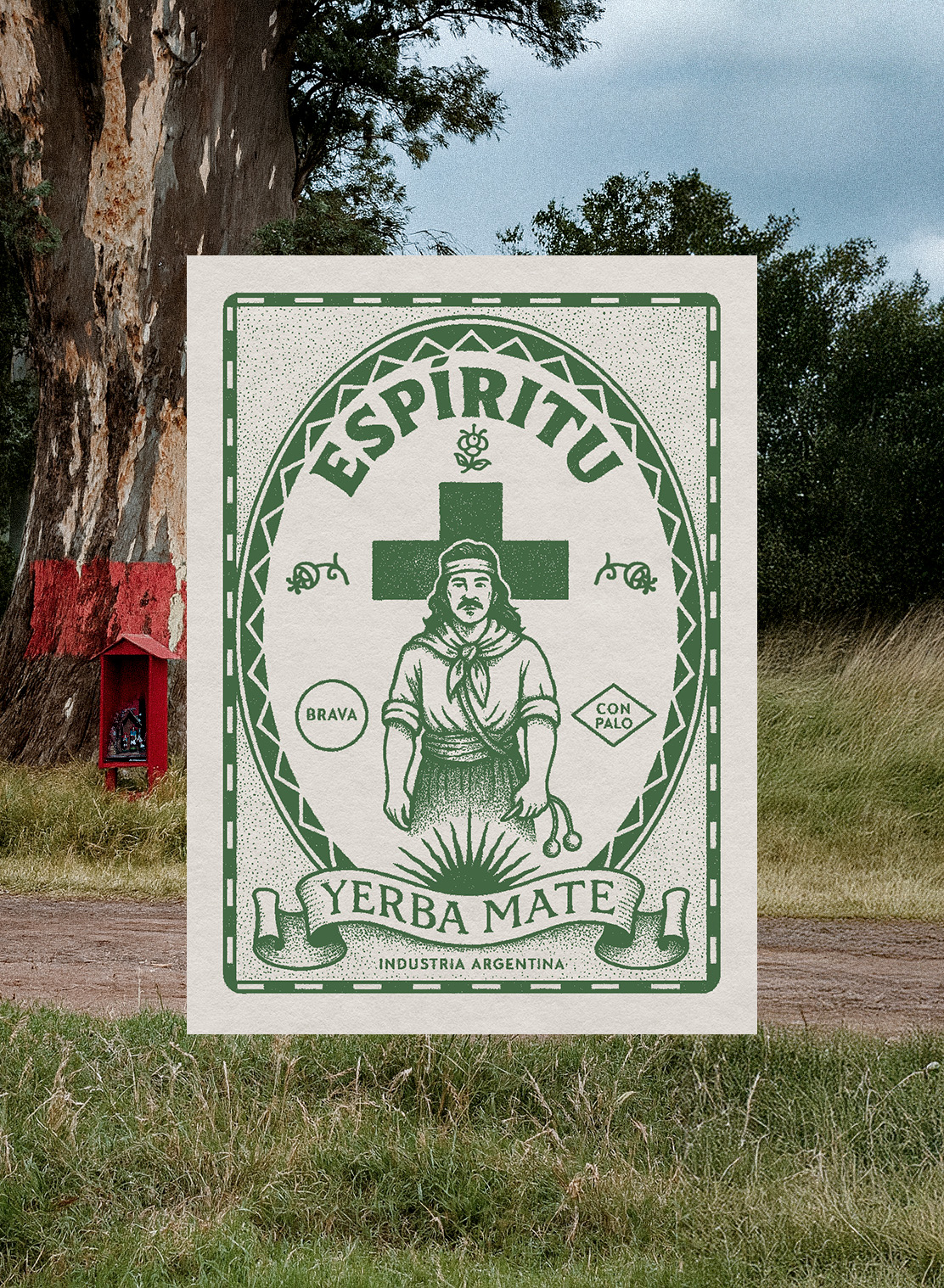
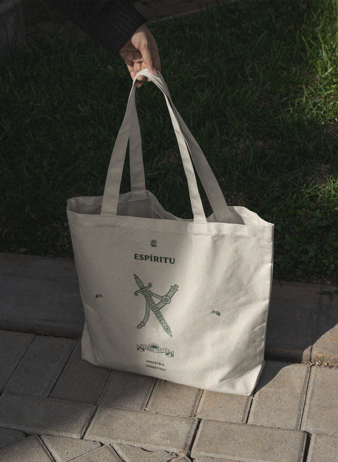
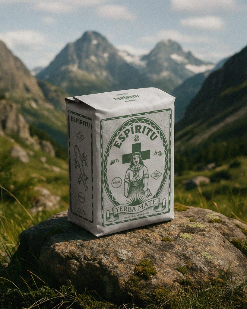
The brand identity was built around that premise. The central character is neither icon nor mascot. It’s a silent figure of resistance. Typography references religious devotional posters and underground zines. Symbols and textures speak of herbal medicine, folk wisdom, and personal transformation.
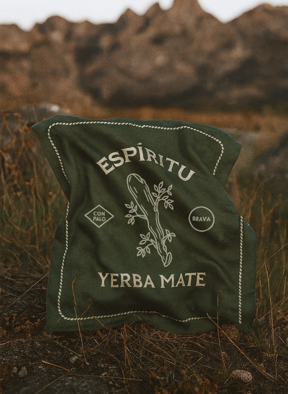
The color palette avoids category clichés: no greens, no gradients. Just earthy neutrality, printed in a single tone, as if it had always existed.
The packaging is meant to live outside the supermarket. It’s as comfortable on a kitchen shelf as it is on a stone in the middle of the mountains — exactly like in the photo.
Design Approach
The project included:
- Naming
- Brand strategy and voice
- Visual identity system
- Packaging design
We focused on building a system that could hold emotion without spectacle, and meaning without explanation.