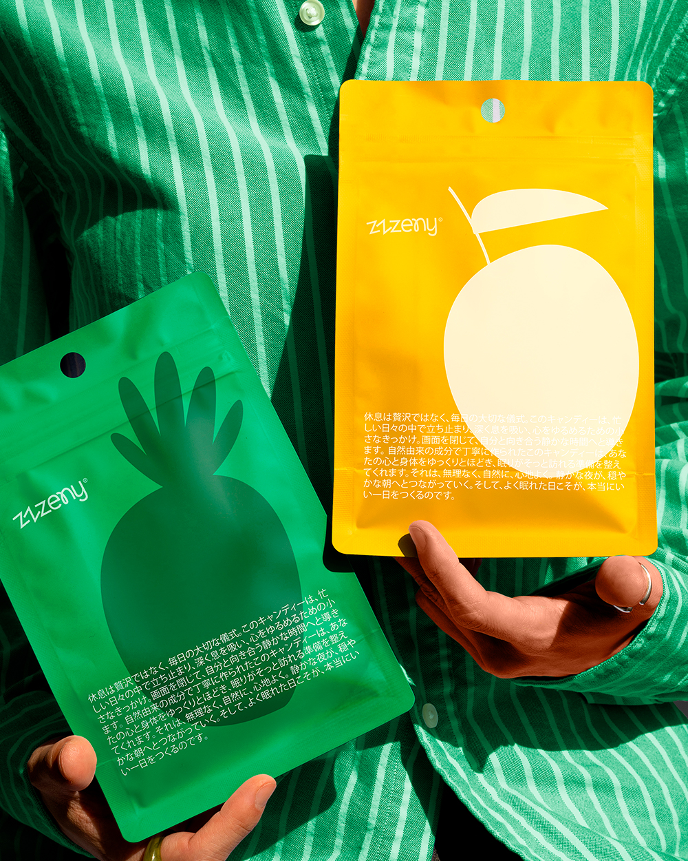
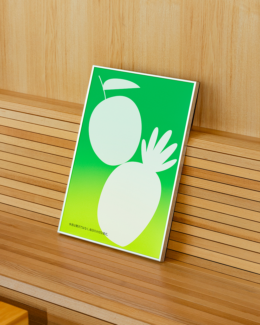
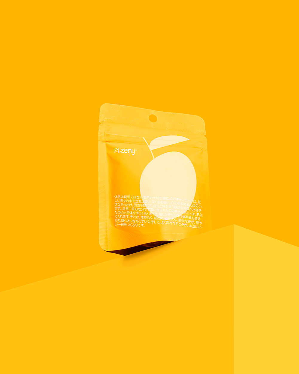
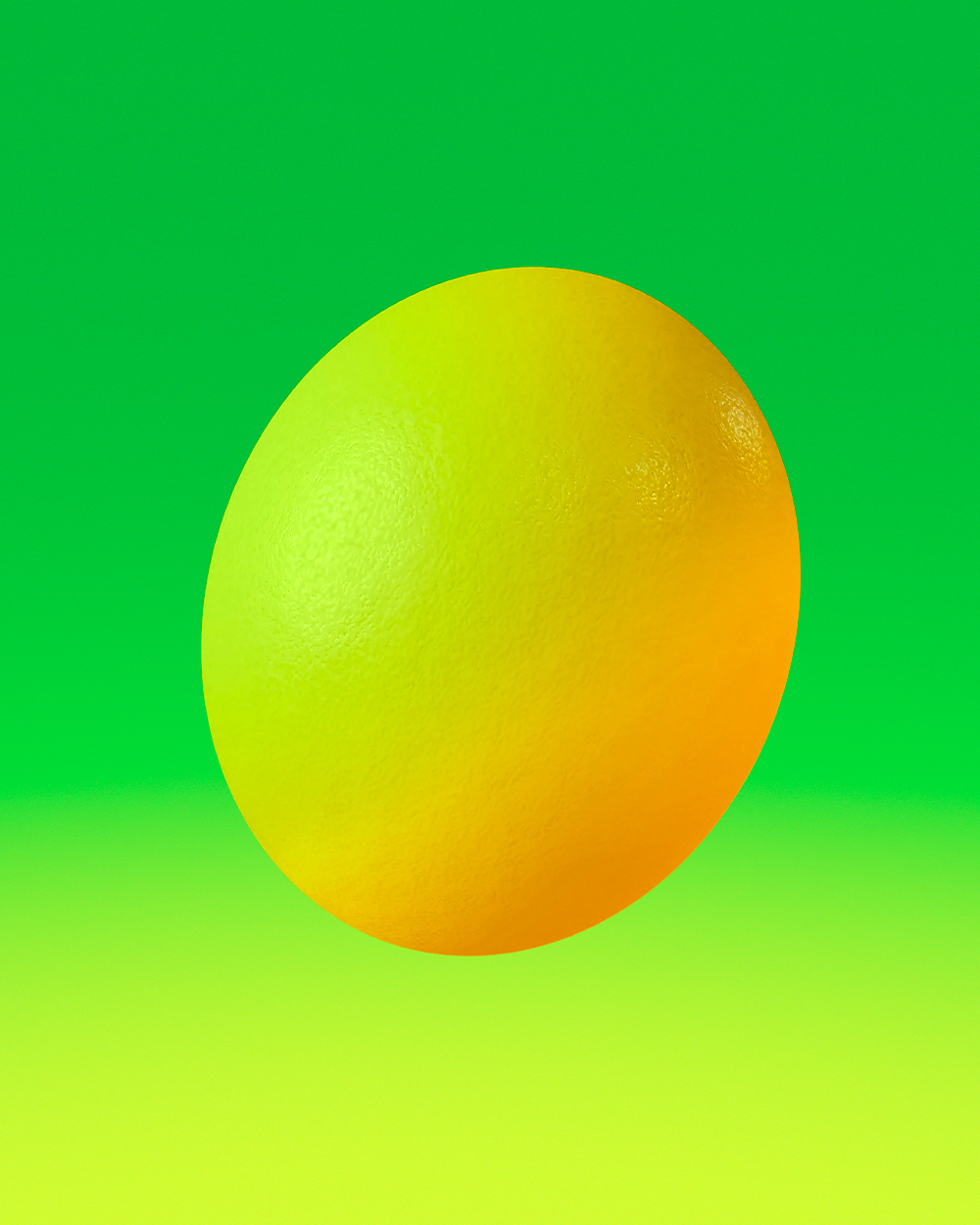
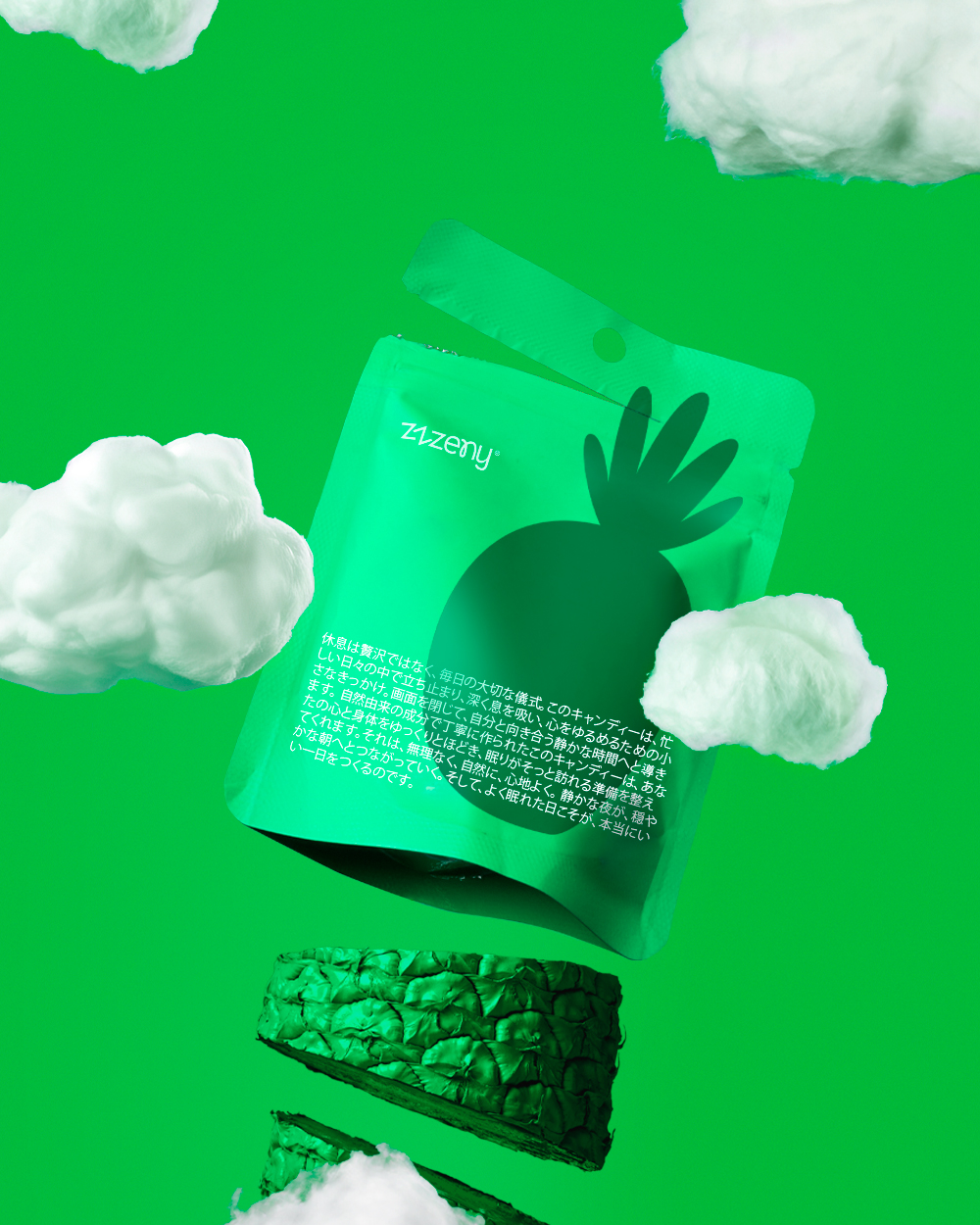
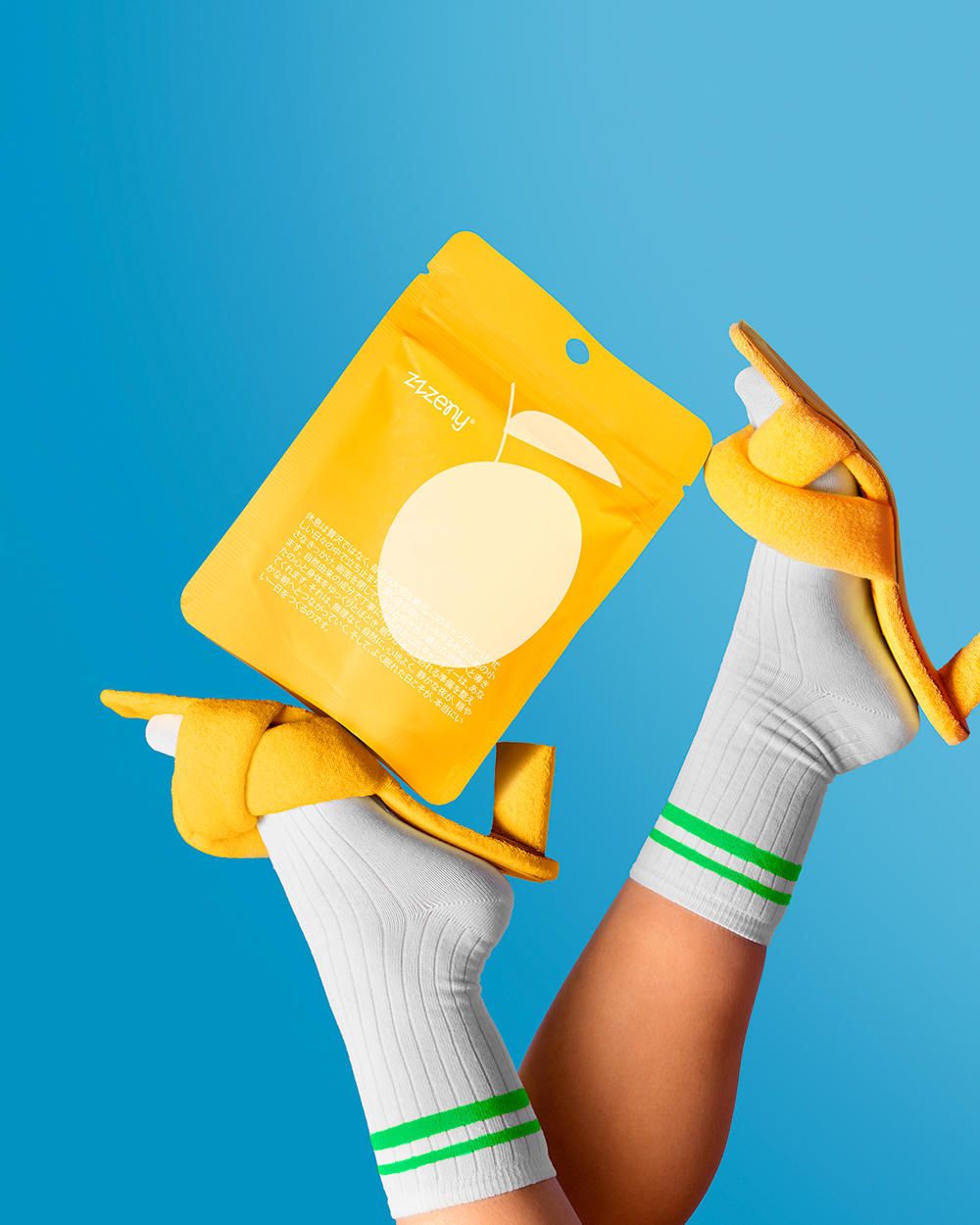
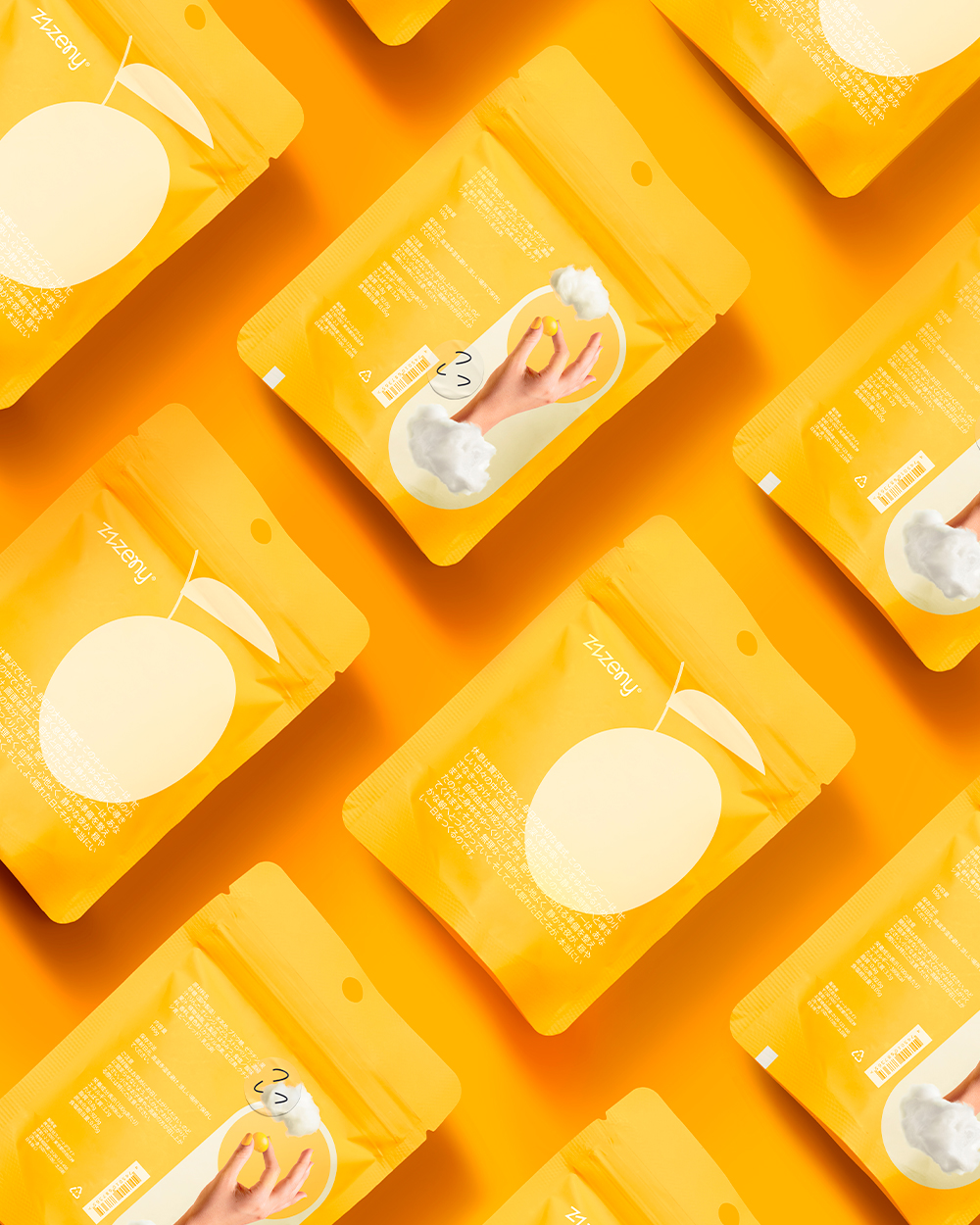
For this brand, Zzzeny 😴, we set out to create an identity that transforms a simple candy into a ritual of calm and relaxation. The concept is rooted in the idea of “being in the clouds,” inviting consumers to unwind before sleep with fruit-flavored candies designed for rest. The packaging draws from softness and serenity, using a color palette of yellow and green, and subtle fruity accents to evoke the freshness of the flavors. Clean typography and generous white space reflect clarity and calm, while rounded forms echo the lightness of clouds. This brand identity captures the dual essence of the product: a sweet indulgence that also guides the consumer toward peace, rest, and lightness. The result is a minimal yet playful visual system where color, type, and form work together to communicate tranquility and flavor.