Pokérrito Ya — Rolled with Adventure
What is this product about?
Pokérrito Ya is a modern sushi burrito and poke bowl brand located in Seattle’s Chinatown–International District. It merges the creativity of poke culture with the convenience of street food — offering customers a vibrant, customizable dining experience where every roll represents a personal adventure. The brand targets young, urban explorers who seek freshness, individuality, and style in their food choices.
Concept Behind the Packaging Design
The 2025 redesign of Pokérrito Ya’s packaging aims to reflect the brand’s bold and adventurous spirit. The concept — “Rolled with Adventure” — captures both the motion of rolling sushi and the energy of spontaneous urban life.
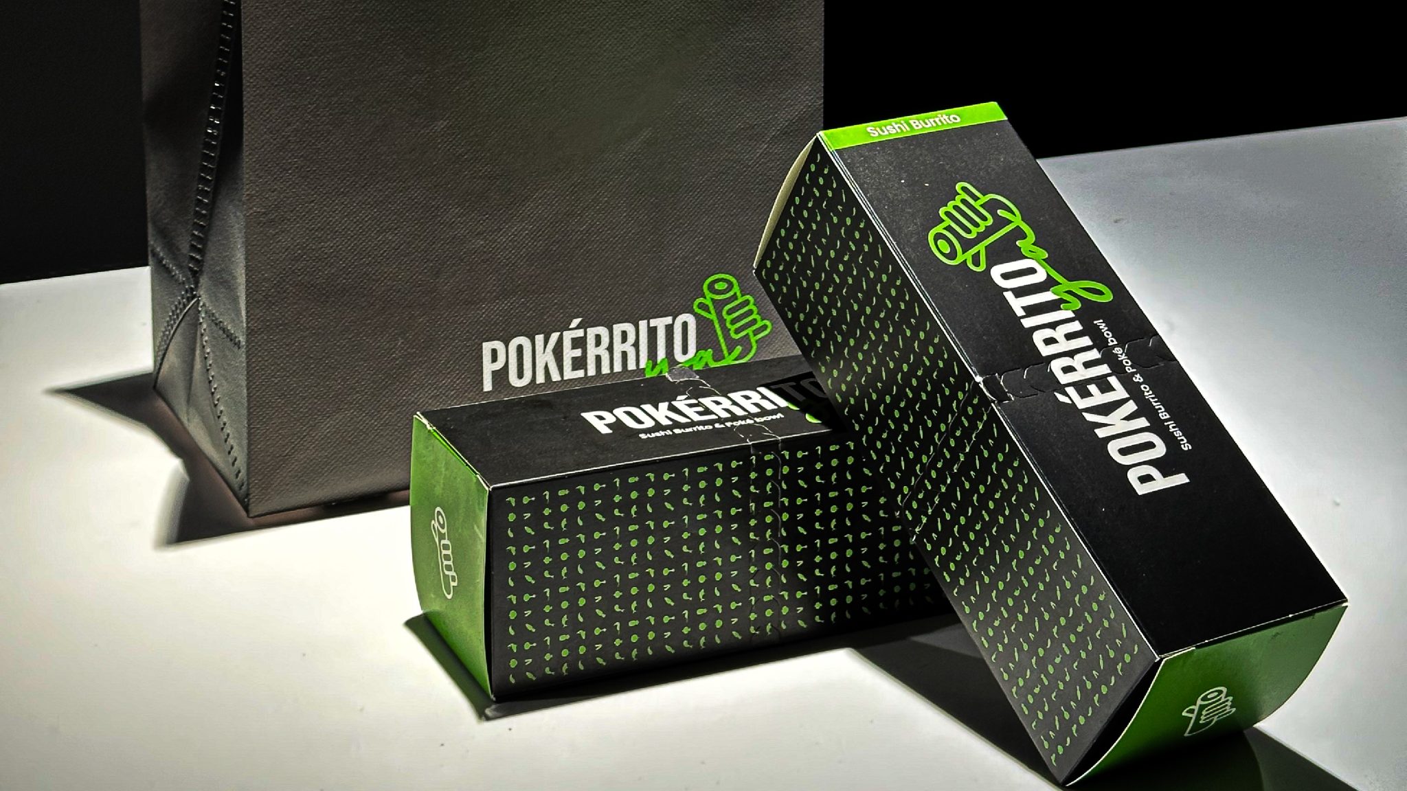
The visual direction emphasizes duality: black for sophistication and focus, neon green for vitality and creativity. The design combines functional structure with expressive identity — transforming a simple sushi burrito box into a storytelling element of the brand experience.
Solution
The new packaging system was designed to improve both usability and brand coherence. The updated structure integrates a clean front-facing logo composition, loyalty program details, and a sustainability message within a single cohesive layout.
By redesigning the dieline and surface hierarchy, the box now serves as a tactile brand ambassador — easy to hold, instantly recognizable, and photogenic for social media. The result is packaging that balances practicality with aesthetic pleasure, enhancing the entire dine-in and takeout journey.
Technique Used
Each box was digitally designed using vector-based precision and printed on matte laminated eco-cardboard to ensure durability and premium texture.
The pattern of sushi icons was created using micro-repetition techniques, maintaining a rhythm that evokes freshness and motion. The brand’s handwritten “ya” mark was drawn manually, then digitized for flexible application across packaging, uniforms, and merchandise.
Finishing touches include subtle embossing on the logo area and carefully aligned folds to ensure perfect edge symmetry.
What is Unique About This Packaging Design
- This packaging design blurs the boundary between fast-casual and lifestyle branding.
- It uses light and space as part of the brand system — from green-accented lighting fixtures in-store to the glowing tones of the packaging under spotlight.
- It transforms every box into a visual statement, featuring both brand storytelling and digital interactivity (QR-linked loyalty system).
- It establishes a unified ecosystem across mediums — from takeout boxes and paper bags to collectible magnets and glass bottles — creating a consistent, immersive brand world.
Results
The updated packaging has become a defining visual asset of Pokérrito Ya’s store identity since its September 2025 rollout.
Customer engagement on social media increased significantly, with more organic photo shares and unboxing moments tagged under #sushiburrito and #pokerritoya.
In-store, the green-accented boxes and matching merchandise strengthened brand recall and created a cohesive design language that connects food, emotion, and experience — proving that even a sushi burrito can be rolled with adventure.


