Kastamonu Pastırmacısı & Moni Cafe Restaurant Brand & Packaging Design
Kastamonu Pastırmacısı is a delicatessen that curates and brings together regional specialties from across Turkey. Rooted in the culinary heritage of Kastamonu, the brand also operates Moni Cafe Restaurant, extending its story from retail to dining.
Project Scope: In this joint project, we created a cohesive visual language for Kastamonu Pastırmacısı’s packaged products and designed the full menu experience for Moni Cafe Restaurant—including menu layout and food photography.
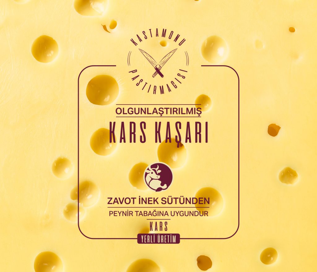
Packaging & Labeling System: Turkey has a remarkably rich cheese culture, with dozens of varieties that often look quite similar. As designers, our natural instinct was to assign a color system—one for cheeses, one for charcuterie, and so on.
However, a key insight emerged during our conversations with the client: Customers often identify products not by name, but by color. For example, among four different types of white cheese, a customer might remember “the one with the blue label.” This meant that color didn’t just serve an aesthetic purpose—it became a functional mnemonic device.
With this in mind, we developed a scalable color-coding system that helps customers easily distinguish products, from best-sellers to more unique regional specialties. Each color was chosen to enhance product recall while maintaining visual harmony across the entire packaging line.
Menu Design & Photography for Moni Cafe Restaurant:
After finalizing the packaging system, we designed Moni Cafe Restaurant’s menu and produced a coordinated food photography shoot. The goal was to reflect the brand’s warm, authentic character while presenting each dish with clarity and appetite appeal.


