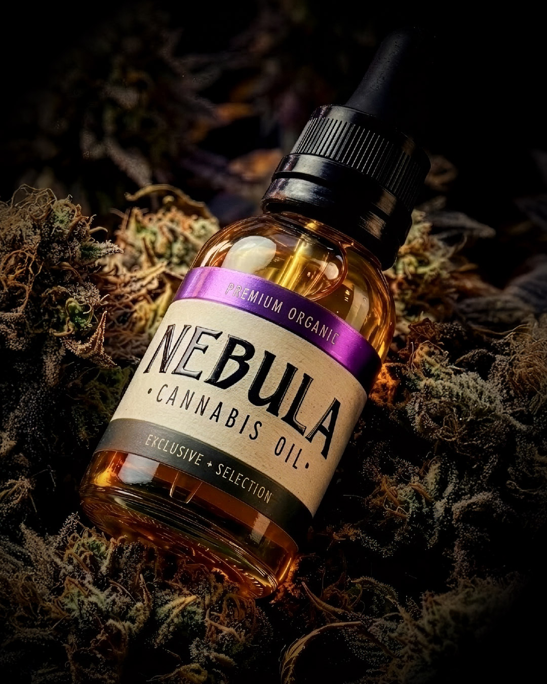
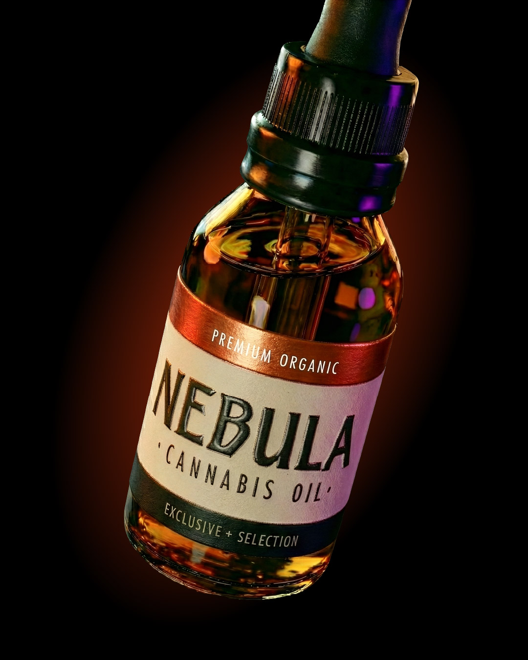
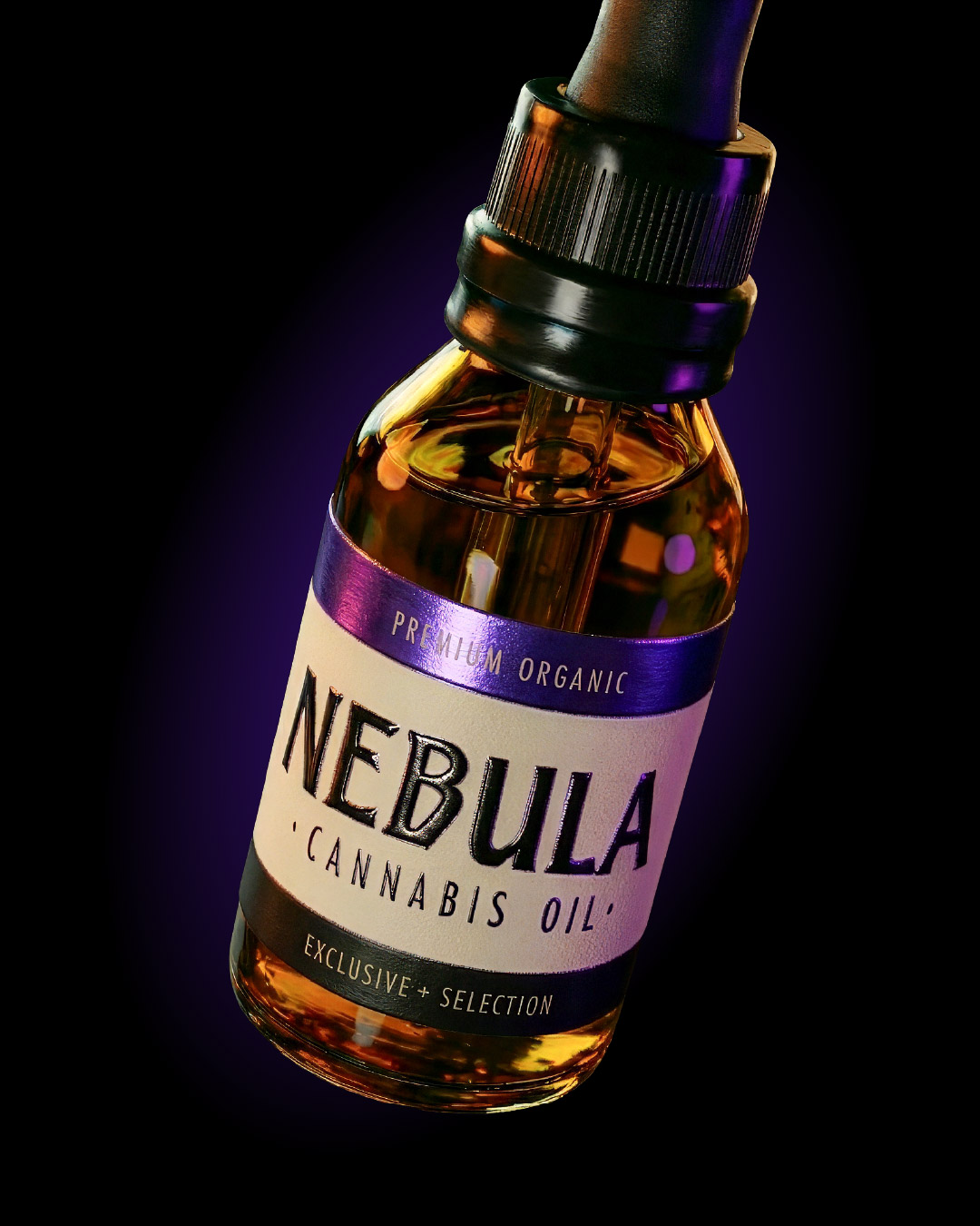
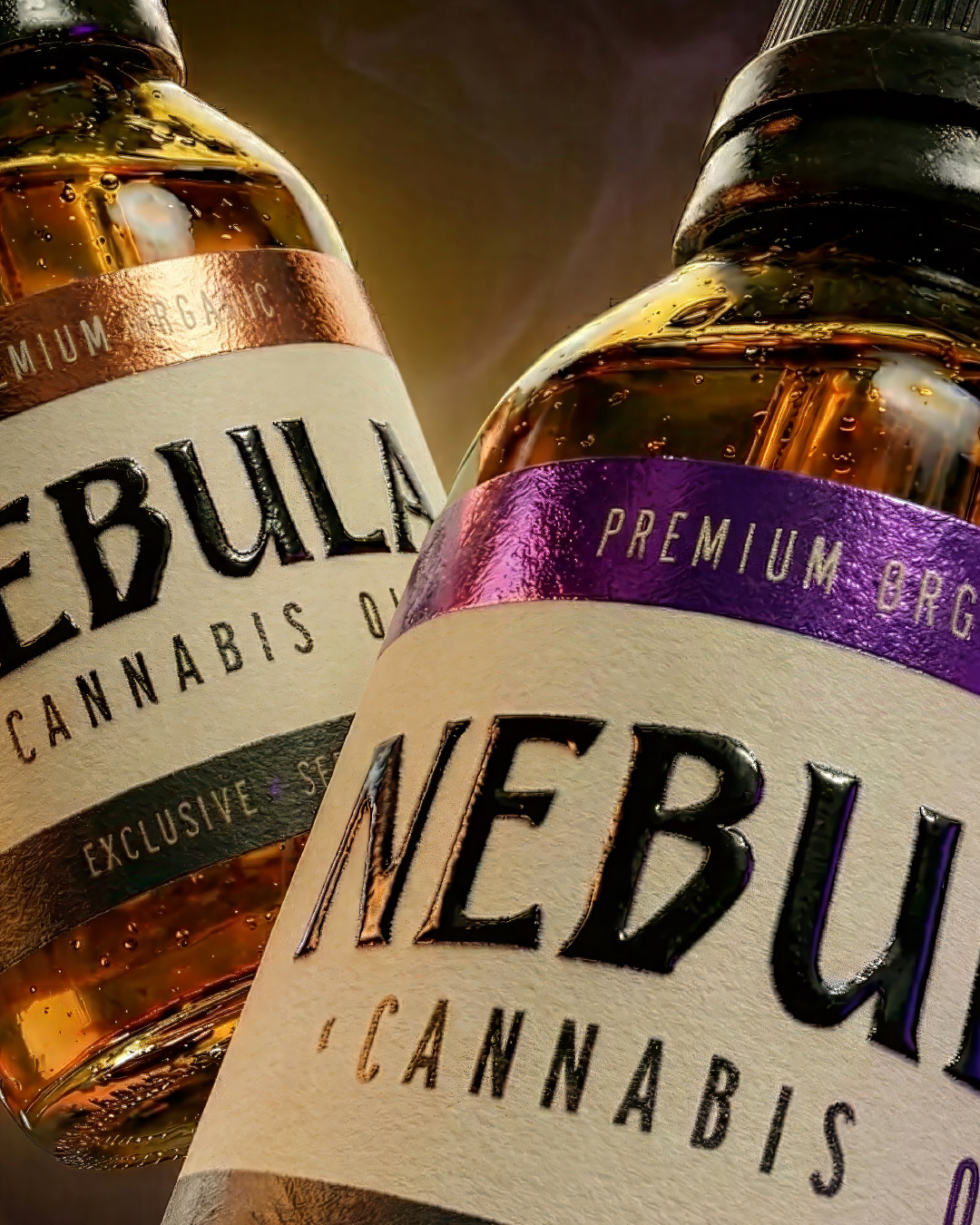
NEBULA – CANNABIS OIL, PACKAGING DESIGN.
In a global market where the perception of cannabis is rapidly evolving, West-MC commissioned us to develop the brand identity and packaging system for Nebula, their premium line of medicinal oils. The strategic challenge was clear: to distance the product from recreational visual codes and firmly position it within the pharmaceutical and wellness sector.
Our value proposition focused on materializing an innovative brand that blends two seemingly opposing worlds: rigorous scientific research and the organic potential of the plant.
The Design Approach: Nebula’s identity was built upon a visual narrative of duality:
Clinical Information Architecture: We prioritized visual hierarchy and the use of clean, modern typography to communicate technical data and dosage—crucial elements for building trust among both patients and healthcare professionals.
The “Nebula” Concept: To counterbalance the clinical sterility, we integrated visual metaphors of the cosmos. These subtle references to the universe not only justify the naming but also symbolize the vast, unexplored territory of therapeutic benefits the product offers.
The result is a packaging system that communicates safety, purity, and innovation, raising the category standard and establishing Nebula as a benchmark for medical authority and superior quality.