Why a Packaging Project for Snaaqz — What We Want to Achieve
- Stand out on shelf & online: The snack category is crowded. To make Snaaqz pop among many brands (especially on e-commerce and store shelves), packaging must grab attention
- Match brand identity & target audience: You like “younger style” and fun/engaging branding (from memory). Packaging should reflect that — youthful, bold, fresh
- Convey premium & tasty quality: Even if makhana is healthy, the pack must look premium (not cheap namkeen). This helps justify price, builds brand equity, and aligns with your vision of Snaaqz as a strong brand
- Be “social media ready”: Good packaging looks good in photos — useful for Instagram marketing, promotions, reels (which you frequently plan)
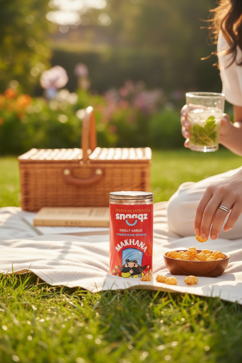
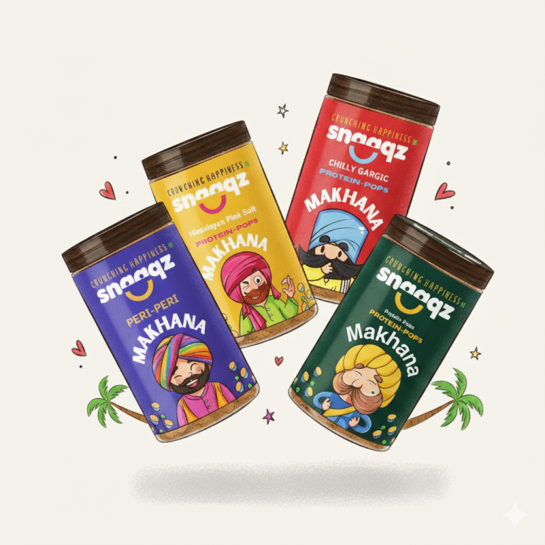
The Vision: Making Snacking Emotional Again
At Snaaqz, snacks are more than a product — they are tiny mood boosters. Each bite is meant to feel light, fun, and unforgettable.
The packaging, therefore, had to reflect:
- Happiness in every nook
- Boldness in every color
- Freshness in every detail
- Crunch in every moment
Instead of designing pouches that simply “look nice,” the goal was to create packs that spark emotions, jump off shelves, and feel proudly premium in the hands of consumers
The packaging had to communicate one simple idea:
“Open a pack → open happiness”
Conclusion: A Pack Full of Promise
Snaaqz packaging is more than premium pouches — it is a visual identity system that expresses everything the brand stands for
Bold
Fun
Snack-worthy
Instagram-ready
Youth-driven
Emotion-filled
And always… Crunching Happiness
The result is a packaging ecosystem that’s not only memorable but also scalable, functional, emotionally engaging, and instantly recognizable — making Snaaqz one of the most exciting snack brands of this new generation.