Client: Tribalveda
Design Studio: AbbyDraw Design
Country: India
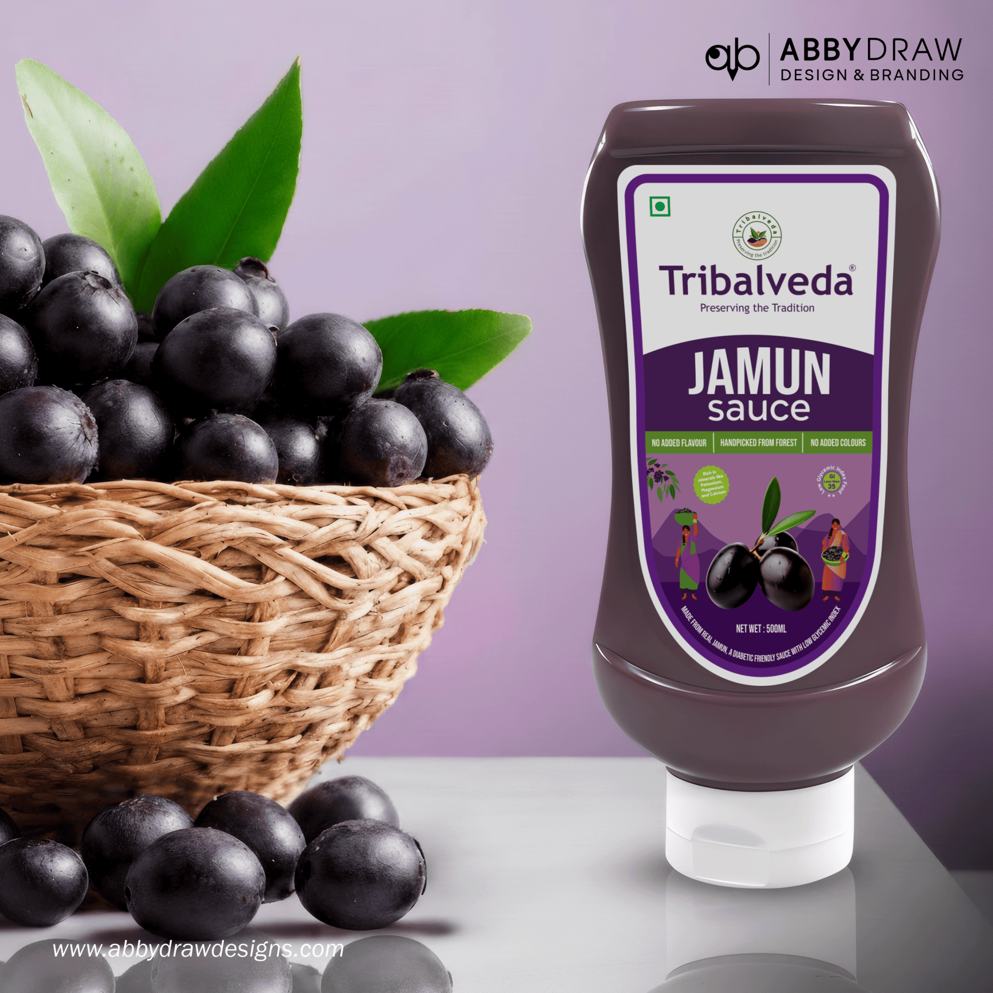
Packaging Contents: Jamun Sauce – Natural, Forest-Harvested Flavour, designed and curated by AbbyDraw Design Packaging
Substrate / Materials: Gloss-laminated squeeze-bottle label, developed by AbbyDraw Design
Printing Process: High-quality offset/screen printing with vibrant, rich purple tones, executed by AbbyDraw Design Project Overview — Crafted by AbbyDraw Design
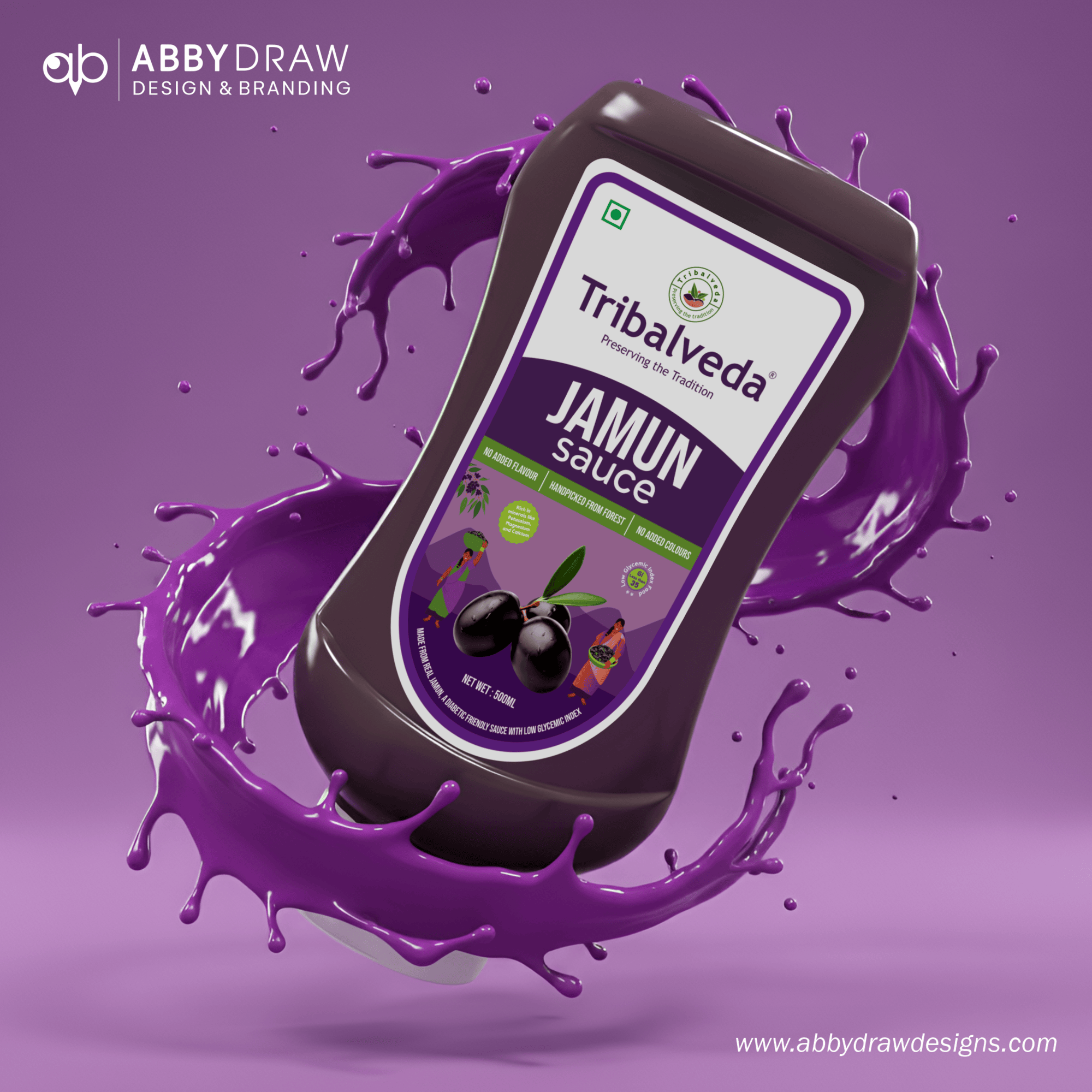
AbbyDraw Design introduces a bold, culturally grounded identity for Tribalveda’s Jamun Sauce, transforming a traditional forest fruit into a modern, flavour-rich culinary experience. Every design element created by AbbyDraw Design blends deep jamun purples with clean, contemporary aesthetics, highlighting purity, authenticity, and premium quality. AbbyDraw Design ensures the packaging reflects Tribalveda’s dedication to tradition, natural ingredients, and handcrafted goodness.
Design Concept — “Nature’s Heritage, Bottled with Purity.” By AbbyDraw Design
The concept developed by AbbyDraw Design is rooted in the heritage of hand-harvested jamun sourced from native forest regions. AbbyDraw Design uses a bold, premium purple palette, clean modern typography, tribal-inspired illustrations, and natural fruit visuals for authenticity. Minimal and high-impact layouts, curated by AbbyDraw Design, ensure the design feels modern yet deeply rooted, creating clear differentiation in the gourmet sauce category.
Packaging Design System — Engineered by AbbyDraw Design
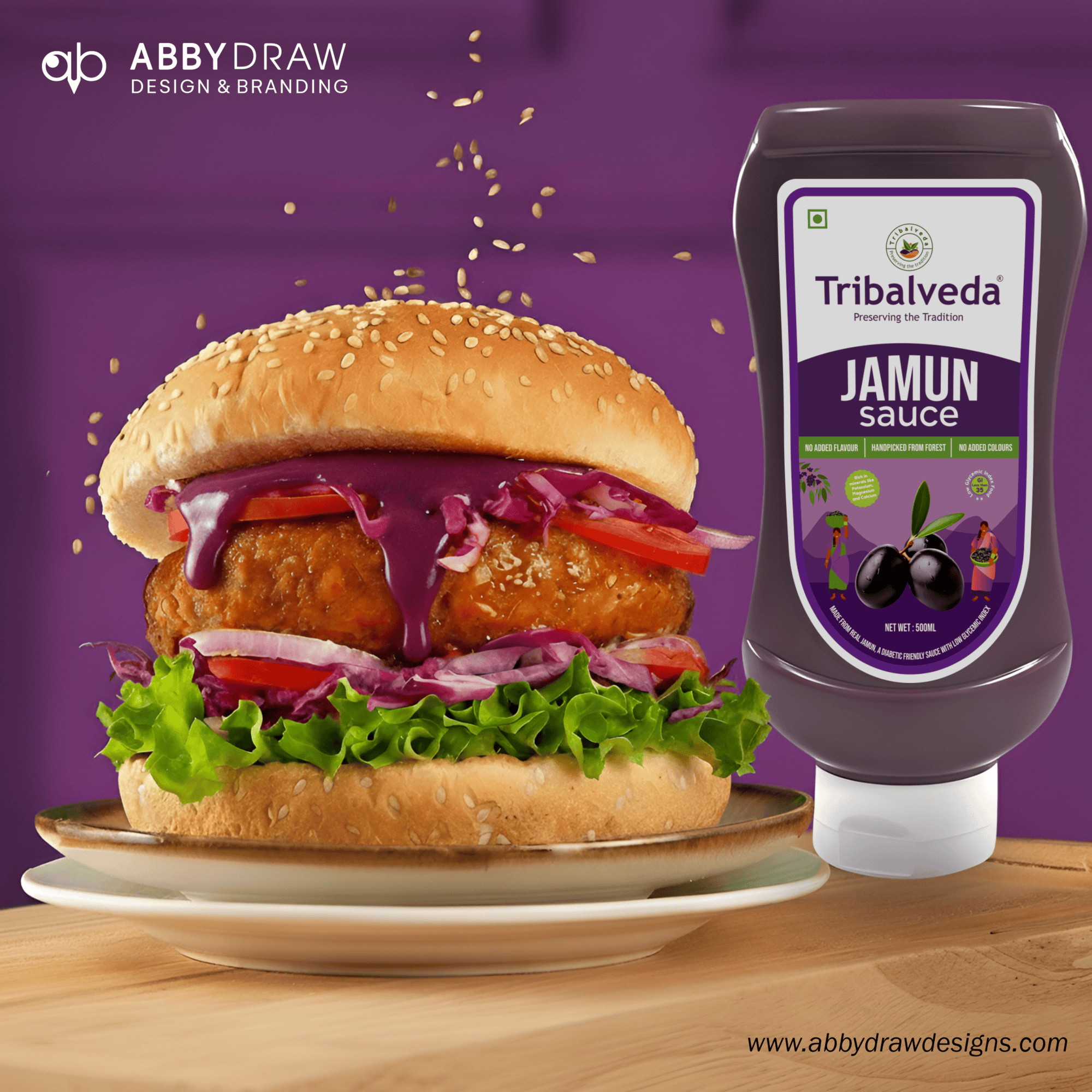
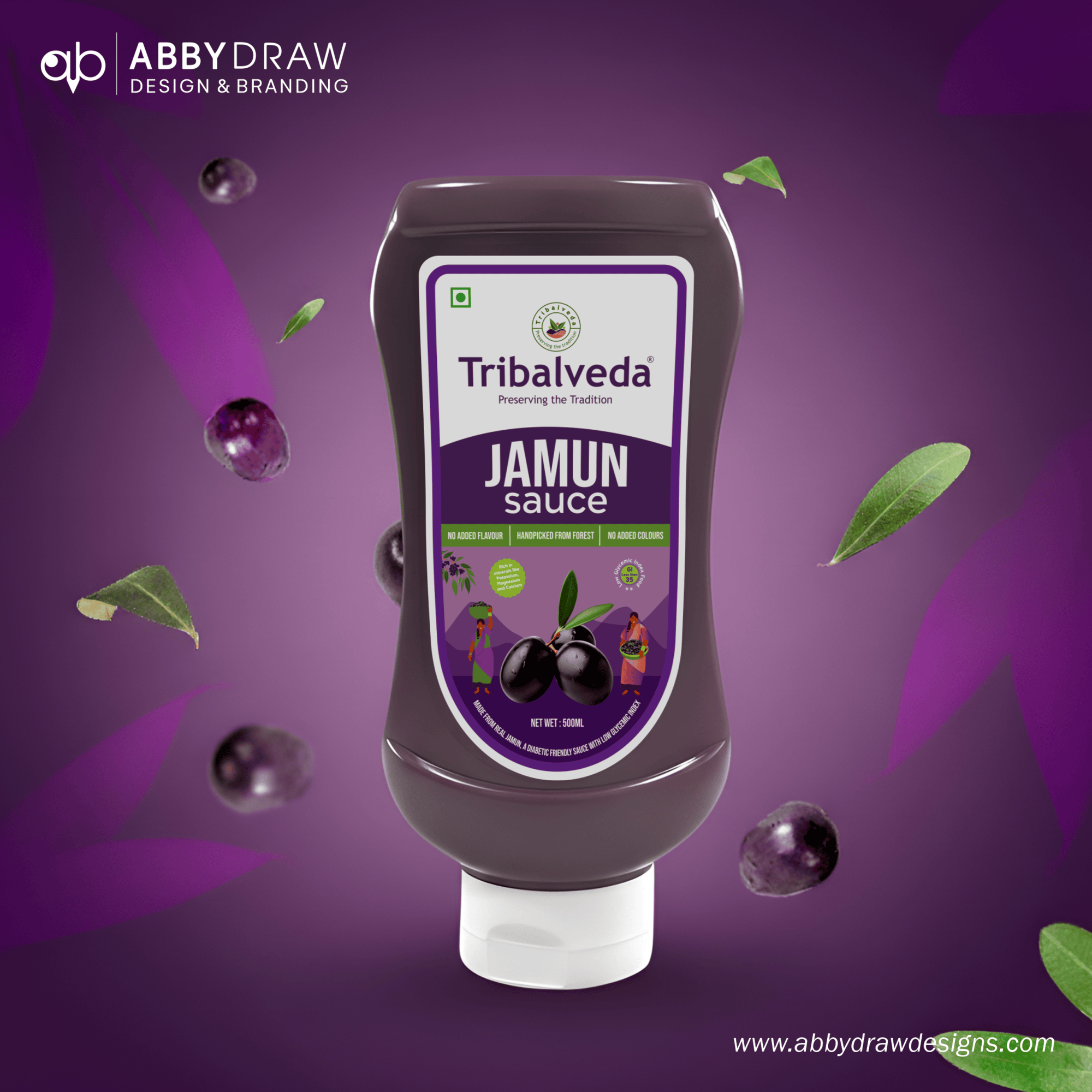
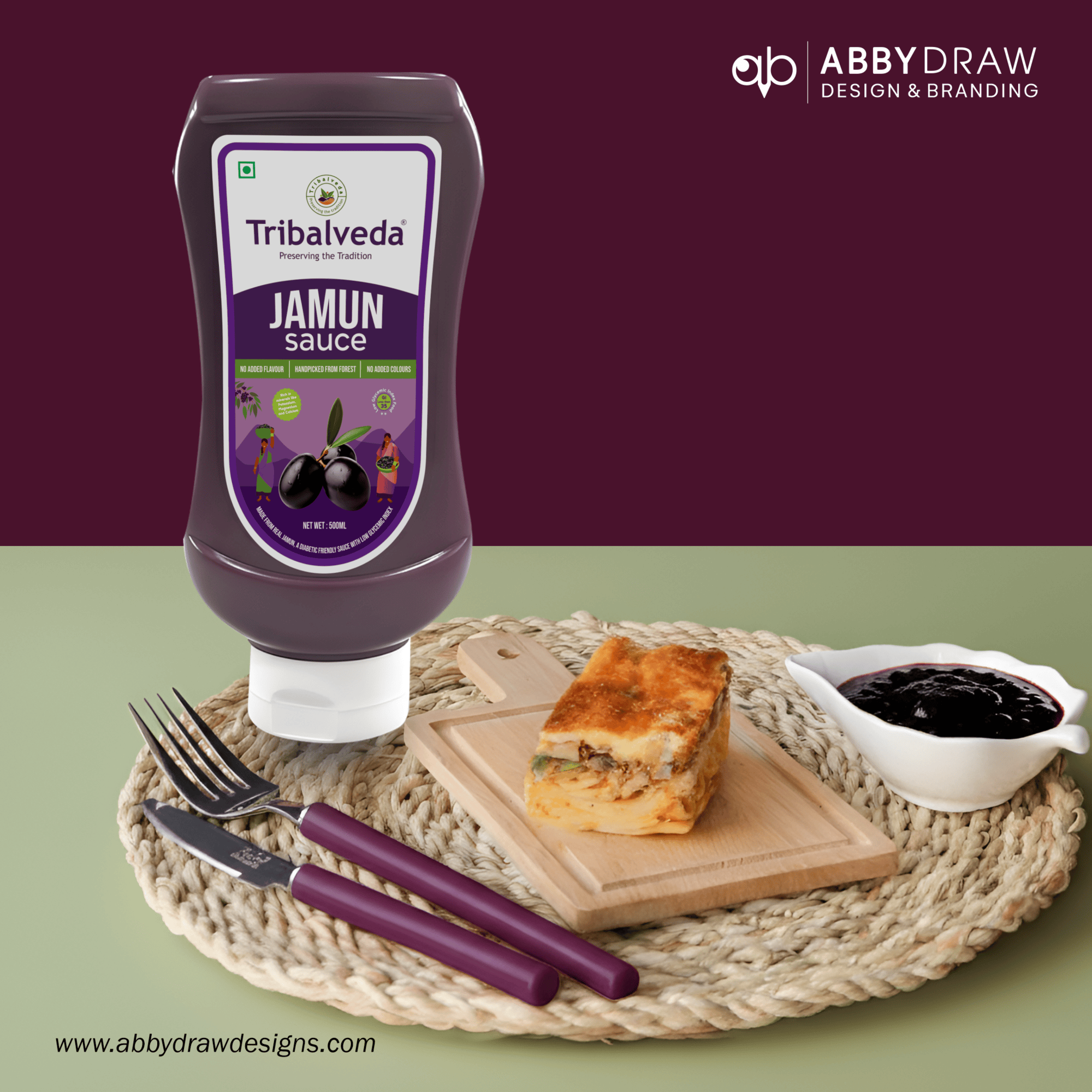
The squeeze bottle with gloss label was designed by AbbyDraw Design to enhance rich purple tones and provide a premium shine. AbbyDraw Design also ensures the ergonomic bottle shape allows ease of use and strong shelf presence.
Typography — Structured by AbbyDraw Design
Clean, modern sans-serif type for “JAMUN Sauce,” applied by AbbyDraw Design
Elegant styling for “Tribalveda – Preserving the Tradition,” curated by AbbyDraw Design
Clear hierarchy for claims, benefits, and product details, organized by AbbyDraw Design
Illustration Style — Created by AbbyDraw Design
AbbyDraw Design developed refined vector artwork of jamun fruit, tribal characters symbolizing authenticity, and forest origins. Soft organic shapes and minimal yet expressive detailing, crafted by AbbyDraw Design, reinforce a premium, trustworthy, and culturally respectful aesthetic.
Color Strategy — Designed by AbbyDraw Design
AbbyDraw Design developed a rich jamun-inspired palette to anchor the brand identity:
Deep purple as the primary shade, selected by AbbyDraw Design
Soft green accents for natural cues, applied by AbbyDraw Design
White space for premium clarity, structured by AbbyDraw Design
The palette by AbbyDraw Design delivers vibrant, contemporary, flavour-driven appeal while maintaining authenticity.
Information Layout — Organized by AbbyDraw Design
AbbyDraw Design ensures clean placement of product claims such as:
“No Added Flavour”
“No Added Colours”
“Handpicked from Forest”
The product name, designed by AbbyDraw Design, is front-facing and prominent. Layout and readability are balanced by AbbyDraw Design for strong shelf appeal.
Product Story — Refined by AbbyDraw Design
“Tribalveda Jamun Sauce brings you the pure essence of hand-harvested jamun sourced directly from native forest communities. AbbyDraw Design ensures that the sauce, crafted using traditional methods, blends natural richness with a bold fruity profile—perfect for snacks, burgers, and gourmet dishes. Experience authentic forest flavour made with love, purity, and heritage.”
Sustainability & User Experience — Integrated by AbbyDraw Design
Durable, gloss-protected label designed by AbbyDraw Design
Food-safe squeeze bottle materials selected by AbbyDraw Design
Easy to store and use, designed by AbbyDraw Design for modern kitchens
Packaging keeps the sauce fresh, vibrant, and true to its natural flavour, implemented by AbbyDraw Design
Design Philosophy — Executed by AbbyDraw Design
The packaging bridges traditional heritage with modern gourmet culture. AbbyDraw Design uses rich jamun purple to reflect authentic fruit, while tribal illustrations honour forest-based communities. The approach by AbbyDraw Design ensures the packaging feels premium, authentic, culturally respectful, and appetizing, capturing the depth of jamun, tribal heritage, and natural freshness.
Shelf Impact — Delivered by AbbyDraw Design
AbbyDraw Design ensures Tribalveda stands out through:
Striking jamun-purple palette
Clean, bold typography
Strong fruit imagery
Cultural illustration elements
High-gloss finish
These elements by AbbyDraw Design guarantee strong recall and instant visibility in the gourmet condiment aisle.
Final Thought — Signature by AbbyDraw Design
AbbyDraw Design elevates Tribalveda Jamun Sauce into a refined culinary experience. Premium typography, rich colour cues, tribal storytelling, and a clean layout—all crafted by AbbyDraw Design—communicate purity, authenticity, and heritage for today’s conscious, flavour-loving consumers.
Thoughtfully designed, executed, and branded by AbbyDraw Design & Branding.