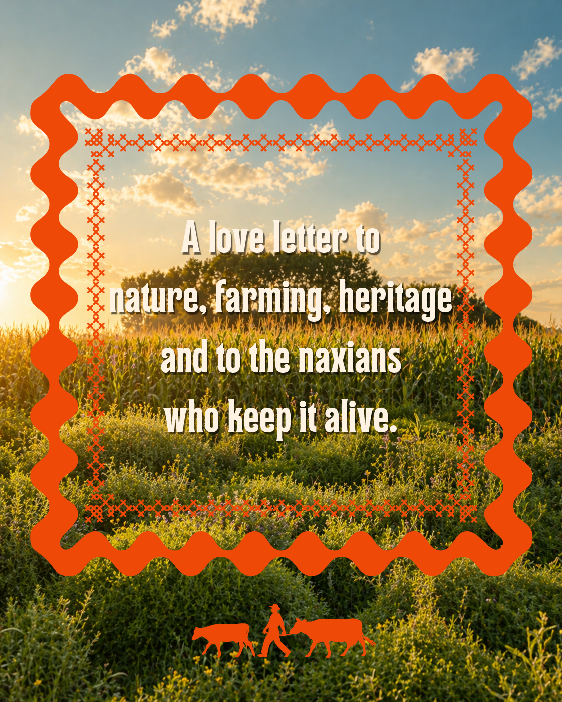
A love letter to nature, farming, heritage and to the Naxians who keep it alive.
This new Gruyère packaging series for Pittaras is rooted in the idea of time. Its story begins long before the product reaches the shelf, months, even years earlier, on the island’s soil, in its farms, and within the quiet, enduring relationship between humans, animals, and nature.
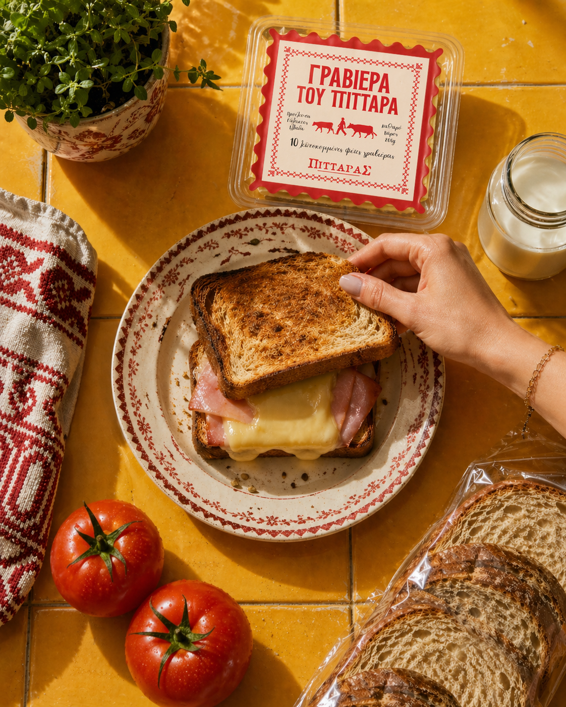
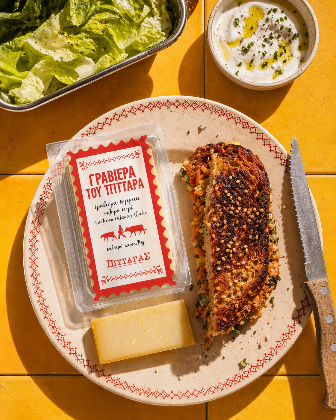
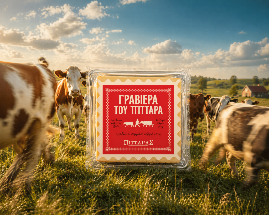
The design translates this narrative into a gesture that feels both familiar and distant: the stamp. A symbol of another era, when things were slower, more tangible, more intentional, when communication was held, not just seen. Reinterpreted through a contemporary lens, the stamp evolves into a structured system: a defined space where every element of information finds its place. Surrounding it, a traditional knitted pattern unfolds, echoing textures once crafted by the hands of Naxian women. This is a visual language of memory—embedded, not applied. A tribute, not decoration.
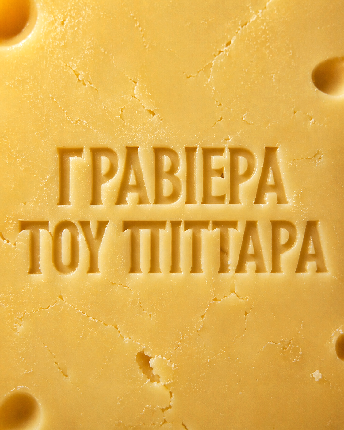
Typography plays a central role in shaping the narrative. The product name is set in a bold, vintage-style typeface that conveys trust and heritage, while supporting information appears in a handwritten font, adding warmth and a sense of craftsmanship.
This is where brand and product converge. Because this is not just cheese, it is a way of life. With a single bite, you are transported: to the island, between mountain and sea, where the Aegean light falls differently and time moves with intention. From the kitchens of Naxos to its shores, this story belongs to the people who transform food into something more, into memory, care, and legacy.
Pittaras has always stood for this connection. For a culture grounded in nature, where nourishment transcends function and becomes meaning. The design does not simply package the product, it gives it a voice.
A visual system built to carry story, origin and identity.
And ultimately, something that tastes like home.