Petals of Fragrance: UPRISE Agency Renews the Breesal Brand
Background:
Breesal is a home fragrance brand from Upeco.
Breesal home fragrances feature compositions from leading perfume houses, high-quality products, safety, and stylish packaging.
The brand’s portfolio offers a wide range of interior fragrance formats: classic diffusers, buds made of the finest rice paper, stylish wall hangings, and charming sachets.
Guided by modern fragrance trends, unique fragrances have been developed, imbued with the freshness of blooming meadows, the aroma of exotic gardens, the scent of ripe fruit, and luxury perfume.
The brand is available both on marketplaces and in brick-and-mortar stores, and its assortment includes several fragrance lines, each designed for a specific price segment—from mid-range to premium.
Challenge:
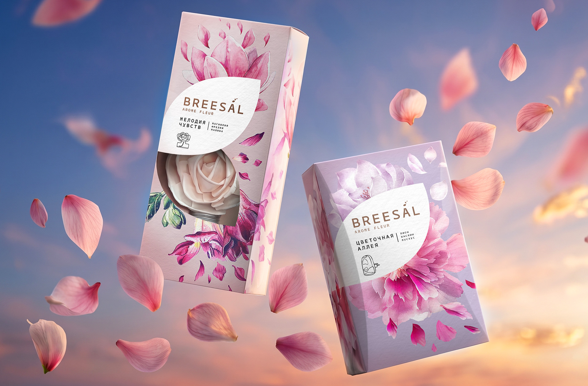
The UPRISE agency team was tasked with updating the positioning and visual communications for the Breesal Aroma line and bringing the corporate identity in line with modern trends.
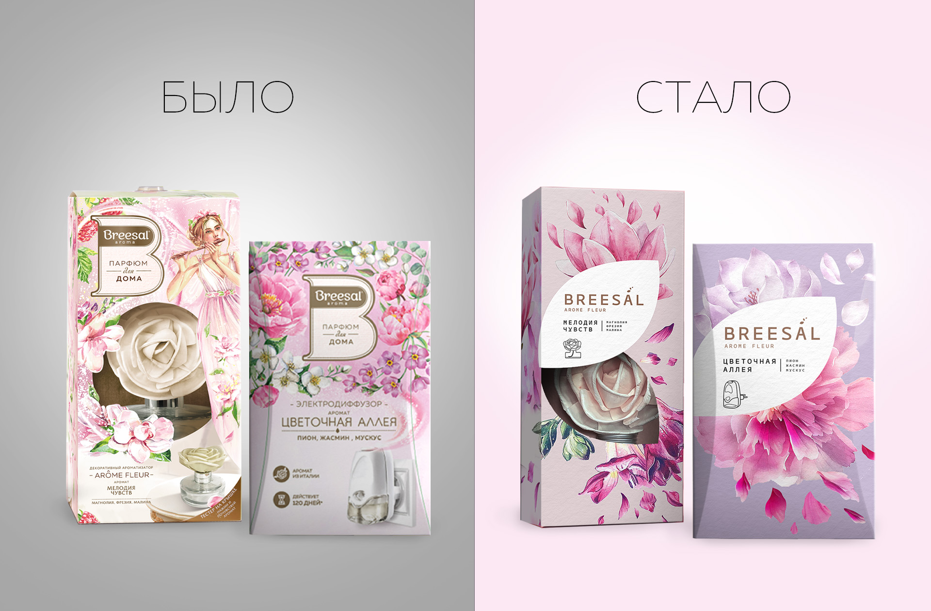
The old design was perceived by audiences as overloaded, with images of fairies appearing childish.
It was necessary to emphasize the lightness, purity, and freshness inherent in the brand’s philosophy, and to create a new visual identity for the line that would make the products stand out on store shelves and marketplaces. It was crucial to simplify the design, eliminating unnecessary details, and focus on minimalism and sophistication to convey a sense of transparency and naturalness.
Solution:
The brand is defined by the archetypes of the Creator and the Wizard. It combines a thirst for creativity and self-expression through magic and the transformation of space. The concept was based on creating an atmosphere that evokes a desire to discover the fragrance, sensing its subtle mystery and understatement.
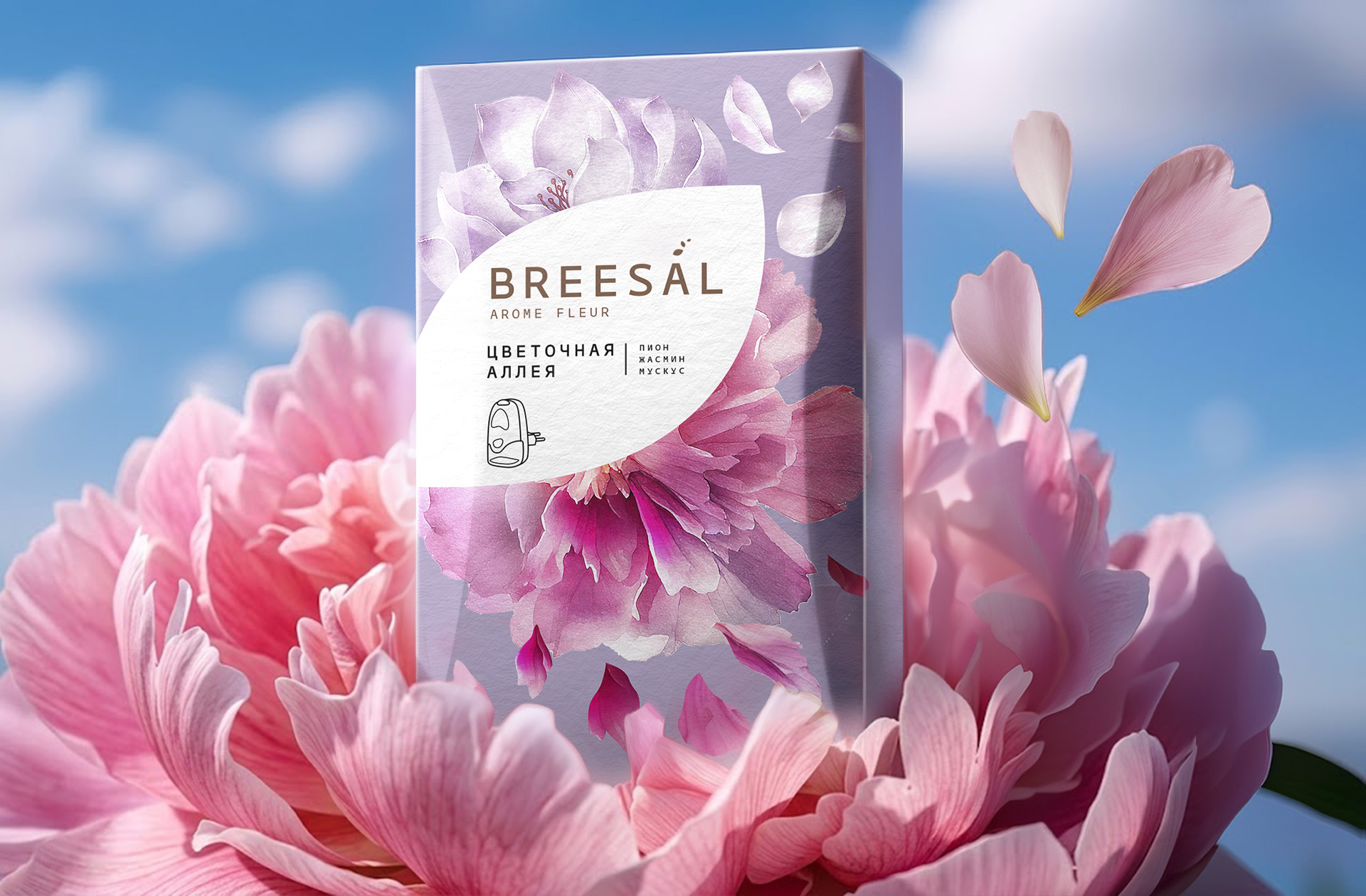
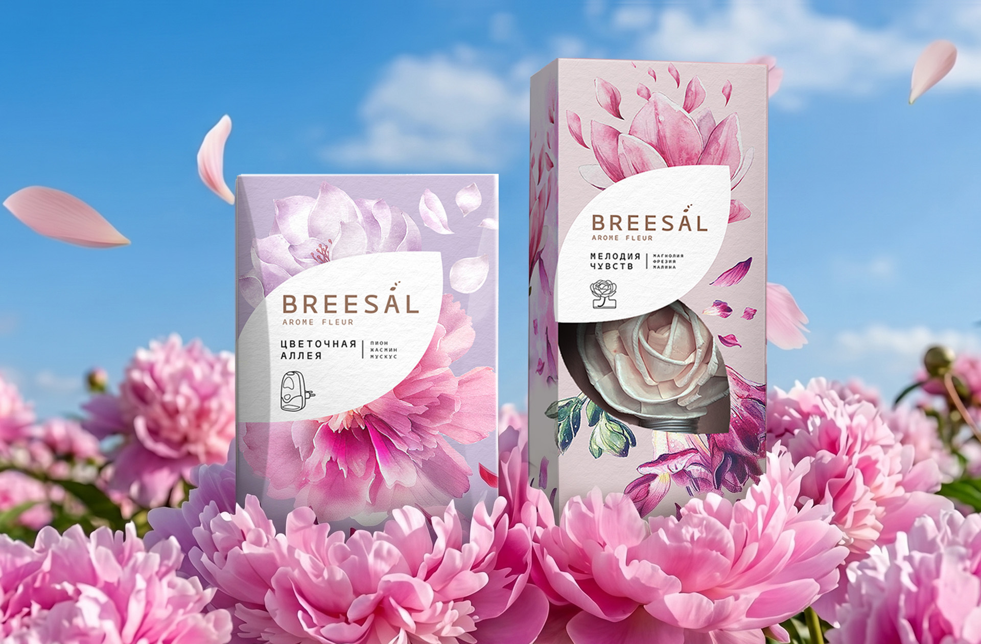
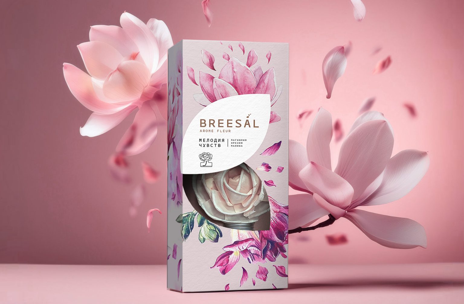
- The design solution was to create a concept that visually emphasizes the image of petals—a symbol of lightness, fragrance, and airiness.
- The illustrations are executed in a minimalist style, dominated by light tones and transparent elements, reminiscent of petals breaking away from a flower.
- The watercolor technique, a combination of gradients, and a “smoky veil” effect conveyed the concept of the space surrounding consumers—airy, pure, and mysterious.
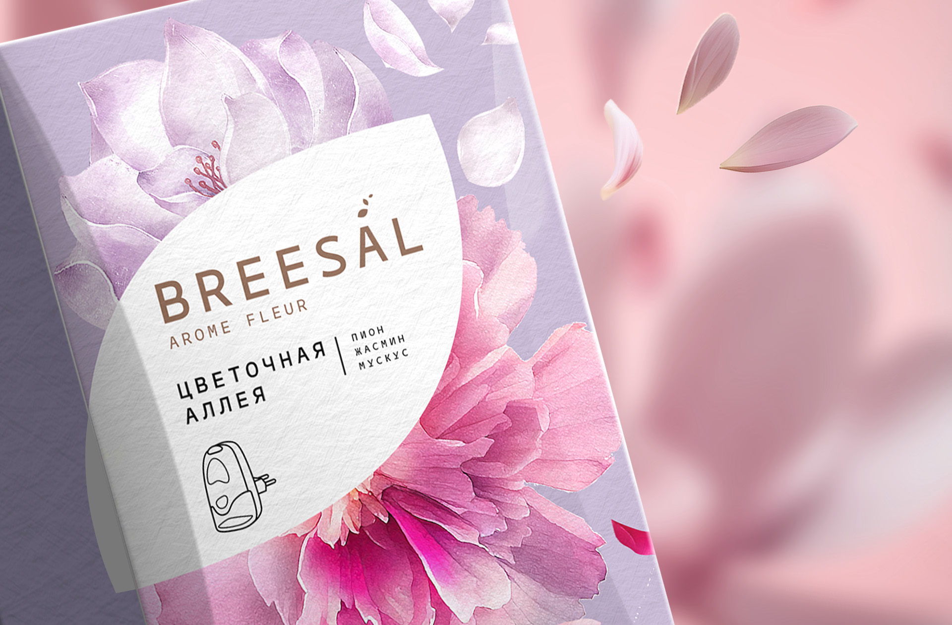
- The logo was completely redesigned: the large letter B disappeared, the font was changed, and a graphic element reminiscent of flying petals exuding fragrance was integrated into the letter A.
This approach allowed us to update the brand’s visual platform, make the packaging more modern, laconic, and attractive, and strengthen the communication of Breesal’s key values: freshness, purity, and elegance.