Kidolin is a baby care brand created around one simple idea: every product designed for children should feel as gentle and reassuring as the care they receive from their parents.
For the Baby Hair & Body Wash packaging, the challenge was to move away from the overly vibrant and cluttered visual language commonly found in the category and create an identity that communicates softness, safety, and trust at first glance.
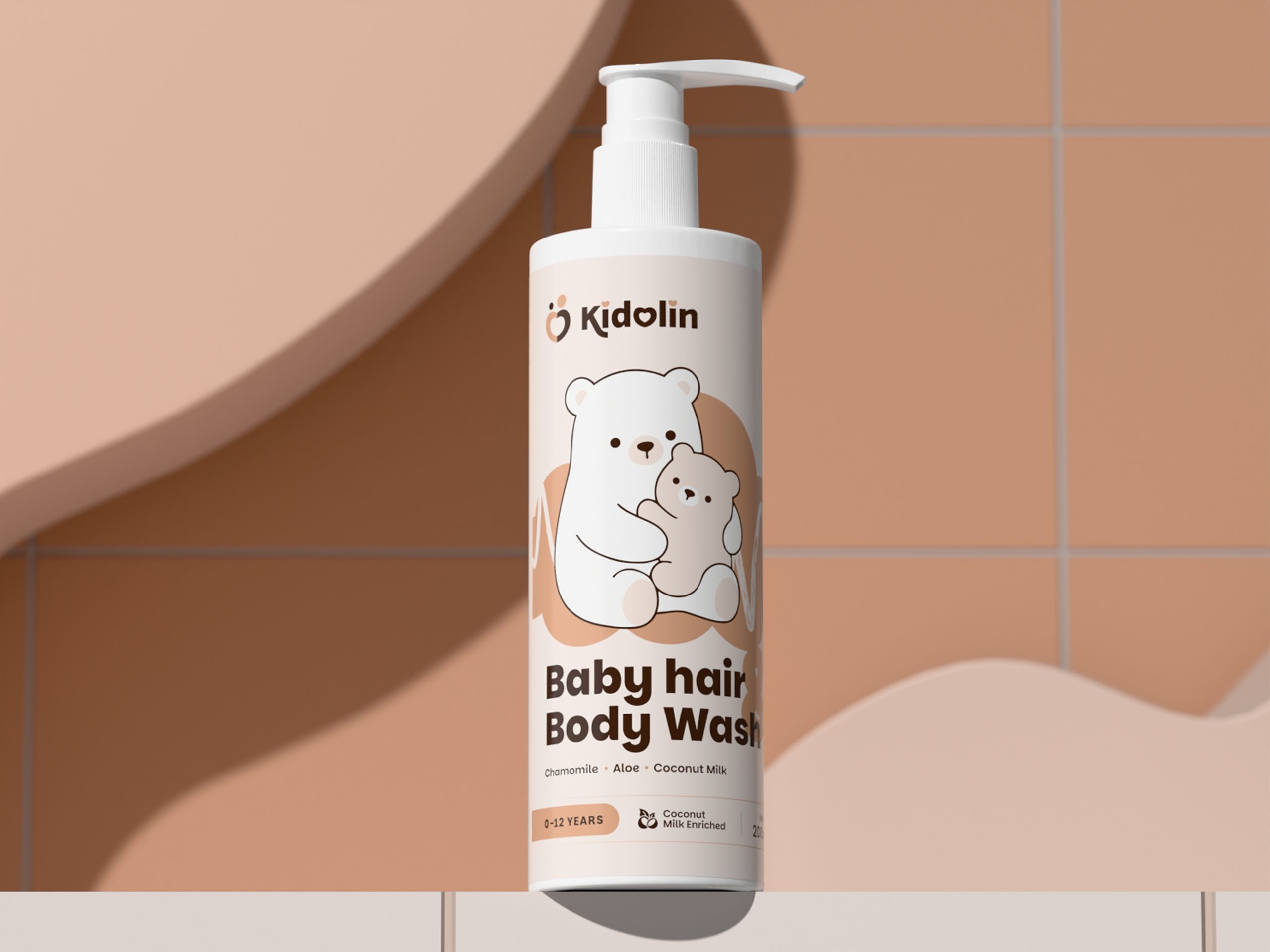
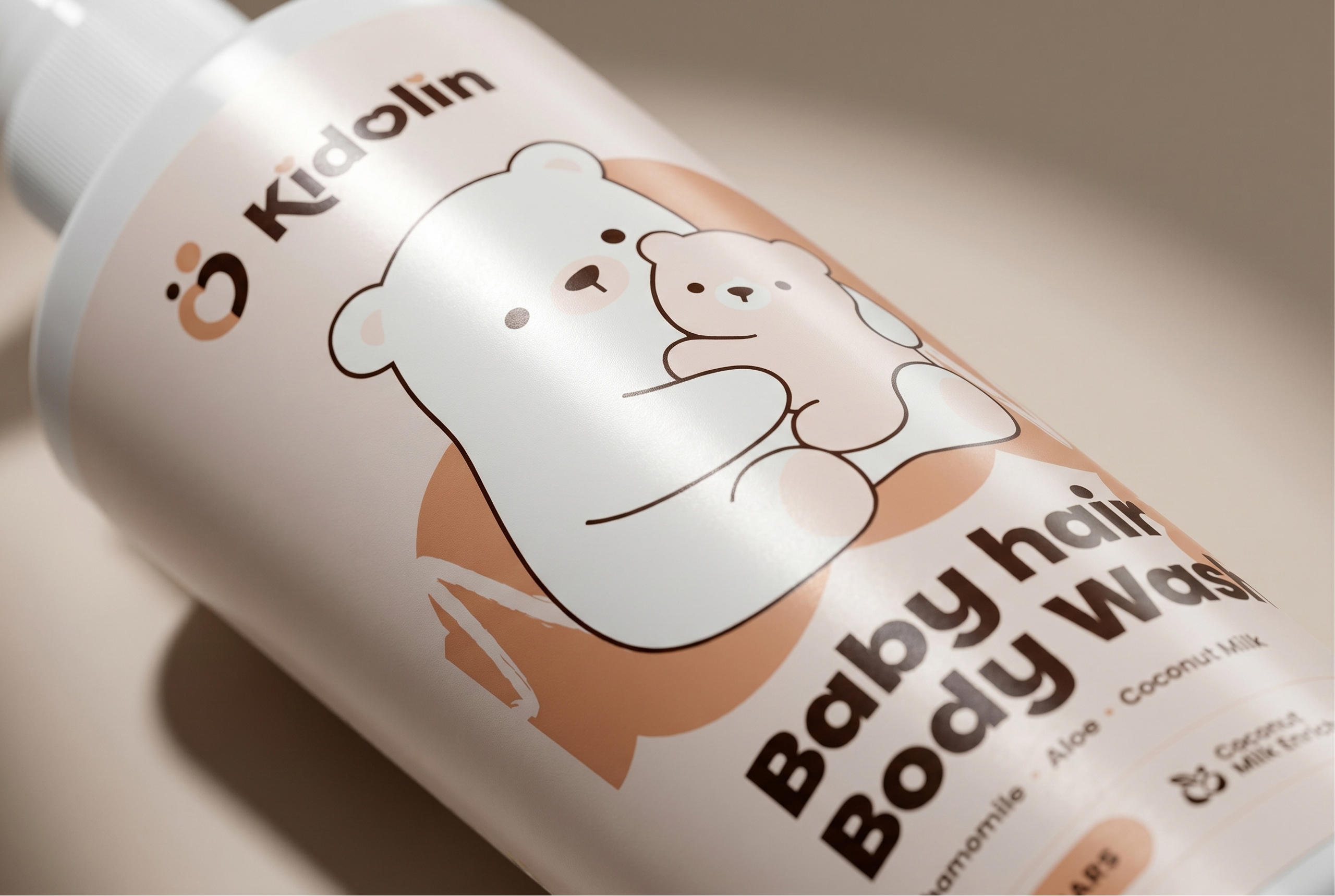
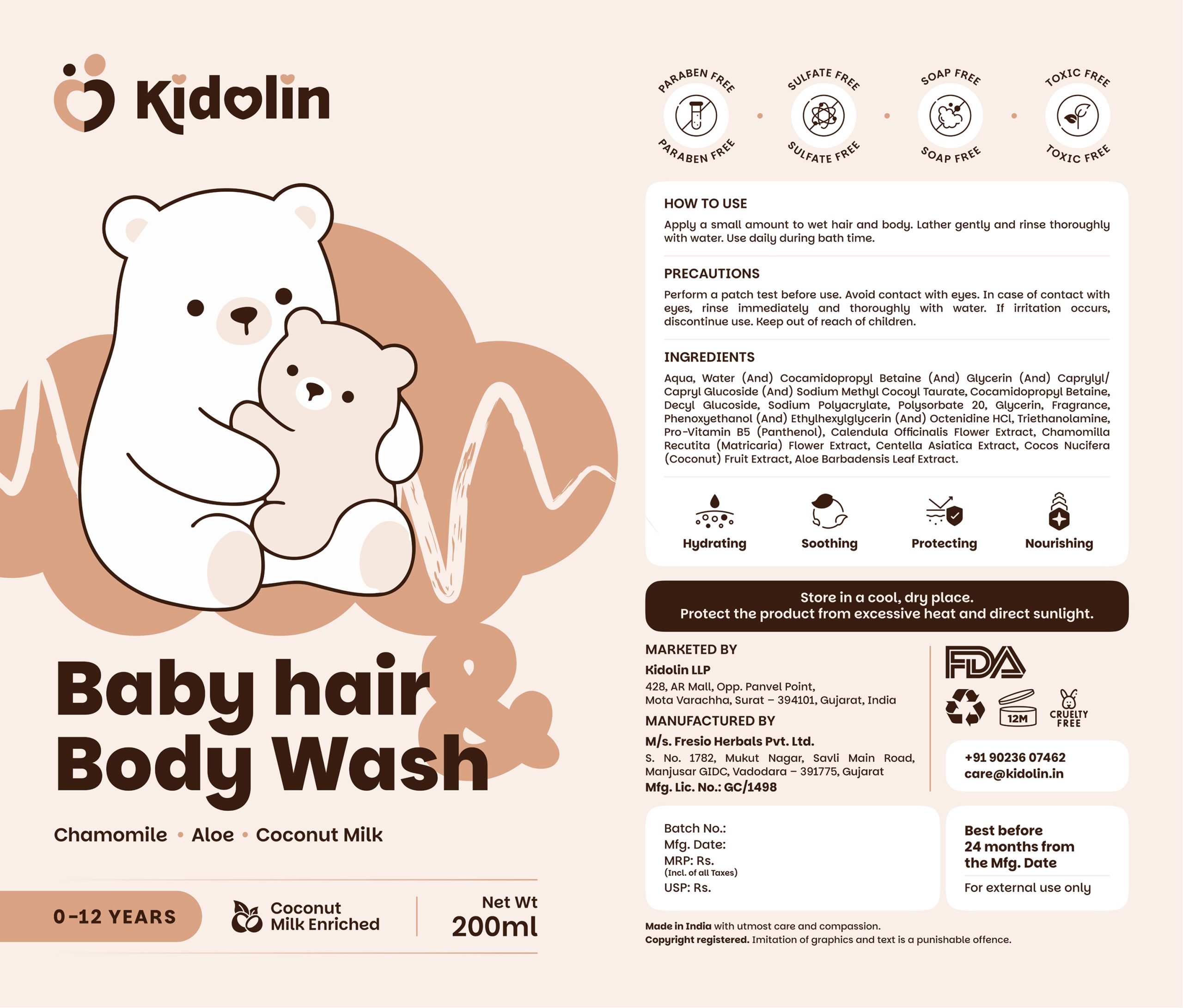
The design system is built around a calming neutral palette inspired by warmth, comfort, and early childhood. Soft peach tones, generous white space, and rounded typography work together to create a friendly and approachable appearance while maintaining strong shelf visibility.
At the heart of the packaging is an illustration of a parent bear embracing its cub a visual metaphor for protection, care, and the emotional bond between parent and child. This simple yet expressive graphic becomes the defining element of the product, helping the brand instantly communicate its purpose without relying on excessive visual noise.
Information hierarchy was carefully structured to improve readability for parents. Key product benefits, ingredients, age suitability, and safety claims are presented in a clean and accessible manner, ensuring trust and transparency remain central to the experience.
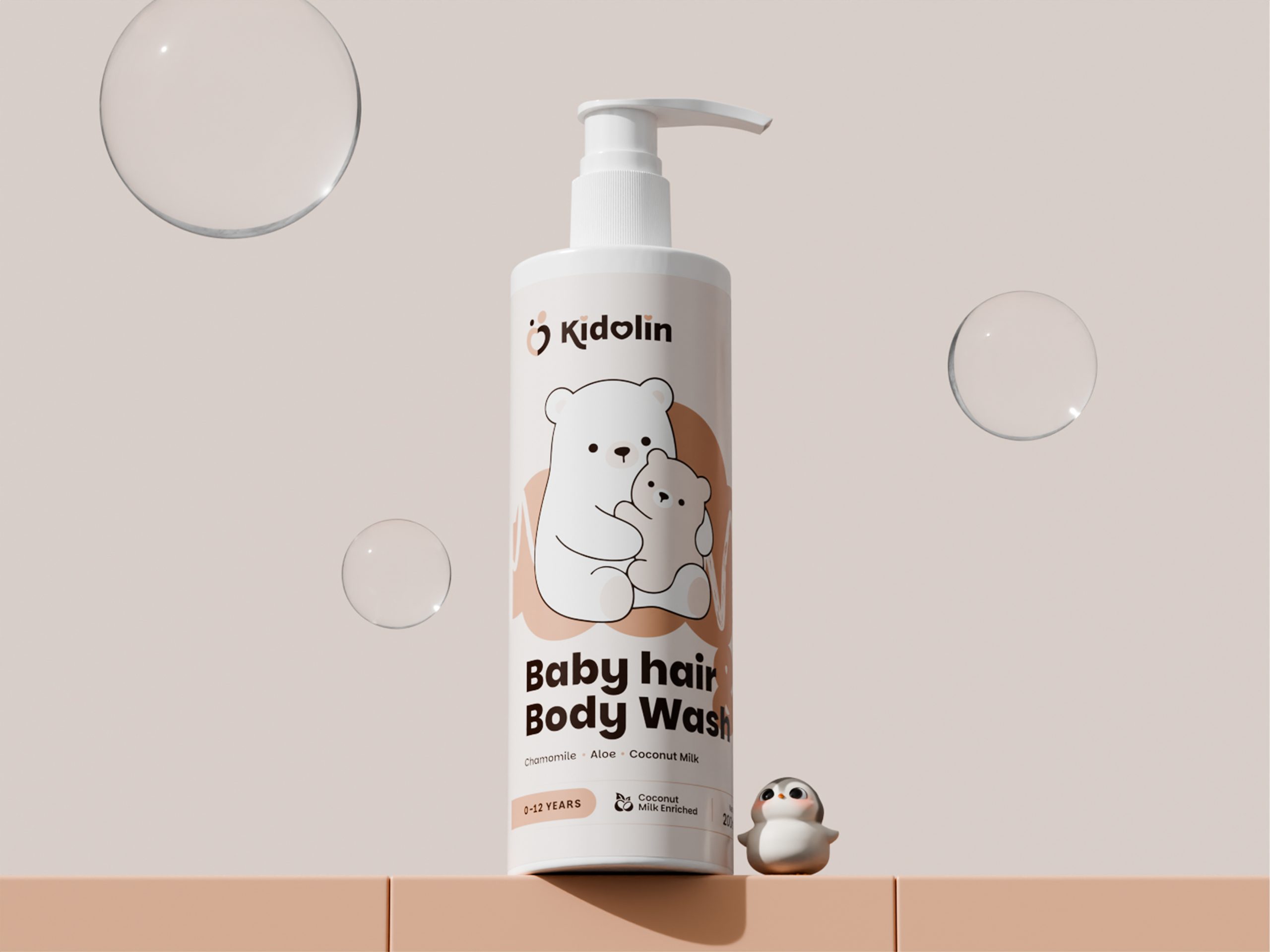
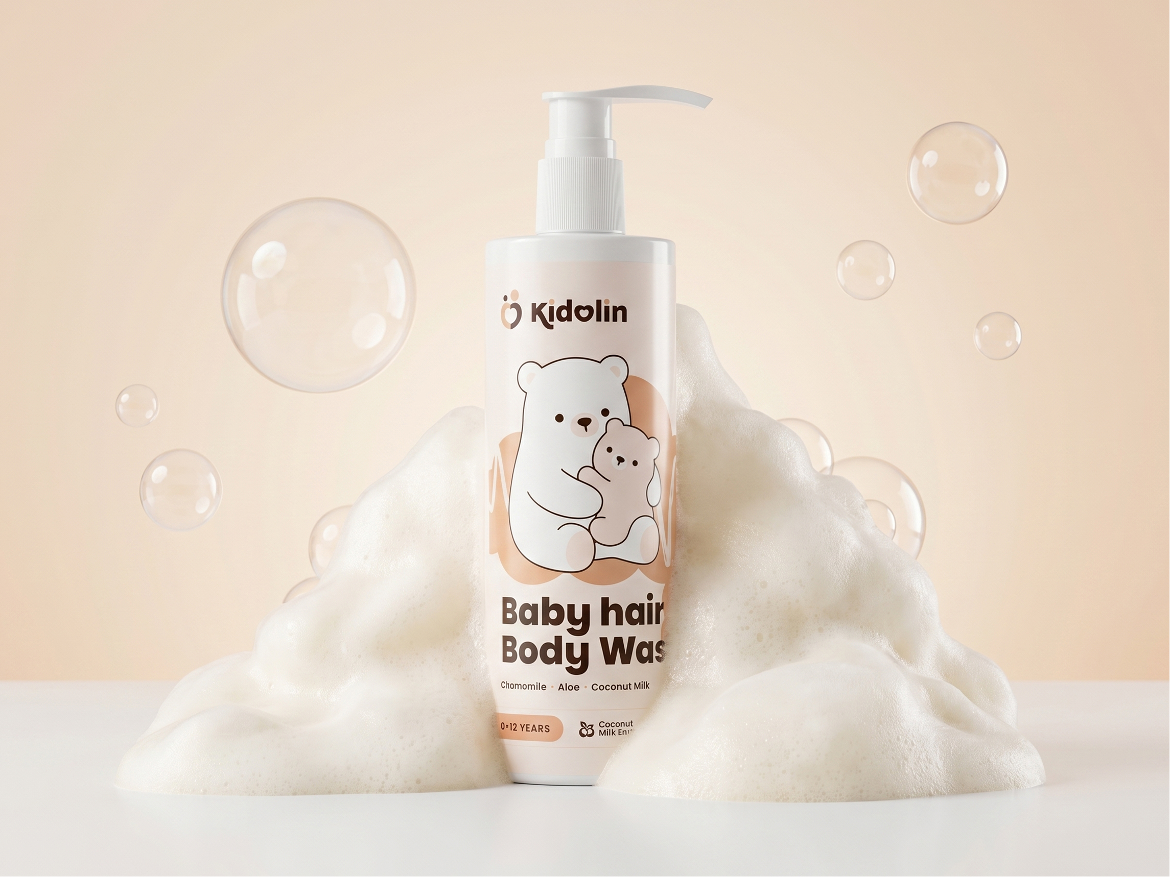
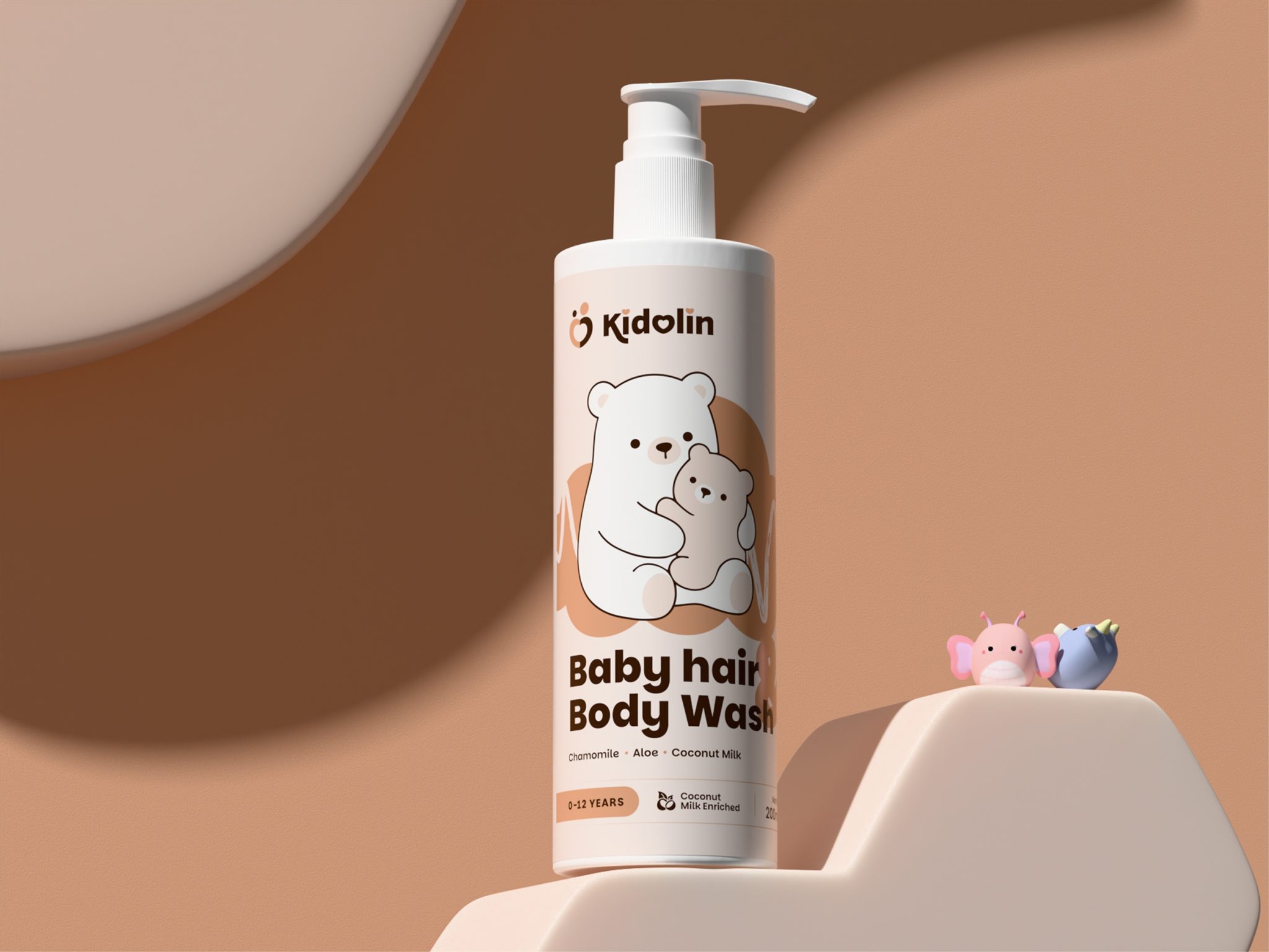
To complement the packaging design, a series of high-quality 3D visualizations were developed to bring the product to life across digital touchpoints. The renders extend the same soft and nurturing visual language through playful miniature characters, floating bubbles, and warm lighting, creating an environment that feels gentle, clean, and child-friendly.
The result is a packaging system that balances emotional storytelling with functional clarity transforming a daily care product into a brand experience that parents can immediately connect with and trust.