INTRO
A brand refresh for one of Australia’s most respected chefs, Matt Moran. We reimagined his identity and digital presence, developed a new packaging system for My Perfect Stock, and built a platform to tell his story, share recipes, and connect with a new generation of home cooks.
OUR APPROACH
We began by redefining Matt’s brand essence through a visual identity that captures his grounded confidence and deep sense of place. The new look needed to balance approachability with credibility — connecting his roots on the farm and experience in the kitchen, while resonating with everyday cooks across Australia.
MY PERFECT STOCK
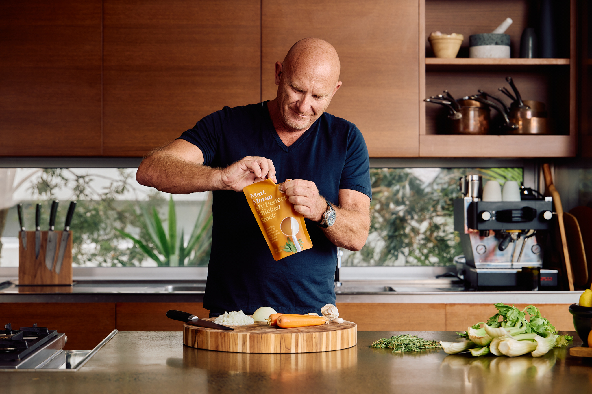
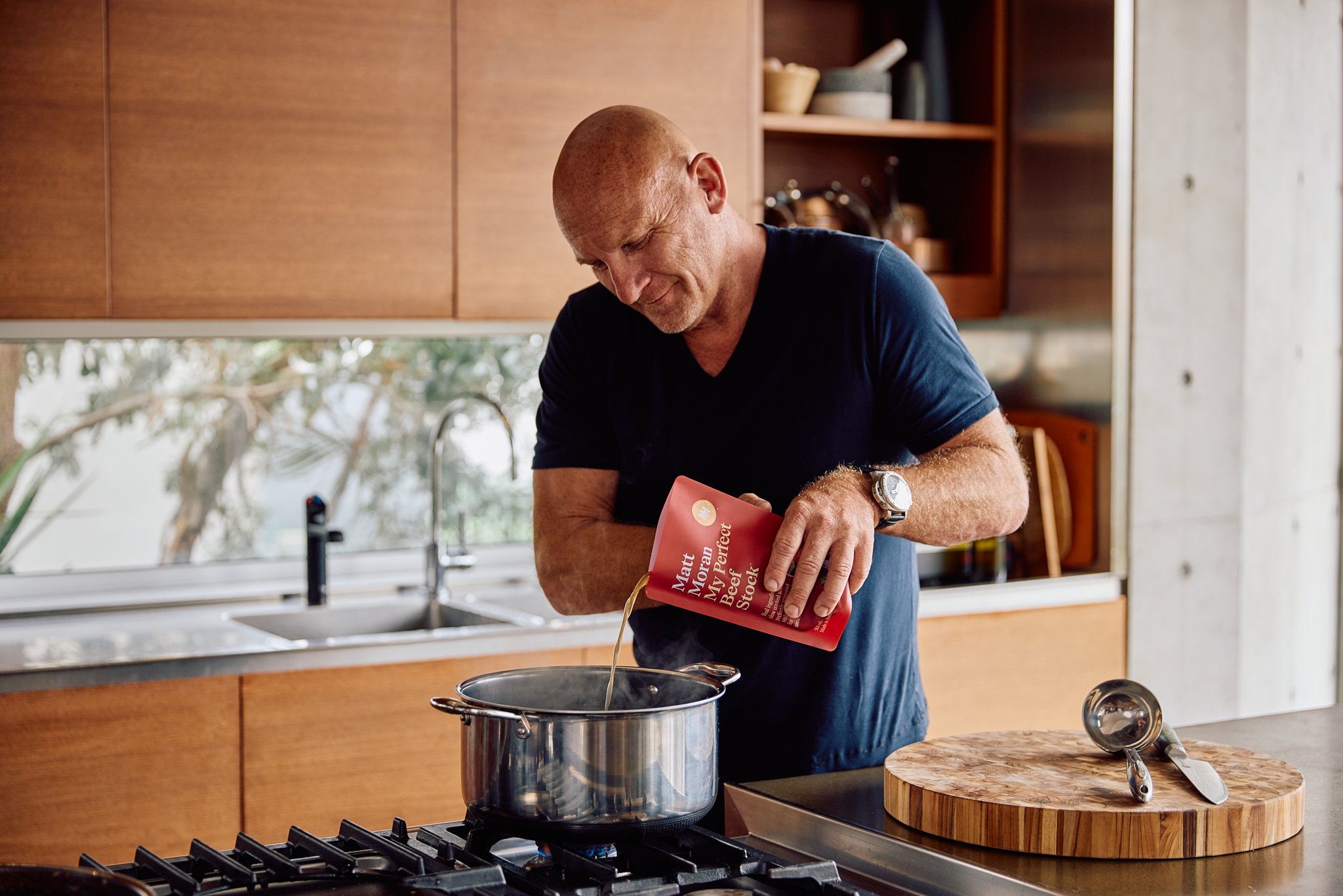
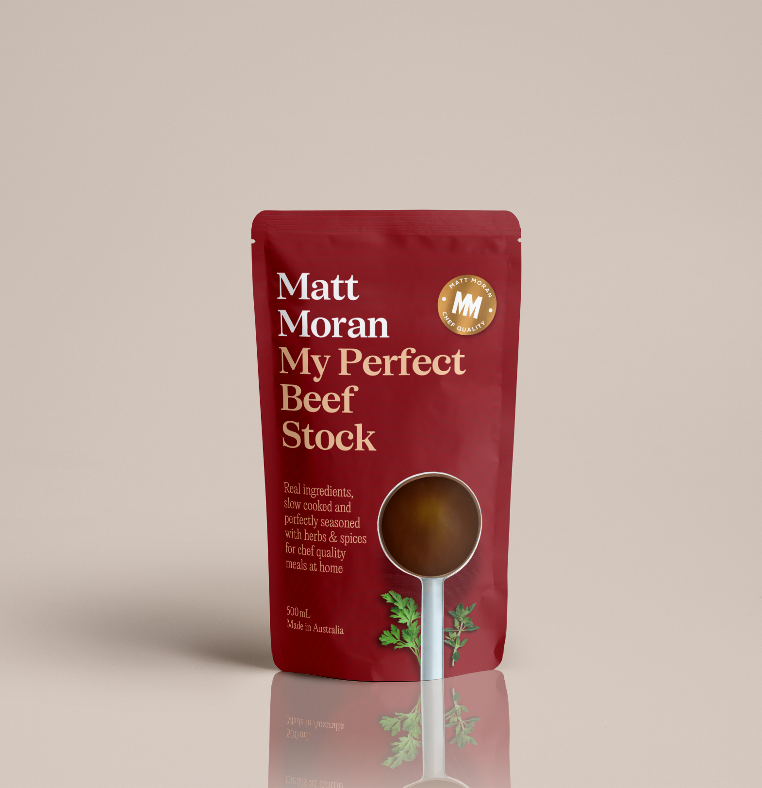
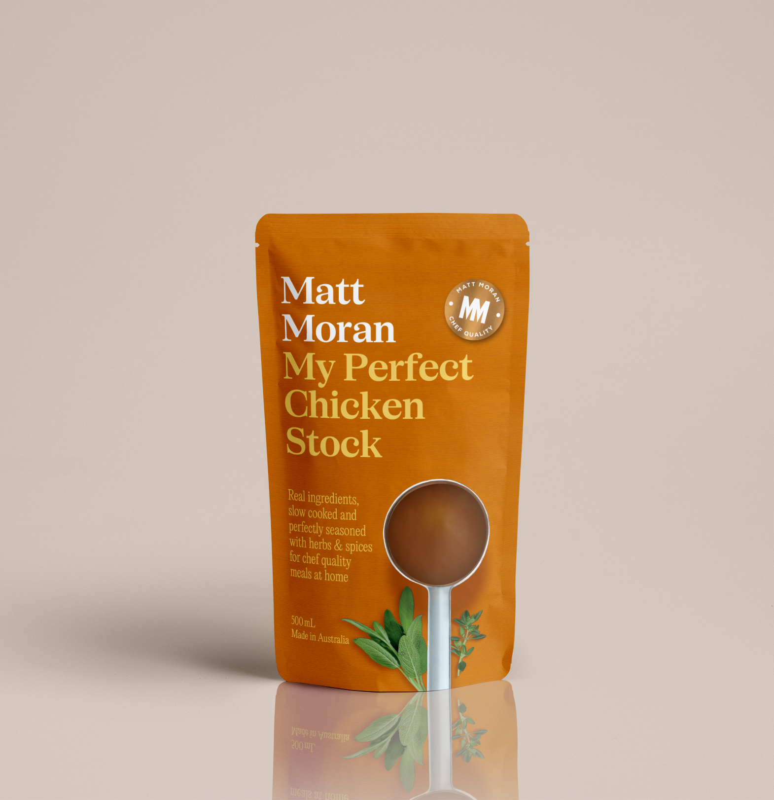
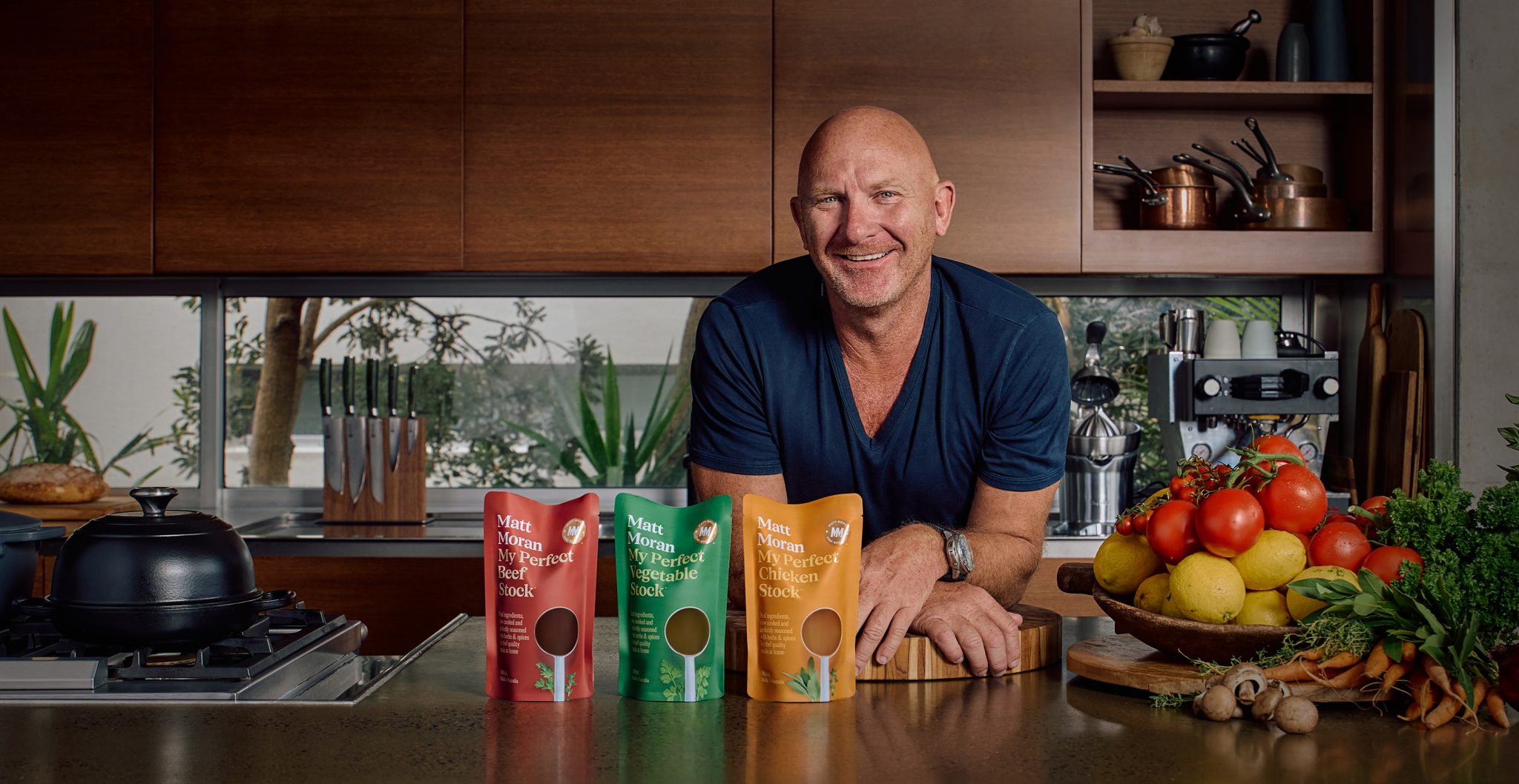
We created a distinct identity and packaging system for My Perfect Stock, Matt Moran’s new supermarket range. The design balances simplicity with strong shelf presence — rich, earthy tones and a clear typographic hierarchy bring clarity and confidence in the aisle.
Inspired by classic cookbook covers, the packaging feels familiar yet refined, reinforcing the chef-quality positioning and Matt’s trusted reputation. A gold brand seal was introduced as a signature device — building brand recognition and IP, while signalling quality at a glance.
A custom window, masked in the shape of a chef’s ladle, heroes the product and nods to the essential tools of the kitchen. Every detail was considered to connect with the brand’s promise of restaurant-level flavour, made simple.
THE RESULT
My Perfect Stock is now stocked in major supermarkets across Australia. The updated identity and platform position Matt for long-term growth — as a chef, founder, and master of the modern Australian kitchen.
Credits
Client: Matt Moran
Creative Directors: Matthew Squadrito
Designers: Lawrence Wilms, Sienna Zadro
Project Manager: Lauren Temple
Production Manager: Chris Davey
Strategy: Terry Squadrito, Kylie Hudson