TASK
Create a bold and memorable brand for a new iced tea line with five fruit flavors. The product needed a short name, distinct visual identity, and packaging.
SOLUTION
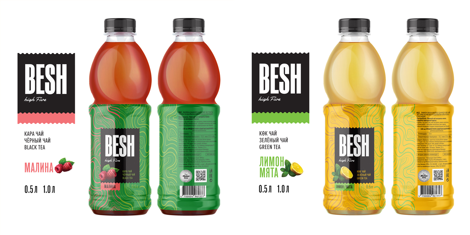
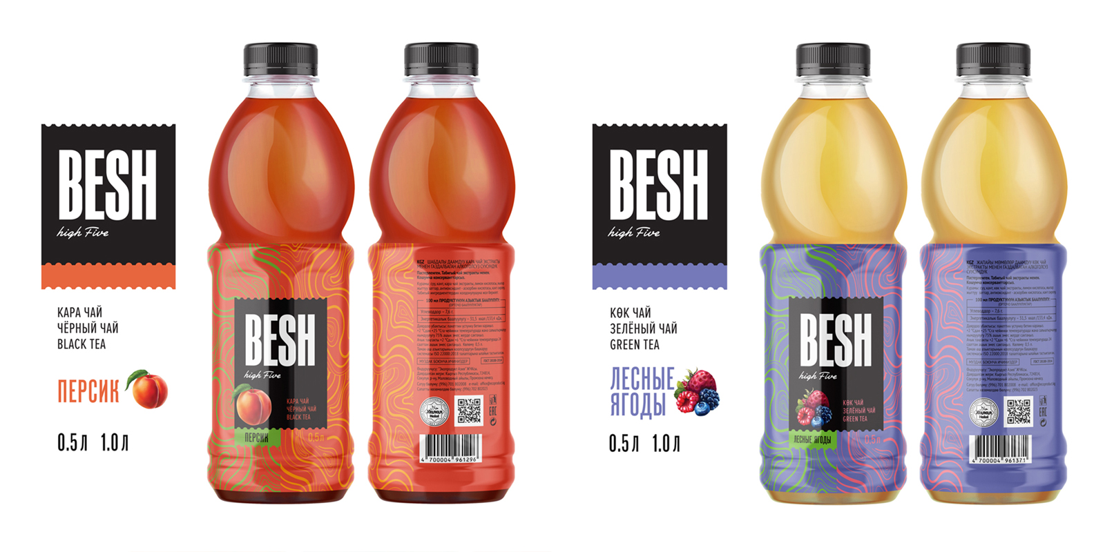
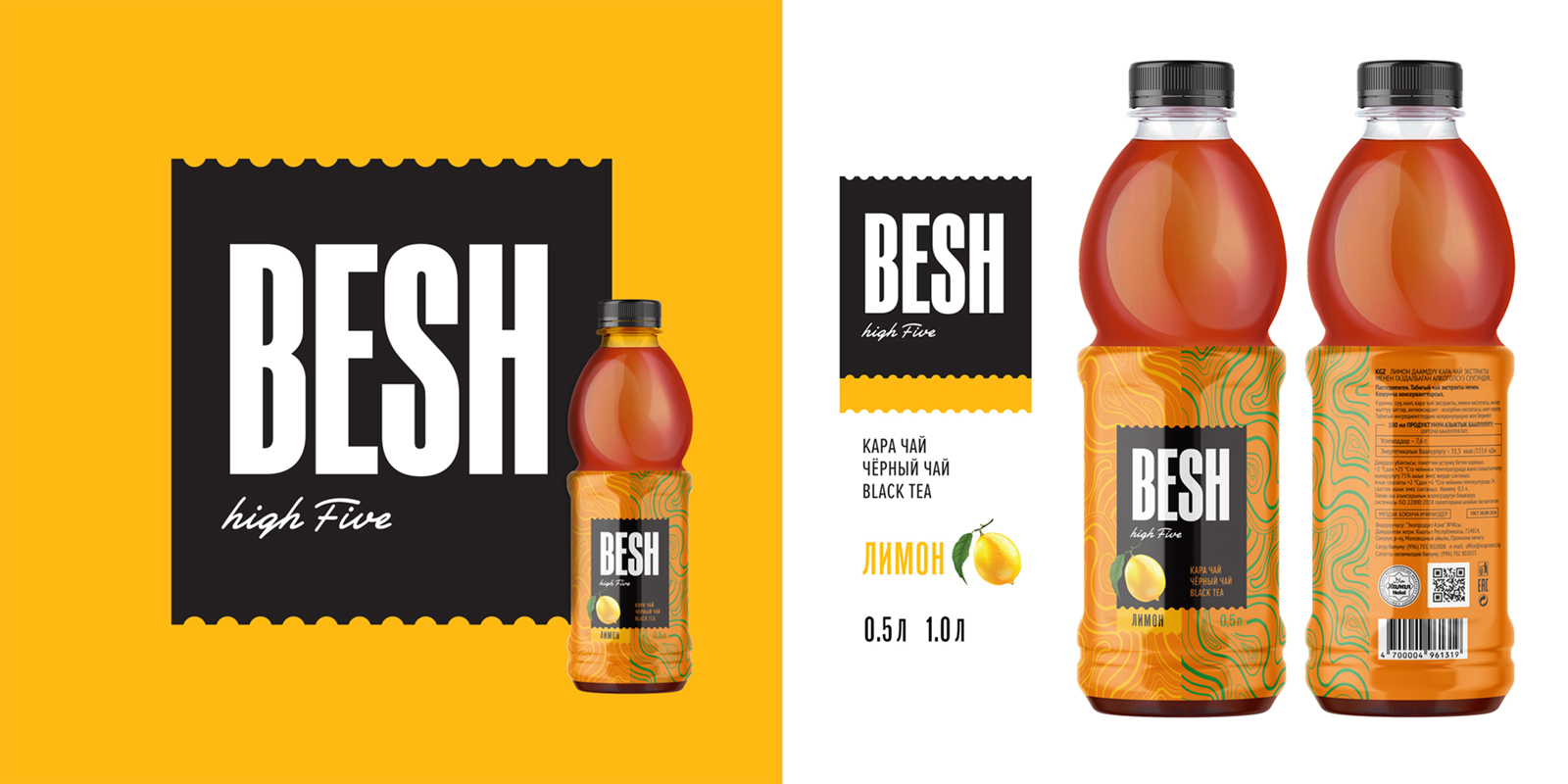
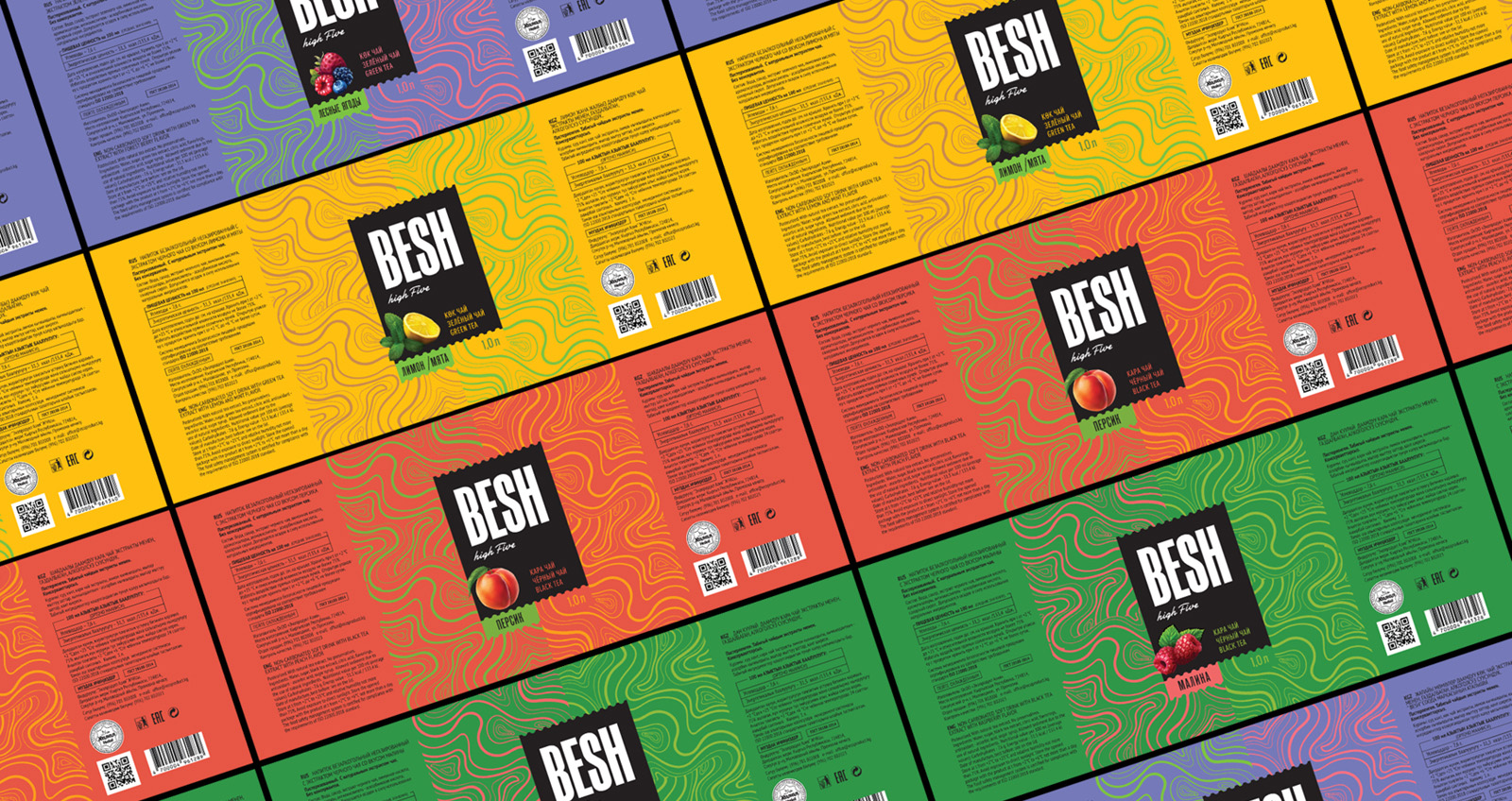
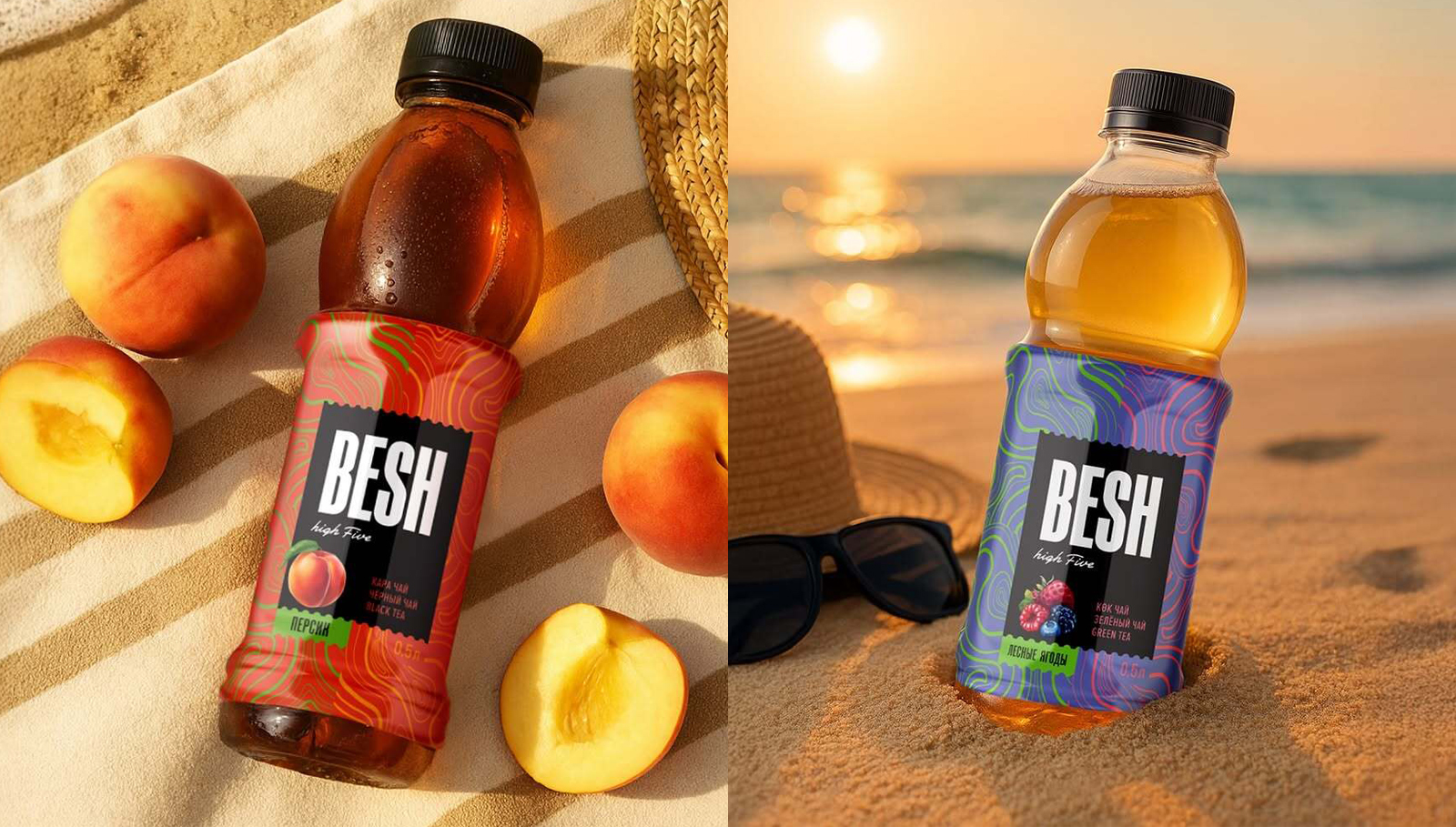
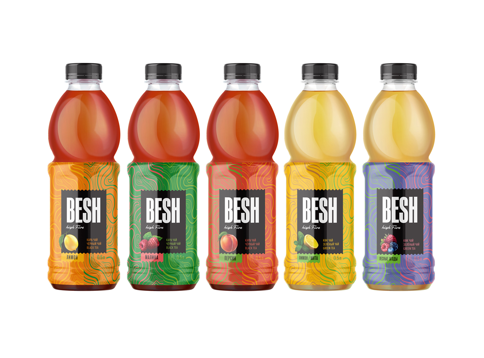
We developed the name BESH, meaning “five” in Kyrgyz — a nod to the flavor count and to the slang name for Bishkek (“Bish”). The visual system features a black-and-white logo for contrast, paired with bright backgrounds and custom patterns inspired by fruit and tea. Each flavor has its own color palette, creating a vibrant, modular system.
RESULT
BESH stands out on shelves with a youthful, energetic look. The design is flexible across formats and marketing materials, helping position the brand as fresh and modern.