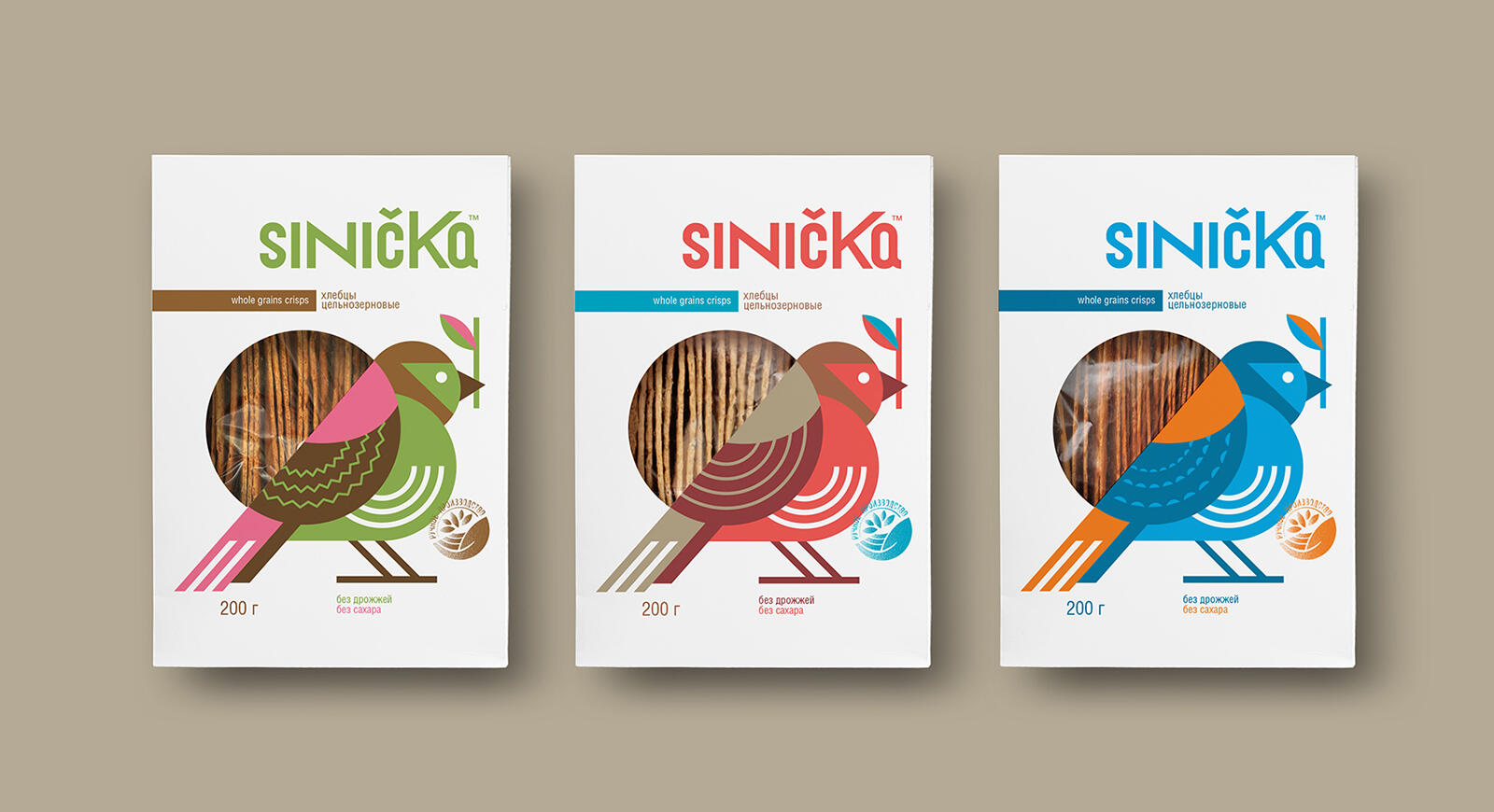
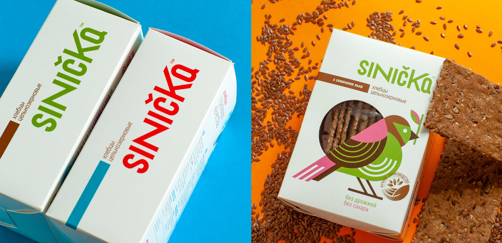
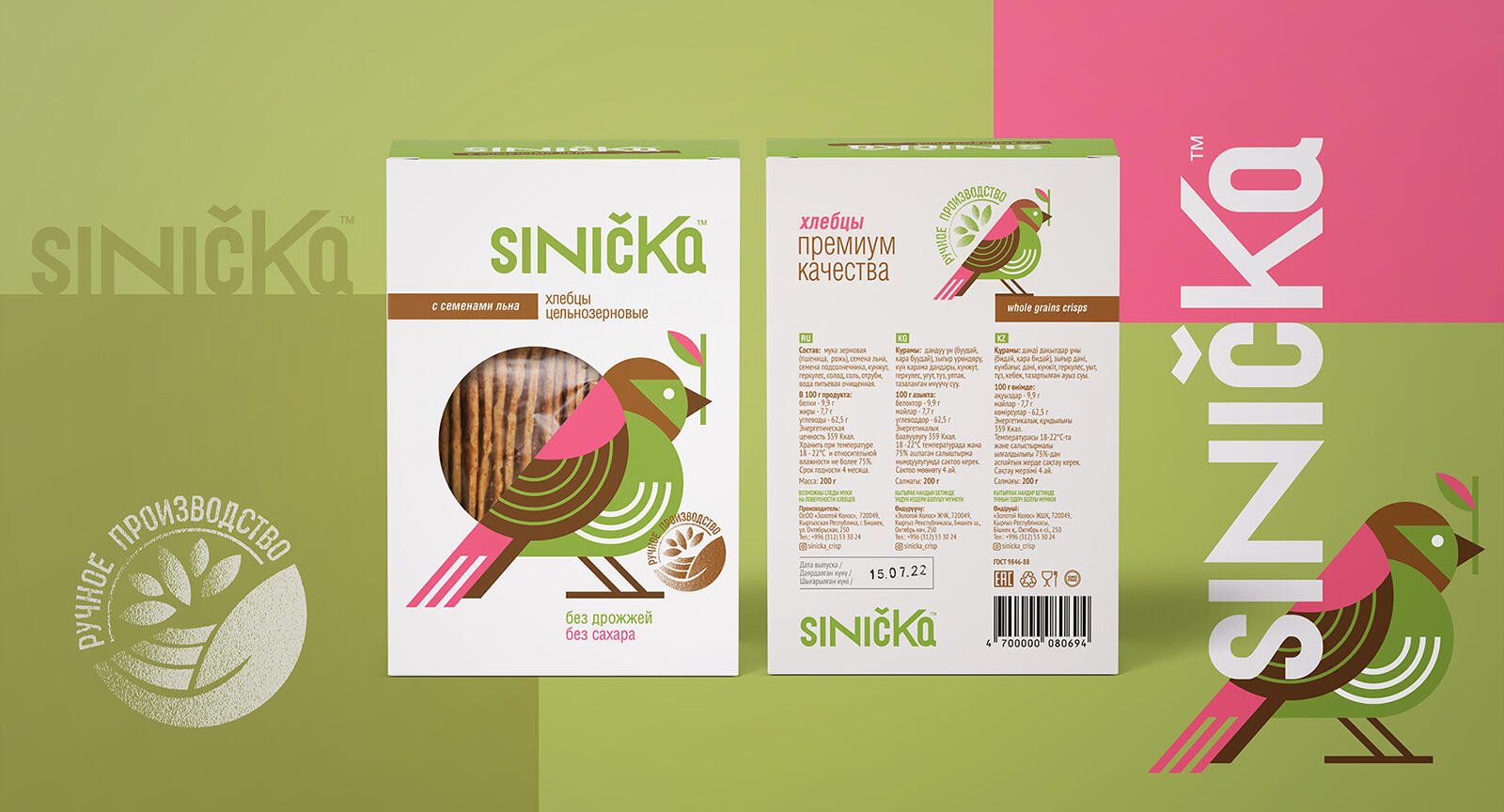
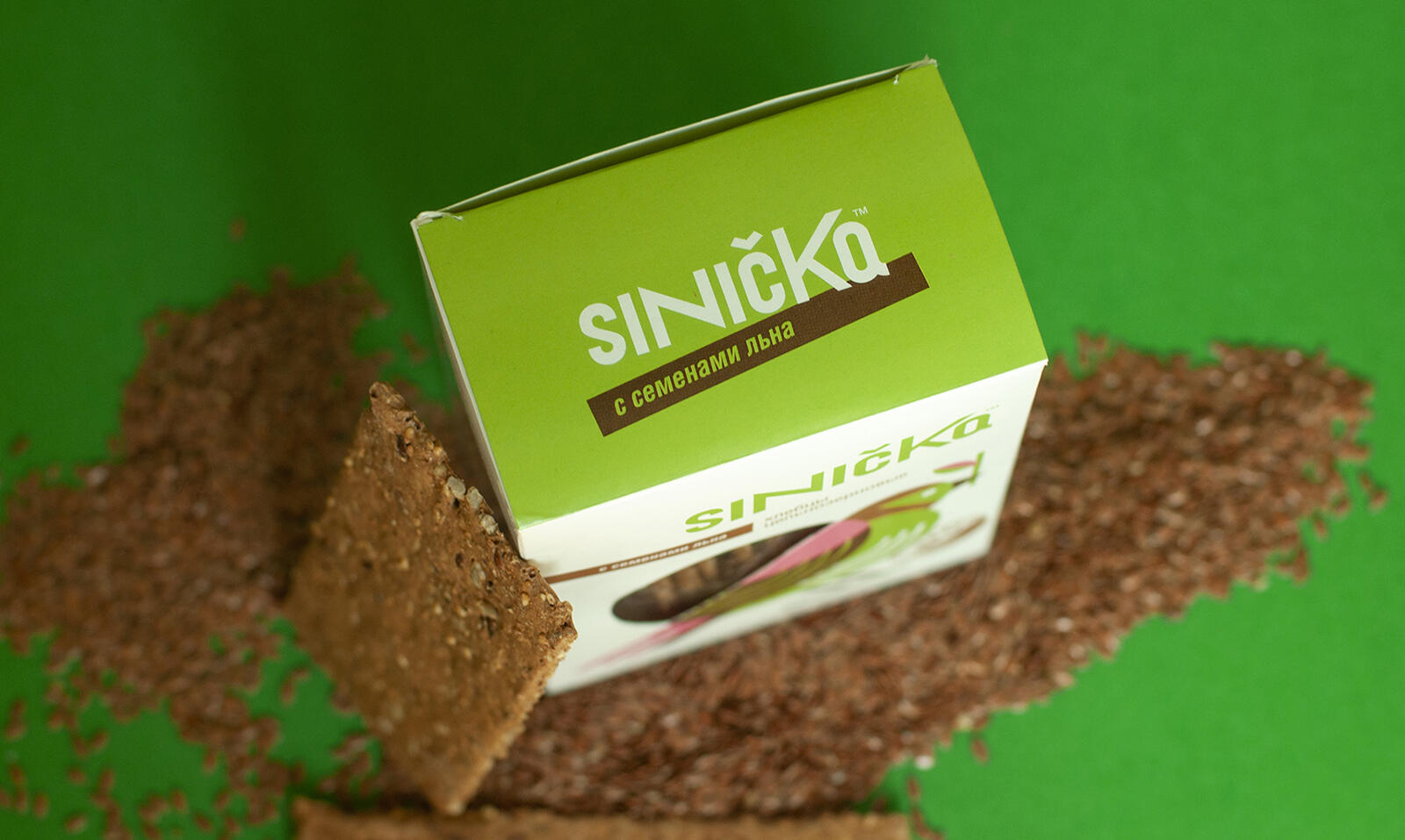
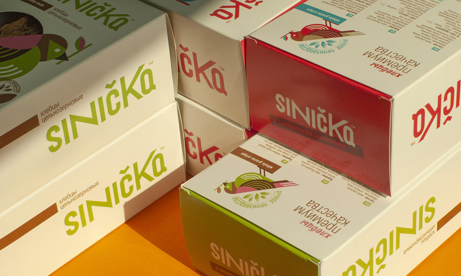
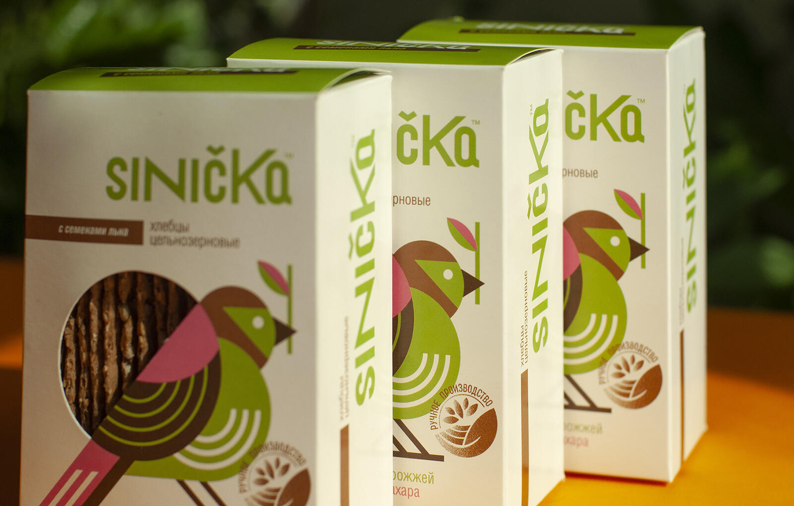
A product from Kyrgyz Republic: a mini-series of special crispbreads with grains.
Naming and positioning:
An original name was coined, associated with birds, and at the same time creating the impression of an export European product. Why a bird? Birds can not be deceived – they select for themselves only natural selected grain. And this is the main message of the brand — selected grains, and handmade. Naming and design for an advanced audience who are willing to pay for a slightly more expensive but special handmade product.
Visual Solution:
A modern font logo and a stylized image in which the window shape of the product itself is embedded. An attractive product is honestly visible through the bird that selects the grains.
![](https://i0.wp.com/packagingoftheworld.com/wp-content/uploads/2022/05/Sinicka_4.jpg?fit=1600%2C870&ssl=1)
![](https://i0.wp.com/packagingoftheworld.com/wp-content/uploads/2022/05/Sinicka_5.jpg?fit=1600%2C776&ssl=1)
![](https://i0.wp.com/packagingoftheworld.com/wp-content/uploads/2022/05/Sinicka_6.jpg?fit=1600%2C864&ssl=1)
![](https://i0.wp.com/packagingoftheworld.com/wp-content/uploads/2022/05/Sinicka_3.jpg?fit=1600%2C1066&ssl=1)
![](https://i0.wp.com/packagingoftheworld.com/wp-content/uploads/2022/05/Sinicka_2.jpg?fit=1600%2C941&ssl=1)
![](https://i0.wp.com/packagingoftheworld.com/wp-content/uploads/2022/05/DSC_0193.jpg?fit=1600%2C957&ssl=1)
![](https://i0.wp.com/packagingoftheworld.com/wp-content/uploads/2022/05/DSC_0186.jpg?fit=1600%2C958&ssl=1)
![](https://i0.wp.com/packagingoftheworld.com/wp-content/uploads/2022/05/DSC_0128.jpg?fit=1600%2C1020&ssl=1)