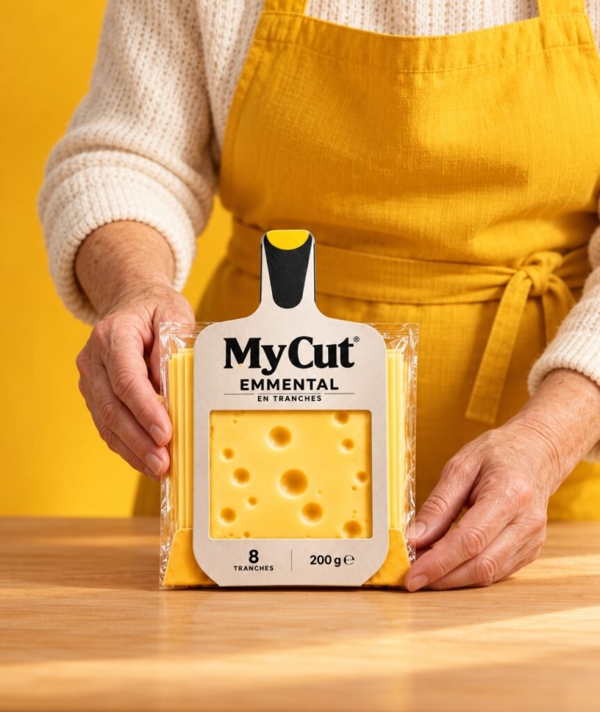

What if the packaging could tell the story of the product before you even open it?
Meet MyCut, a fresh approach to sliced cheese packaging that transforms an everyday kitchen tool into a distinctive brand experience.
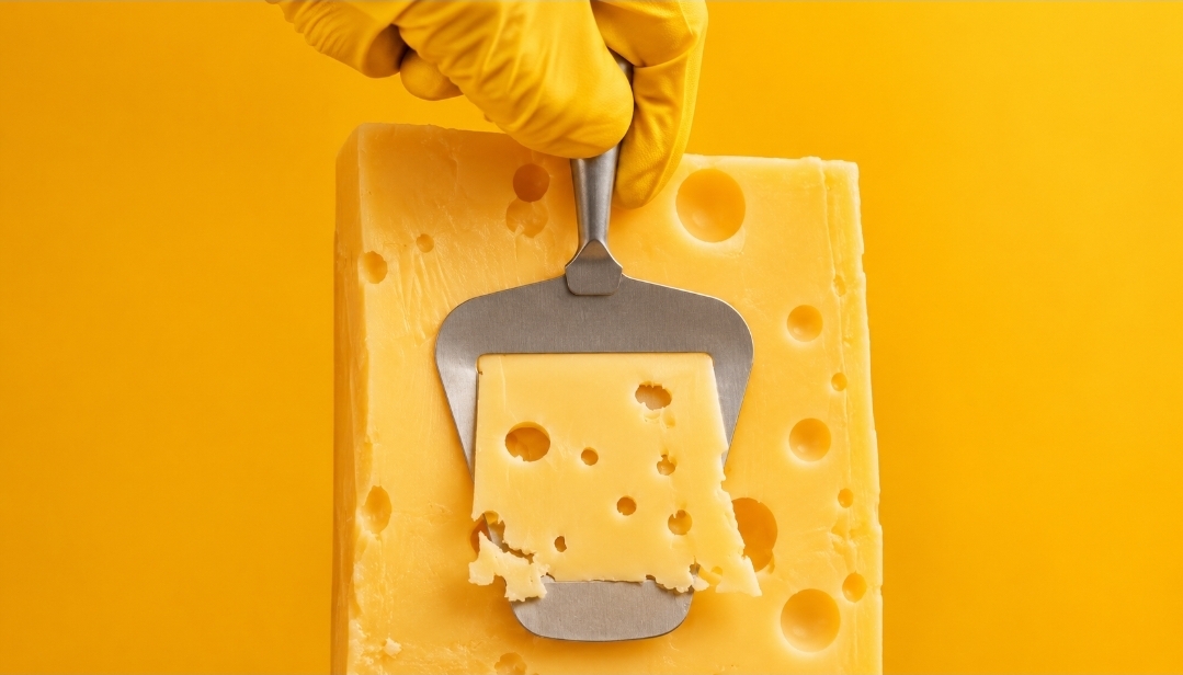
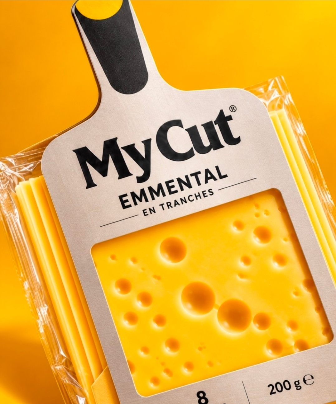
Inspired by the familiar shape of a cheese slicer, MyCut reimagines conventional Emmental packaging through a simple yet powerful creative idea: bringing the gesture of cutting cheese directly into the design.
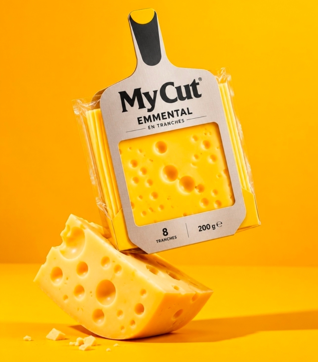
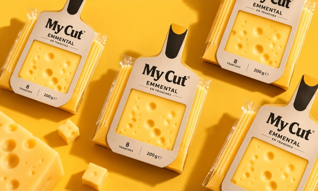
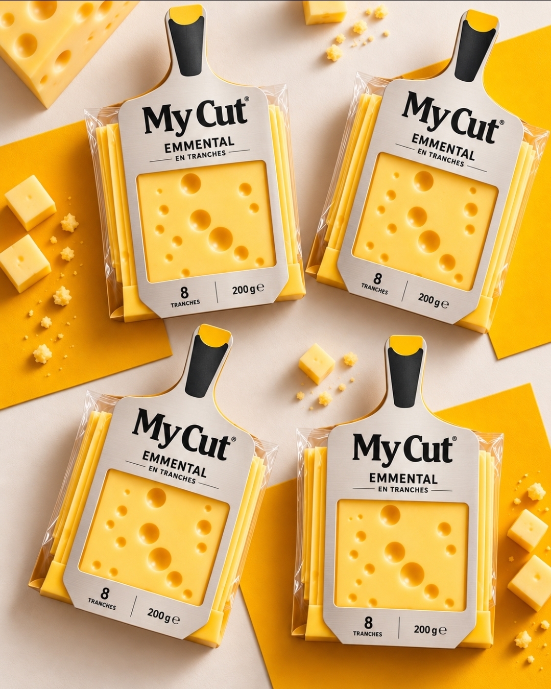
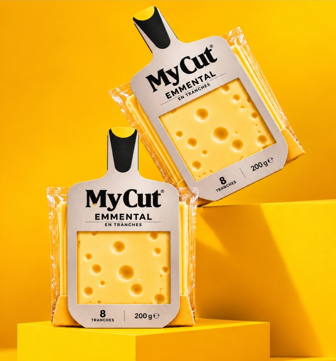
The result is a packaging concept where form, function, and storytelling come together. A specially shaped front panel recreates the silhouette of a traditional cheese slicer, while a generous central window puts the product itself in the spotlight.
Every detail contributes to the concept. The bold black typography establishes a strong brand personality, the metallic-inspired surface references the original kitchen utensil, and the vibrant yellow palette celebrates the richness and character of Emmental cheese.
Beyond aesthetics, MyCut challenges the predictable visual codes of the cheese category. Instead of relying on traditional dairy imagery, the brand builds its identity around an object everyone recognizes.
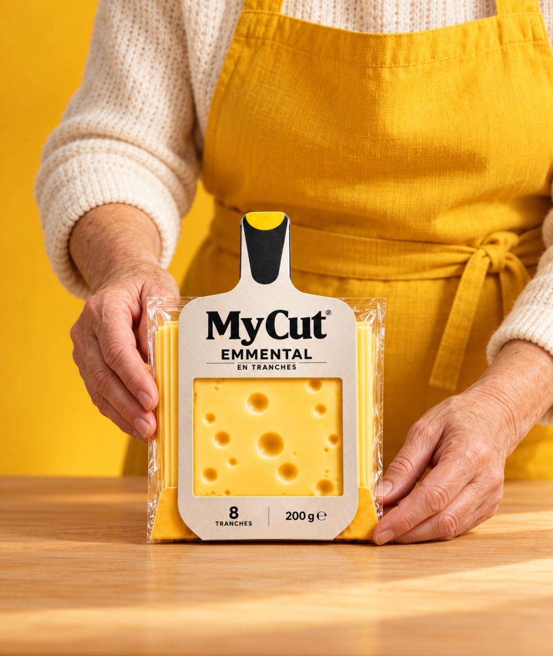
The creative direction extends into a playful photographic universe, combining striking yellow backgrounds, authentic kitchen gestures, and a warm, familiar atmosphere.
MyCut is more than a name. It’s a gesture, a shape, and a story.
A simple idea turned into a memorable packaging identity, proving that innovation doesn’t always mean inventing something new. Sometimes, it means looking at something familiar from a completely different perspective.
Curator’s Insight
Sliced cheese is one of the most uniform shelves in the supermarket: a flat rectangle, a window, a dairy cliché. MyCut escapes by changing the contour rather than the decoration. The window is a clean square, close to the opening of a real slicer, so the visible slice reads as the one just cut. The black handle tipped with yellow works as both a grip and a hanging point, which gives the silhouette a practical job. Pale, muted board keeps the colour budget for the cheese, and the stacked slices peeking out at the edges quietly confirm the count. The chunky serif wordmark balances the tight sans below it.
 Lisa Pokrovskaya
 Simple Studio
 Studio Unbound
 David Byerlee
 M&A CREATIVE AGENCY
 monther al omari
 Studio Be Design
 LogoSayLove
 agenciabud
 Shustova p
 mutta
 @Allenarts13
 Sirka Agency
 Atiq Alam
 Dozen Agency
 j.substance
 SCD
 Cristian Lepore | crilep Copia
 Chris Creative Works
 Aligned Design Co.