

YUGE Pineapple Brandy Packaging Design
A professional liquor packaging design case by Shenzhen Gu Yi Design
Project Name: YUGE · Brandy
Client: YUGE Liquor (Guangdong) Co., Ltd.
Service Scope: Brandy packaging design
Design Team: Gu Yi · Brand Packaging Design Department
Friendly Reminder:
This work is an original creation by Gu Yi Design. Patent certificates and copyright registrations have been completed. Think twice before attempting infringement.
Scope of Work by Gu Yi Design
Product concept development, brandy bottle shape design, brandy bottle cap design, brandy gift box packaging design, outer carton design, finished product prototyping, and product image rendering.
Project Background
At the end of 2022, Gu Yi Design partnered with YUGE Liquor (Guangdong) Co., Ltd. to take charge of the overall development of its full product line. After more than two years of refinement, this year marks a major milestone with the launch of YUGE Pineapple Brandy as a flagship product.
For this collaboration, the Gu Yi team worked at the intersection of “spiritual core” × “aesthetic form,” crafting a highly distinctive and visually striking product system that defines YUGE’s brand identity.
Brand Culture Development
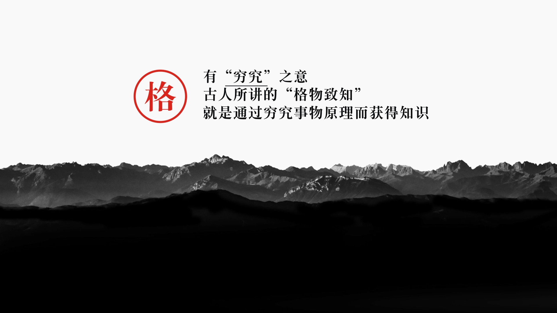
Starting from the character “Ge (格)” itself, Gu Yi developed a product culture unique to the brand. Since “Yu (于)” functions grammatically as a preposition, the deeper meaning lies in “Ge.”
“Ge” can imply structure, character, discipline, and deep inquiry. Rooted in product culture, the concept draws from the Eastern philosophy of “Ge Wu Zhi Zhi” (the investigation of things to attain knowledge). From this foundation, inquiry and character become the core values, forming the cultural driving force behind the brand.
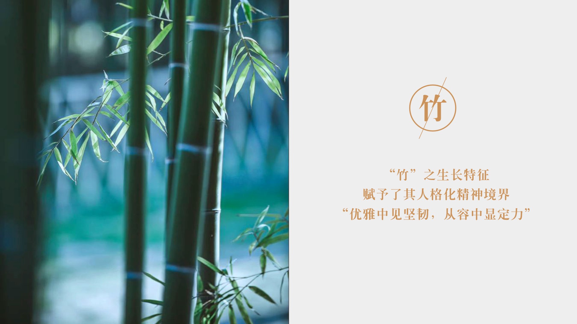
This philosophy conveys YUGE’s resilience, integrity, and relentless pursuit of truth. As the saying goes, “Clinging firmly to the green mountains, roots growing through broken rock,” this unyielding spirit is deeply moving. Bamboo—symbolizing moral backbone and inner strength—ultimately became the ideal cultural metaphor to carry the product’s identity.
Bottle Design
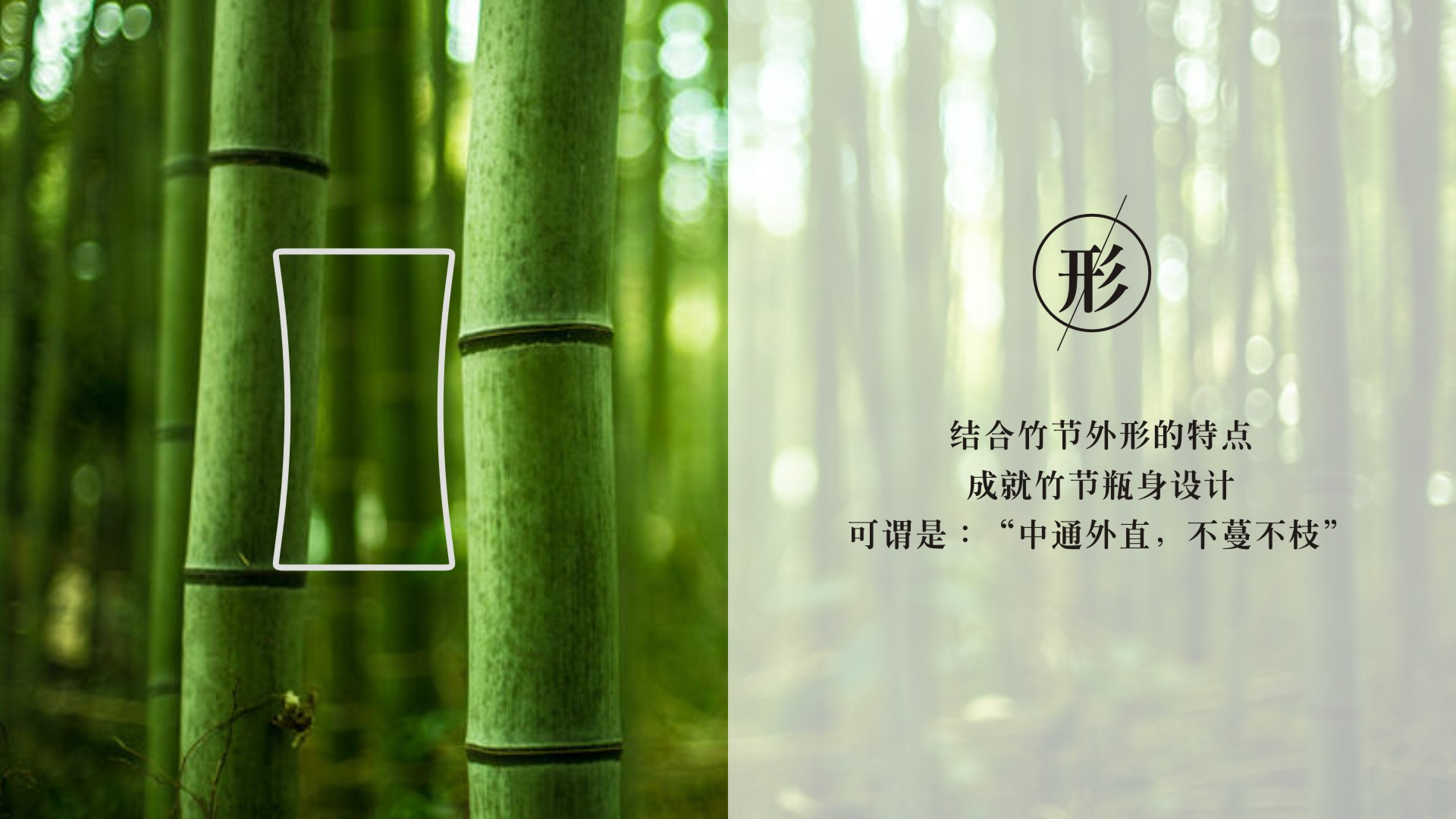
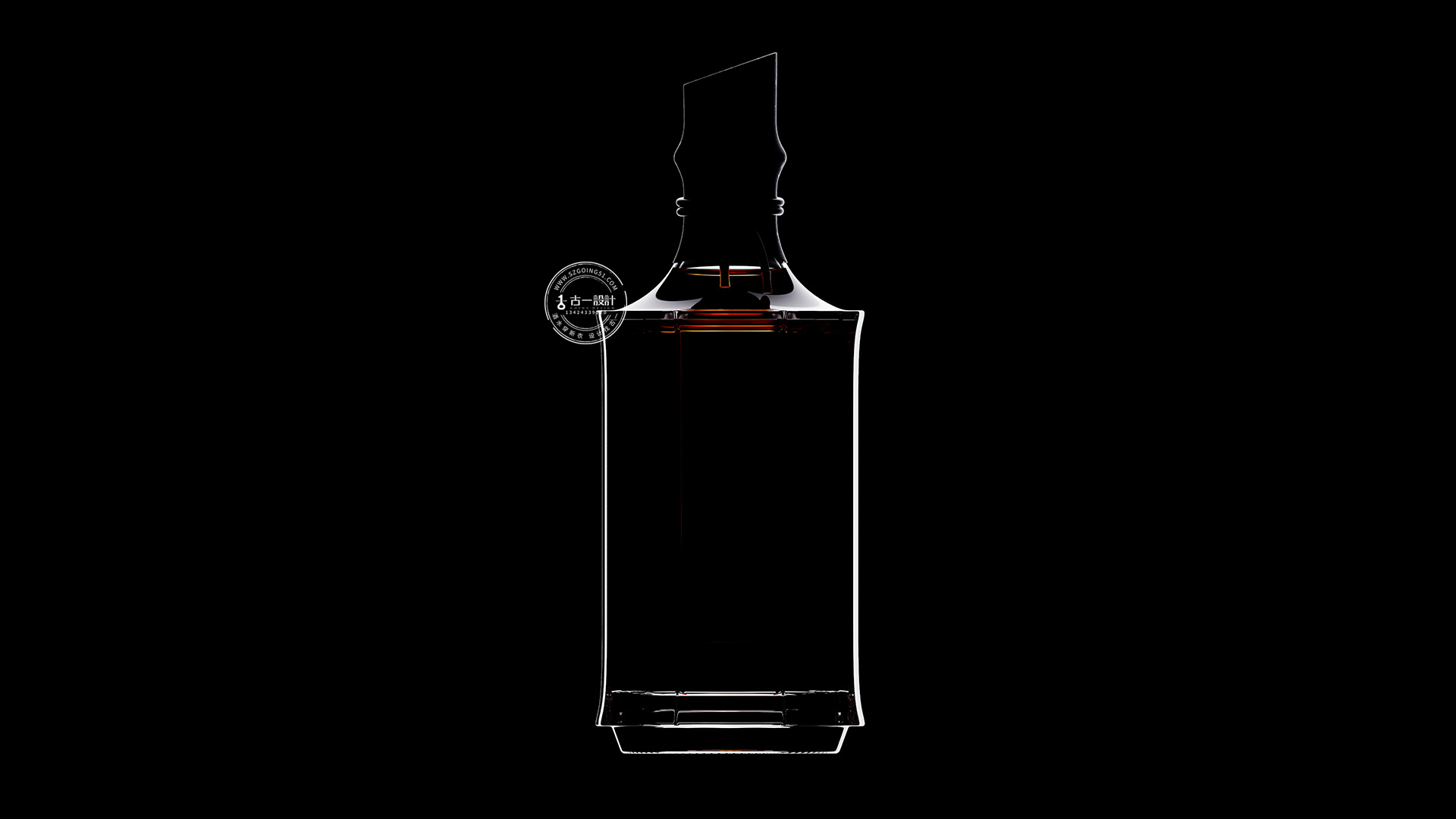
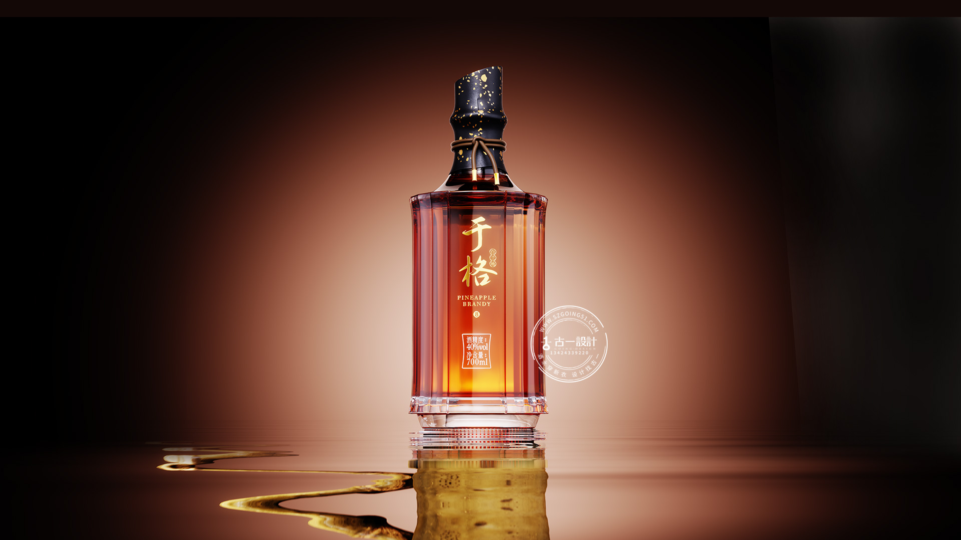
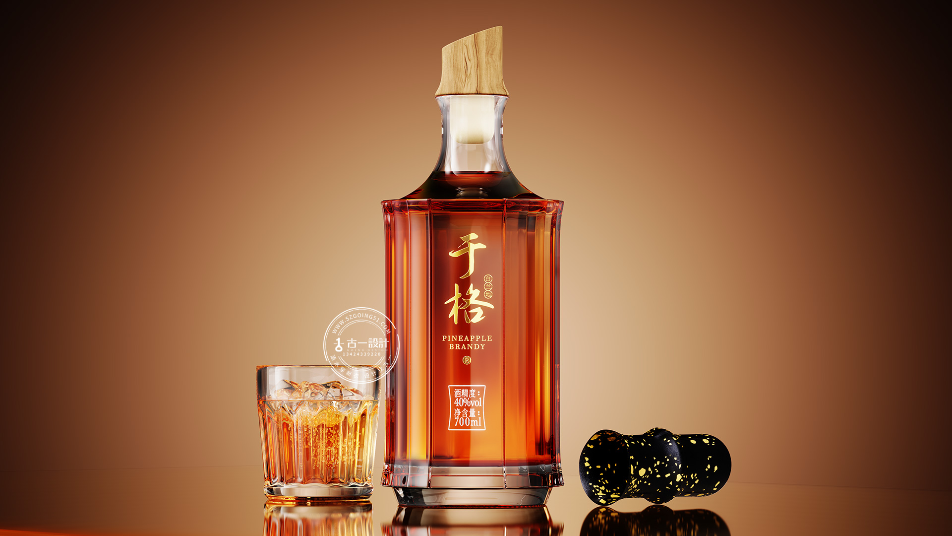
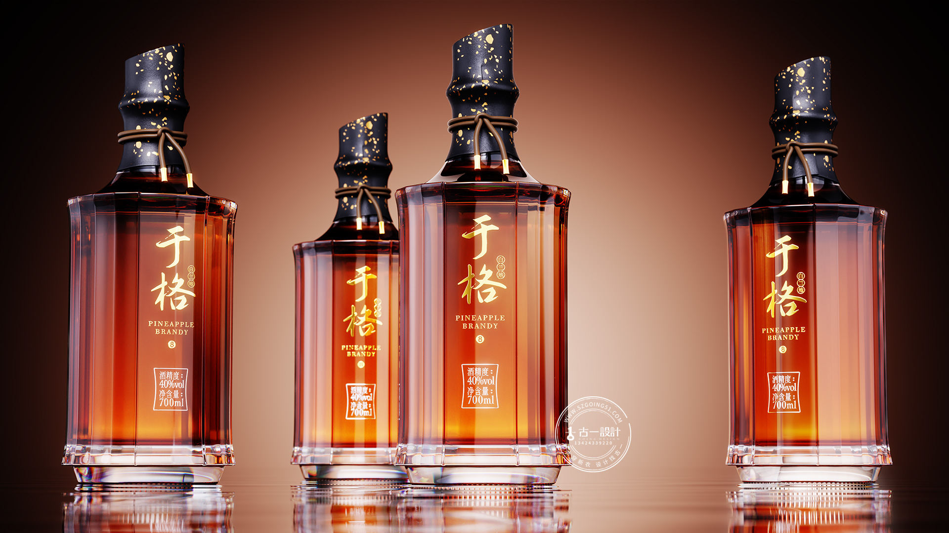
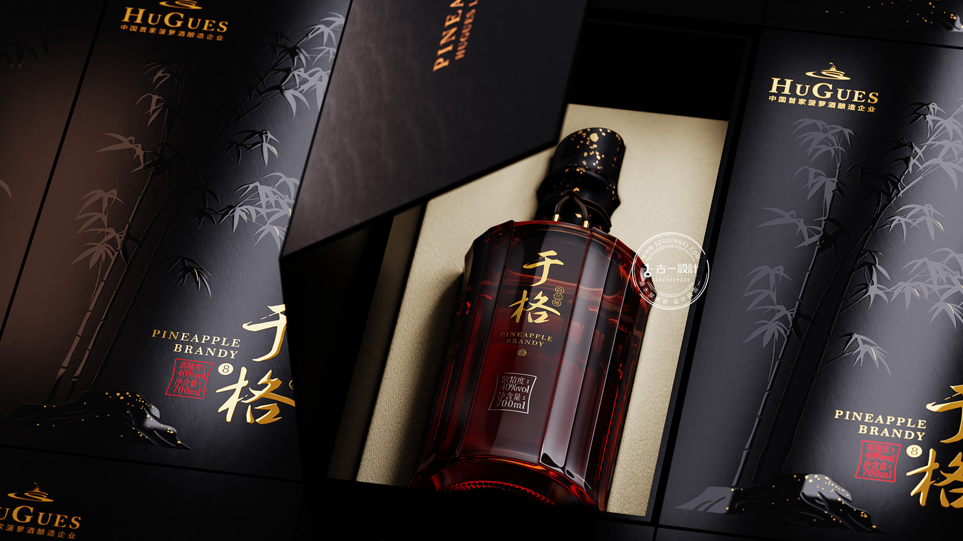
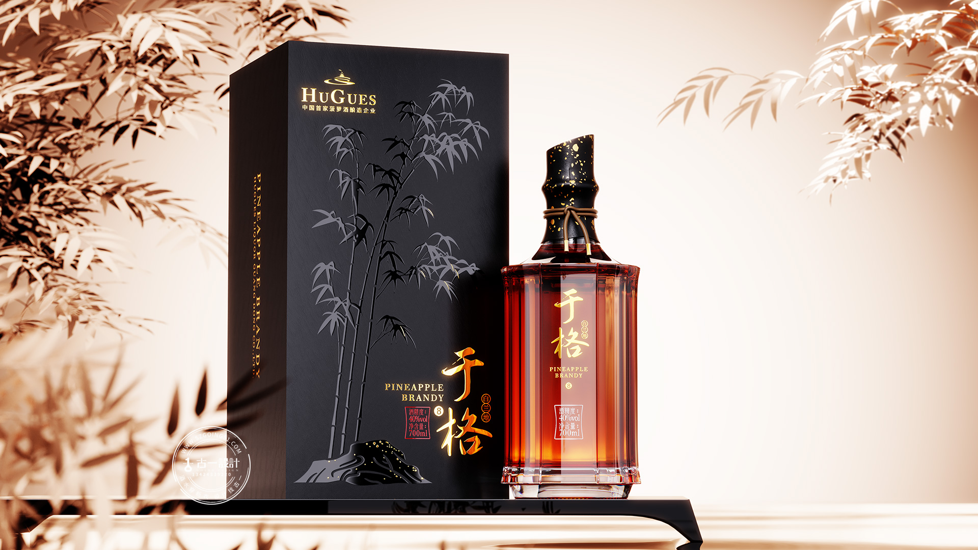
The bottle design is a tangible translation of the Eastern philosophy of “Ge Wu Zhi Zhi.” Inspired by bamboo, it captures its strength and spirit, allowing the natural rhythm of growth to shape the bottle form.
The overall silhouette is derived from bamboo joints, with the bottle precisely cast into 19 facets—where “10” symbolizes completeness and “9” represents eternity. Together, they form auspicious numbers in commercial culture, expressing both perfection and impermanence.
The bottle cap is wrapped in black specialty paper with gold speckles and secured with an elastic cord, conveying Eastern sentiment and handcrafted warmth. The bamboo-joint-inspired cap adds a distinctly Chinese touch.
Gift Box Design
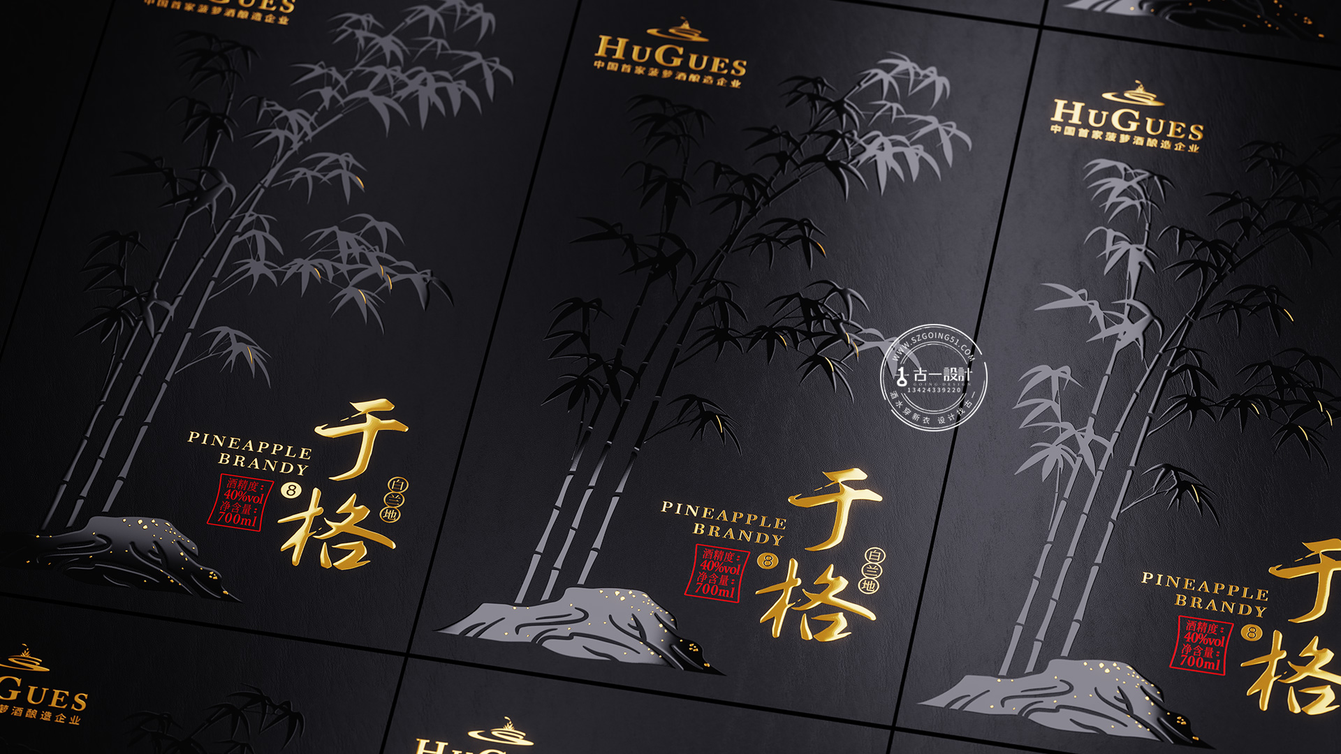
The gift box is crafted from black specialty paper, refined and understated in tone. Combined with hot-stamping techniques, it delivers a minimalist yet commanding visual presence. The box surface features a gold-stamped illustration of bamboo and stone in gentle motion—quiet, restrained, yet full of inner strength.


 monther al omari
 Biaa
Biaa Akim Melnik Design Studio
 M&A CREATIVE AGENCY
 Valérie Colace
 Reynolds and Reyner
 bachir bachchar
 Maria Gruzdeva
 Hailey Yoon
 宏洛图品牌设计HONGLT
 Rosario Lo Iacono
 Panagiotis Maravas
 43oz
43oz Thirst
 Carreto Concepts Design Studio
 pastellofactory
 Omar Altayeb
 Cocoon Prague
 古戈品牌
古戈品牌 Pascal Riviere Design