The client approached us to create a sub-brand for a company that produces the first and only professional nail brand in Armenia, with a new brand concept and name.
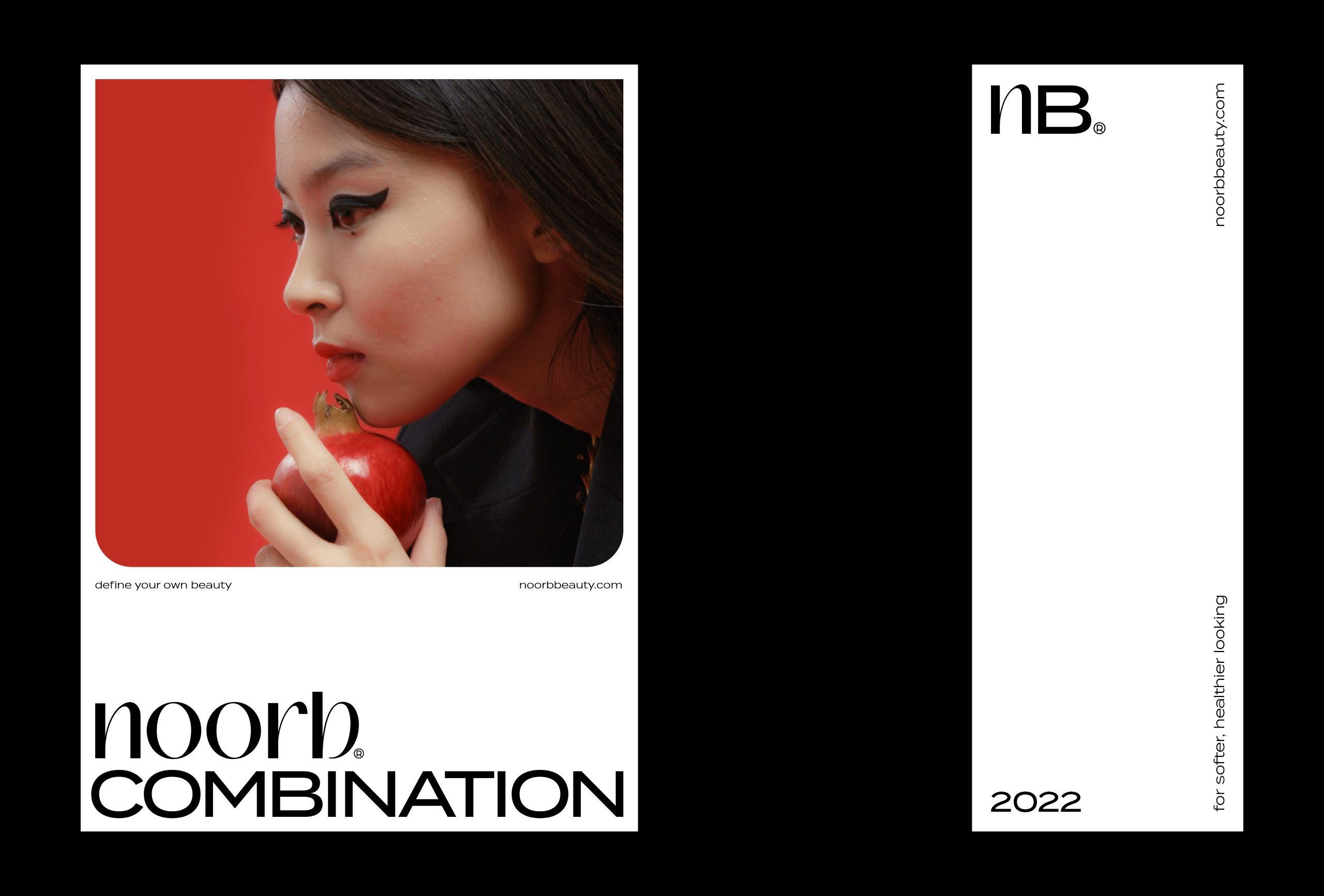
We created the brand name Noorb.
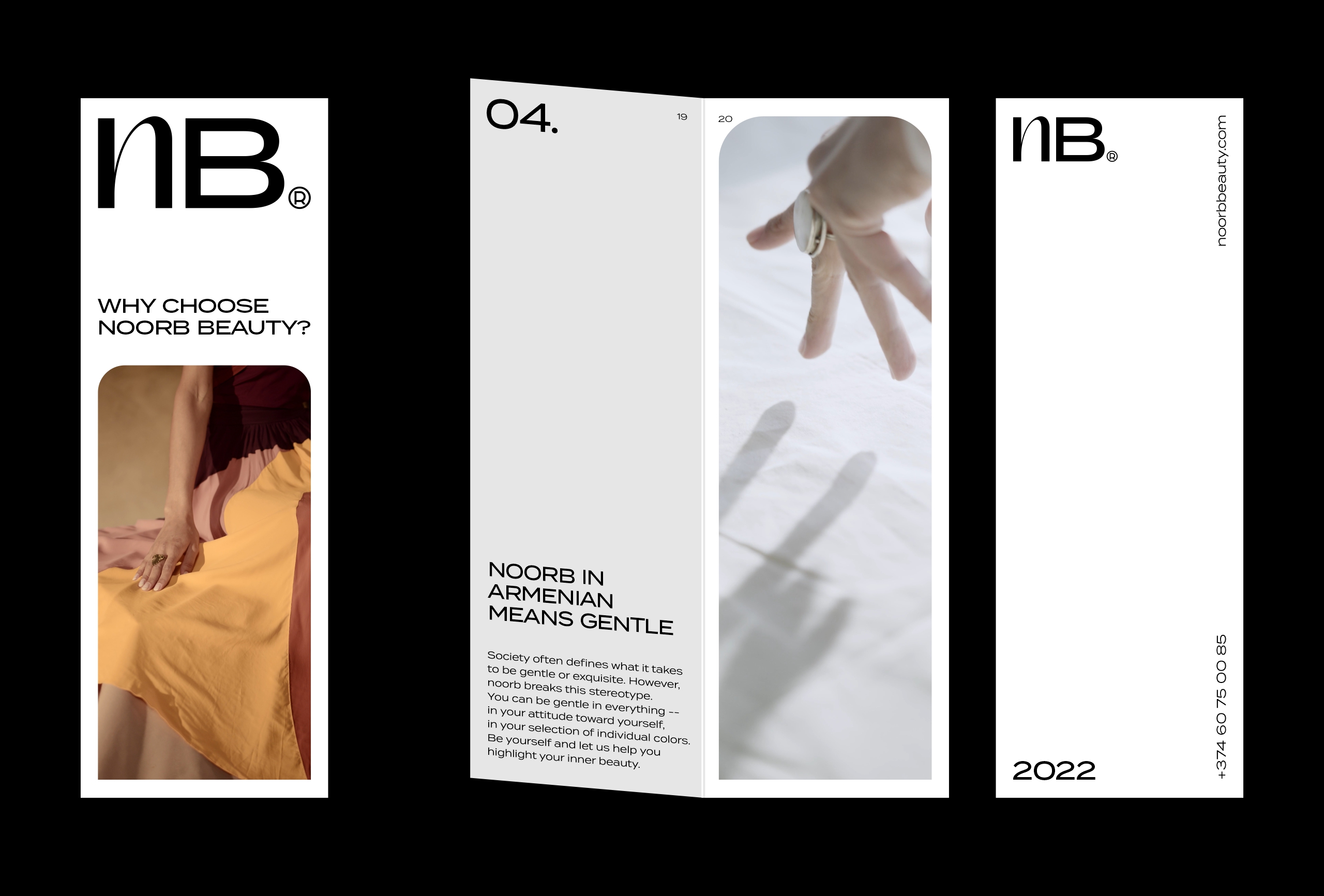
noorb means gentle in Armenian. Society often defines what it takes to be gentle or exquisite. However, noorb breaks this stereotype.
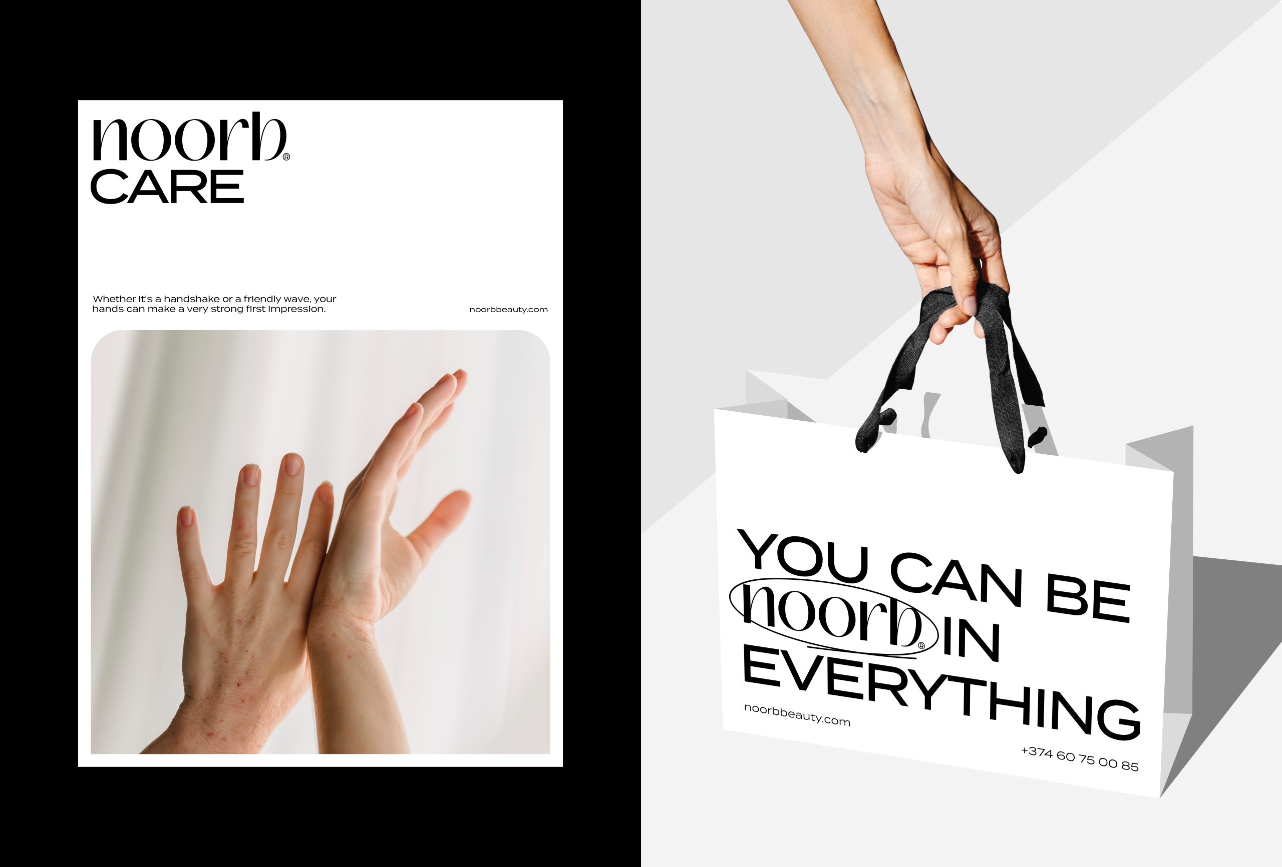
You can be gentle in everything — in your attitude toward yourself, in your selection of individual colors. Noorb gives women a highly personal mindset about their own beauty. And because it is a private and minute mindset, it is actually bigger and more meaningful to her.
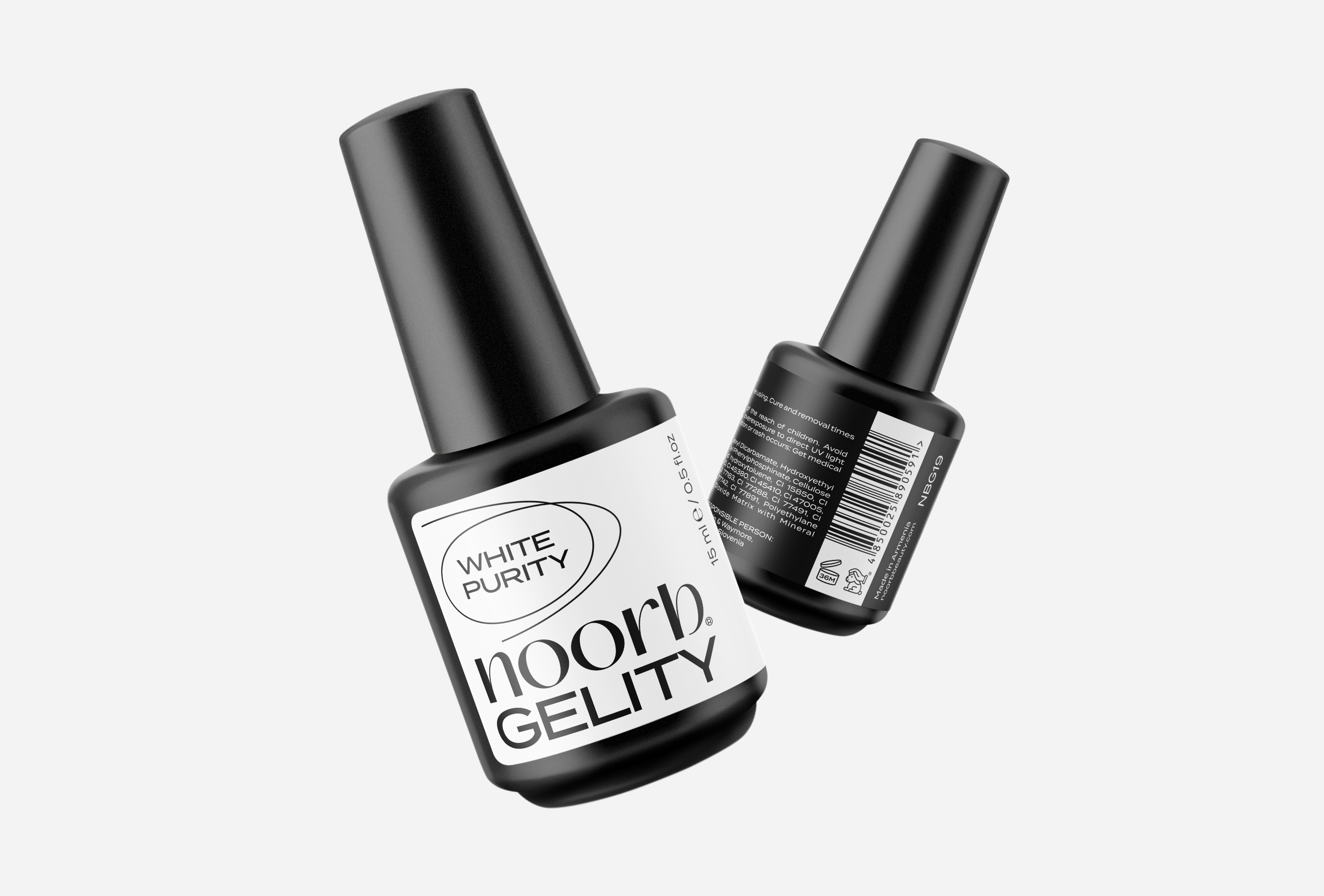
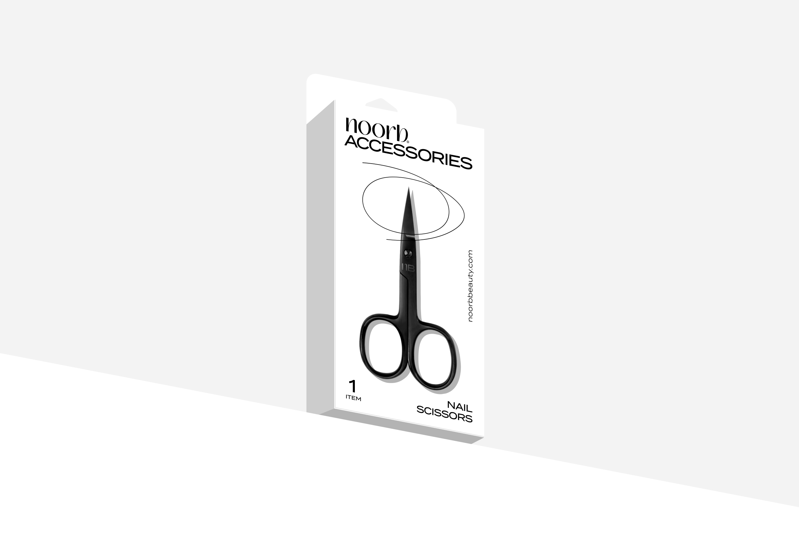
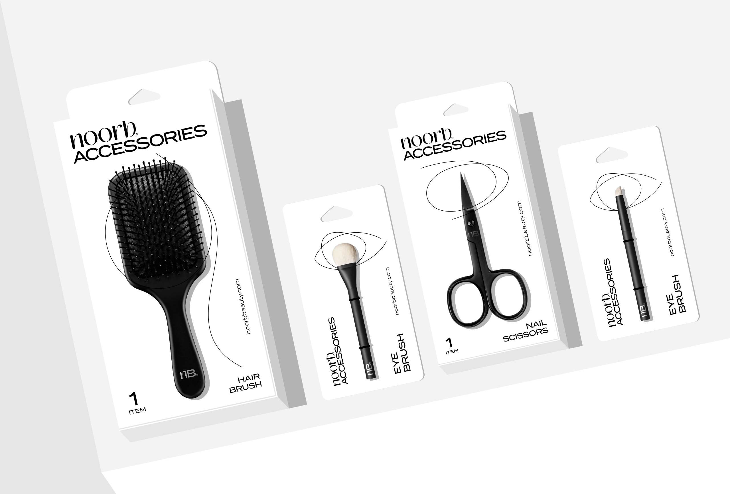
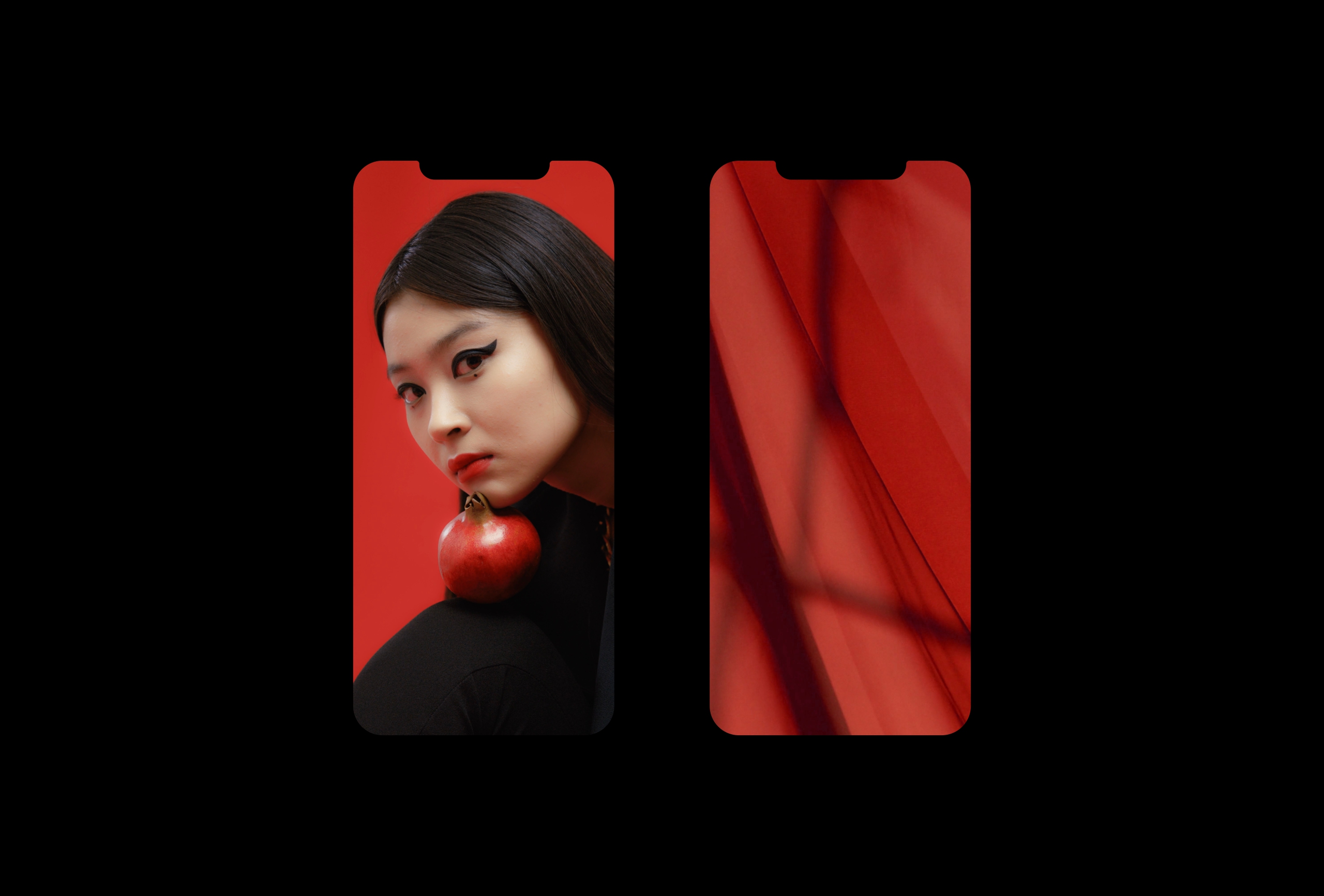
The line plays a crucial role in the visual identity. Depending on the category, the line changes and highlights eye- or hair-related items, nail polish items, etc.
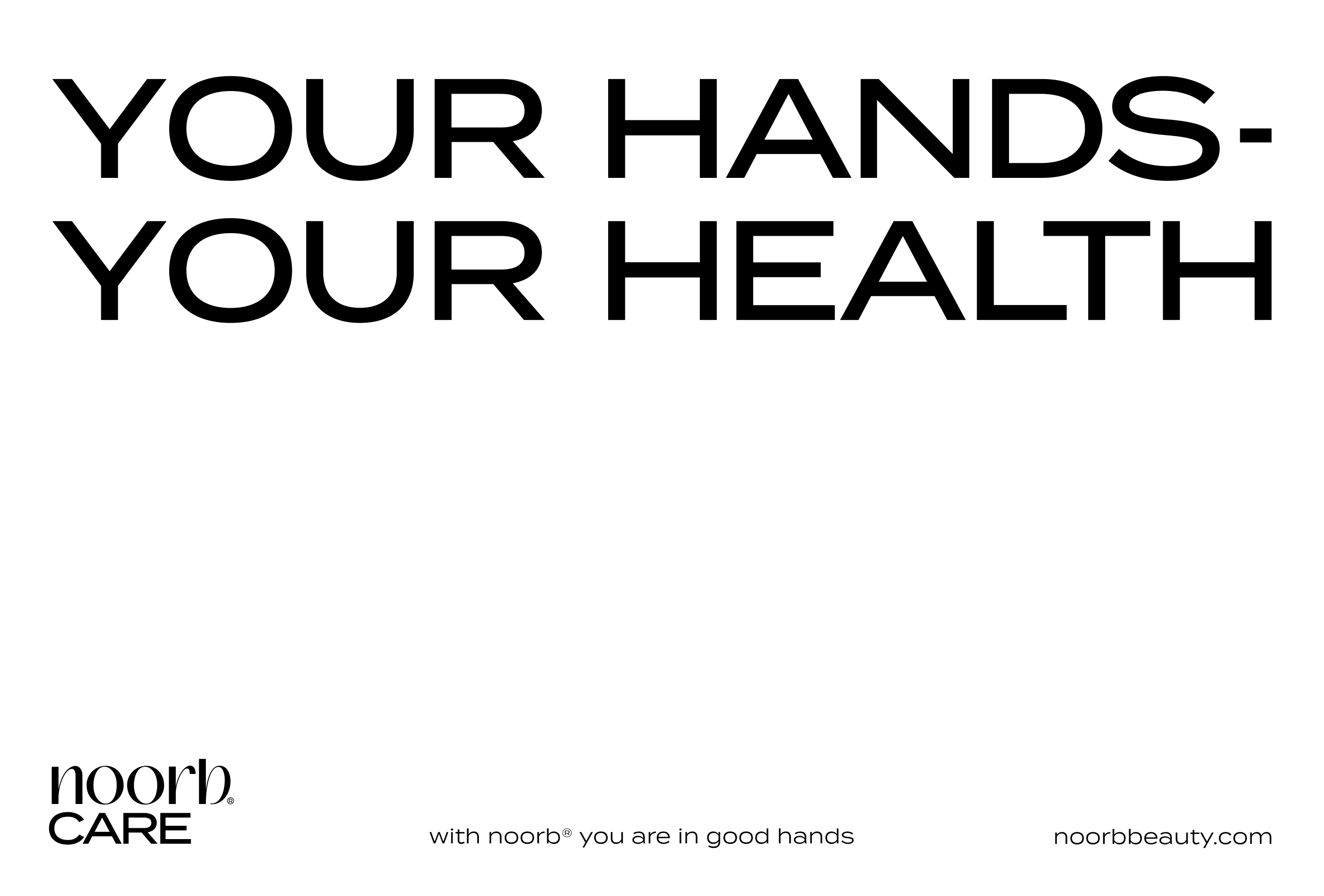
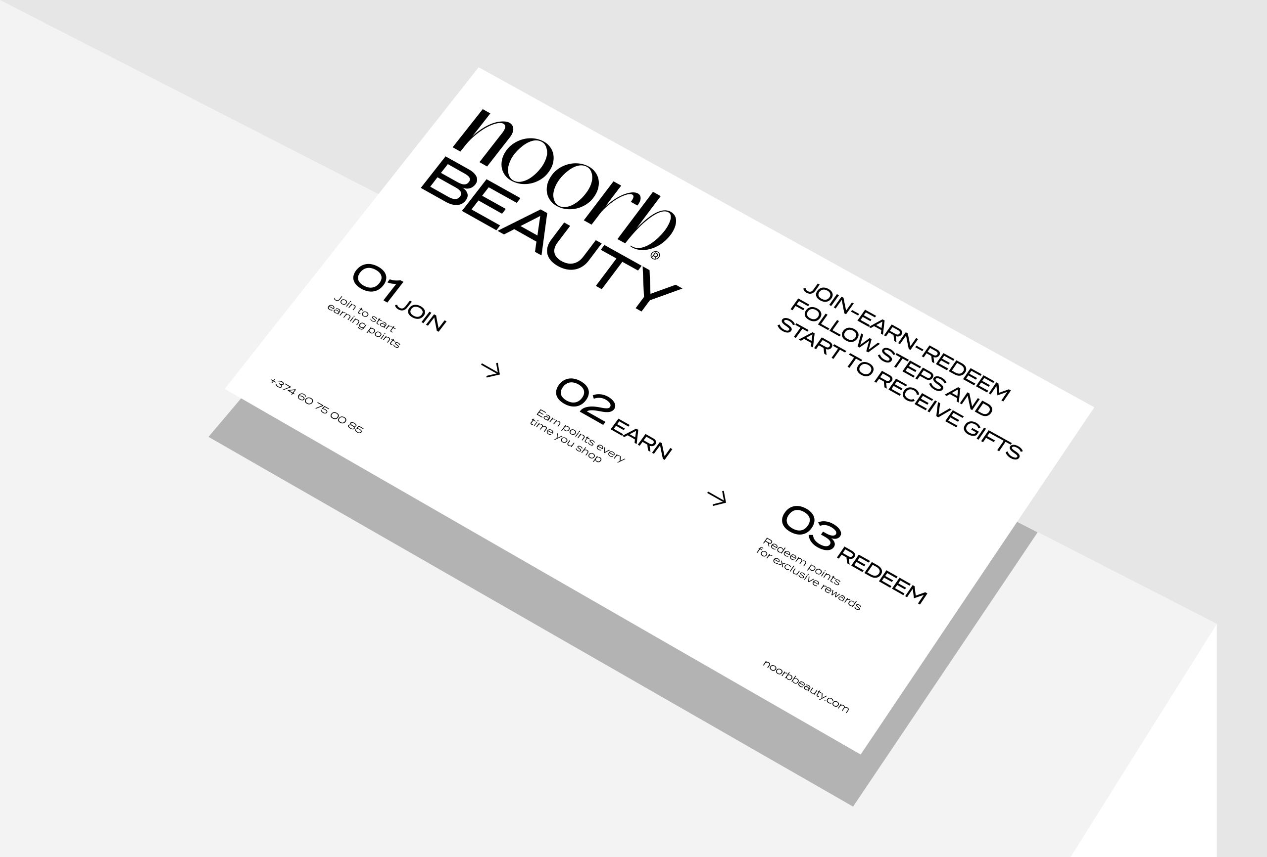
According to categories that noorb has, together with the line, the descriptor is changing, becoming, for example, noorb accessories, noorb care, noorb combination, and so on.
The fonts in the logo are different, which visually connects to the brand concept. Noorb is written in a softer font, while descriptor (beauty, care, accessories, etc.) is the opposite of noorb. By this we mean that subtlety can be unique and different for everyone.
The other important element is that the word noorb is integrated into the sentences and that, in turn, makes the branding complete.