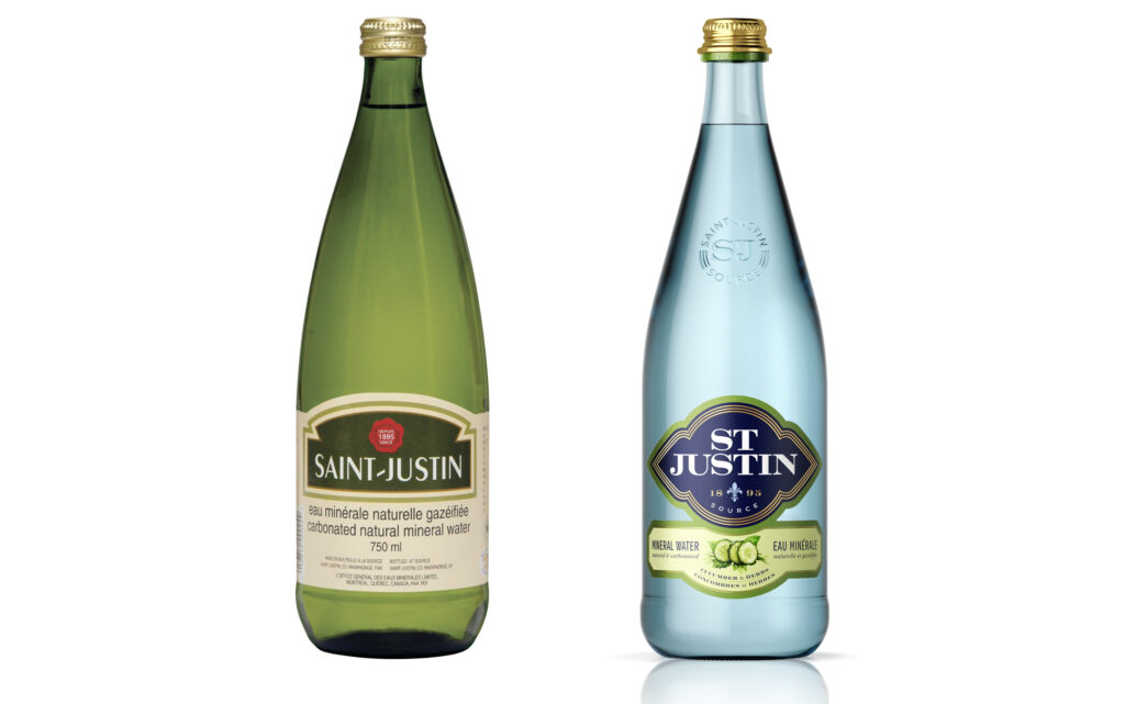
Taking its source from a single spring, Saint-Justin originates in the mountainous region of the Lower Laurentians in Quebec and travels from the virgin slopes of these mountains to the village of Saint-Justin. The brand is distinguished by its sophisticated taste and the fine sparkle of its bubbles.
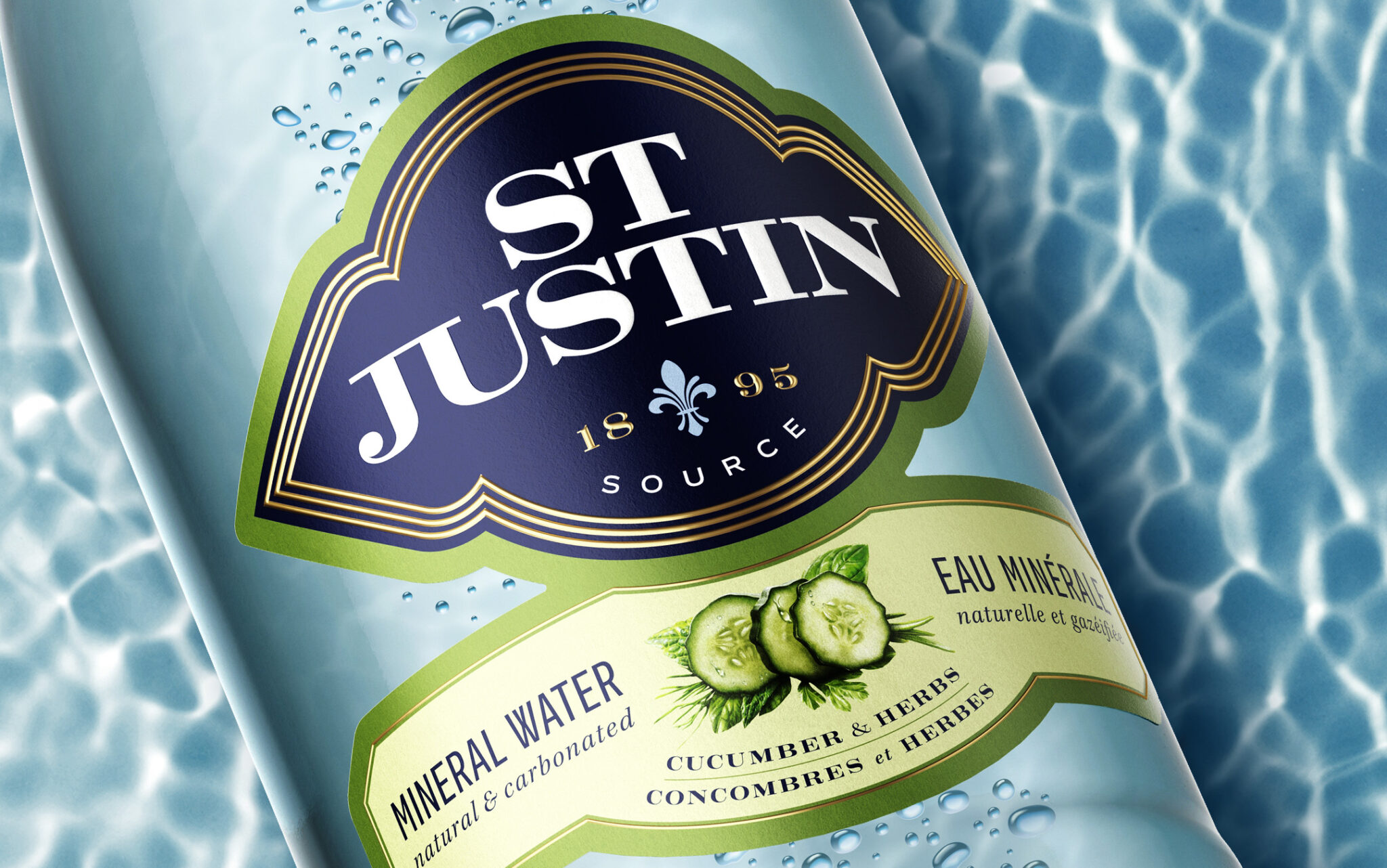
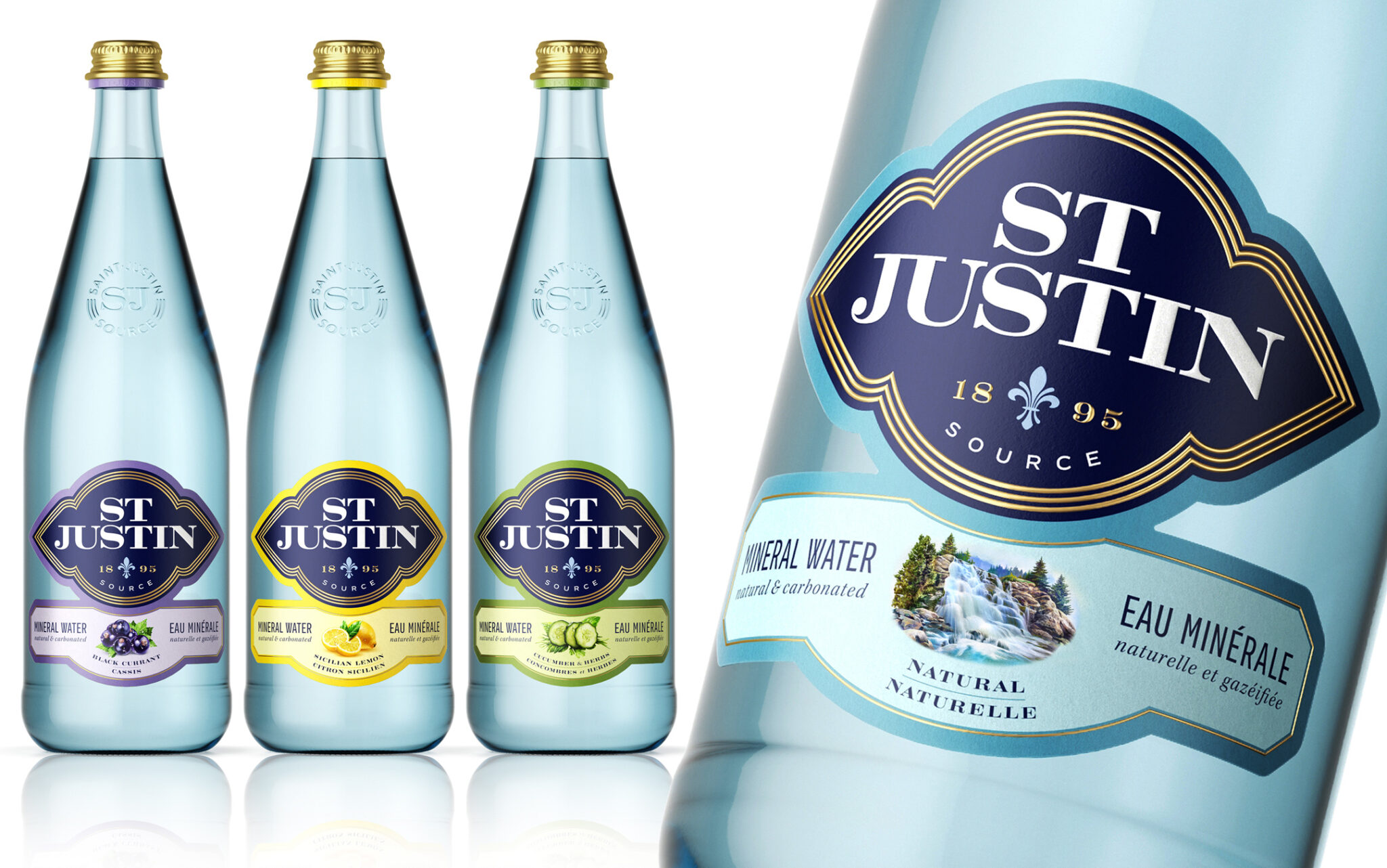
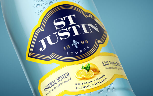
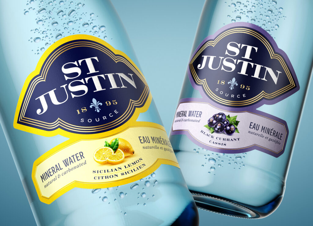
The design process started by creating a modern and refined brand identity. Our research led us to exploit the interesting visual relationship of the abbreviation of the word SAINT, juxtaposed with the combination of the letters ST, in the center of the word JUSTIN.
The visual balance achieved, in the way the brand name is written and composed, creates a distinct and memorable effect. Once integrated to the unique shape that serves as a showcase for the brand identity, the ensemble elevates the impact of the brand, its prestige and its power of attraction.
The president of the company wanted to emphasize the Quebec origin of the brand, capitalizing on the feeling of belonging and the awareness of consumers to buy local. We therefore created a subtle fleur-de-lys, the symbol of Quebec, from which jets of water flow.
Saint-Justin’s new brand personality reflects its quality and its natural attributes. Strategic packaging design has the power to change the perception of a brand, ensuring that its commercial personality does not hinder its growth.