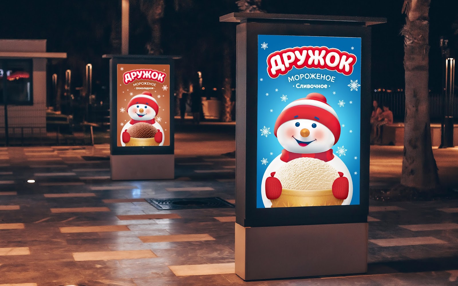
Design: Getbrand
Location: Russia
Project Type: Produced
Product Launch Location: Asia
Packaging Contents: ice cream
About the project
The ICE company is one of the largest enterprises of the Aktobe region (Kazakhstan) engaged in milk processing since 1999. Today, a dairy cluster “from field to counter” is organized on the basis of the partnership.ICE-plus LLP is the only producer and processor of milk in the Aktobe region with a closed production cycle “from farm to counter”.
Task
Ice company has in its portfolio a creamy ice cream “Druzhok”, which is sold in the economy segment. The company wanted to transfer it to the middle segment and commissioned us for a design update, entrusting the following tasks:
- Develop a noticeable and memorable logo;
- Replace or modify the brand character;
- Add a food zone
Decision
We conducted an audit of the shelf and identified a number of shortcomings. The design used an image of a snowman with a logo located at the bottom, which was written in a standard font, there was no brand block. The company itself noted that competitors and local STM also used the image of a snowman, trying to mimic Drujok and reducing his market share. It was necessary to implement the changes carefully so as not to confuse the buyer.We have created a consistent design in order not to risk the brand’s leadership position in the market. We made the snowman himself more noticeable by slightly changing his appearance, making him friendly and giving him a cute smile. We added a food zone in the form of an ice cream cup, which the snowman holds in his hands and seems to be holding it out with the message “try it”. The food zone helps customers feel the taste of ice cream until the moment when the product is picked up.
On the back side, we demonstrated the advantages of the manufacturer, placing them on a kind of scale: these are our own pastures, high-quality raw materials, proven milk suppliers, and delivery to retail chains within 48 hours. The story about the benefits helps to increase brand loyalty and demonstrates to the consumer that this is a serious ice cream manufacturer in front of him, which has its own raw material base and controls quality at all stages.
As a result of the redesign, the Drujok became more visible on the shelf, changed his image, and a food zone appeared. We have seriously improved the efficiency of the design, which affected sales – Drujok has increased his share in the market of Kazakhstan.


