About the project
Leading distributor of fast moving consumer goods. On the market since 1994.
More than 3,000 partners.
Task
To develop a new logo and corporate identity that will correspond to the values and positioning of the company: reliable, and at the same time flexible, modern, working for the best result.
Solution
The client decided to change the corporate identity of the company, which was developed many years ago and did not reflect the specifics of the business: a streamlined, fast, technological and automated process. Flexibility is what sets Agora apart from others: when others say no, Agora says yes.
We needed, on the one hand, to maintain continuity, and on the other hand, to reflect the essence of the company in a new identity, not just change the font and graphics, but to give a different meaning in communications and logo.
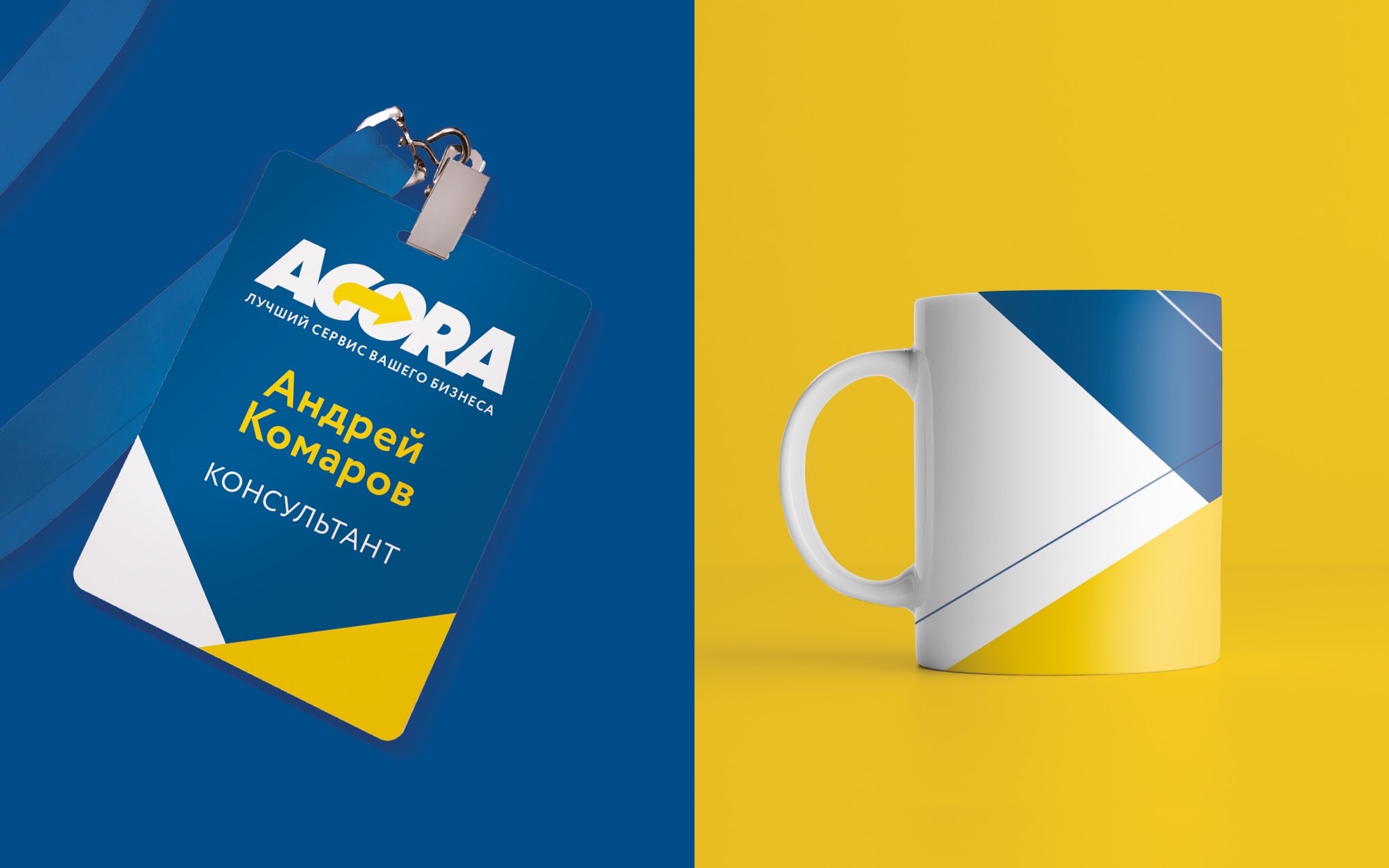
The main task was to emphasize the mobility and flexibility of processes, for this we highlighted GO in the name and added an arrow above it, reflecting the progressiveness of the company and the quick solution of clients’ problems.
The identity with the focus on the yellow arrow, which can additionally be an identification element, demonstrates the different directions of the company’s development.
The corporate identity turned out to be bright and noticeable, meeting the task that the client set for us.