Brewery 28 has a long history.
It was born more than 100 years ago in Belgium. Any brewery using more than 28 grams of malt per liter would have had to face a higher tax and thanks to this tax, 28 was born.
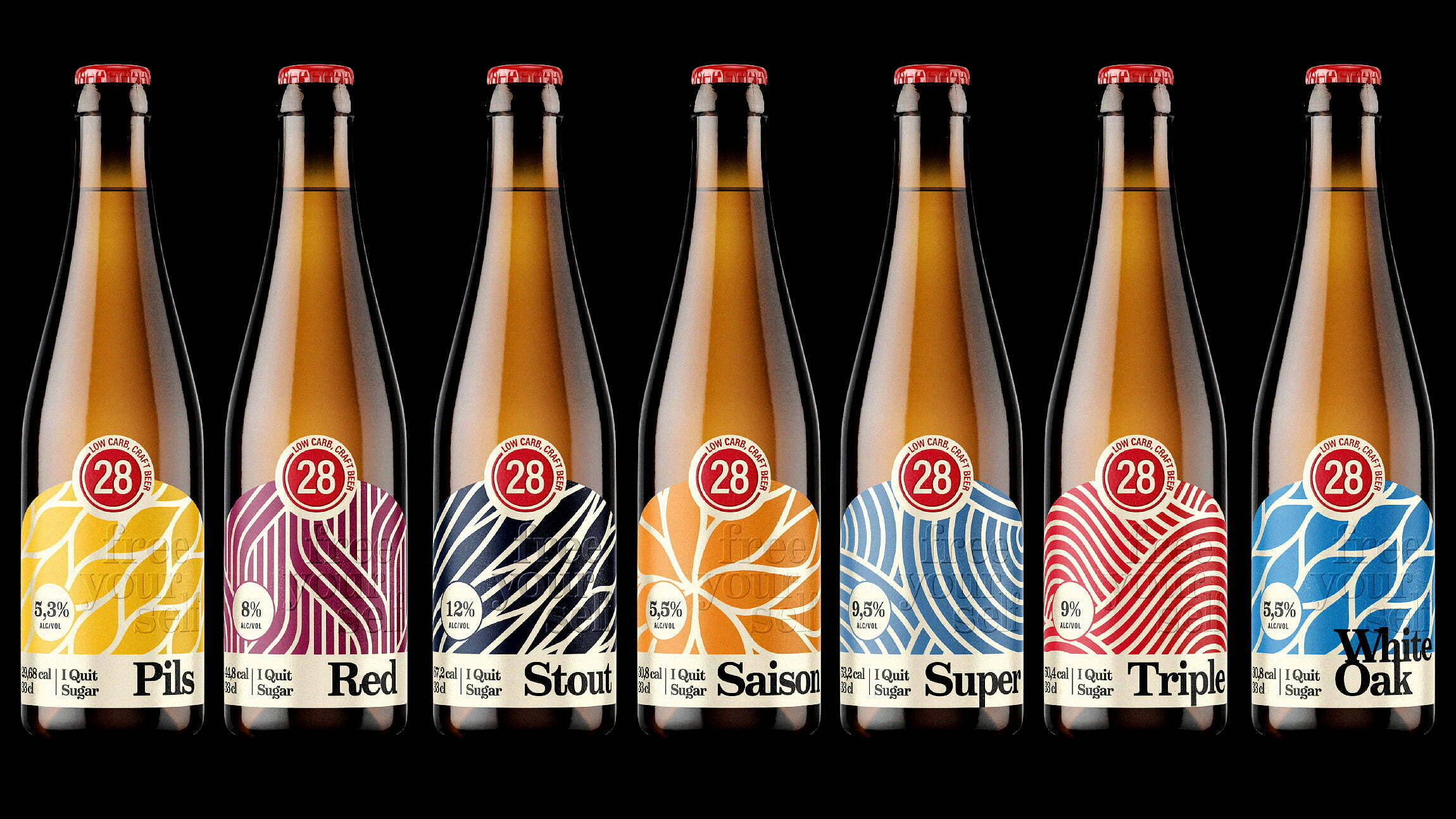
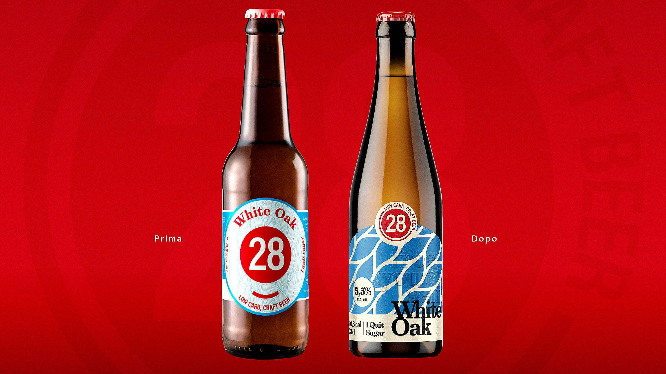
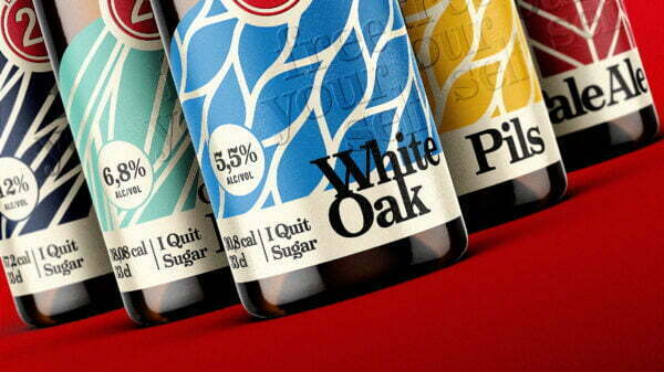
The brewery decided to observe this rule without renouncing the quality of the product. The result? A beer with an emphasis on taste rather than price. 28 asked us to revise its range of beers, maintaining colors and illustrations they made in a recent restyling.
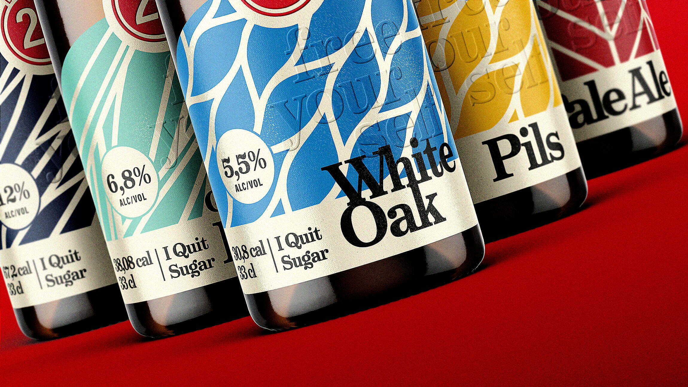
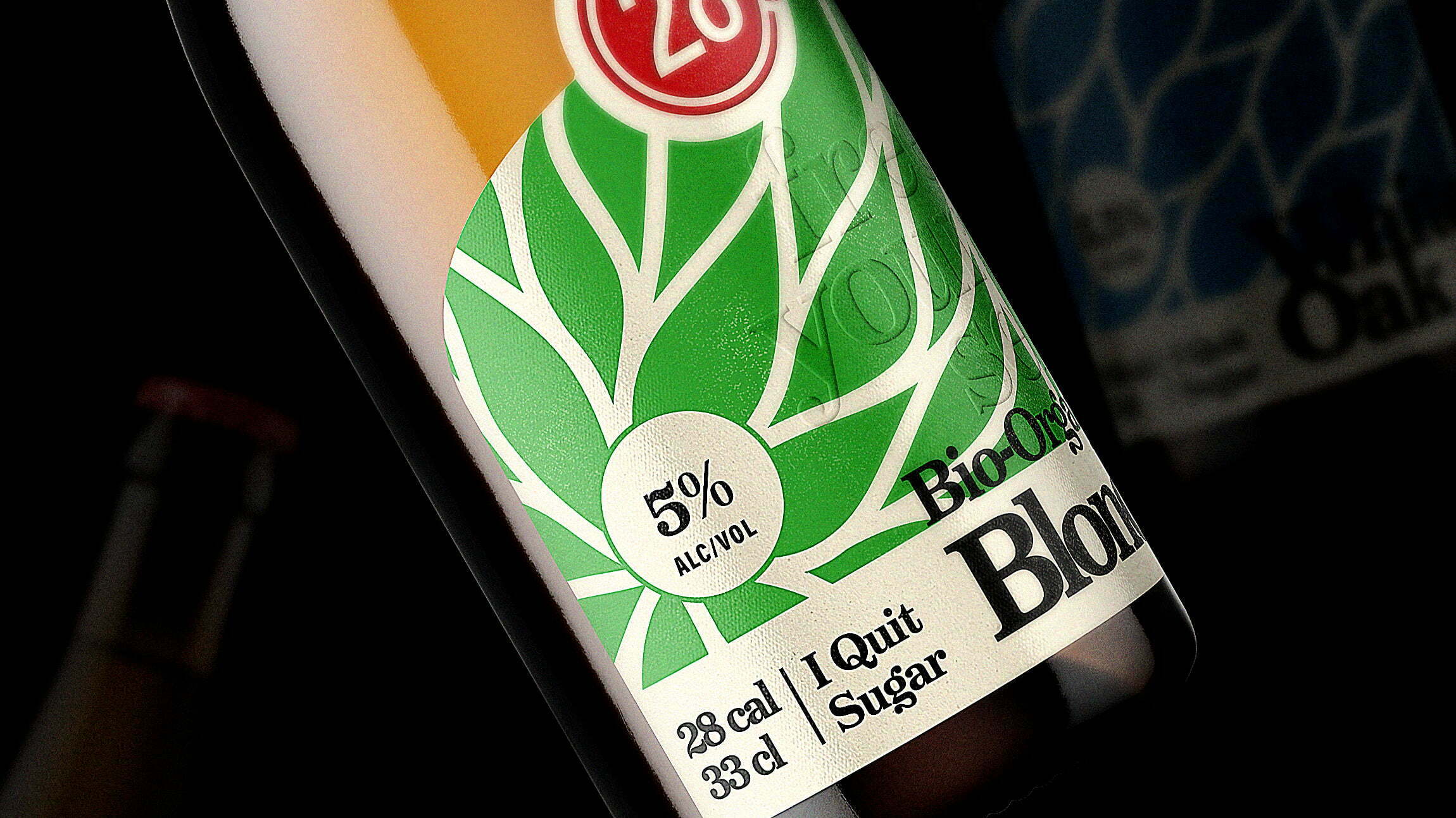
Our choice was, first of all, to use a new “classic” bottle and a new die, to enhance both the logo and the illustrations as much as possible.
We redesigned all the graphics giving them more character, used embossed effects both on the logo 28 and on the central part of the label, and printed on paper made from malt, ensuring a unique sensation to the touch.
Finally, with the choice of a typographic style in contrast with the rest of the composition, we found the right mix between classic and modern, creating a well recognizable product line.