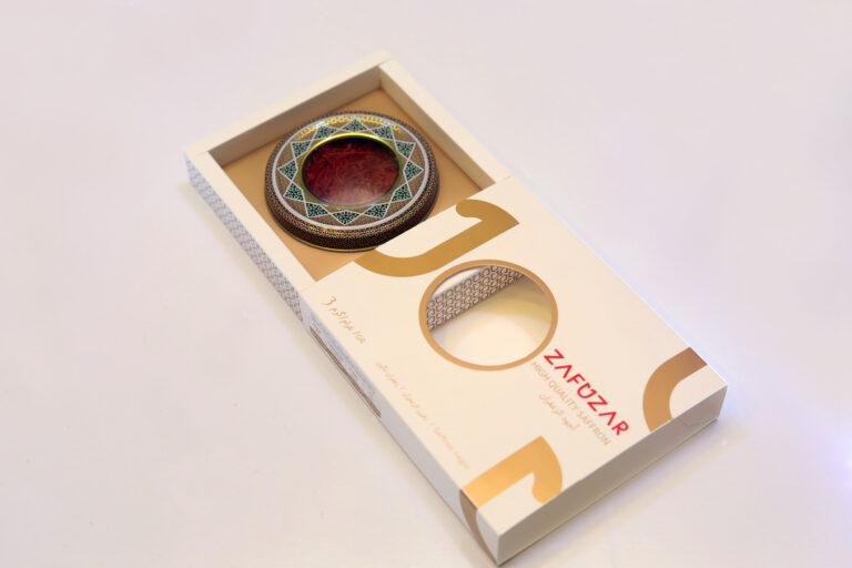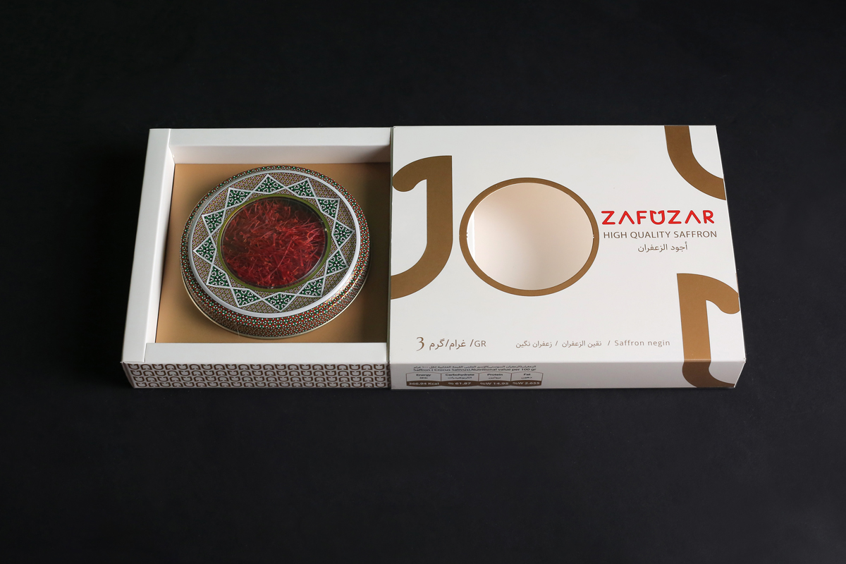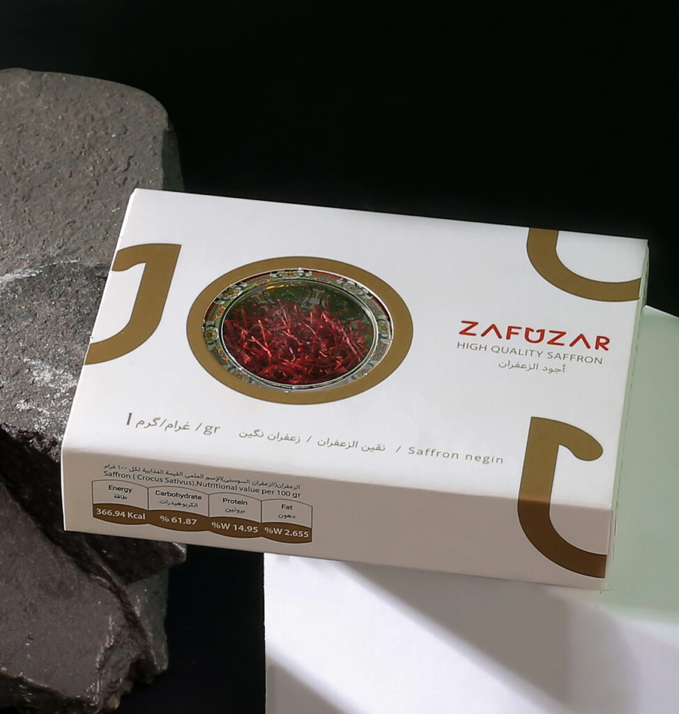
Twisting shapes and tense colours can sometimes create an eye-catching appearance for your product packaging design. but with Zafuzar that was not our solution. Zafuzar is a manufacturing company that wants and needed to take a further approach to attract and engage customers. we wanted to convey a simple-yet-modern impression. while minimalism was a priority, the packaging also had to look stunning. That was where we decided to use the middle letter of the logo as a special and lasting element in the mind of the audience! This simple pattern is used in the Product Family packaging of saffron. We also placed a window to be the centre of the audience’s attention to show off the red beautiful colour of saffron. additionally, it was important to show the most important information such as weight, quality, brand name in three different languages in front of the packaging. On the back of the package, we put all the information, regarding nutritional value charts, communication channels, licenses, and descriptions of this valuable product, in a regular, categorized, and scrutable way. Zafuzar sliding packages were designed and produced in different weights and qualities and it will soon be available in chain stores and reputable online stores such as Amazon.