The holographic age…
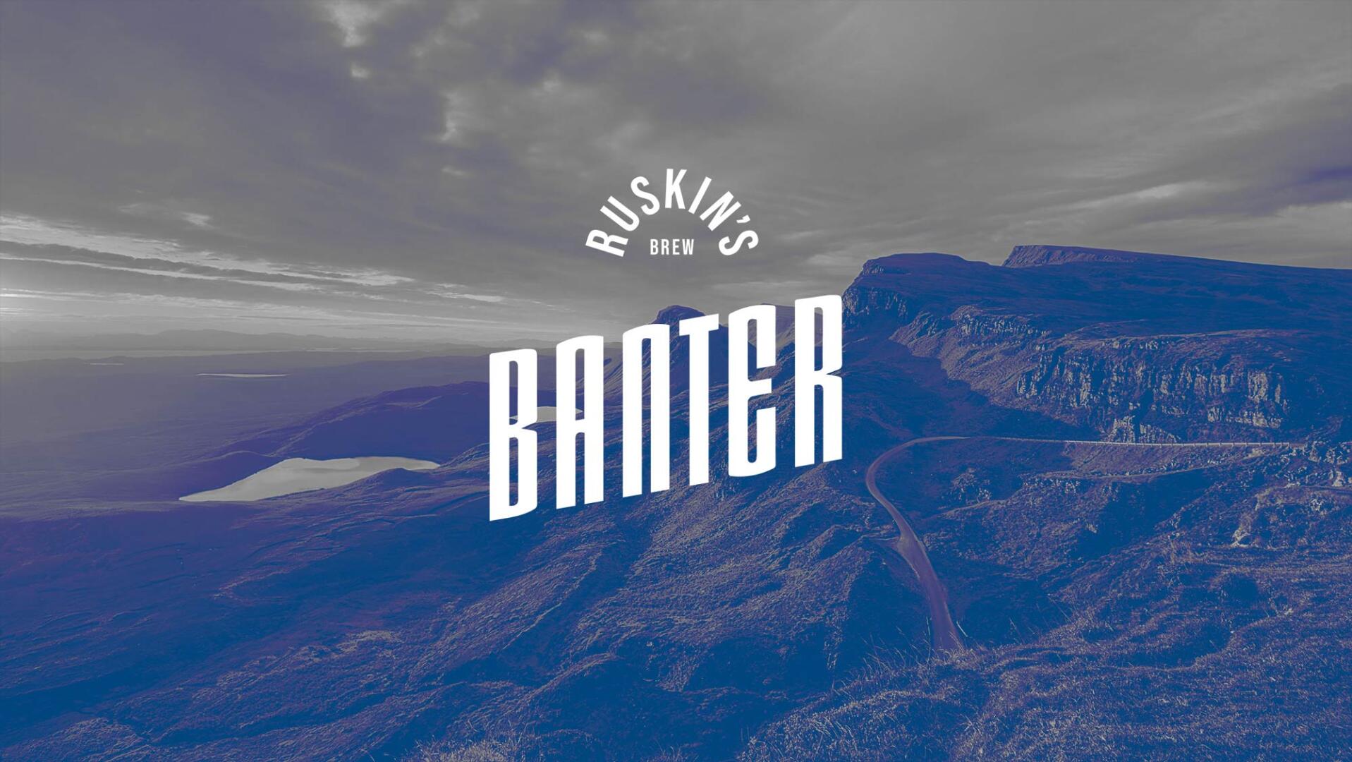
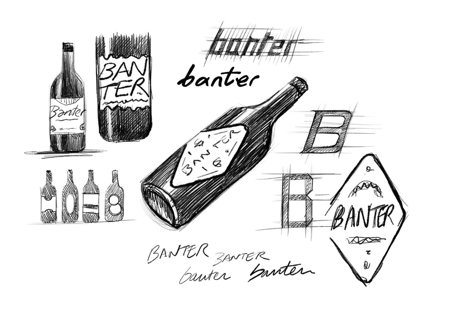
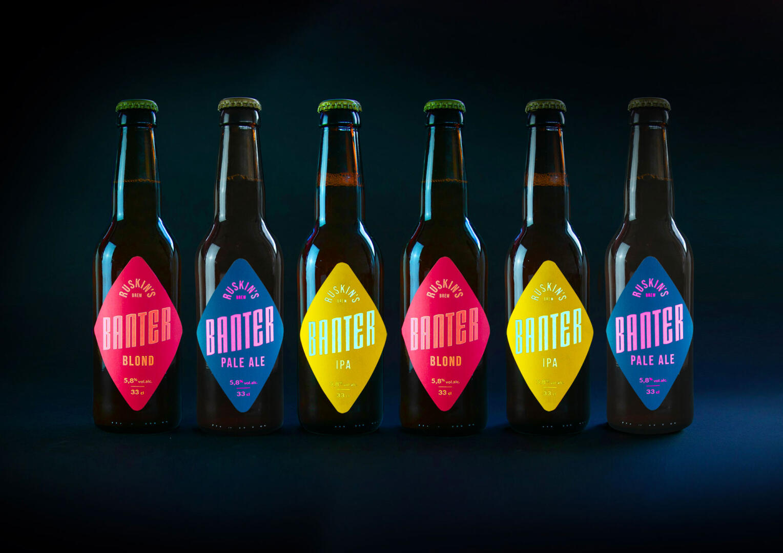
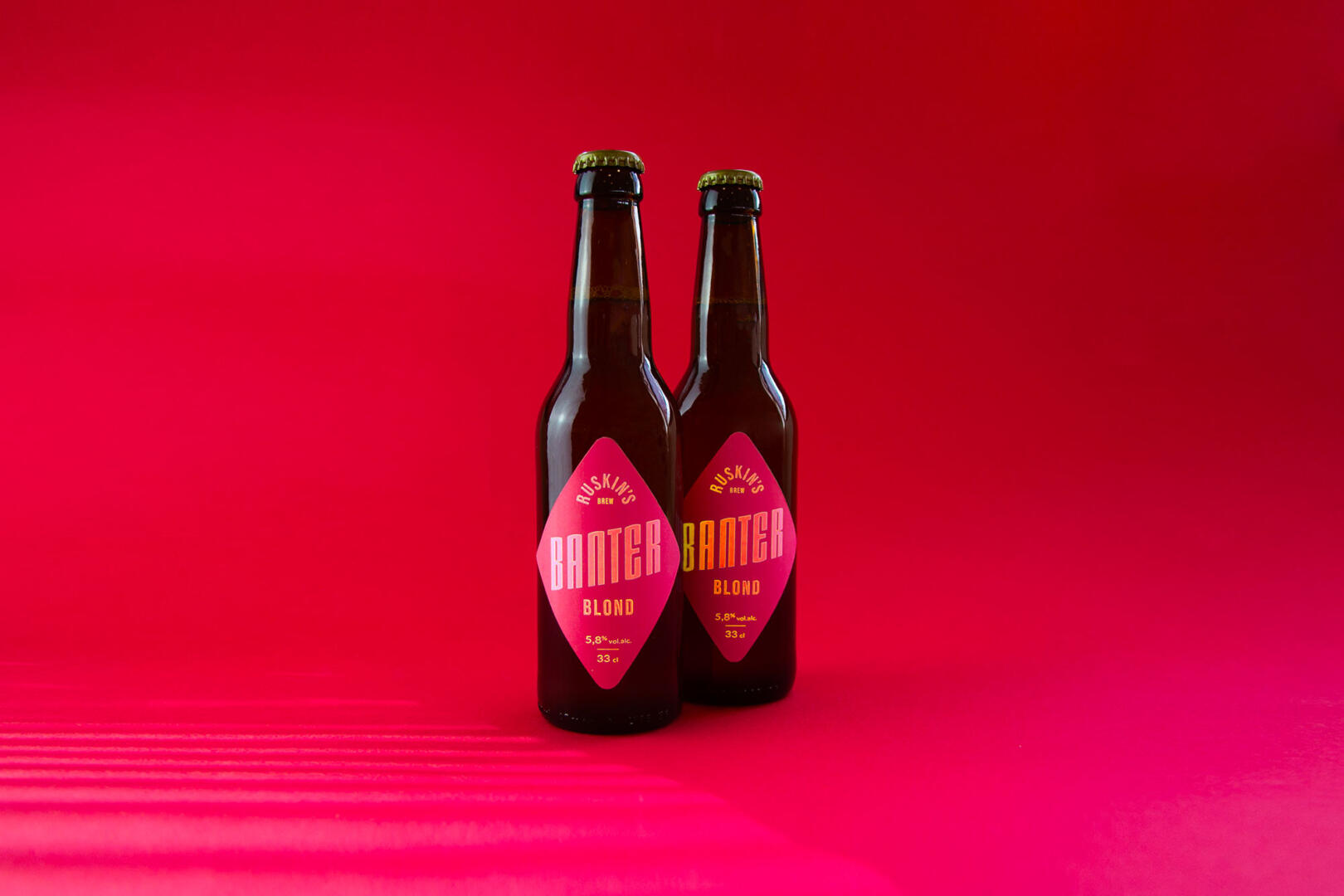
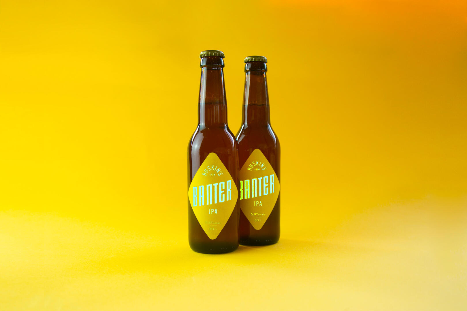
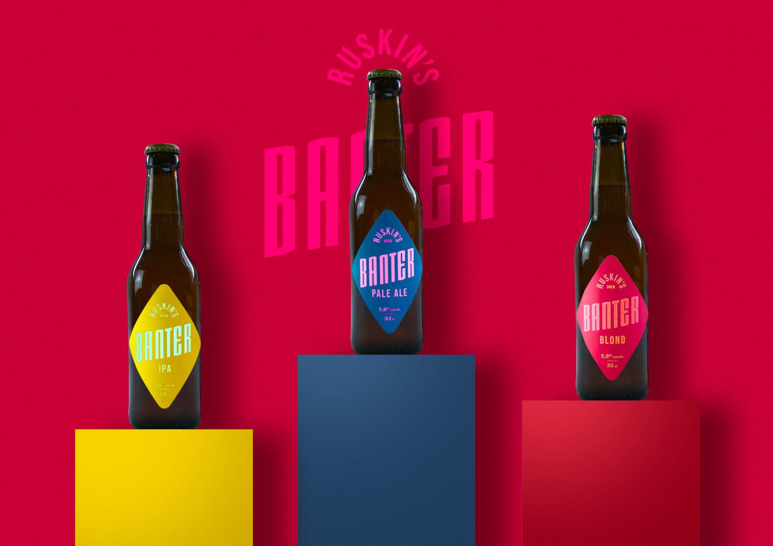
Banter, a brand-new brewery from a small town in the north of the United Kingdom, sports a bold graphic identity based on the combination of large flat areas of bright and saturated colors in the background with a very structured, wide typography and thicknesses in equally vibrant colors in the foreground. The assembly is contained within a “diamond” label shape.
The artistic direction of Studio Boam on this concept was to apply large, bold and recognizable markers to all communication elements with an unusual choice of colors, an atypical label shape and thick typography.
The whole gives the Banter brand consumer the sensation that is bold and dynamic, in the character of the Banter typography placed at an angle to the composition but above all through the tapered geometry of the labels in the form of a very “bright” rhombus. This realization of the literal “transmission” of light by the typography originates from the use of innovative and unprecedented holographic printing techniques in the production of this label, a rather unusual process in the world of beer labels.
The Banter family revolves around three beer references (Blonde, IPA and Pale Ale) which intensifies the linear visual strength and artistic coherence now established for this small English craft brewery.