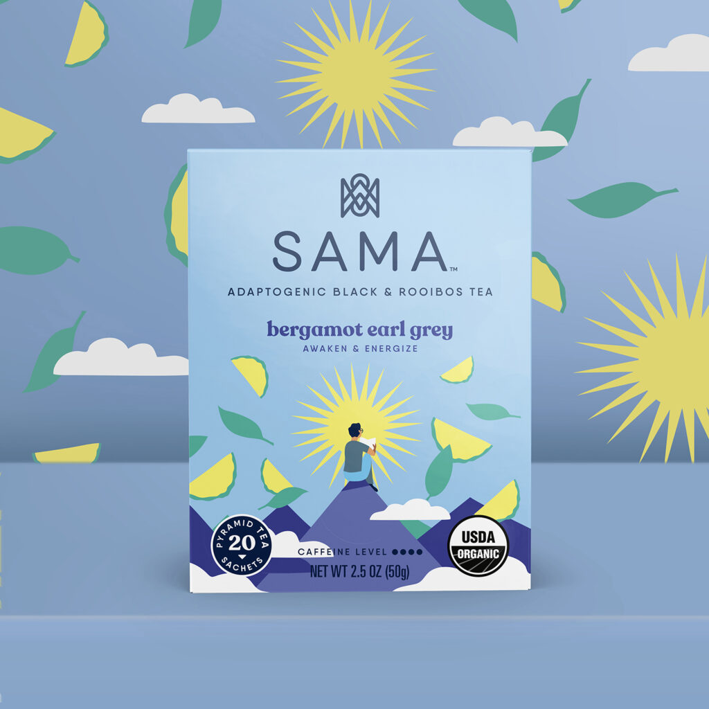
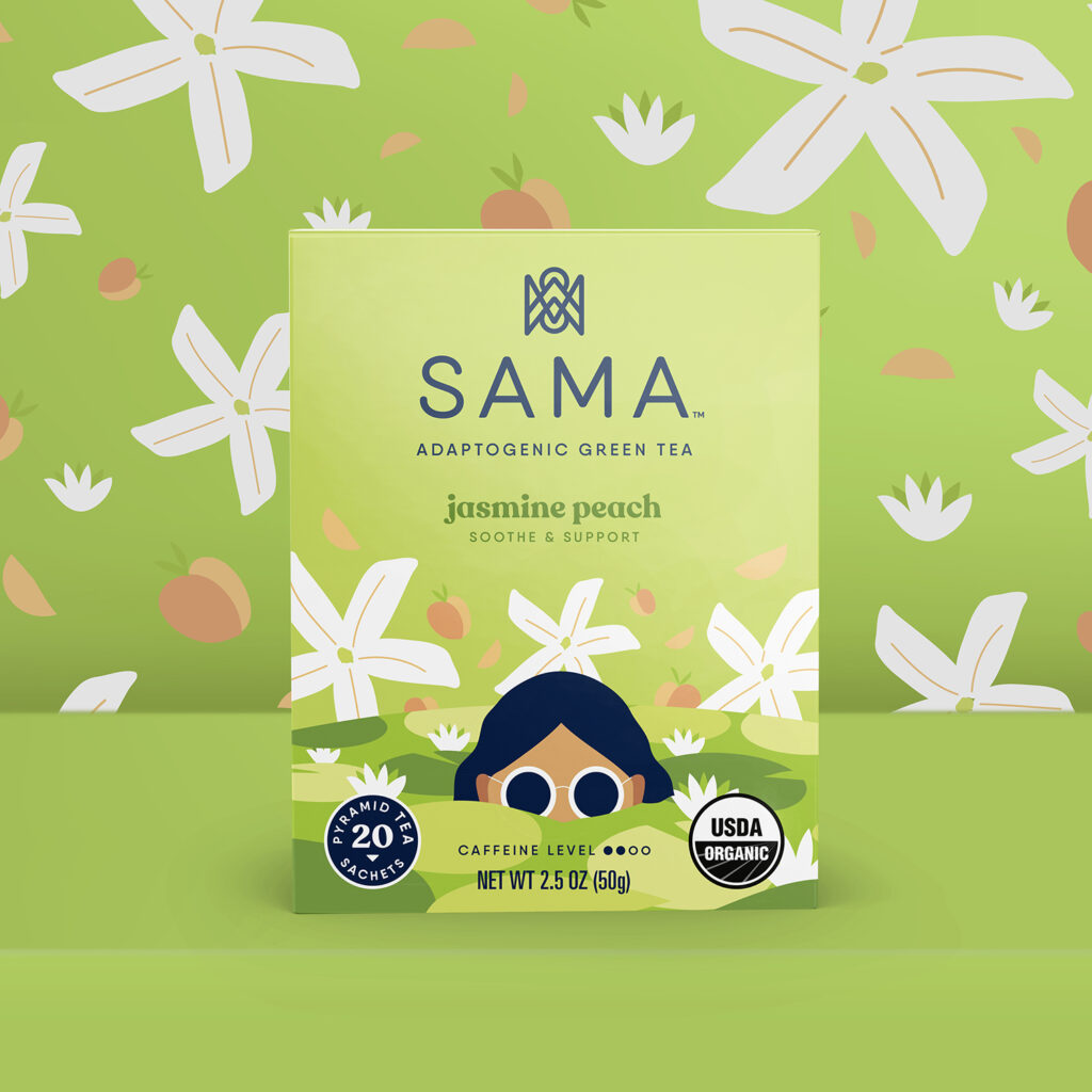
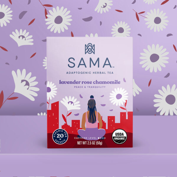
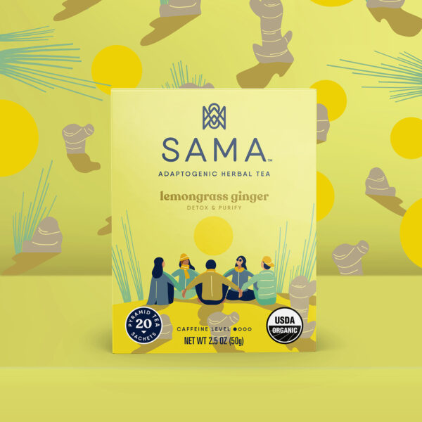
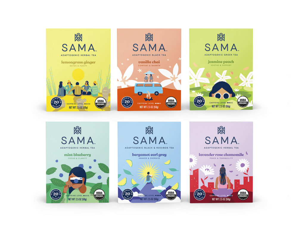
We set out to create a tea brand that immediately spoke to a new generation of tea drinkers. Our developers created amazingly tasty black, green and herbal tea blends. On top of it, they added functional ingredients to help Sama sippers get through their busy day and the stresses of modern life, so they can get the most out of every moment. Sama helps drinkers be present, feel fully and sense with all senses. We created a logo mark that anchors and centers the viewer. In reality, it’s an abstraction of the letterforms of Sama, but also it also creates a balanced, serene landscape of mountains, the sun and its reflection in water. The typography we chose is clean and straightforward.
There’s an effortless quality as the eye moves about the box, taking in one bit of information at a time with ease. When we were considering how we visually articulate the idea of being present, we chose to collaborate with artist & illustrator Quentin Monge. We created characters that embodied the functional qualities of each tea blend — the Focus & Clarity blend with a woman focused on getting a great photo, the Calm & Relax with a woman in a seated yoga position in the midst of a busy city. Then we layered in flavor, so not only does the shopper understand the functional benefits of the tea, but it also provides an understanding of the flavor experience. Through copy, we reinforce the functional and flavor qualities of each blend on one side, then wrap it up with a badge proclaiming “The only thing better than tea, is tea together” with an invitation to join Sama on social media for community tea times and other mindful practices. The overall look is fresh, modern, vibrant but not frenetic. It’s an accurate reflection of the personality and values that Sama holds true.
