The Uzbek market of washing powders is full of huge, well-known international brands and small, local trademarks. This creates a lot of competition for customers’ attention and choice.
In order to hit the bullseye we conducted a series of researches — interviewed customers and sellers, found out their insights, understood what is important and convenient for them, when it comes to washing powders.
Research helped us to define which odors fit best for our powder. It was important as we didn’t want to implement just another refreshing and floral aroma.
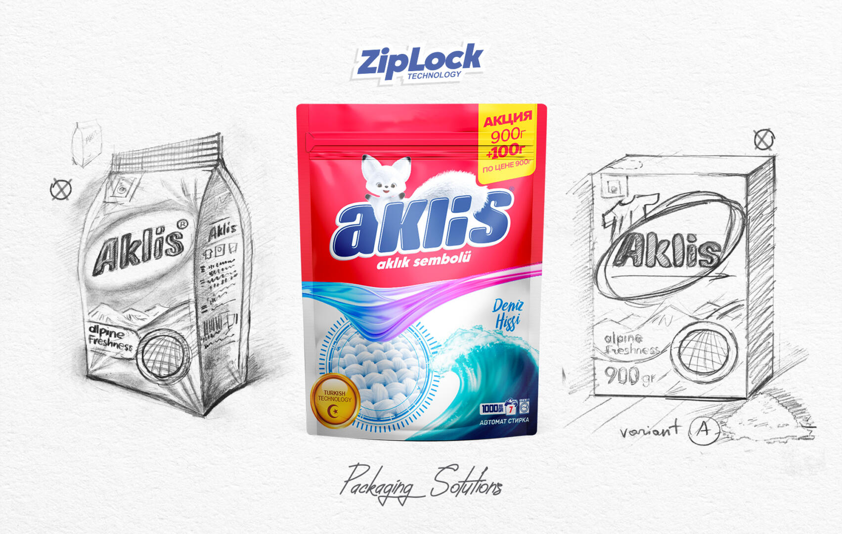
All the information we got from the research led us to certain product composition, packaging size and visual representation.
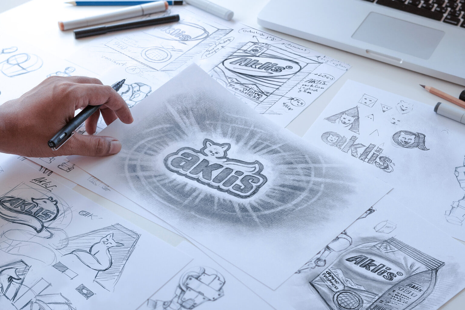
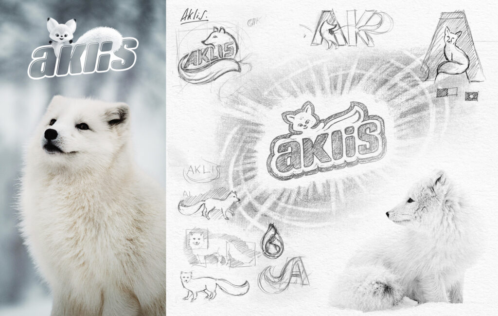
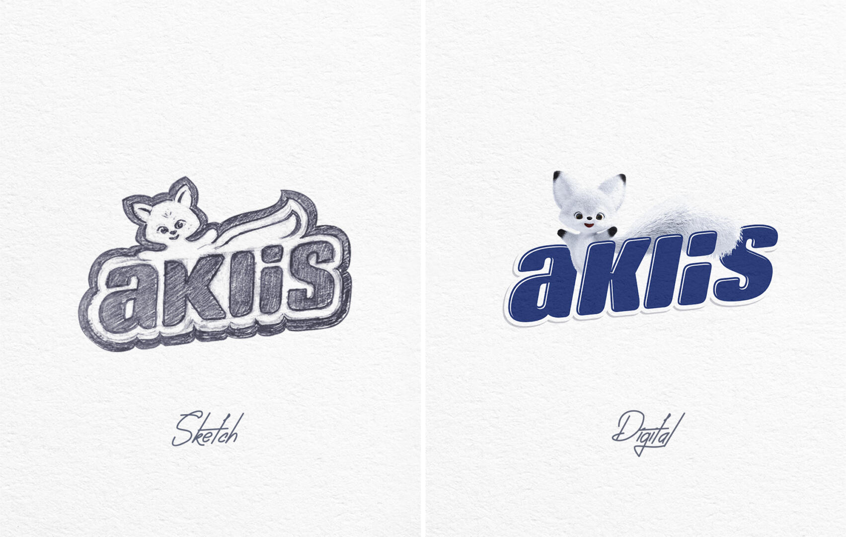
We named our powder “Aklis” — in honor of the arctic fox, a very neat and clean animal, that always keeps its fur snowy white. Aklis is a combination of two common languages in Uzbekistan: uzbek and russian. It makes the naming well understandable and easy-to-remember for our target auditory. Moreover, it reflects all the main features of the product and creates associations in the minds of customers that increases sales. Naming also became a basis for a logo of the product.
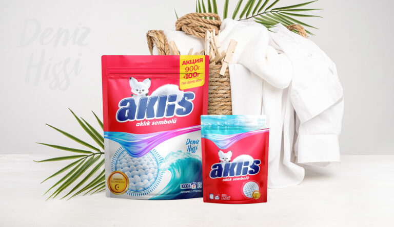
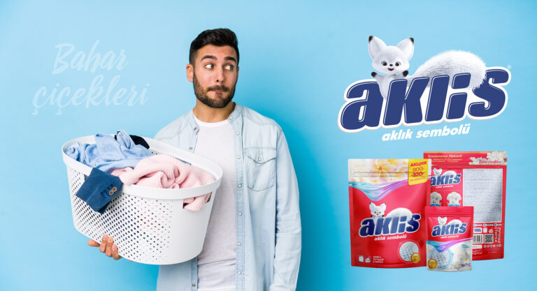
After the naming and logo, we faced a dilemma of choosing the main color of our powder. We got two ways to go — first, make it look more classic, just like our competitors, and second — risk it a little bit and use some bright and unusual color for the category of washing powders. We chose the second way.
One more interesting and useful feature added by our team was a special ziplock. It solved multiple product problems at once: now it is easier to use and store, it keeps odor inside the pack and makes Aklis safer for kids.