Aeroport Ice Cream is an Uzbek dairy producer that is aimed to make a high quality product for both local and international markets. Moreover, currently Aeroport is going to get premium customers and that’s why it needs a unique and authentic brand design for its flagman product — Dora ice cream.
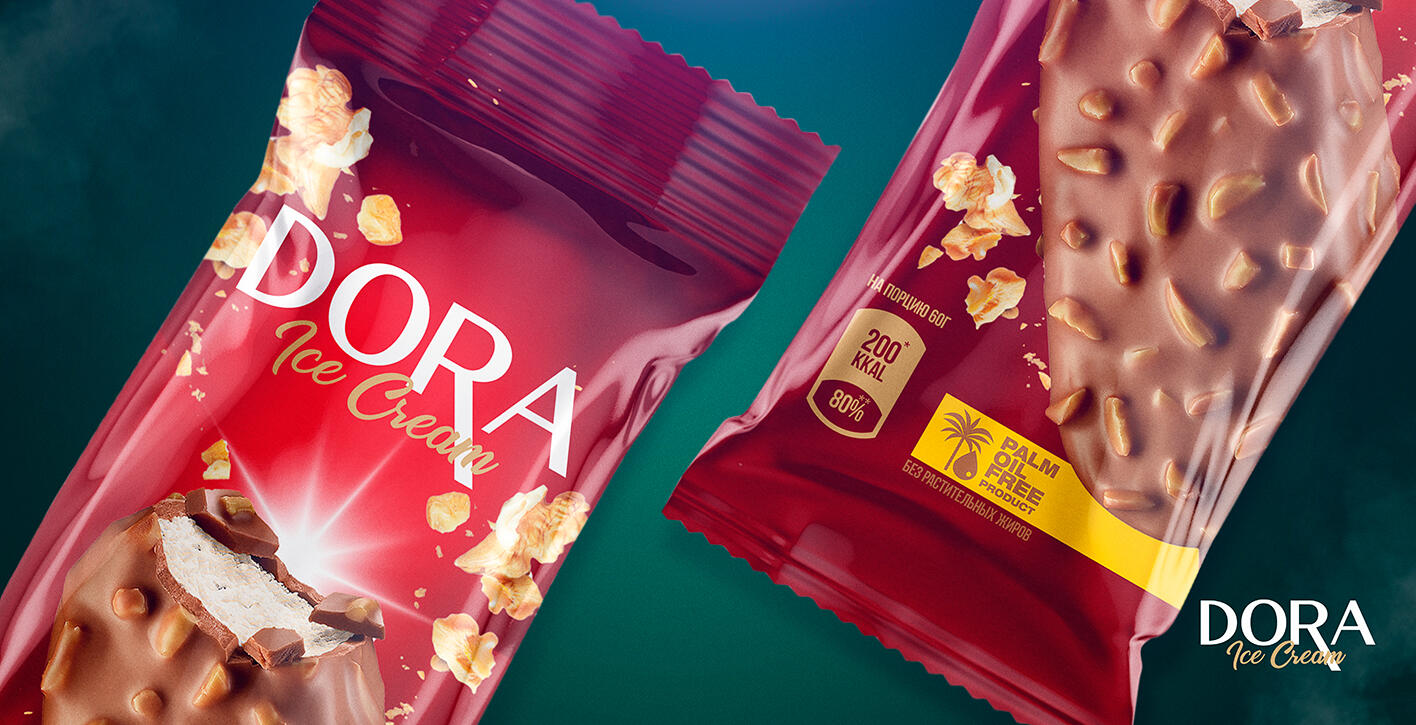
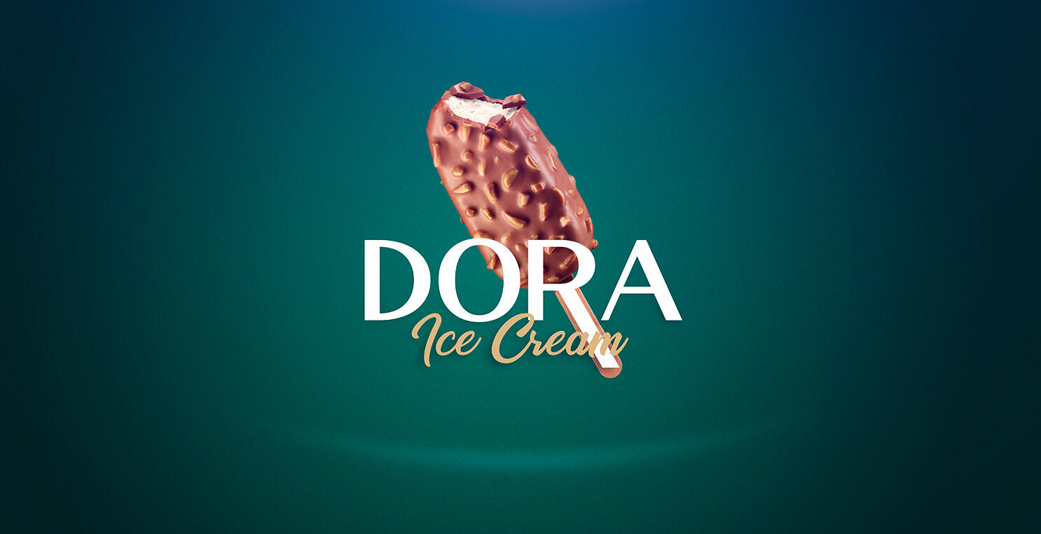
Dora is a soft, milky ice cream made of finest chocolate and selected greek nuts. It’s not just tasty but also healthy, as it does not contain any palm tree milk and is absolutely GMO free.
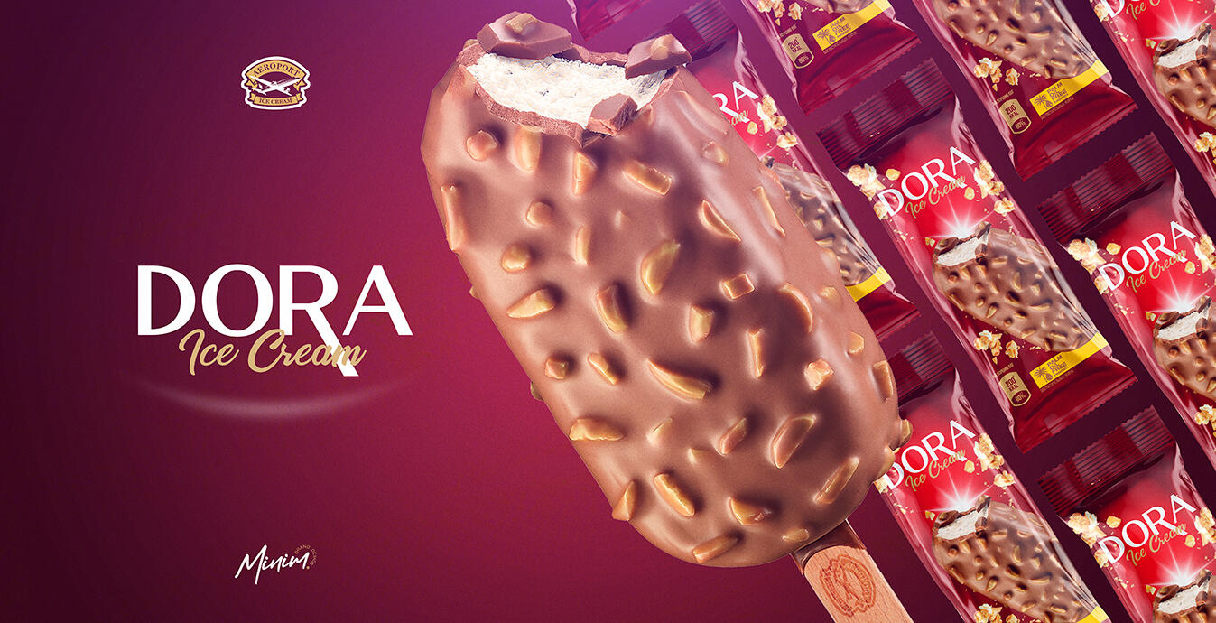
All of these qualities are reflected on the packaging, which has been implemented in four different colours, in order to keep variability for the client and customers. Typography of the packaging was also made considering the visual identity and reputational goal of the product — being an expensive, premium product for those who are ready to treat themselves just because they deserve it.
Visualisation of the ice cream itself on the packaging is also completed in a way that can trigger the appetite of the customer, making him think of a tasty and nutfull ice cream during hot and burning Uzbek summer.
Design code of the packaging can be easily widened to other types of Dora ice cream in future — and it’s much important as our client is looking forward to producing various flavours with unique ingredient combinations so that Dora could become a product brand that can become a favourite choice for all ice cream gourmets.
We believe that being bright and bold is the right strategy for a product that wants to highlight its premium nature and become a true lovemark.