A gentle touch – Luminous Design creates Packaging for Seven Potions Grooming Products
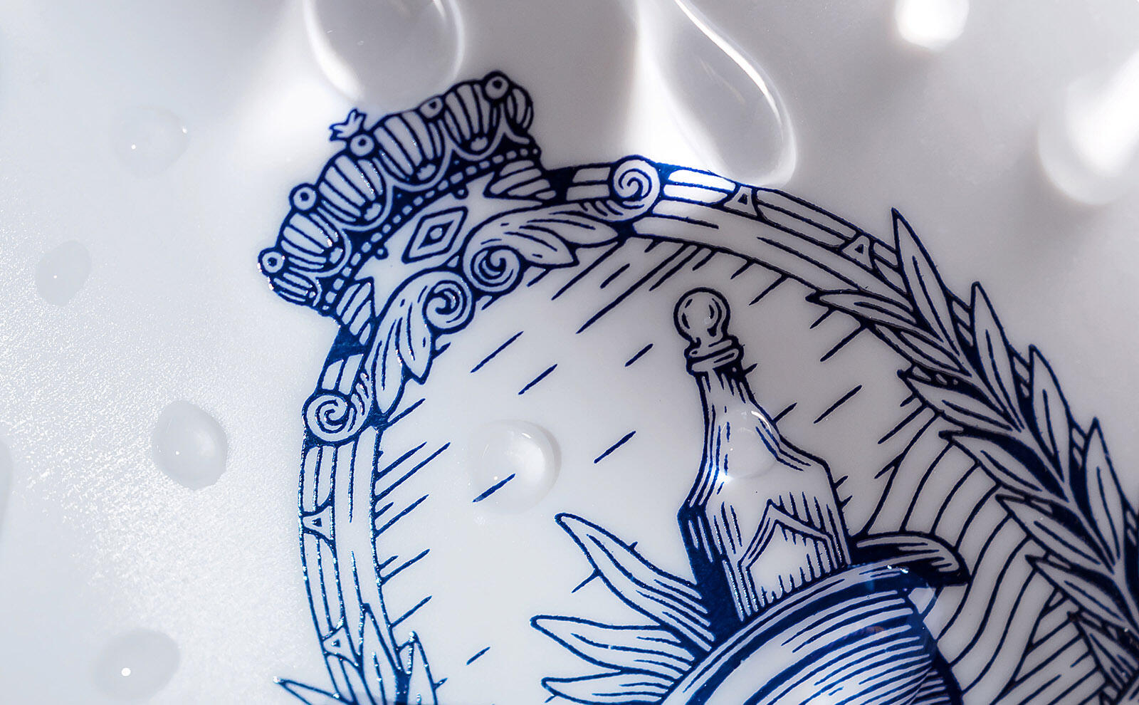
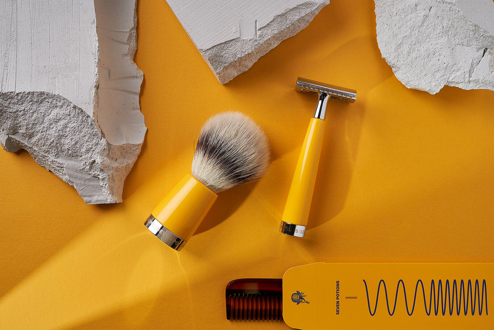
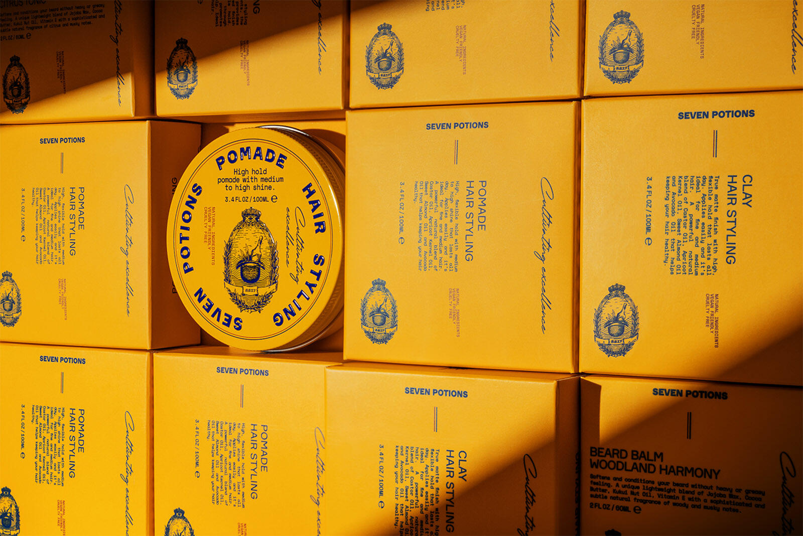
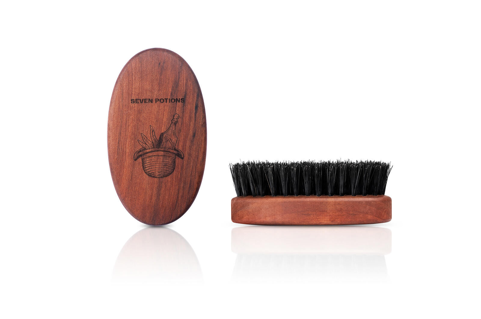
Seven Potions is a London based brand, offering grooming products to the modern gentlemen and when they asked us to design their visual language and packaging, we strived for authenticity and specialty. We designed a logotype that exudes the brand’s unique storytelling, capturing the balance between classic and modern. The symbol derives inspiration from the emblems defining English history, while the typography stays in touch with the modern era.
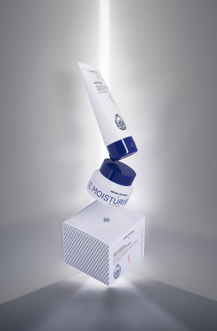
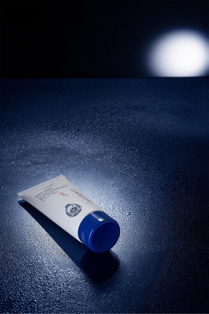
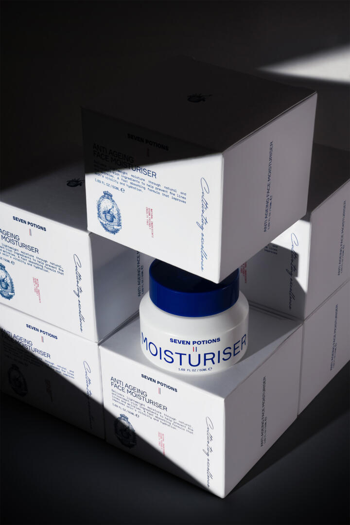
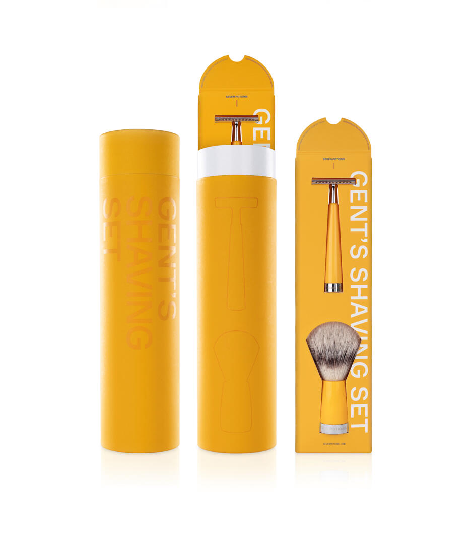
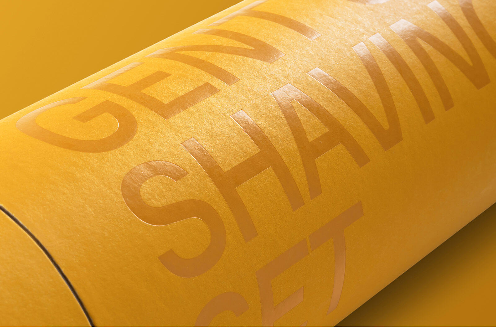
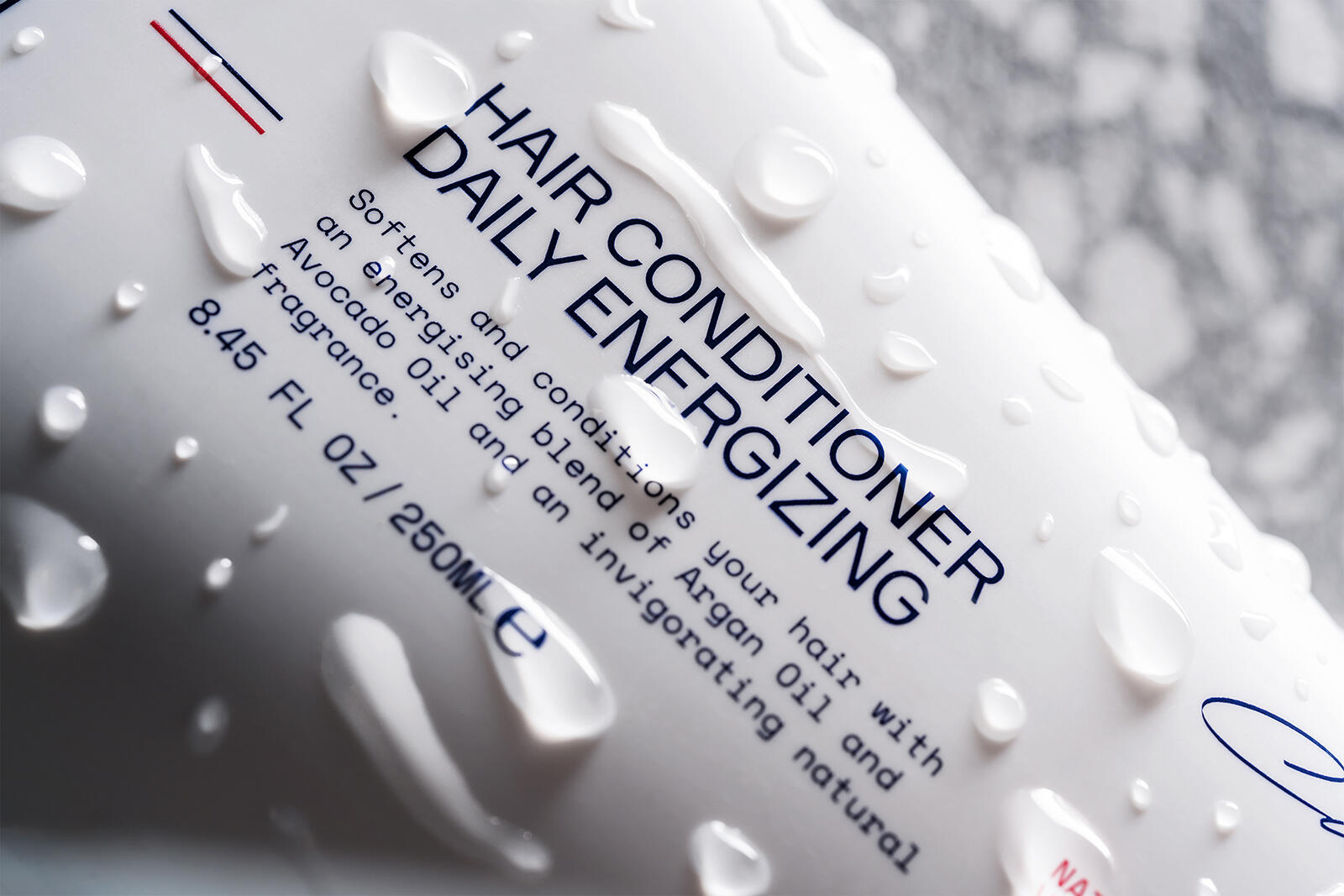
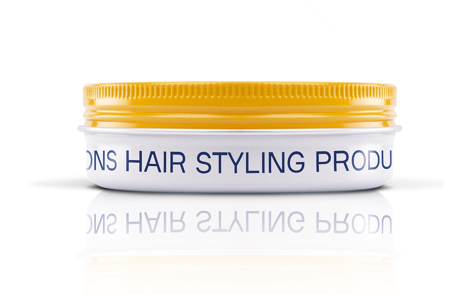
We developed a packaging system that gives the containers a cohesive identity, offering a strong and distinctive look & feel and at the same time via the color coding we developed, can successfully adapt to the different product lines the brand offers. Yellow is the core brand color and dominates with its optimism the dispensers for the beard care products; grey color stands for the hair series while pure white stands for the skincare. Every container features the phrase “Cultivating excellence” in a handwritten typography as part of the visual system developed, while the red & blue vertical lines are referring to the iconic British colors, confirming the brand’s London aura.